FREEDOM

Spring 2024 – Assignment #8

“Freedom to Express”
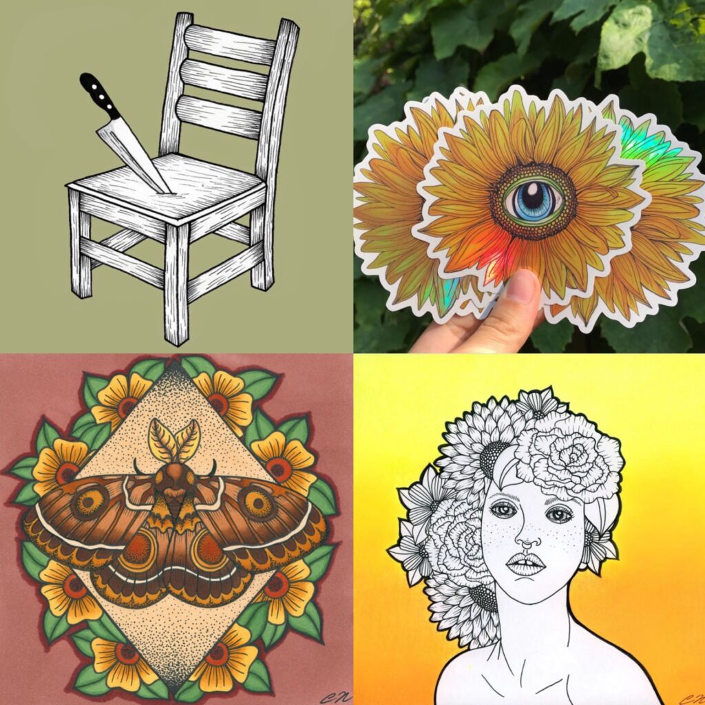
Drawing has always been my safe space for unfiltered self-expression. It allows me to convey thoughts and emotions more deeply. The process of sketching, figuring out what colors to use, making mistakes, and starting all over again takes me hours to complete a piece. It’s a cathartic experience that frees me from the expectations and allows me to be locked in one thing and nothing else.
“Freedom to Explore”
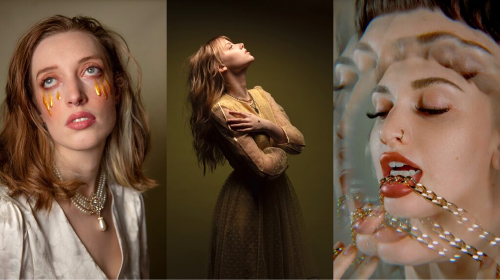
Photography has been instrumental in expanding my perspective, allowing me to see the world through a unique lens. Each assignment at school presents an opportunity to tap into my creativity and develop my distinct approach to capturing images. I always look forward to seeing how my classmates interpret the same projects. Photography has helped me discover beauty in unexpected places.
“Freedom from Expectation”
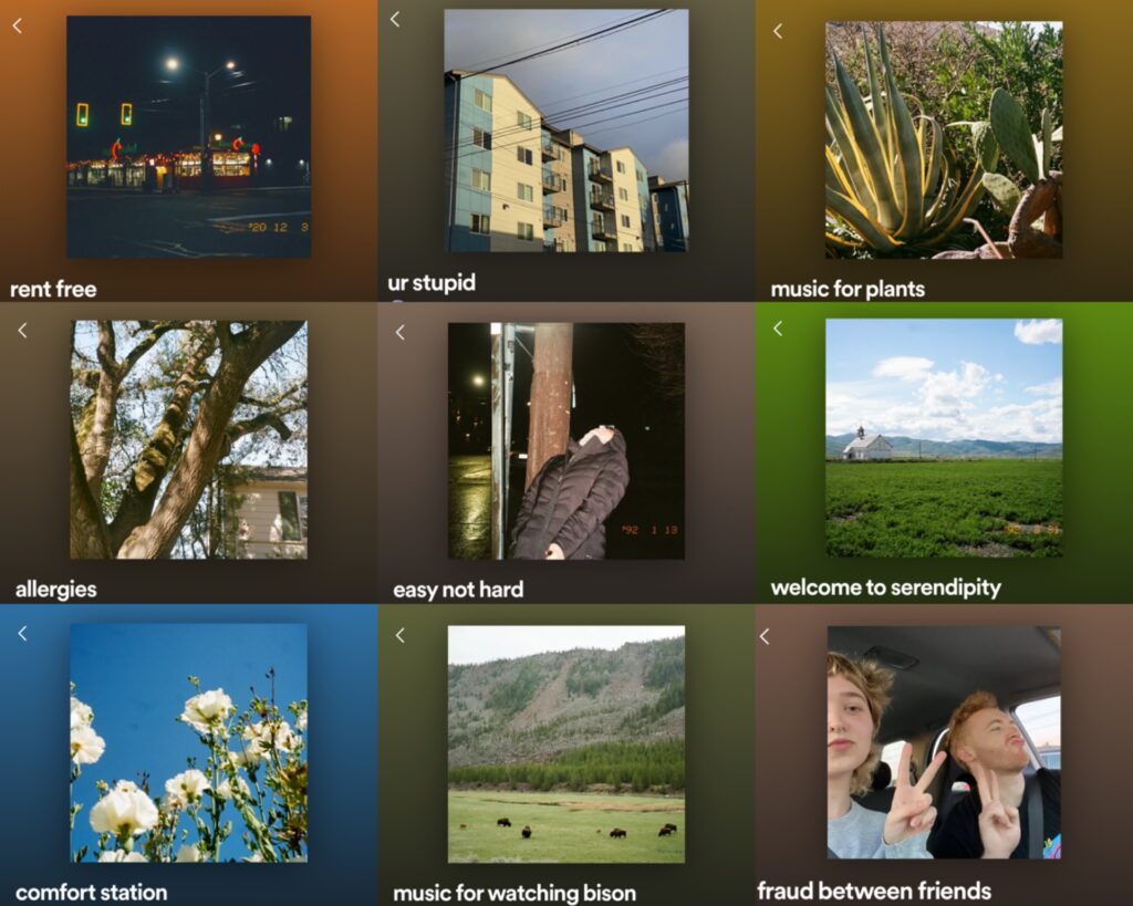
Music has always held a special place in my heart, and for years I pretty much only listened to indie and old-school tunes. In recent years, I have allowed myself the freedom to explore a wider range of genres, letting music speak to me on a personal level. It’s a personal journey that I am not compelled to share unless I choose to, but I’ve always enjoyed sharing music with my friends and finding new artists. It’s a love language. 🙂
P.S. i wrote this while i was sick so I’m sorry if it doesn’t make any sense it did in my sick brain tho!!!
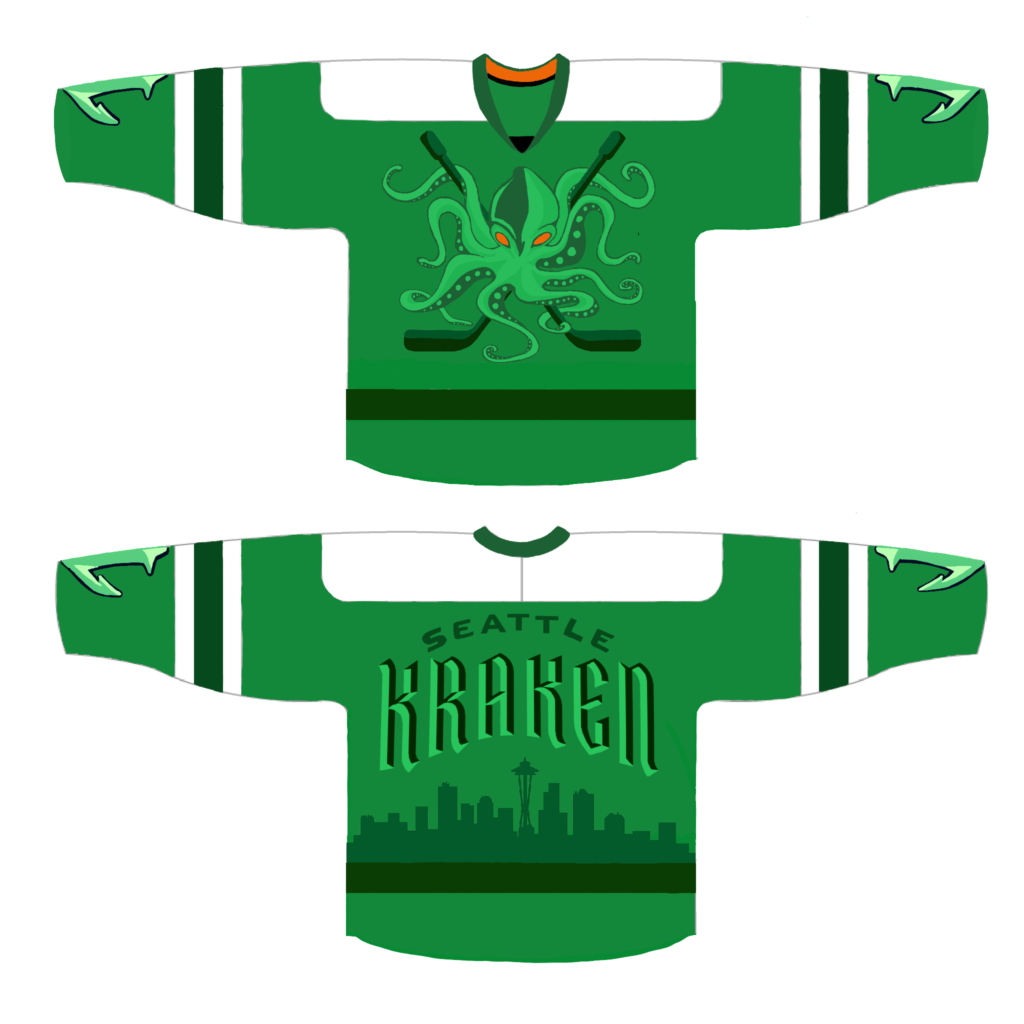
Seattle Kraken Jersey – Green Night

Spring 2024 – Assignment #7

My Seattle Kraken jersey is inspired by Green Night, mostly because I really wanted to design a green jersey. This might be a hot take but personally I’m not crazy about the current Kraken logo and the color scheme, Ice hockey is a cool and badass sport so I wanted to infuse a touch of punk/metal aesthetics mixed with a retro Super Sonics vibe into the design, I had a great time creating the Kraken crossbones and adding the Seattle skyline. Although it won’t be the official Green Night design for 2024, I love how this turned out and would happily wear it.

A Mural For Mom

Spring 2024 – Assignment #6

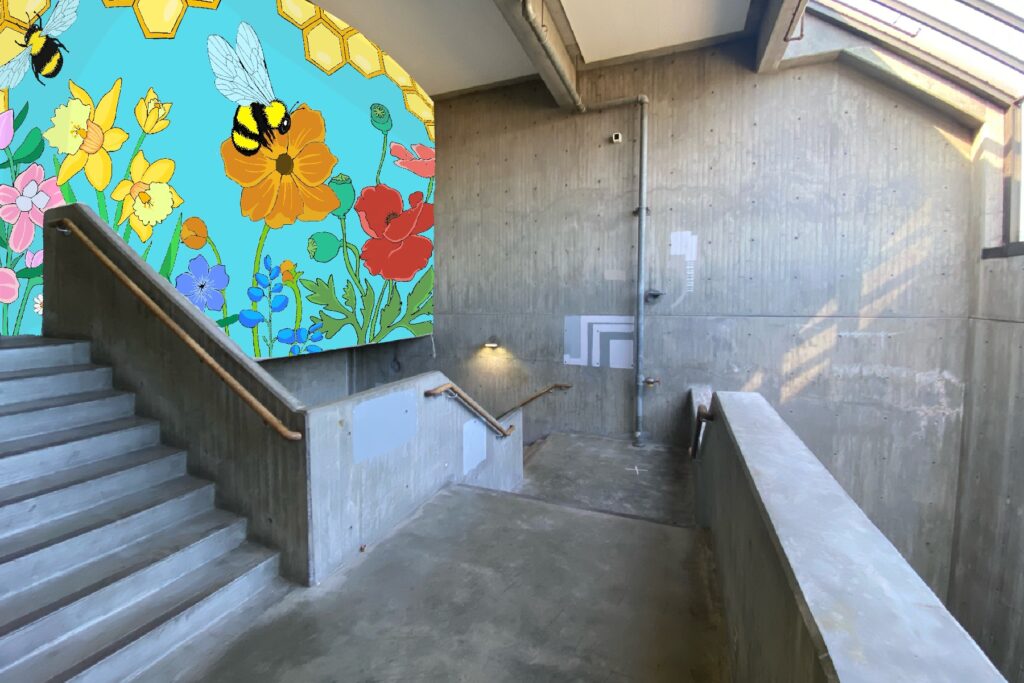
My mom has always loved working with the earth, my parents had their own landscaping/gardening business for many years and recently retired. I have fond childhood memories of running around in the garden barefoot while my mom planted flowers, grew vegetables. .

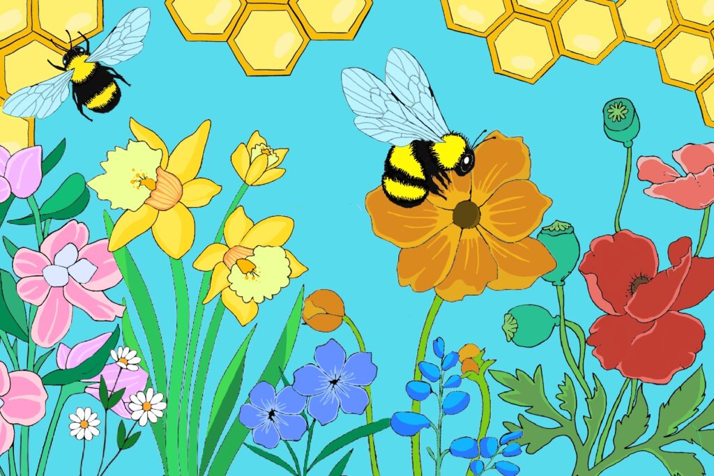
Our backyard has always felt like wonderland so, for this assignment, I wanted to design a mural inspired by my mom’s garden and her love for the natural world. Her favorite color is blue, and she has always adored bumblebees, so I made sure to include those elements as well. I am really pleased with how it turned out, and she loves it too

Food Truck

Assignment #5 – Spring 2024

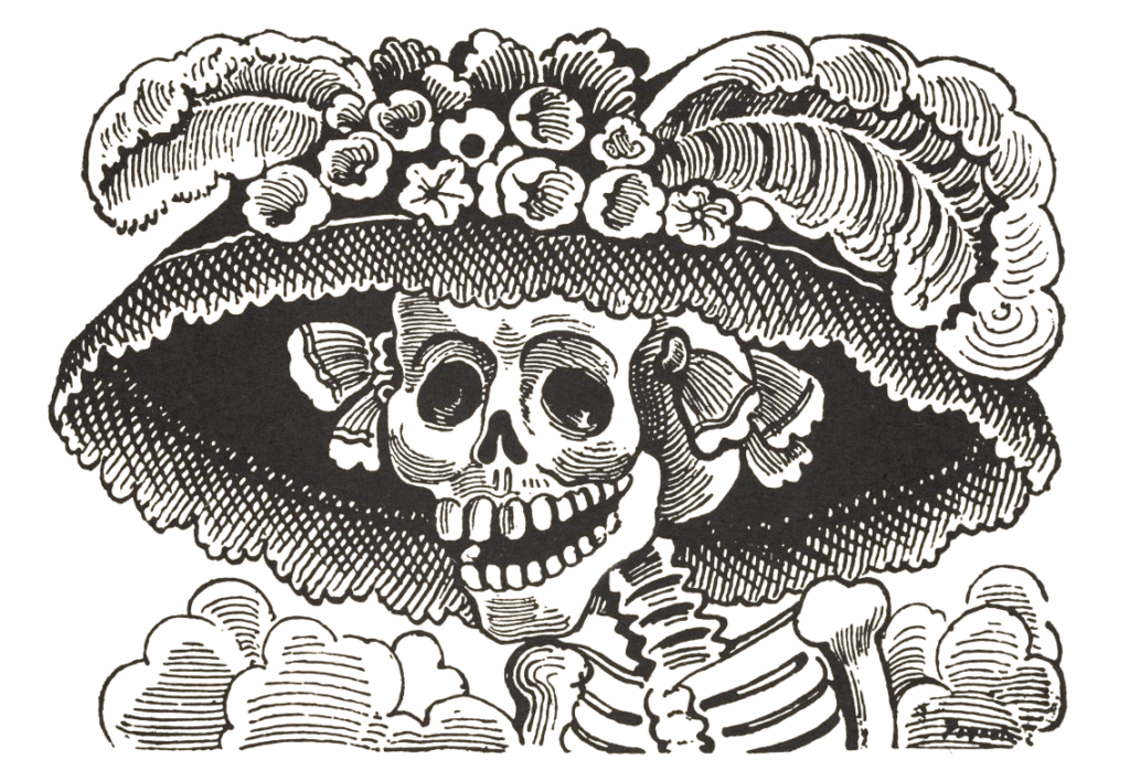
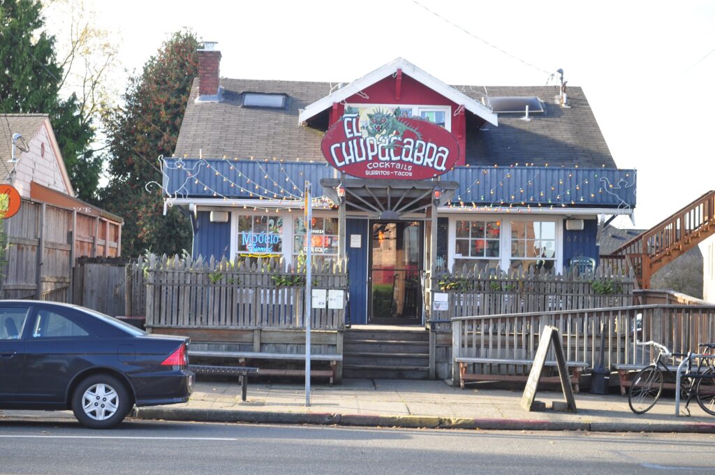
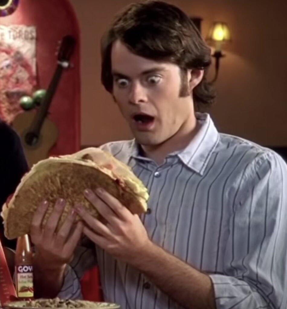
There are two El Chupacabra locations in Seattle that you won’t want to miss! Chupacabra Greenwood, first opened in 2005, located on Phinney Ridge, El Chupacabra Alki, opened in 2011, nestled in West Seattle. Both locations are in old houses, adorned with various knickknacks and art. Chup is known for damn good margaritas, mission-style Mexican food, lively music, and homemade hot sauces. Both locations offer a casual dining experience with a unique twist, full bar, and Mexican-style cantina atmosphere with punk rock roots. The music can be a bit loud, and the wait staff may have a sassy attitude, but we guarantee a great time for everyone.

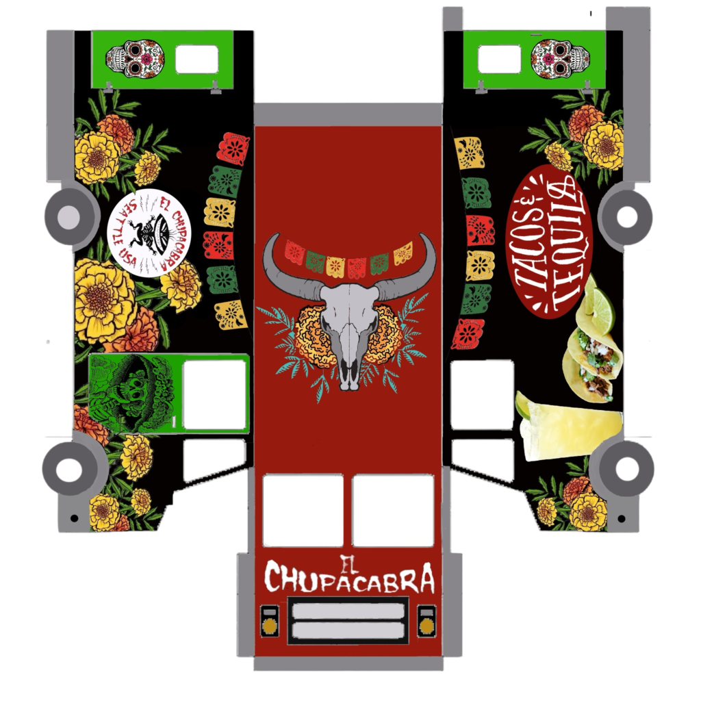
Who doesn’t love a cozy and affordable neighborhood spot? Especially one with an excellent happy hour menu, good music, and a grungy feel. Not to mention a patio and a kids’ menu. Taco trucks have always been popular, but I wanted to bring something new to the table. That’s why I decided to design a food truck inspired by El Chupacabra. This place has been there for me, especially during my early 20s when I was broke most of the time I would always run into familiar faces. I’ve been working at Chup for the past year and a half, and it’s been the best service industry job I’ve ever had. The people I work with are incredible, and I genuinely enjoy my job. The tips are good, the food is tasty. So, it was only natural for me to choose Chupacabra for my food truck venture.

If it were up to me, this food truck would primarily focus on serving the best margaritas in town all over the city but we can’t forget about the food! So, we’ll also have a taco menu, along with the classic chips and salsa. When designing this truck, I wanted to capture the funky and badass aesthetic of the restaurant itself.

The making of “Bus World”

Assignment #4 – Spring 2024

Blender project deliverables

  • Suzy – a chronically late bus driver
  • “And has thou slain the Jabberwock?”
  • a portal.

I missed the initial week of planning our blender project due to strep throat (not fun do not recommend). When I came back to school my teammates asked “how do you feel about sock puppets?” and of course was so down.

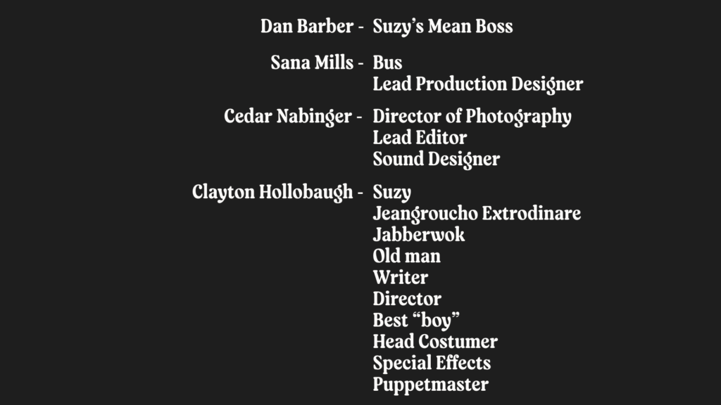
Clayton put together a script and crafted the best sock puppets, Sana designed adorable backdrops and the bus! As filming day approached, things got a bit hectic and it ended up being a pre-production day of hot glueing, taping and feeling slightly overwhelmed but it all worked out in the end! Having everything all planned out and ready to go made all the difference.

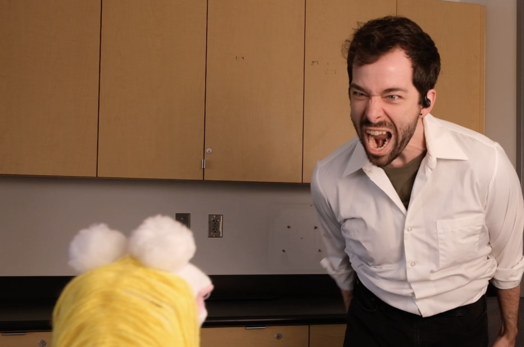
We waited to film until the following week, thanks to our well-planned script, the filming process was a breeze, special thanks to Dan for delivering an outstanding performance as the angry boss.

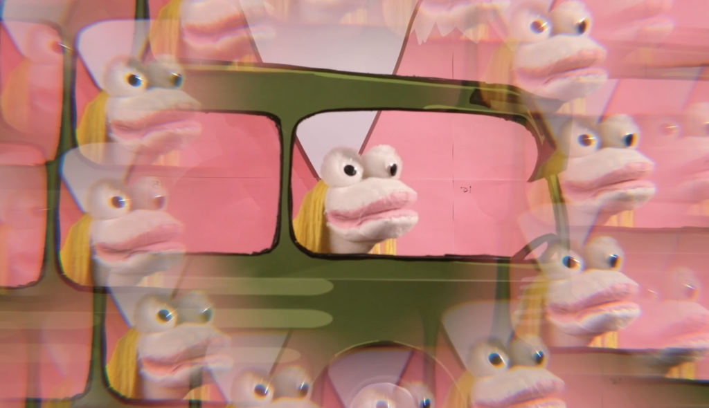
When I began editing the footage at home, I was in literal tears.. it was one of the most challenging videos to edit because I couldn’t stop laughing. Squeezing everything into a two-minute video proved to be quite a challenge, I had fun finding sound effects on YouTube to enhance our short film. The original audio didn’t sound great, we took the time to redo it, and the final result came together beautifully.

“Bus World” turned out to be a very fun and silly video, reminiscent of 2010 YouTube videos. Clayton also added in some after effects and Sana put together our final presentation! Working in groups can sometimes be stressful, and the outcome may not always align with personal preferences but that was not the case, I really enjoyed the creative process of “Bus World,” and collaborating with Clayton and Sana, I’d be down to make a sequel.. Lmk

$25,000 – Powering KEXP

Assignment #3 – Spring 2024

One of my most unforgettable trips was back in 2017, I went backpacking in Europe. After spending a few weeks exploring different countries, I hopped on a plane to meet up with some friends in Iceland. It was one of the most beautiful places I’ve ever been to it felt like being on another planet.

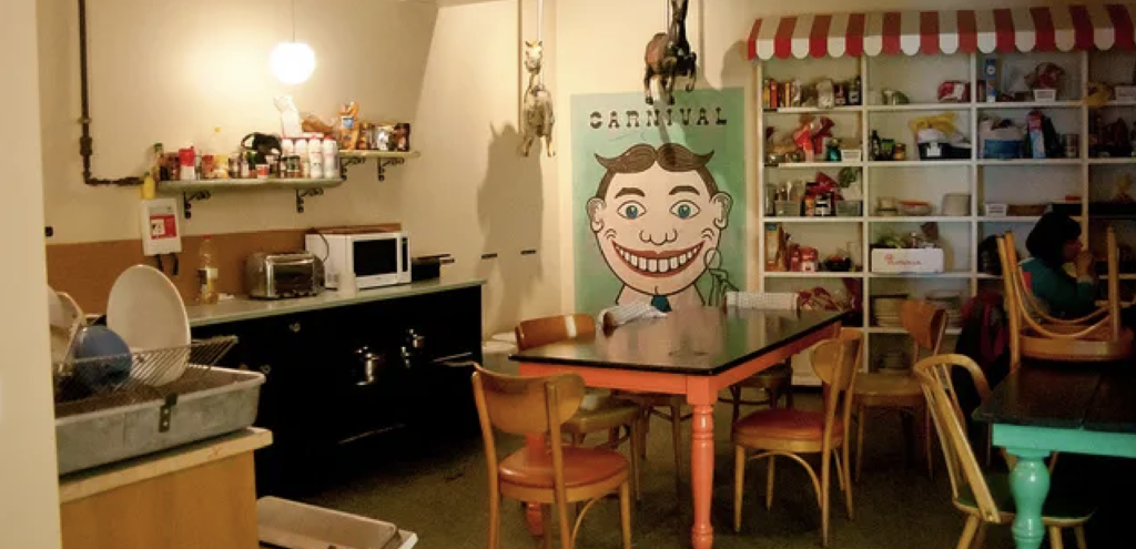
KEX hostel has a carnival theme and it was spooky at night.

I arrived at the KEX hostel in Reykjavik, sick, exhausted, and missing home but hearing Cheryl Waters voice on the radio in the lounge instantly made me feel at home. Every night, there were performances and music that felt so familiar and comforting. It was such a sweet feeling, especially being so far from home. Music can create a sense of belonging no matter where we are and that’s why I’d give my loose change (25,000) to KEXP.

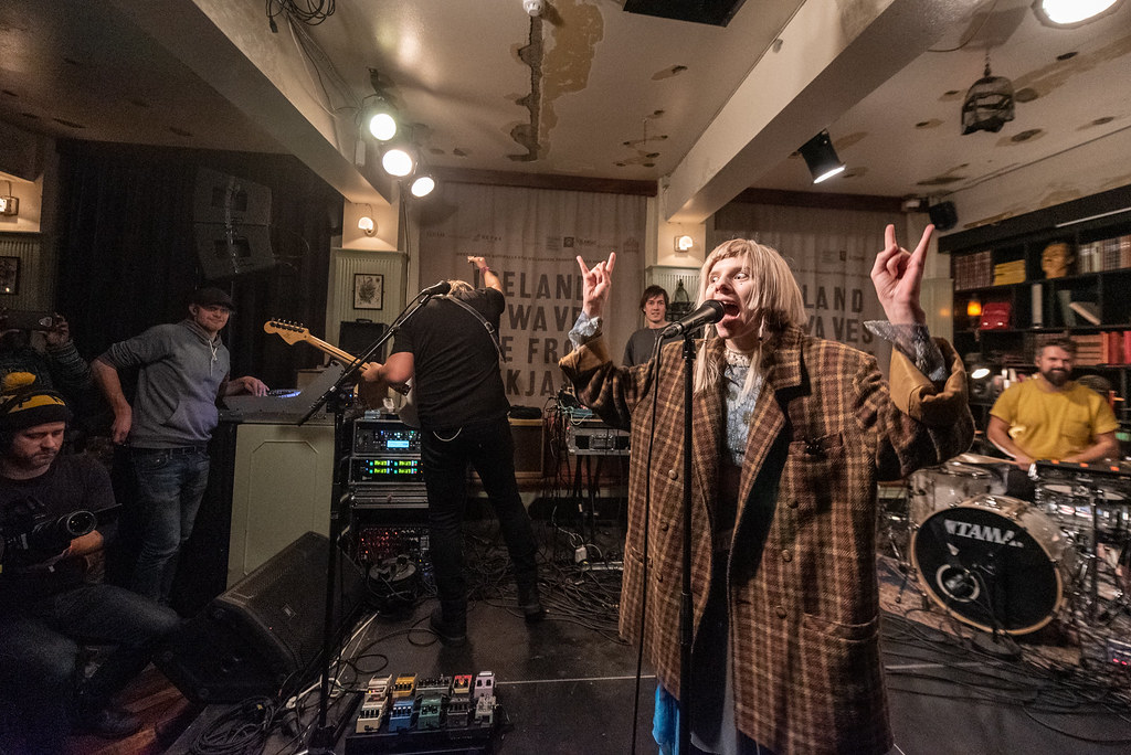
Aurora preforming at KEX during Iceland Airwaves in 2018.

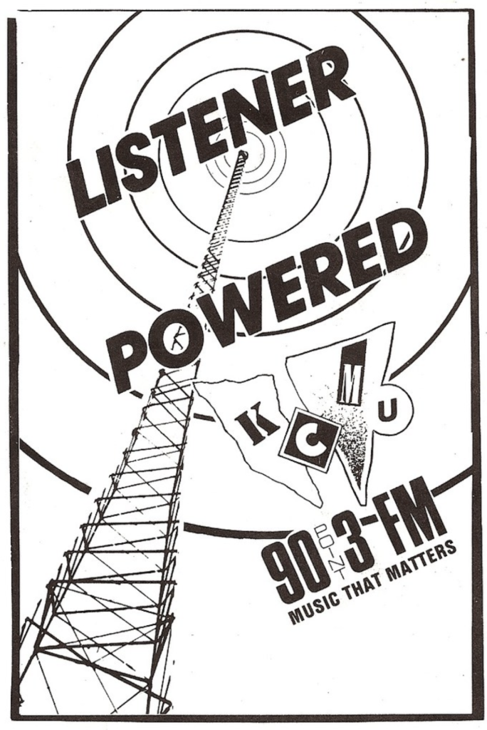
KCMU was founded in 1972 as a student and volunteer-run 10-watt radio station affiliated with the University of Washington. In the early 2000’s the name changed to KEXP and became an independent non-profit organization, relying on listener support to continue running. KEXP offers a wide range of genres from indie rock, alternative, electronic to hip-hop, and more. Their DJs curate playlists showcasing established and emerging artists.

KEXP is way more then just a radio station, they give back to the community by organizing events, concerts, music festivals and partnering with organizations and artists to promote music, education and cultural awareness.

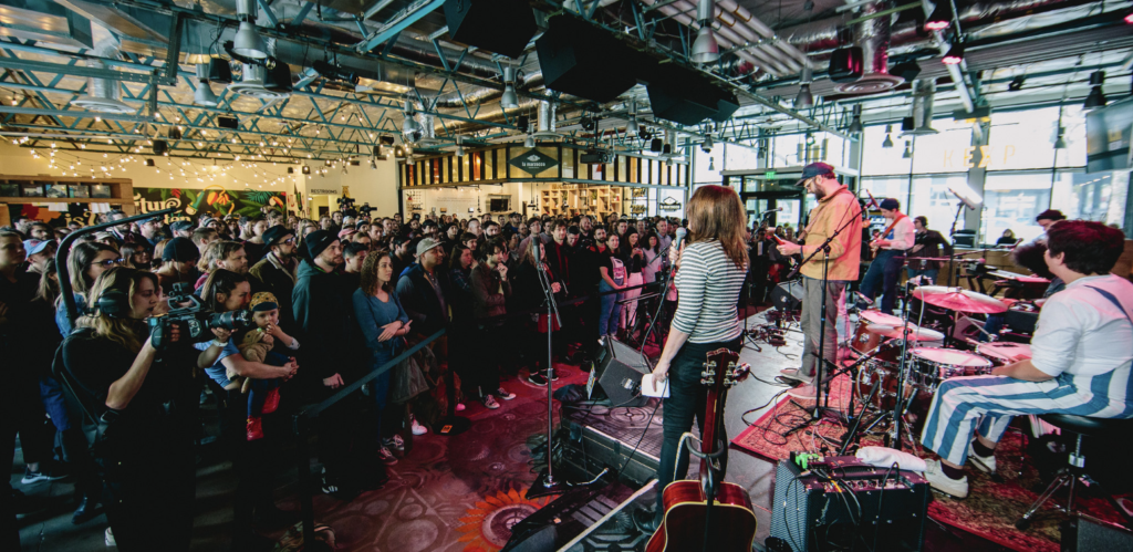
That’s a lot of people who love music!!!!

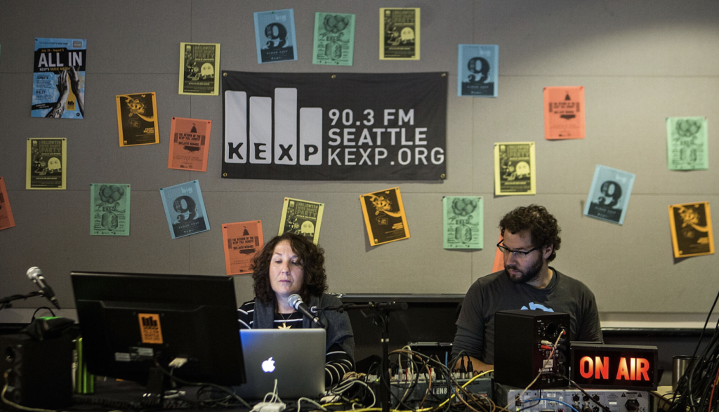
KEXP is also well known for its unique and intimate live performances. Artists from around the world come to their in house studio to perform on the air. KEXP is based in seattle but they have grown over the years and now have a global audience of music lovers who tune in through their website, live streaming, and YouTube channel, making it a beloved Seattle staple and influential radio station worldwide.

Donating to KEXP, directly supports independent music and I think that’s pretty cool, they deserve all my spare change, thank you for coming to my Ted Talk.

The Stanley 32oz Dog Bowl

Assignment #2 – Spring 2024

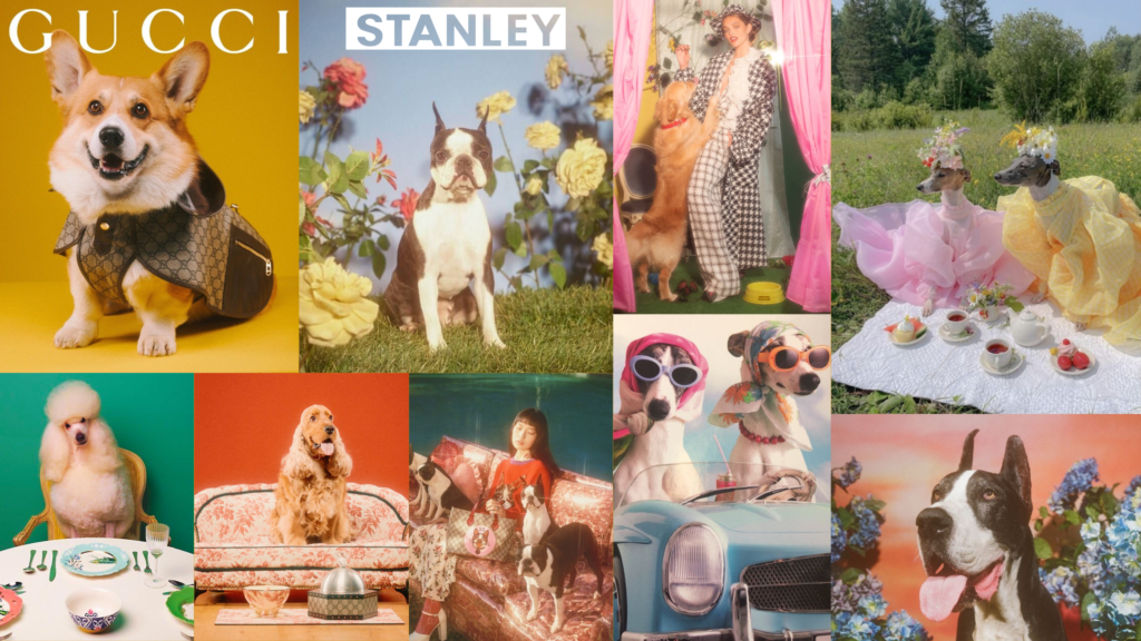
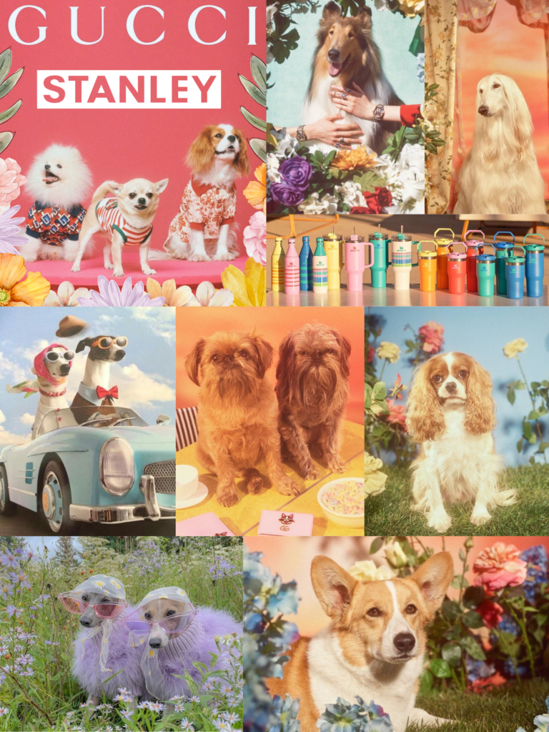
Introducing the all new Luxurious Gucci x Stanley Dog Bowl, elevate your pup’s dining experience with style!

Crafted from premium Stanley materials and adorned with one of a kind Gucci motifs, this dog bowl is a true work of art. Treat your pet to the finest dining experience. Not only does the Gucci x Stanley Dog Bowl exude elegance, but it’s practical and functional.

This exclusive collab is a limited edition release, inspired by spring colors and soft florals making it even more special. Don’t miss your chance to give your furry pal the gift of luxury this season… but wait there’s more! want to match with your pet? we are also releasing a human bowl so you can share a fancy and fun dining experience together.

Design Systems

Spring 2024 Assignment #1

Spectrum, Adobe

https://spectrum.adobe.com

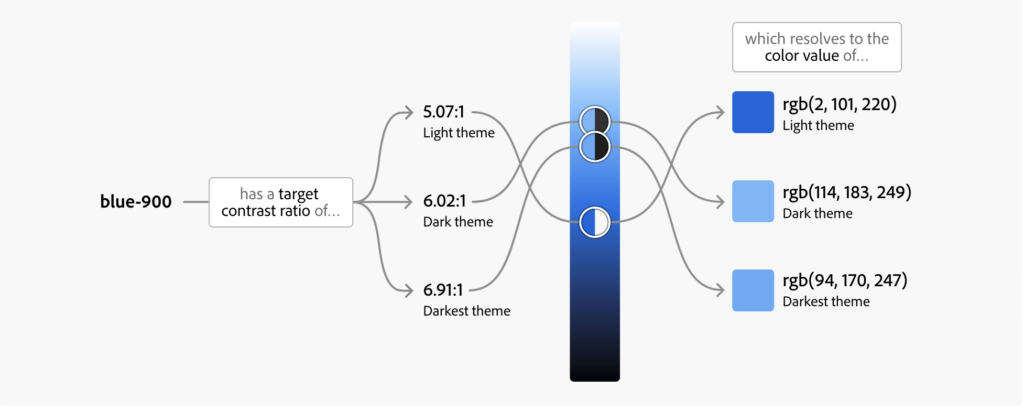
The Adobe Spectrum website uses mainly blue, yellow, and white colors. In the psychology of color blue represents dependability, intelligence and depth and people tend to feel more secure when they see the color blue, probably why so many websites use it.

i’m blue da ba dee da ba da

The website has simple/intuitive icons that makes navigating easy along with a simple and straight to the point menu. Design elements are consistent, maintaining brand identity, such as the Adobe logo, color scheme and similar graphics throughout the website.

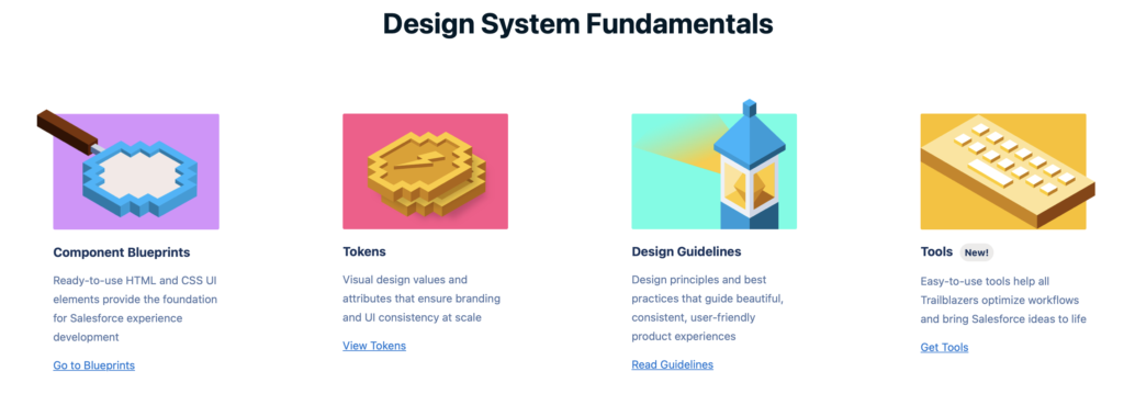
Lighting Design System

https://www.lightningdesignsystem.com

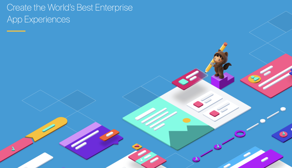
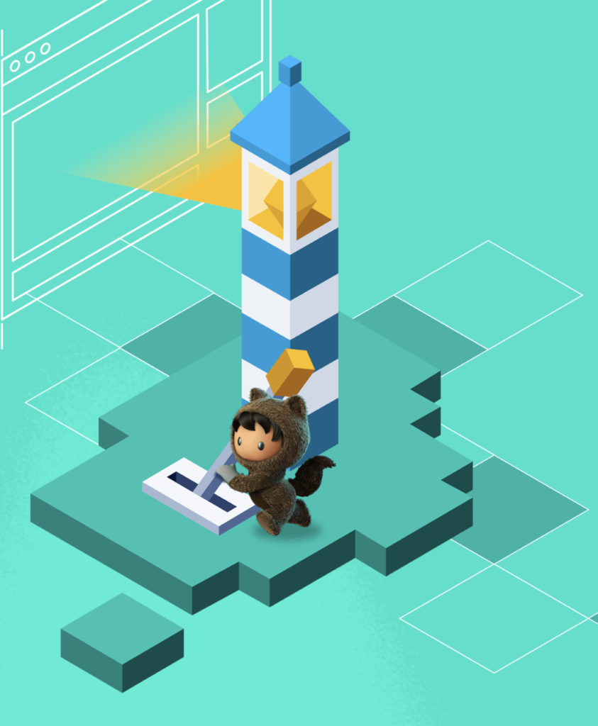
The Lighting Design System website follows a pretty minimalist design approach, the home page is very fun, cute and colorful but the rest is kinda bland and again lots of blue!

i would personally enjoy seeing more of this lil creature

The website uses a grid system for a consistent layout, the typography is clear and easy to read, and well-designed icons are used throughout. The website is responsive and adapts to different devices (works just fine on my iPhone). The navigation is pretty easy to use, clear labels and a solid menu structure very similar to Spectrum, Adobe.

The Guardian

https://www.theguardian.com/us
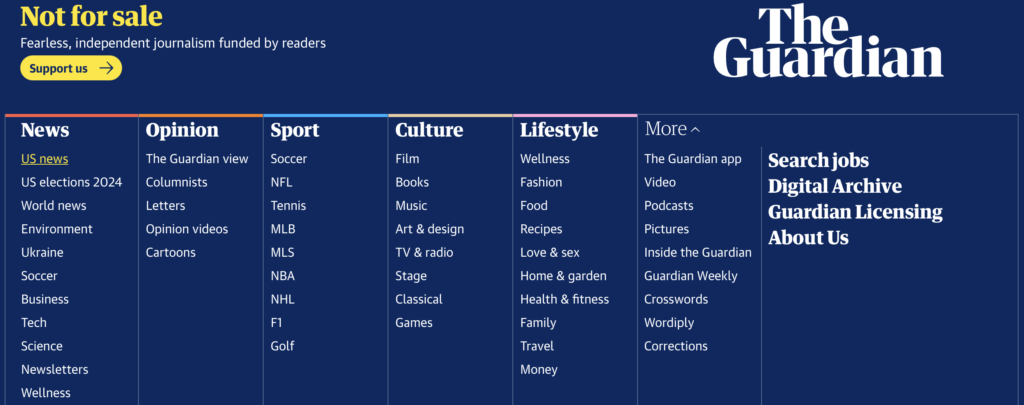
more blue.. it’s all blue everything is blue!!!

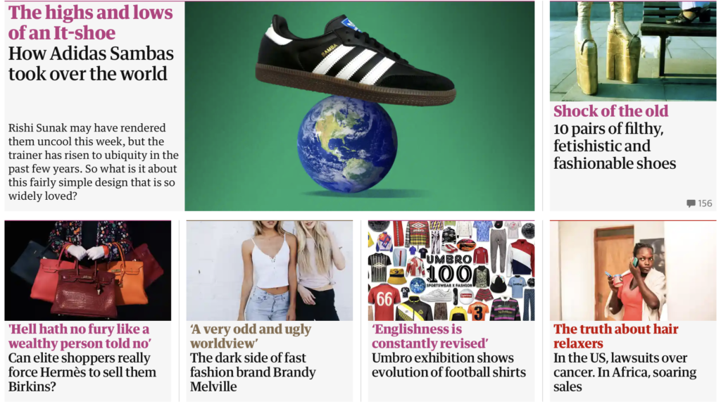
The Guardian website uses attention-grabbing, bold typography with large headings, and clear fonts to grab the attention of readers. It organizes articles and news stories in a card-based layout to present articles and news stories.

There are lots of images with the saturation cranked up a tad, and I noticed a lot of primary colors throughout the website in the images and text. The design includes interactive features like sliders, videos and social sharing buttons to engage users and provide a fun user experience.

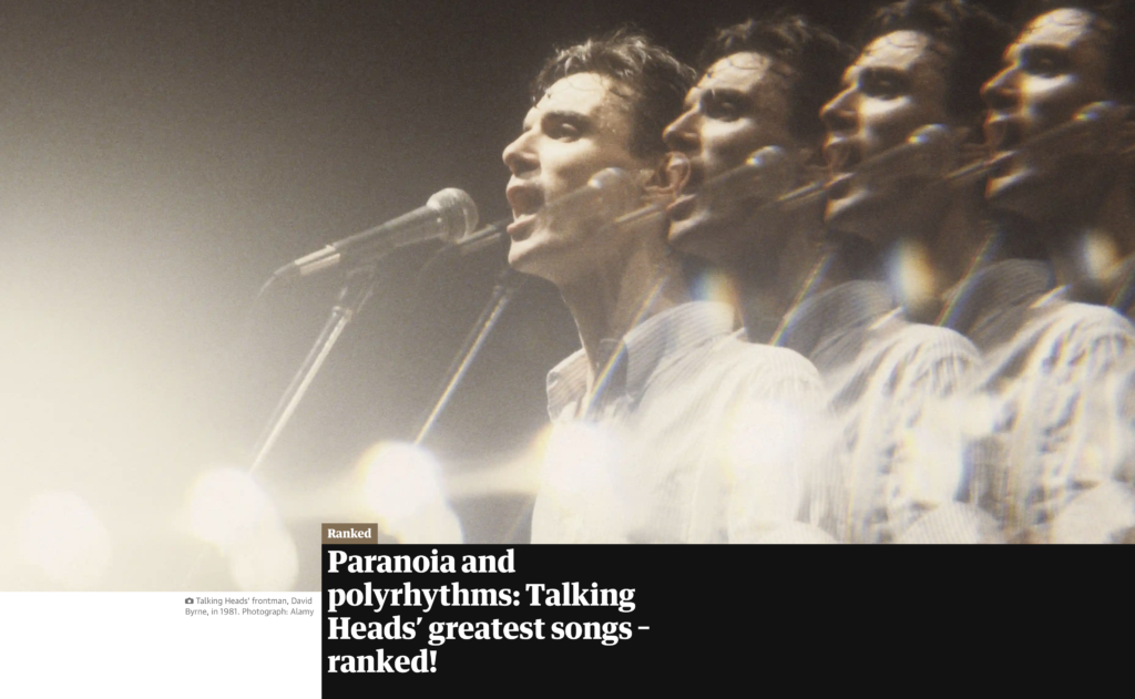
i really enjoyed this article about the talking heads