Okay I had a hard time creating a visual for this so you’ll have to bear with me a little bit. My idea is to have one of those 3D sculptures that looks different from each angle hanging from the ceiling at the top of the stairwell. As you came up around the stair loop from each side it would read “S C C A”.
I have no idea how to do this kind of thing but I think it would be cool to learn and would create a fun, semi-interactive piece for visitors to see when they came up the stairs.
In response to Christiana Wu’s “Freedom” vignettes.
Freedom to Express
The first time I went to college I was going for theater arts. I took a playwriting class and wrote a one act play that I was extremely proud of and got a lot of compliments from my fellow students. My parents wanted to know what I was working on and I shared it with them and my mom was upset because I’d included a character who was gay. She said some rough things and I still think about it, obviously. I ended up dropping out of the class. To this day I censor any of my work that I share with my folks. So if I were to create something embodying the freedom to express, maybe I would give that one-act a rewrite.
Freedom to Explore
To me this sounds like working on a project that uses a new skill. I’ve dabbled in Unity in the past but I would love to explore that program further. I’d love to just have time to work and expand that skillset and create a little game. Something simple just to get my feet wet. To me the freedom to explore has a lot of overlap with the freedom from expectations so it was difficult to separate the two.
Freedom From Expectations
Speaking of: If I was to make something that was totally free from the expectations of others, it would be a dance video. I think dancing is fun, but I would hate to do it in front of anyone else. Like this would be a project I would work on in secret and never show anyone. But if I was “free from expectations” then maybe I’d release it, who knows. Could be the next Numa Numa Guy.
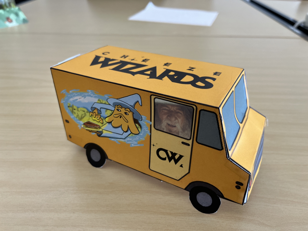
So here’s my food truck for Cheese Wizards! They already have quite a nice truck but as soon as I thought of it I knew I wanted to make one for them. At the end of the day I just wanted to draw a cheese wizard so that’s what I did. I love my wizard, I love his expression, and I think it makes for a great main piece for the truck! However I wish I had budgeted more time for this project; the illustration took a while and I didn’t have much time left over for the rest of the truck.
With more time I would have added more detail to the siding and would have created my own type rather than finding an existing logo for the top/doors. I chose cheese colors which do stand out nicely on the street. I also know that yellow psychologically is supposed to make you hungry so that’s a plus. As a treat I put my favorite wizard in the window.
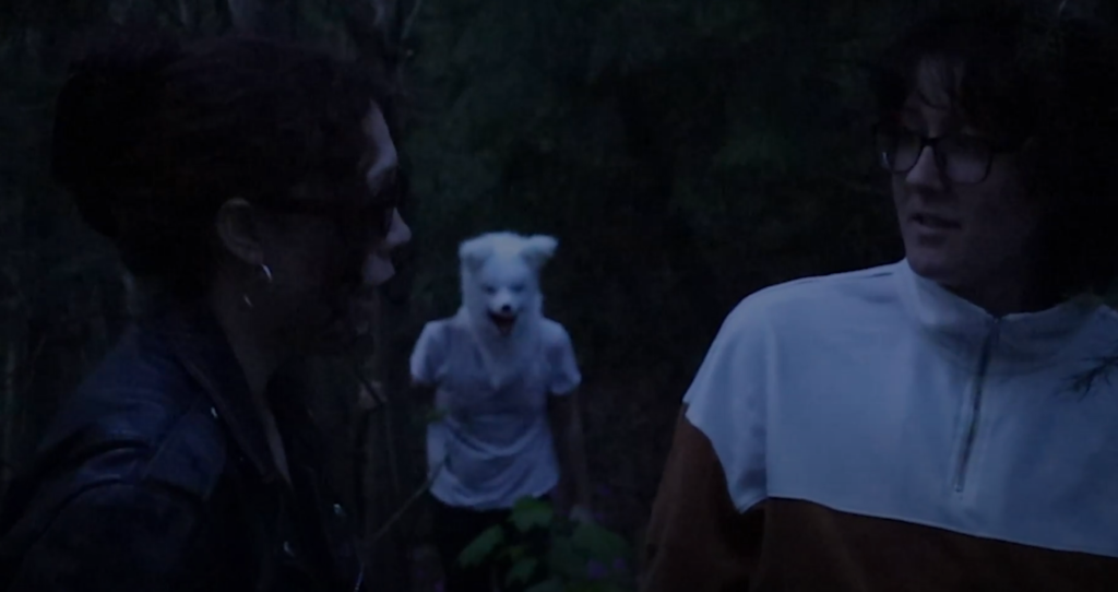
This project was such a pleasure to work on, even though we all said we felt like we’d just finished our finals when it was over. So much time ideating, writing, editing, and especially filming. We spent two days back to back filming from 2 till 8:30 PM, including a trip to a park in Ravenna for the scene in the woods. But the critically acclaimed “Racecar Movie” was worth it. And it would not have been possible without my incredible teammates Heather Van Walden and Alyssa Guzman!
I was sick the first friday and coordinated with them over Slack. They already had the base idea laid out: a meta-mockumentary about our team trying to make a movie. Even during our first video calls over Zoom I was impressed by how creative these two were. They were so good at coming up with an idea and building on it rapidly. Between the three of us we had no trouble filling the time-limit of our sketch. The problem was deciding what bits not to keep!
All three of us were in constant communication throughout the process and held each other to the standards necessary to get our somewhat ambitious ideas on film. It made the usual stresses of coordinating a group project so much easier. (It helped that we were all passionate about our idea as well.)
I could go on and on about the process of writing the script (which was really just a shot-list, we adlibbed most of the dialogue) and how incredibly well my team rolled with the wacky twists we kept coming up with. We collected all the props we could get our hands on, made a big mess in the conference room, and started shooting! Like my character I have some acting experience but I was so impressed with how willing my teammates were to push their nerves aside and get on camera. I think everyone performed really well, especially considering we were improvising dialogue on the fly!
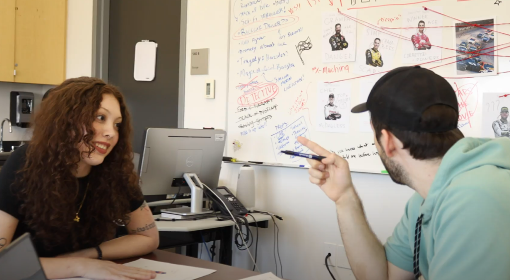
We had some help with the cameras when all three of us needed to be onscreen, so shout out to Sana and Nate for stepping up and helping out. That said, Heather was the absolute MVP when it came to lighting, shooting, and editing. Alyssa and I are Graphic Design students and did our best to help with composition and editing but Heather took a crazy concept and a bunch of weird recordings and made an actually comprehensive video.
There was a day when we stayed after class and helped go through the first 1/3 of the footage and choose what takes worked and where the cuts should go. Alyssa had an incredible sense for timing and what takes worked well, and I wish I had Heather’s skill with premiere! They worked so fast I was gobsmacked.
A few days later we presented our creation (shoutout to Alyssa for working hard on the presentation) and the response was so much fun. From the laughs it seemed like our labour of love came out pretty dang well. I’m very proud of the work we did and my amazing teammates for making it what it was!
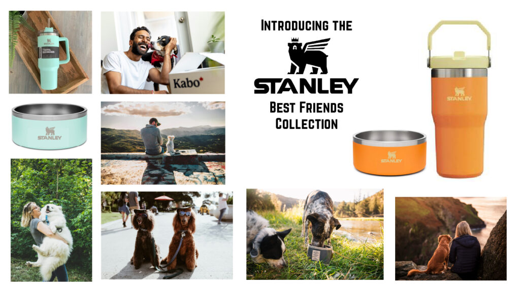
The water boal is a simple design in line with other competing hydration brands and Stanley’s own design: sleek, tough, and colorful. The idea behind the collection is to sell matching bowls/quenchers so that you and your best friend can drink together in style!
The Guardian uses its design system to create an easy to read hierarchy of information so that people can find the articles that are relevant to them as soon as possible. The layout of the site is built on a grid system that changes at various breakpoints for different screen sizes, down to just one column on mobile. The web page is comprised of “fronts” for different topics made up of containers and cards. I find the look a bit cluttered, honestly, but it does remind me of traditional print media. If you knew what you were looking for it would be easy to navigate but dropping on the site for the first time is slightly overwhelming to me.
Uber
I tried to visit the Uber link but they wanted me to sign in so screw them.
Adobe Spectrum
Spectrum’s design is meant to function across a wide variety of platforms and programs. Their focus is on inclusivity and accessibility for the widest possible audience. Their 3 principles are Rational, Human, and Focused: a research first approach to practical solutions designed to serve the users without too much fluff. Seems like an excellent approach. The Spectrum system is extremely exhaustive, covering every detail including animation easing and writing content specifically for onboarding. I cannot imagine creating something like this myself, but of course it was created over time by a large team.
Salesforce Lightning
Lightning immediately feels friendly and approachable with its bright colors and little fursuit character. The front page lists quite a few core tenants but overall they appear to be going for a fleshed out, flexible system that is accessible to all people and available on all devices. Like Spectrum they are fishing for a wide audience. Since Lightning needs to be used not only by the Salesforce team but by their clients as well, their guidelines include “Builders”: tools that allow their clients to “create and customize applications and business processes”. Like Spectrum Lightning is exhaustive and cohesive. You could spend hours reading through their system. Just browsing I stumbled on their Conversation Design system which appears to be a guide for how their chatbots interact with customers.
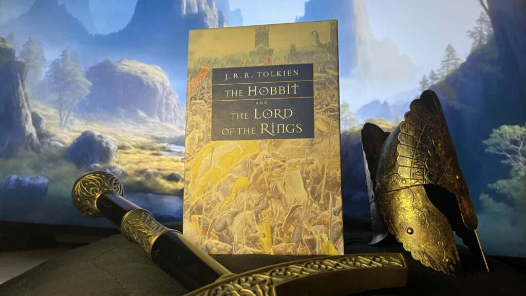
I have this beautiful set of The Lord of the Rings that caught my eye as I was looking around the apartment for something to shoot. I wanted to surround it with objects that felt like they were a part of the story and luckily I have a couple of prop replicas from the movies. I set the objects on a pillow covered with a black blanket for a neutral base. For the backdrop I put a picture of this painterly landscape on my TV and pushed the objects right up in front of it. Unfortunately it was very difficult to get everything in the shot without showing the frame of the TV.
I tried to frame the books at the center and make it clear that they were the focal point of the image. I had an old timey wooden chest in the frame but removed it because it pulled focus. I think with better lighting and a larger screen you could actually create a really cool effect this way!