Categories
Uncategorized

Blog # 8

“Freedom to Express”
For someone who has served in the Navy, the constraints imposed by the Uniform Code of Military Justice can significantly limit one’s personal expression, particularly on matters that might be
controversial or critical of US Government practices or policy. This environment made me suppress my personal beliefs and criticisms, as expressing them could lead to serious repercussions including disciplinary action or discharge.When leaving the military, I felt liberated. This newfound liberty was empowering, and it finally
allowed me to openly discuss and express the thoughts and opinions I previously repressed.

“Freedom to Explore”
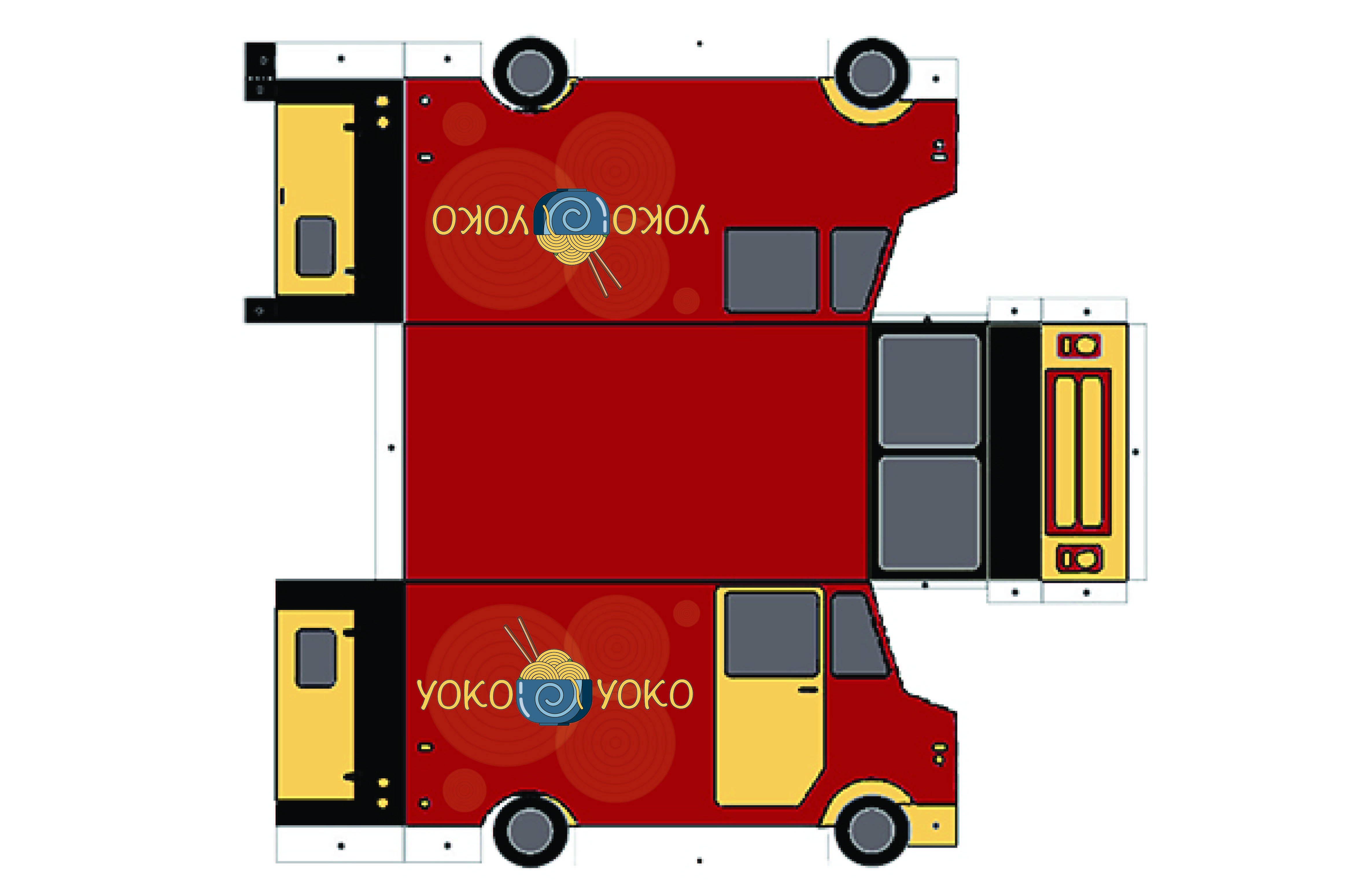
I included an image of chicken and rice. I come from a Colombian background and ate rice and chicken for my entire childhood. It wasn’t until I left the house that I started experimenting with other types of food. Exploring different types of art and design can be similarly transformative. Engaging with a wide range of artistic styles and design methodologies not only broadens your appreciation for different cultures and historical periods, but also enhances your ability to think critically and creatively. For instance, exploring the narratives of a classical painting improved my storytelling abilities.

“Freedom from Expectation”

Reducing the feeling of failure is crucial for graphic designers, particularly in a competitive field. Fear can hinder a
designer’s ability to experiment and take creative risks, leading to work that is safe and predictable. It may not be viable at this moment, but I want to one day create work that resonates and matters to a variety of people. I want to lose my sense of identity in my work because its more meaningful when its brought to a community.

Categories
Uncategorized

Blog Assignment #7

Categories
Uncategorized

Mother’s Day Mural Blog

Concept number 1: I created a mural featuring my  mother’s cat Milo surrounded by green plants for Mother’s Day. This is a deeply personal and meaningful gesture because he passed away last year from cancer. He was considered part of our family, and she cherished all the memories she had with him. The Green plants symbolize growth, and renewal. Incorporating them into the mural not only adds a vibrant aesthetic but also conveys a message of ongoing life and nurturing. This mural would be  a lasting tribute to Milo’s memory and  a permanent expression of appreciation for my mother. 

Concept number 2: Is a mural that features Milo, green plants, and sunflowers. The green plants are often symbolizing qualities that parallel the nurturing  qualities of my mother. The sunflowers add a layer of symbolism with their association with warmth and positivity. 

Concept number 3: This is a mural with Milo and sunflowers. The sunflowers are bright, and cheerful. The contrast between the black fur of the cat and the vivid yellows and greens of the sunflowers enhances the aesthetic appeal of the space, but also makes the mural a captivating focal point. 

What more important is that my mother would love all three.

Categories
Uncategorized

Blog # 5 Food Truck

I was excited to see that I had an opportunity to design a unique wrap for a food truck representing a culinary haven of mine. I loved to visit a local ramen restaurant. I use to frequent this restaurant while I was in the navy. The beloved Yoko Yoko Ramen restaurant,  promises not only delectable dishes but also a feast for the eyes. 

The heart of this design lies simplicity. All design in illustrator for its versatility. I created  A linear vector of a delicious bowl of ramen takes center stage. Its circular noodles forming an intricate pattern reminiscent of yarn. This simplified vector emulates a message of warmth an comfort just like the original restaurant.  I simplified the pallet to just a few colors. Red and yellow is the dynamic duo of food industry colors. The red dominates the truck’s exterior. Red, known for its appetite stimulating effects. Yellow, on the other hand, radiates warmth and positivity, inviting patrons to step closer and savor the experience. Both colors can been seen at a distance which can help people attract those who frequent. Our logo, is a simple circular emblem that adapts effortlessly to any background or color palette. The typography is also simple and legible. Whether parked against a city skyline or nestled in a serene park, the design remains striking.

As a resident of Port Orchard I live a little further away and don’t frequent as much.  Now, that my favorite noodle spot has wheels, they  can pick several places in kitsap. Hopefully closer to where I live. 

In the world of food trucks, ours stands out both in color and design. Its new visual identity will resonate with people who already know the brand and incoming new customers that are curious to experience delicious ramen from a food truck experience.

Categories
Uncategorized

Blog #4 Film project

Working on our film project was an incredibly rewarding experience. We began by pooling a variety of ideas, eventually honing in on creating a commercial, an area that particularly resonated with our group of graphic designers. Inspired by iconic commercials like the Snickers ad featuring Betty White, we decided to focus our narrative around the stuffed rat and the saying “I love cheese sticks”.

To enhance our commercial’s storyline, we introduced a car crash safety specialist character, adding a layer of depth and intrigue to the narrative. This allowed every aspect of the commercial to contribute meaningfully to the overall concept. Our choice of setting was a factory office space. It was driven by practical considerations, enabling us to shoot efficiently on our college campus. We utilized various campus locations such as an elevator, a stairwell to mimic a factory setting, and an empty meeting room for a break room scene, ensuring the locations were both appropriate and accessible given our team’s logistical constraints.

Despite encountering challenges, such as an unforeseen accident involving a team member, our project continued smoothly thanks to the collective effort and adaptability of the team. Contributions ranged from logo design to scene filming, each adding a unique touch to the final product. My husband Sam provided invaluable support during the filming process, and Patrick’s expertise in editing was crucial for assembling the final cut. The result was a commercial that captured the nostalgic essence of classic comedy based ads, blending dynamic action with playful elements.

The final product combining humor, storytelling, and visual elements was engaging and memorable. It was a highly successful endeavor that provided valuable insights and skills for everyone involved. It fulfilled our academic goals but also provided us with practical experience in collaborative creative problem-solving. The challenges we faced underscored the importance of teamwork in achieving success.

Categories
Uncategorized

Seattle Non-profit Cancer Pathways


Cancer Pathways was formerly known as Gilda’s Club Seattle. It holds a place of importance in my heart, compelling me to consider a donation of $25,000 to support its invaluable programs, if I had a spare 25 grand. This decision stems from a deeply personal experience. During the COVID-19 pandemic, I lost my godmother to breast cancer. My family received very little resources to effectively support her through her struggle. Had I been equipped with the education and support that Cancer Pathways provides, I would have felt better prepared. 

Cancer Pathways offers a range of programs that are crucial for educating and empowering individuals affected by cancer, including their families, caregivers, and communities. Their “Cancer Happens®” program helps teens and young adults by educating them about cancer and debunking myths propagated by the vaping and tobacco industries. This program fosters safe spaces for youth to discuss cancer, learn about emotional and social support. 

Another remarkable initiative by Cancer Pathways is Camp Sparkle, which serves children and teens aged 5 to 17 who are dealing with cancer, either personally or within their families. The camp provides a supportive community where children find out they are not alone in their experiences.

Furthermore, the organization’s Community Education, Support Groups and Wellness programs extend their reach to all ages, offering webinars, and podcasts. Their podcast “Encompassing Cancer” is a particularly innovative way to keep the community engaged and informed even when they are unable to meet up in person.

Cancer Pathways was established to serve as a foundational support system for families confronting the devastating impact of a cancer diagnosis. Inspired by the original Gilda’s Club in New York, Anna Gottlieb founded Cancer Pathways in Seattle, demonstrating a commitment to making a meaningful difference in the lives of those affected by cancer. 

My “proposed” donation to Cancer Pathways is motivated not solely by personal experience, but also by my belief in the organization’s role in community support. Cancer Pathways provides vital resources and fosters a community for those impacted by cancer. The ability to engage with a supportive community during difficult times can significantly alleviate stress and ease hardship.

Categories
Uncategorized

Stanley Dog bowl

Embark on your next hiking adventure with your best friend equipped with the 32 oz Stanley Dog Bowl. Made with the same high-quality stainless steel used in Stanley’s cups, this bowl keeps your dog’s water cool and refreshing for hours, even under the hot sun.

Categories
Uncategorized

Assignment # 1 : For the Web

Prompt: In your own words, share a few insights from what you observed from the websites. Name three sites you visited, and three specific things you learned about that company. 

Uber: 

Uber’s website is fairly minimalistic, but warms it up with some colorful ai looking art. The black background with white text is easily legible. The art on the main page conveys that they’re a company for people working in cities. If you’ve seen any website from the mid-2010s, you’ve seen this one. 

● It looks like the website is very environmentally conscious when it comes to sustainability, committing that they’ll be fully electric by 2040. 

● They make good use of color on other parts of their website, just not the main page.

● Uber has a clear step-by-step guide on how to use their app, just in case you or a family member needs to use it for the first time.  The purpose of this website is to inform the audience of the benefits of the app.

The Guardian: 

The yellow background makes this website bright and inviting. They have a clear and consistent design throughout their webpage, with the use of bright colors in their containers to the highlighted headlines. The small text is a little overwhelming, but I’m still able to read it clearly.

● They intentionally make their highlights pop so article headlines stand out.

● They use a serif font that would be normally be used in traditional print. Serif font helps you read easily.

● They incorporate vivid, editorial-style imagery that not only catches the eye but also provides an engaging look into the creative processes designers use to craft compelling layouts.

Audi: 

Audi’s website is very clean and legible. You can tell this is a luxury brand with it’s imagery and wide use of white space.

● Audi strategically utilizes images of sophisticated interiors paired with flashy video’s of advanced features to show the premium products in its vehicle lineup.

● The san serif font allows for a clean and modern look which helps with legibility and makes the brand feel more expensive.

● The incorporation of sound immerses the viewer, enhancing the sensory experience.

Categories
Uncategorized

black box problem

Categories
Uncategorized

VR Project #4

What Point of interest (POI) did your team decide on?

Our team decided to look for local parks in our area. We wanted to focus on the local animals and fun facts about our regional park. I live in Port Orchard and I was grateful to find such a cute family friendly park close by. I’m thinking about going back after finals.

How did you create it (photoshop, Figma)?

I created my panels in adobe express. Adobe express is a new feature in adobe that I was really excited to explore for the first time. It has assets that you can add to create texture right in the program. I’m so grateful that I didn’t have to search for free assets in another website. The animate feature is so intuitive and fun to use. I think this is a groundbreaking program that will help designers create fun and interactive projects. It’s not a replacement product for the other adobe programs because of its limited options, but it was easy to learn and if you need a quick presentation for a client this program works wonders.

What assets did you use? (jpg/gif/audio/etc)

I used jpg’s and a cute little mountain Beaver gif.