Freedom – 3 Posters

I am proposing three posters, one for each section of the phrase, “Freedom to Express, Freedom to Explore, Freedom from Expectation.” The posters will primarily use typography to illustrate each theme.

Freedom to Express

This poster starts with a solid black background. In the upper left quadrant are the words “Freedom to” in a bold san-serif typeface, in white. In the upper right is the word “express.” The typeface is the same, but the type is slightly larger and is glowing as though in neon, each letter a different color. The glow reaches out into the dark around the letters.

Freedom to Explore

This poster is on a deep blue background. Again, in the upper left quandrant are the words “Freedom to” in the same bold, white, san-serif type. On the right side of the poster are some large circular dots of random sizes and orientations. The word “explore” is aligned to the first part of the phrase, but the letters stretch, rotate, and extend to snake in and out of the “holes” created by the white dots.

Freedom from Expectation

The final poster is on a solid white background. The text is black. “Freedom from,” is written in the same typeface and weight as on the other posters, vertically centered on the left side of the poster. The “e” of “expectation” is in line with the start of the phrase, but the remaining letters of the word leave the baseline to differing, random degrees, rotating a little to give the impression that they are floating away like helium balloons. The last letter bleeds slightly off the page.
Seattle Kraken Jersey

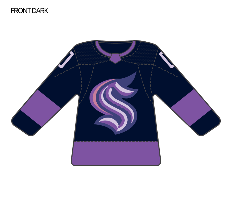
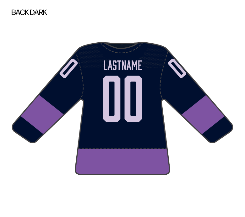
For this assignment I chose to design a jersey in honor of LGBTQ+ Pride. I love a rainbow, but I wanted to think of some other way of representing queer community than that. I also observed that many other guest artists transformed the Kraken S logo in their special event jerseys, so I decided to do something similar. This jersey uses some of the Kraken’s colors, but adds some shades of purple and lavender. The Kraken S has been transformed into a unicorn.

Mural for Mom

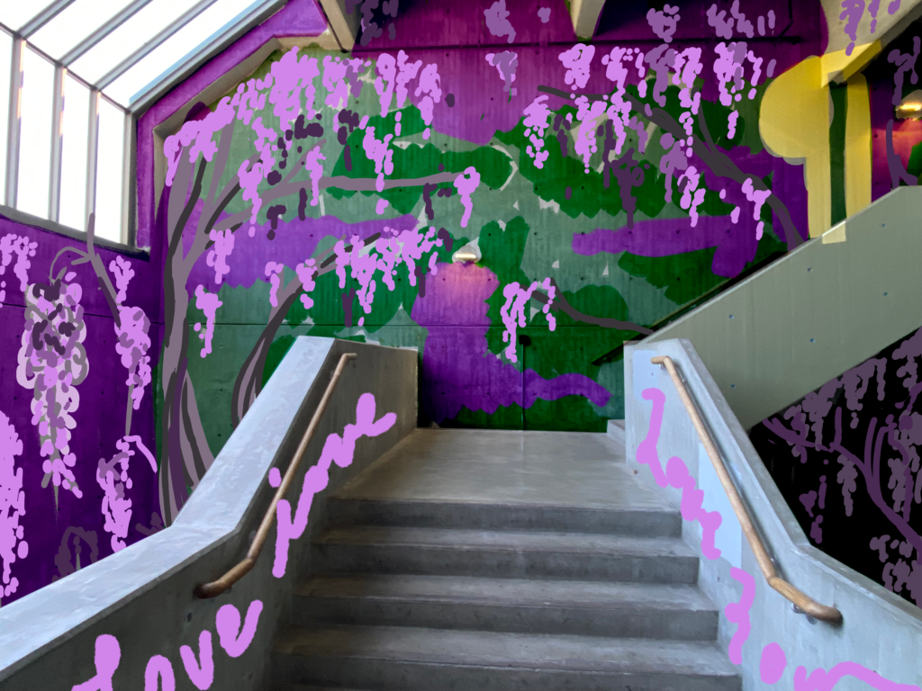
For this assignment we were to create an installation for the stairwell at Seattle Central inspired by our mothers. I love murals and it was fun to think about how to use such an interesting space. My mom is a physical therapist and loves gardening when she has time. When she ran her own PT clinic, the logo of her business was an illustration of wisteria. It’s a flower she likes, and also a good metaphor for the strength, grace, and flexibility that her profession helps foster in their clients and community. Wisteria also felt like a good fit for the space–with it’s winding stairway and hidden crevices, a winding, entwining vine would bring an intriguing sense of exploration and growth to the stairwell.

Food Truck Design

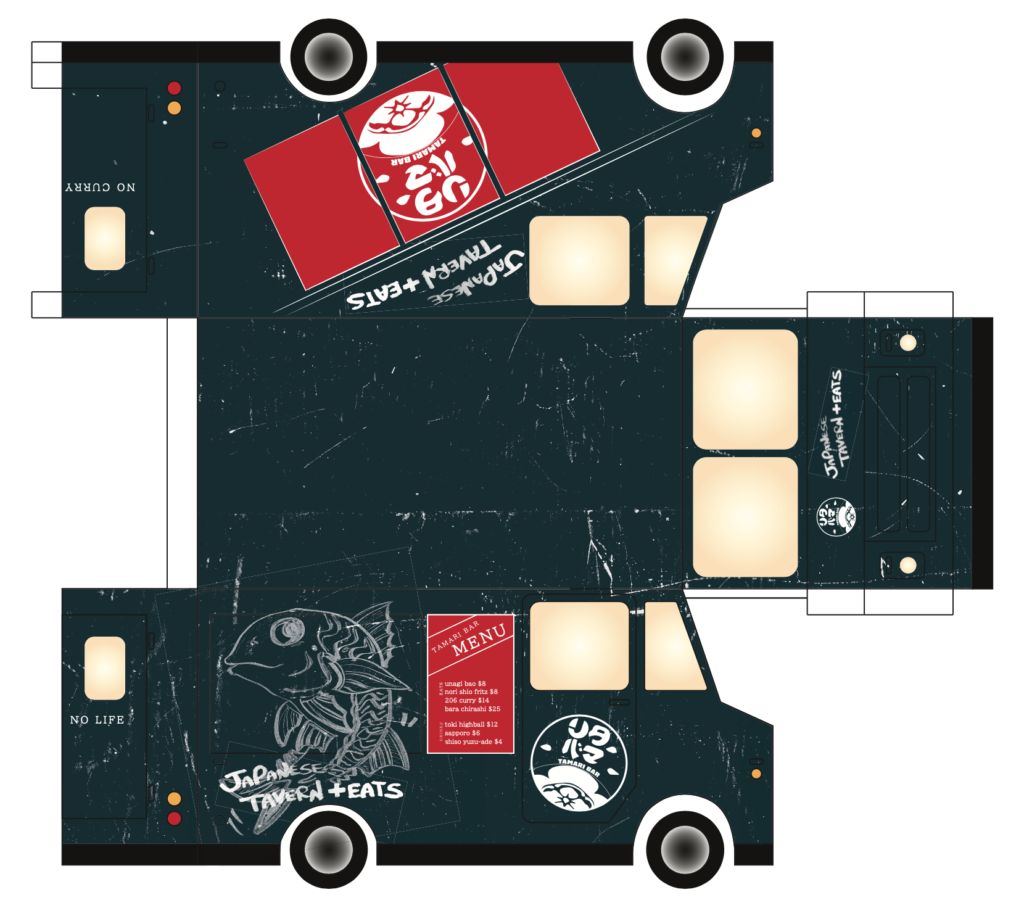
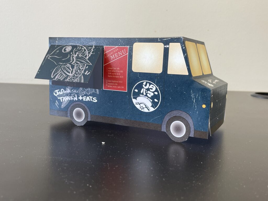
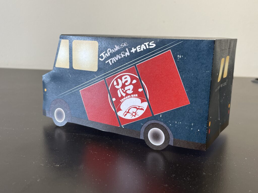
Our assignment this week was to design the exterior of a food truck. For this assignment, I chose to design for Tamari Bar. Tamari Bar is a local izakaya located just a few blocks down Pine Street from SCCA. They serve Japanese curry, sashimi, and a variety of bao with Japanese fillings. I work at Tamari Bar a few nights a week, so I’m familiar with the menu and look–but that’s not the only reason I picked this spot. In fact, I was primarily inspired by the design of the interior and the signage around the restaurant, two things that I admired about Tamari Bar before I joined their team. This also posed an issue, though. Since a food truck is by its nature separated from the brick and mortar location, how could I capture some of the restaurant’s essence in this different format?

My solution utilizes some of the recognizable symbols of Tamari Bar, including their logo, a design depicting the noren curtains that hang outside the door, and some of the owner’s distinctive hand-drawn illustrations and text. For color inspiration, I looked to the interior of the restaurant, which has recently been repainted a very deep teal. Alongside dark wood and warm yellow lights, that color gives Tamari Bar a distinctive atmosphere. I pulled pops of red from the lanterns and curtain outside. The texturing is a little more pronounced than I had originally envisioned, but is meant to give the truck a feeling of being well-loved and a little industrial, but still welcoming and fun. In my mockup, I cut out the serving window to get a sense for what it it would look like open, and I added a simple gradient glow to the windows. I picture this food truck being a welcoming beacon on a warm spring evening like tonight. 

Collaboration and “Sand Traps & Six Shooters”

Sami, Timneet and I worked together to create Sand Traps & Six Shooters, a Western film about a mysterious stranger who shows up in the town of Sagebrush and causes a stir. Working with our team was a delight and we collaborated well together. Here are just a few of the things I think made our collaboration work so well. 

Our initial brainstorm: This was a fun process with all of us freely putting out a lot of different ideas. Writing everything on the whiteboard kept it loose and made it possible for everyone to follow the ideas as they came together. Once the core of our story began to materialize, we still had to narrow down our ideas a lot, but I think all of us were able to both advocate for ideas and to let go of some that didn’t end up fitting in. We didn’t toss everything out, though–some of the best shots and moments from our final came from that initial brainstorm, like the overhead shot of the glass fading into the title card (Timneet’s idea) and the line, “What the hell is he doing here? There ain’t a green for miles!” (a true gem from Sami). I really loved getting to collaborate with Timneet and Sami. They are such fun people to create ideas with!

Illustration and division of labor: All of us are illustrators but we all have different styles, so how should they integrate? We split it up by subject matter. I did backgrounds, Timneet did main characters, and Sami did text and background characters. I think this allowed us to create a cohesive illustrative style that represented all three of us. Using the same color mask and paper texture on all of the illustrations also helped to create a coherent style and palette that brought it all together. All of the illustration would have been a lot of work for one person, so I’m really glad we were able to split up the work this way! 

Positivity and mutual support: Our group had a positive attitude, and we created an atmosphere together that was supportive, flexible, and kind! We were having fun together and I think that shows in the final video. I especially loved our in-person shoot day. I learned that Timneet is a great director (she worked with me on my line delivery and hat tip pacing), and Sami’s enthusiasm and excitement were infectious and made me feel less nervous about being on camera.

Trans Women of Color Solidarity Network

If I had $2500 to give to a nonprofit, I would give it to Trans Women of Color Solidarity Network (TWOCSN). TWOCSN is a local organization founded by, led by, and serving transgender women and femmes of color. Their work is focused on community-building, mutual aid, and housing assistance. I would select this organization for many reasons, but these are my top three. 

  1. TWOCSN has a focus on housing justice. This is especially vital because trans people of color are more likely than cisgender and white peers to experience homelessness and housing instability, as well as discrimination in seeking and remaining in housing. There is furthermore a huge need for housing resources that are culturally responsive and welcoming–and ideally run by and for the communities they serve. TWOCSN was recently gifted property on which to create House of Constance, which would provide transitional housing and healthcare support for BIPOC transgender community members. There are huge barriers to small community organizations owning and operating transitional or affordable housing, so for TWOCSN to get to this point is a huge deal, but they need additional financial support to get the facility up and running. The services they would provide are sorely needed as soon as possible.  
  2. As a white queer and trans person, I feel extremely indebted to the Black trans women and femmes who are my movement ancestors and who fought long and hard to win many of the rights and protections that I have today. There is still a long way to go to ensure a future that is truly equitable, but I believe that it is my responsibility to contribute what I can and fight alongside the folks in my community who continue to be most impacted by discrimination and inequality. 
  3. TWOCSN is a small community-based organization without access to many larger forms of financial support like private grants. This is an endemic problem in nonprofit space–funders don’t want to invest in smaller organizations that are doing innovative community-informed work in new ways, and donors are taught that we should invest our money in “safe” organizations with a longer track record. It makes it extremely difficult for new orgs to get off the ground. This is why I believe in investing my donation money in the orgs that may not have access to other resources. 

Stanley Dog Bowl

Why give your dog water out of your hand on your next hike when they can have their very own Stanley instead? Our new Retro Outdoor Dog Bowl line bring all the durability and character you look for in a Stanley product to your canine companion. These insulated, lightweight bowls keep your dog’s food and water fresh with double-walled stainless steel construction, vibrant nature-inspired hues, and retro patterns that capture the adventurous spirit of the 1970s. Whether you’re hitting the trail or just chilling in the backyard, your four-legged friend can drink in style from these durable, chew-proof bowls.

Design Systems Exploration

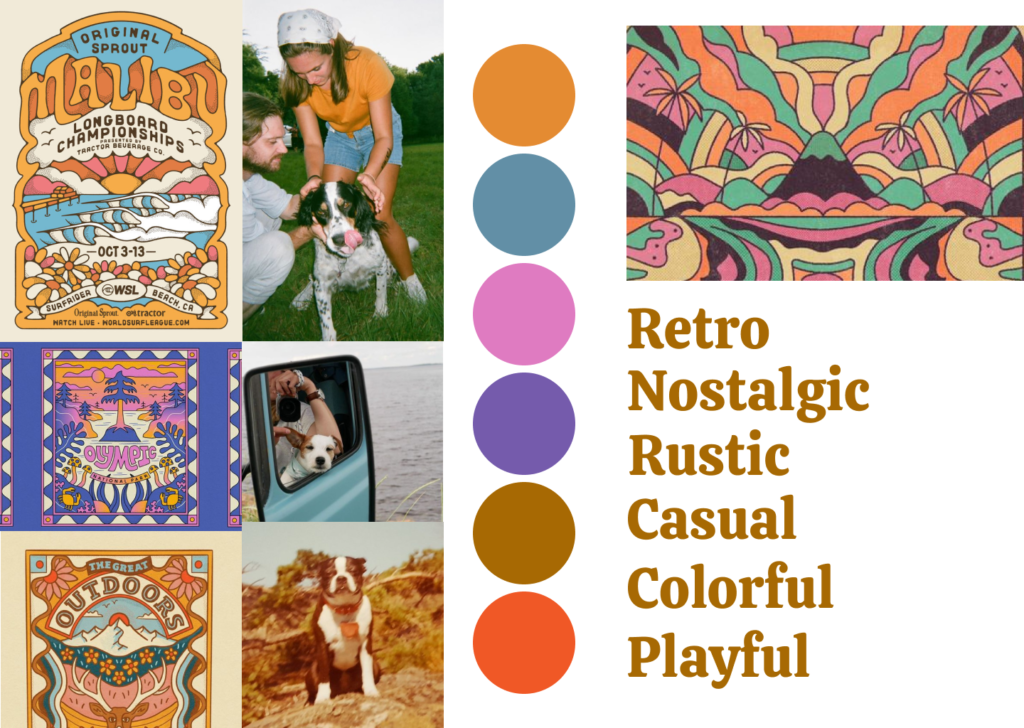
For this assignment I looked at three example design systems: Mailchimp, Salesforce Lightning Design System, and Atlassian Design System. I approached this by trying to imagine that I am a new designer working at one of these companies.

Mailchimp

Overall, I found Mailchimp’s design system site really easy to navigate and understand. I’ve used Mailchimp for bulk emails in the past and find their product pretty easy to navigate, too, so this doesn’t surprise me.

Observations:

  • The lefthand navigation uses words that make sense to me and is not overly complex. Coming into this I thought of design systems as a branding guide +, and Mailchimp’s system definitely feels like that to me, with branding-related info (ex: brand colors) up front.
  • It was interesting and helpful to see that the list of colors lists not only color codes, but also accessibility information for each color when set as a background for different brand-color text options.
  • CSS was included throughout, presumably for devs to use. I thought that was interesting.
  • They have a very extensive icon library that looks like it would be easy to navigate and use.

Salesforce

What I learned about Salesforce is that they seem to be a robust company doing a lot of different things. I found this design system kind of confusing.

  • I got really hung up on the three large icons with text that appear in the center of the page when you first open the design system. “Component Blueprints” is a little confusing, and I still have no idea what “Token” means in this context, so this was distracting and made me feel like I didn’t belong on this page. Once I decided to ignore this and dive into the lefthand menu things got a little better.
  • I was pretty blown away by how much ground is covered by this system. Within “Kinetics,” for example, are 10 different subsections, some of which have their own subsections. It was interesting to see how specific the system gets, including “principles” of kinetics.
  • If I were a new employee at Salesforce I feel like reading just the design-focused sections of this document would take days, and getting familiar with it would take months. I wonder if this level of detail is normal, how difficult it is to keep such a massive system consistent across all its sections.

Atlassian Design System

  • This one was the most confusing of any that I looked at, starting from the navigation. I would have thought that things like colors and logo would be in the “brand” section, for example, but brand is actually where mission/vision/values lives. Color is under “foundations,” which I guess makes sense in a way, but you have to open up things to find it.
  • Similarly, what is a token? What is a component? The definition of “token” when you click on that in the menu reads, “Design tokens are the single source of truth to name and store design decisions.” What??
  • The Getting Started section is somewhat more helpful and has a design-specific flow, but I still overall feel pretty intimidated and confused by this system.

Square Compositions

Assignment

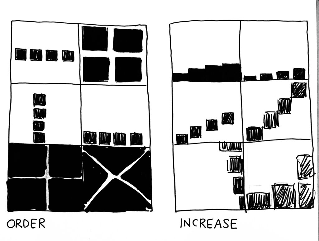
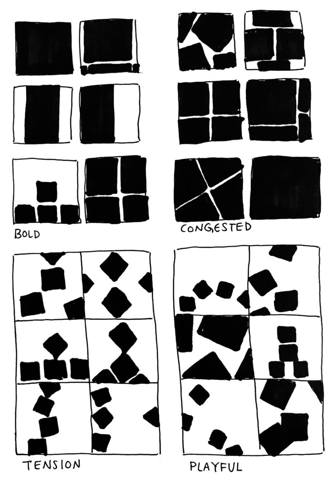
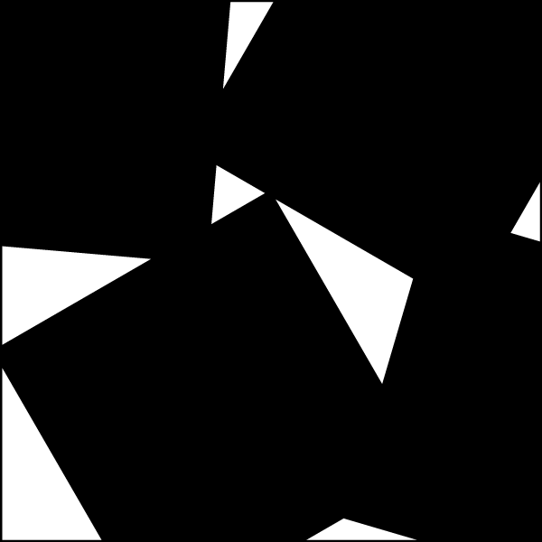
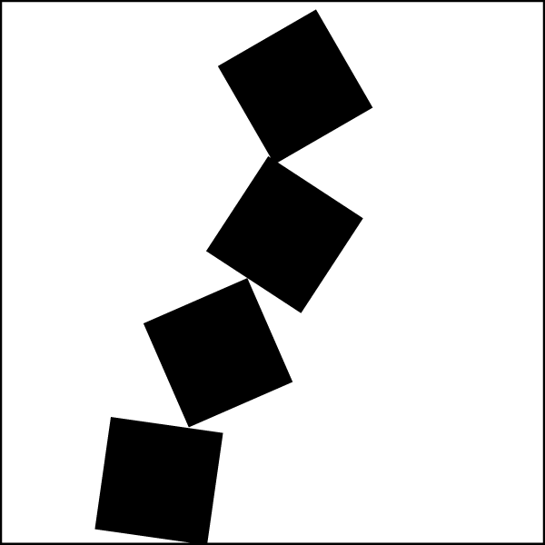
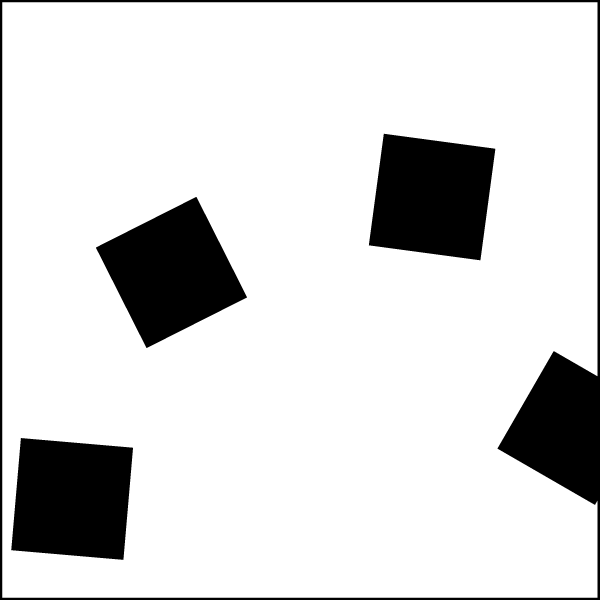
For your assignment you need to use 4 flat black squares of the same dimension, to create a graphic image to express the meaning of the following six words: order, increase, bold, congested, tension and playful. Make six thumbnail sketches by hand for each word. Consider how these squares can be expanded into a more comprehensive solution. The ideas are more important and the execution. Select the most effective solution for each and execute in a larger design.

Sketches

Solutions

Order
Increase
Bold
Congested
Tension
Playful