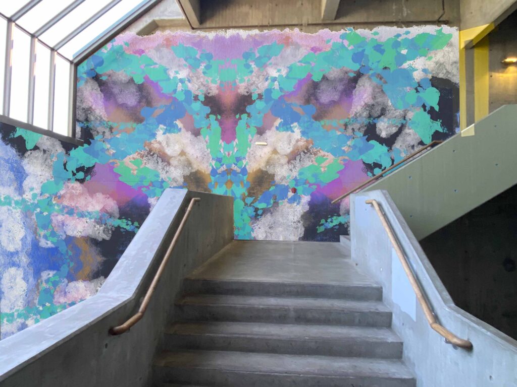
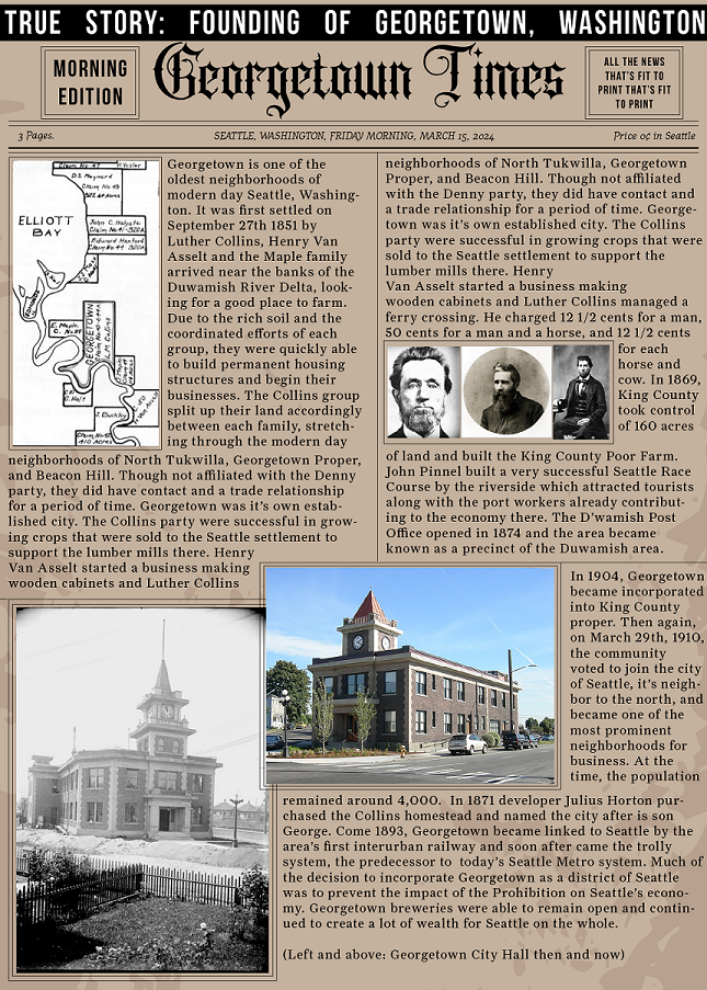
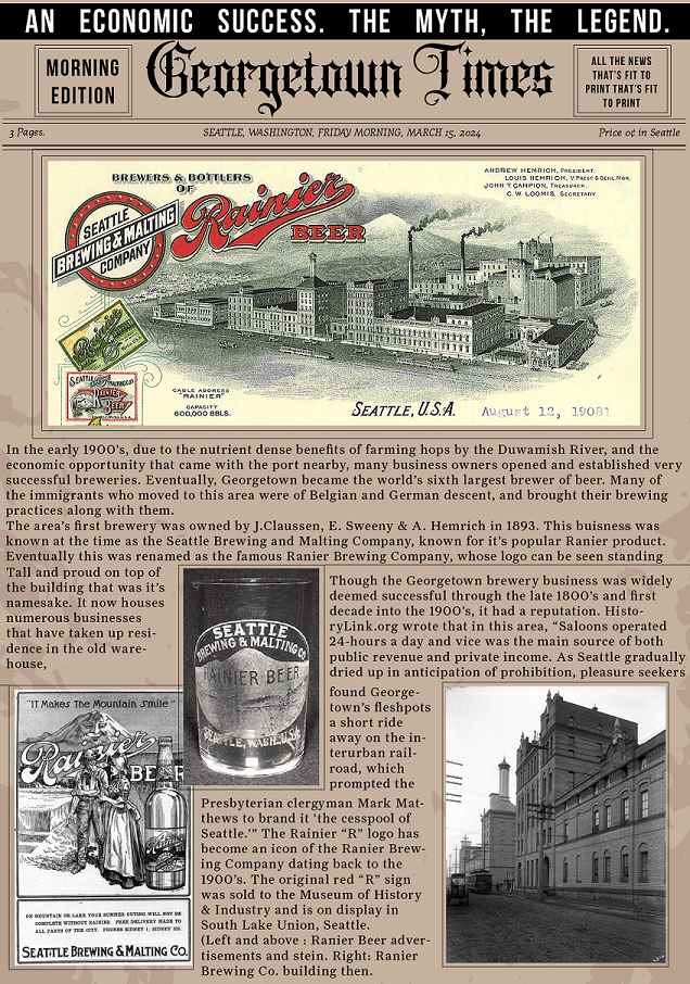
Blog Post #8 Spring Quarter

Freedom to Express

The depict “Freedom to Express” I would create a shared public art installation in a local space. I would cover a large outdoor space with poured concrete, create benches, plant pots, stairs to sit and eat on…etc. as a complete blank slate. Then, as part of the art installation I would invite the community to come regularly work on adding their own art to the space. It would be a forever-ongoing project, featuring the artistic touch of whoever most recently decided to display their work there. This project would be inspired by the spirit of graffiti and street art. Instead of trying to prevent people from creating art in public spaces, they would be invited. There are many stories to be shared.

Freedom to Explore

For “Freedom to Explore” I would organize a live mystery event where actors are spread out around a large property and the participants would explore the property to learn about each character’s part of the story. It would be really interesting to create a story line with multiple possible endings. The event would start in the afternoon and run for about three hours, including drinks and food available for those who purchased tickets. Actors would move through a variety of scenes in their designated spaces to help further develop the story. Maybe some would even interact with each other at different points? Participants would receive a themed mini notebook and writing utensil to guide them through taking notes on the story as they explore the space.

Freedom From Expectation

For “Freedom from Expectation” I think it would be interesting to create an art gallery experience of portrait photographs. A group of subject would be selected – people who have a shared story of choosing to be themselves despite other’s expectations of them. I would photograph them as they are, in their favorite clothing. Maybe doing something that they love. Then, I would have them dress up and place them in a setting that matches what they feel was expected of them earlier in their life. Who they chose not to be. I would photograph them in this environment, visualizing the “alternate reality” where they chose to do what others wanted them to do. I would place the two photos (the “alternate reality” and themselves) next to each other in the exhibit. I would maybe include a short description from an interview with each of them describing their experience acting out the life they felt others want them to live.

Blog Post #6 Spring Quarter

This mural’s meaning connects both my mother and the students of the creative academy. The image itself was designed in procreate through experimentation with a variety of brush types and color. I wanted to create as much texture as possible with the use of brushes that are a little bit “gritty” in tone. Since the texture also replicates spray paint, I thought it was also appropriate to put on a wall. This piece of art was made through an organic creative process of experimentation. My Mom has always stayed in touch with her creative roots through painting – taking classes more recently as an adult. It takes both perseverance and an open mind to allow yourself to play without knowing what exactly will come out in the end, but trusting in the process. This is a huge part of any creative pursuit that any SCCA student would benefit from being reminded of.

Blog Post #5 Spring Quarter

The Unicorn Truck

I chose to create a mobile cocktail truck for the famous carnival themed Seattle restaurant and gay bar, The Unicorn. The Unicorn’s theme, color scheme, and typography are well defined and already iconic. The striped pattern motif can be seen on the walls of the bar with their playful wallpaper. The color scheme also comes straight from the walls of the restaurant. In their logo they use an early 1900’s slab style western decorative font. I found a very similar one to work with for the title on each side and the filled in version on the front. I wanted to make it clear that this is not a food truck, but a cocktail truck, so the drink icons are a main feature on each side. The Unicorn is playful, fun, free, with a vintage twist, so this was the goal of the art direction for this truck.

For this project I worked in Illustrator. I first image traced the image of the truck provided, then use the paint bucket tool to fill in live areas with either patterns or colors that I had saved to my swatches panel. I was able to download the Unicorn’s logo straight form their website as a PNG, so it was easy to size and place wherever I needed to put it.

Blog Post #4 Spring Quarter

My group created the short film “Roach Resilience” through major teamwork. Initially when brainstorming ideas we each provided concepts and we spent time developing each idea further for each other. We pitched all three concepts to our supervising teachers and one option was chosen to move forward with. Then began a lot of writing. Daina worked on storyboarding while I researched images and created a moodboard. Emily T created a shared google doc and we started writing our treatment description, shot list, and organized our plans. Daina took screenshots from previous Survivor trailers to guide our storytelling and help us develop a feel for common reality tv tropes. I looked into challenges participants of Survivor have faced in the past and came up with ideas to adapt them for the setting and context of our film. Emily helped synthesize our ideas into our planning document.

At our next meeting we spent half of our day writing a script, finalizing our shot list, training AI on Owen Wilson’s voice, crafting tiny set and prop pieces, and shooting a few scenes. Together we brought in materials we thought would be helpful – Emily T providing the very important plastic cockroaches. We all worked together on writing and editing the script and finalizing the shot list. While Emily and Daina started working on crafting I worked on training AI. We all listened to the sound clips to approve of the clips we would end up using. Finally we all crafted various pieces and worked together to manipulate and puppeteer the cockroaches for filming our first few scenes.

Our third meeting was a filming day. We all worked together to set up each scene. Puppeteer, decorate, and suggest any changes to our filming techniques.

From there we split up the remaining computer work. Daina worked on after effects to create animated visuals and text we would need throughout the video. Emily T worked on editing the film footage, and I worked on recording and editing the sound.

On our final Friday together we worked on adding the elements together and finalizing everything that was due. We problem solved together when we couldn’t figure out how to combine our audio footage with sound tracks.

All in all, the whole project was a major group effort. What worked well was clearly defining each person’s roles and responsibilities, working with each of our strengths and skills.

Blog Post #3 Spring Quarter

If I had $25,000 cash to donate to one Seattle-area non-profit, I would choose to make the donation to Mary’s Place. One of our area’s greatest social issues is homelessness and though we do have a number of organizations and social services available to help, the political structures, underfunding, and a confluence of other intersected issues continue to make this an issue that doesn’t seem to be going away anytime soon. When I was in college, I worked at a campus ministry that often partnered with ROOTS, another Seattle-based nonprofit that provides services for homeless youth and young adults. We volunteered there regularly by making meals, sitting down and talking with youth, and cleaning up. Eventually we got to know many of them personally and learned their individual stories. I’ve seen up close, the multitudes’ of complicated factors that can lead a person into living on the streets, as well as the dangers of it.

ROOTS was the place that taught me about the real experiences of people on the streets, the services that are available to them in this area, and how effective (and sometimes ineffective) they are. ROOTS is an emergency shelter with staffed social workers who area available to help young people who are looking to start the process of integrating back into society. The issue with the services this location provides is that they can only serve youth who are under the age of 21. Once they reach 21, they have to find other locations to receive emergency shelter services and can no longer work with the social workers and staff who they may have come to know and trust.

Mary’s place is an organization that offers emergency shelter, meals, and more for adults and their children, and assist a number of other Seattle -area shelters in food preparation and delivery. Their business provides medical services, classes, education, employment placement and counseling, housing placement, in addition to their emergency services. They even offer a mobile team that brings meals and medical services to families who cannot make it into a shelter for the night. They take a holistic approach combating multiple factors that affect families that are struggling with homelessness.

Currently they are working on projects to build more affordable housing units and another new shelter facility in Burien. They continue to reach their sights further to help more people. I would love to support the good work that they are doing.

Blog Post #1 Spring Quarter

Insight #1 – Consistent use of color systems

Mailchimp’s major strength is it’s use of consistent color systems across the board. Their design system website doesn’t just show the colors they want to use in their color palette. They take great care to explain and show examples of what TO do and what NOT to do with the use of those colors.

For each color, they include examples of overlayed text to show legibility.

They also use psychological data to explain when to use certain colors from their palette. For example, their color “pumpkin” is often used to alert the reader.

Pumpkin in action!

Insight #2 Flexibility Creates More Opportunities

“Our attitude of progressive premium is conveyed through a high degree of flexibility and the bold use of basic elements that shape our brand.”

Audi’s design system is focused on flexibility to create more opportunities for design that is constrained to different device sizes, systems, and allows for easy integration of animation. One initial example of this is creating a series of logos that incorporate different stroke weights that can either be used stagnant, or can animate from thin to thick.

Another thing I appreciate about their design system website is that they have mockups of their brand guide applied to different types of technology. If a designer just started working for Audi and was learning how to apply the design system, this quick visual overview would be incredibly helpful to set the tone and define the vision.

Animation is so important to the design system that it has it’s own page in their guide. Here they show examples of ways they have used animation in the past, as well as a series of technical drawings that explain “best practices” for animating elements.

Insight #3 Layout Design

Designing using grid systems

Since The Guardian is a news outlet, their website intuitively reflects a modernized version of a newspaper. They rely heavily on the use of a grid system, incorporating containers and cards that can be repeated and re-arranged.

The Guardian’s design system website breaks down each component of the grid: fronts – articles – containers – story cards. Once someone clicks on a card’s image or headline they are taken to a fully flushed out article page to read more about the topic.

The grid system also applies to smaller devices, like tablet and phone. Here they show examples of the use of the grid system for different device sizes.

One thing I would love to see on this site is mockups that show finished versions of applying these principles.

AR Class Project #4

My final project for my AR Class was focused on the theme of a historical walking tour through a neighborhood in Seattle. My group wanted to allow users to walk up to a certain crossroad location and view information panels with arrows pointing to the locations they may choose to visit. I choose to place my experience at the corner of Airport Way South & South Nebraska Street in Georgetown WA, right next to the Jules Maes Saloon.

I created each panel as well as the arrows in Illustrator, using historical Seattle newspapers as the inspiration for the design.

I chose fonts that were created in the early 1900’s and found a blackletter title font for the name of the newspaper. I created the texture in the background using image trace and picked colors from the image above.

Images I used for this project were found in a variety of places. I found some Seattle Times and HistoryLink.org articles that included a lot of historical photographs. I also found some from some Google Images searches and Wikipedia.

Once I had the vision, creating the panels was fairly seamless. I had to reduce the size of each panel by about 50% in the end to make sure I would be under the 3 MB file size limit, but when I launched the panels in the app they were still large enough to see everything clearly. I had some issues with viewing all of the panels when launching the experience. For some reason, one panel and most of the arrows didn’t want to show up.

I enjoyed the opportunity to merge my personal love for history, travel, and design in this project. It was fun to try my hand at recreating a vintage style poster design, finding elements that would stand true to the times.