Categories
Uncategorized

Freedom bloggggg

“Freedom to Express, Freedom to Explore, Freedom from Expectation”

Concept- Wes Anderson Inspired live action digital shorts.

Freedom to Express
“Freedom to Express” unfolds in a quaint, pastel-colored town square. The square is a perfect symmetry of eclectic buildings, each adorned with whimsical signs and retro facades. A diverse group of townsfolk, each with distinct, quirky outfits, gathers around a makeshift stage. The scene is bathed in a warm, nostalgic glow, enhanced by the symmetrical framing and meticulous attention to detail. Every character, from a bespectacled poet to a flamboyant accordion player, steps up to the stage to share their art, their voices blending into a harmonious cacophony. The camera captures this with a series of meticulously timed, symmetrical wide shots and intimate close-ups, emphasizing the individuality and collective spirit of unrestrained expression.

Freedom to Explore
In a stop-motion segment “Freedom to Explore” follows a young woman as she embarks on a journey through a meticulously designed diorama world. The narrative begins in her vintage apartment, filled with maps and travel gadgets. With a flick of a map, she sets off, and the camera follows her in a series of symmetrical, lateral tracking shots through a variety of handcrafted landscapes: a dense, miniature forest teeming with quirky, stop-motion wildlife, a sprawling desert made of sandpaper and tiny cacti, and quaint, bustling villages with dollhouse-like charm. Each scene is accompanied by a whimsical score and narrated in a deadpan, yet charming manner, highlighting the women’s growth and discoveries in a world where every detail is thoughtfully designed to evoke a sense of wonder and adventure.

Freedom from Expectation
This scene is depicted through a meticulously composed shot of a solitary figure standing at the edge of a cliff, overlooking a vast, stylized sea. The figure, dressed in a simple yet distinct outfit, is surrounded by neatly arranged, symbolic items representing past obligations: a perfectly stacked pile of books, a typewriter, a pair of spectacles. The background is a breathtaking horizon painted in soft, pastel hues, with the sun setting in perfect symmetry. The camera slowly zooms in, capturing the serene, contemplative expression on the figure’s face as a gentle breeze rustles their hair. The scene is accompanied by a poignant, whimsical soundtrack, encapsulating the moment of release from societal pressures and personal expectations, inviting the viewer to embrace a life defined by simplicity and self-fulfillment.

Categories
Uncategorized

Poly Kraken Jersey

Designing a hockey jersey to represent the polyamory community involves incorporating symbols and colors associated with the polyamory flag, such as the infinity heart symbol and the colors aubergine, magenta, and cyan. The design should promote inclusivity, love, and connection, fostering a sense of unity and pride within the community.

Categories
Uncategorized

Mother’s Day Mural

My mother loves baking. It’s something she learned from her mother and is one of the ways she shows her love. For my 34th birthday she is mailing me some brownies which I plan to bring in and share with my class, so they can experience her love, too!

Categories
Uncategorized

Westman’s Bagels Food Truck

As a student diving into the world of branding and design, dissecting the visual feast that is Westman’s mobile eatery becomes an exciting exploration into the art of capturing a brand’s essence.

First impressions matter, so I’ve gone with a sleek exterior dressed in navy blue, porcelain blue, and light peach hues. These carefully chosen colors aren’t just arbitrary; they reflect the brand’s personality — vibrant, welcoming, and as comforting as a warm bagel on a chilly morning in Seattle.

On both sides of the truck, a playful pattern unfolds, showcasing Westman’s iconic logo alongside delightful illustrations of bagels, aromatic cups of coffee, and an assortment of baked treats. It’s like a visual menu that tantalizes the senses, inviting customers to embark on a culinary journey through the streets of Seattle.

As a student learning about branding, I wanted elements of the Westman’s truck design to speak to the brand’s identity. From the placement of the logo to the carefully curated color palette, every decision is intentional, aimed at creating a cohesive and memorable brand experience.

In essence, this design is meant to show the thought process behind every creative decision. It’s a reminder that great design isn’t just about aesthetics; it’s about telling a compelling story and forging a connection with your audience.

Categories
Uncategorized

Making the little mole

A few things went particularly well in the making of our blender film, the little mole. I think first and foremost was the commitment each member of the team showed to the work. All three of us showed up on time and were fully present throughout every step of the process. I really appreciated this as having worked on group projects in the past where I had teammates blow off meetings or not be communicative. We communicated well and easily coordinated meetings and production. I really appreciated not having to be overly responsible for shepherding my team through to the finish line.

Another thing we did well was supporting each others ideas. Anytime one of us threw something out there, people were open and didn’t immediately shut down ideas even if they felt a little out there. People were open and curious with each other which made for a safer space to share and ideate.

Once we chose our final concept we easily shifted into making it happen. Since Jordan wrote the story, I committed to producing all the props and really thought about how that could in and of itself be one of the characters of the story. I really enjoyed building the world that our story existed in and could see that as a potential career path down the line. getting do do research into a genre, in our case, Film Noir, and learn what are the components that make something feel noir, from music, costume, title design, and props/sets. That came naturally to me and felt like I already had an instinct for this world-building work. I’m really proud of how the final film came out and how the props/graphics, and details form the sets really contributed to it feeling real and legit.

I appreciated how we each had something that we “owned” on the project. Jordan wrote and helped direct, I built sets and props and titles and voice acted, and David acted, was DP and edited. It was useful to have these clear roles and responsibilities in reducing friction along the way.

Categories
Uncategorized

Creative Justice: Seattle Area Non Profit

When asked to come up with a local non-profit, I feel is deserving of $25K, many areas of need come to mind. Ultimately I am going with Creative Justice, a pioneering organization dedicated to transforming the juvenile justice system through art, healing, and community engagement. Founded in 2015, and led by Nikkita Oliver and a team of staff, Creative Justice operates at the intersection of arts and social justice, offering a unique and impactful approach to youth incarceration and rehabilitation.

At its core, Creative Justice provides arts-based alternatives to traditional juvenile detention for young people involved in the criminal justice system. Through a combination of mentorship, creative expression, and restorative justice practices, the organization aims to address the root causes of youth crime and disrupt the cycle of incarceration. Participants in Creative Justice programs have the opportunity to explore various art forms, including visual arts, music, writing, and performance, as tools for personal expression and social change.

One of the key strengths of Creative Justice lies in its holistic approach to youth empowerment and healing. By centering the voices and experiences of marginalized youth, particularly Black and Brown youth who are disproportionately impacted by systemic inequities, the organization fosters a sense of belonging and agency among its participants. Through artistic exploration and community building, Creative Justice helps young people develop critical life skills, resilience, and a positive sense of identity.

Creative Justice actively engages with the broader community to promote understanding and advocate for systemic change. Through exhibitions, performances, a cafe, and public events, the organization raises awareness about the issues facing youth in the justice system and challenges harmful stereotypes and narratives. By amplifying the voices of young people and collaborating with artists, activists, and policymakers, Creative Justice works towards building a more just and inclusive society for all.

I believe Creative Justice is more than deserving of a $25K donation to support its continued efforts in empowering youth, fostering healing through art, and promoting social change. With additional funding, the organization can expand its reach, strengthen its programs, and further advocate for the transformation of the juvenile justice system. By investing in Creative Justice, we invest in the future of our communities, where all young people have the opportunity to thrive and contribute positively to society.

Categories
Uncategorized

Stanley Dog Bowl

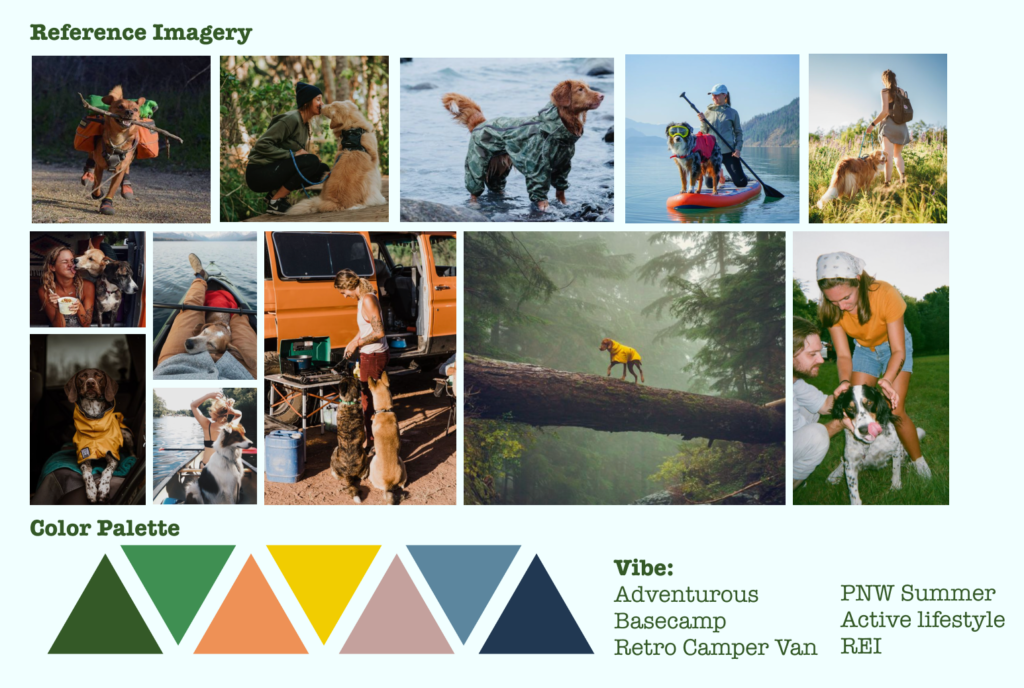
The “Unleash the Adventure” campaign highlights the durability and portability of the Stanley dog bowl by showcasing dogs enjoying outdoor adventures with their owners, typically in settings like camper vans and gorgeous PNW forests. Whether it’s hiking, camping, or a day at the beach, the bowl becomes an essential companion for pets on the go. The campaign aims to showcase the Stanley 32oz stainless steel dog bowl as a reliable, stylish, and eco-friendly choice for pet owners, while also highlighting its versatility and suitability for various lifestyles.

Categories
Uncategorized

Design Systems

“Design systems act as a single source of truth” I love this quote from the article, as it highlights the powerful way design systems can help truth design concepts with stakeholders who may not be in the creative or design space of a company. Using your design system as a point of accountability to approve concepts with your stakeholders seems efficient and effective. Often it can be the approval process that can hold up a project and I can see how design systems attempt to help with that.

Here are a few highlights I took from the design systems article:

  • A collection of reusable components and assets, guided by clear standards of use.
  • It provides resources, guidelines, and a shared language for anyone involved in designing and building a product or brand.
  • It’s a central source of knowledge for teams working across products and platforms to ensure exceptional user experience for their customers.
  • A designer can quickly mock up a series of prototypes with ready-made UI components.

Now for my review of three company design systems:

Mail chimp

  1. Conveniently includes code for their developers to easily reference when building components
  2. Starts with visual foundations in it’s design system outline, including color, data vis, grids, and typography – I imagine this ordering and prioritization of this content early in the design system site is connected to their core business model and what is needed on the back end to make the business run
  3. Learned a new term- Slats – which represent a unit with associated data and actions. Again this seems reflective of the back end work space for developers

The Guardian

  1. They layout their design system more “in situ” showing the parts of the system within the natural ecosystem of a Guardian news paper, print and digital. I think this is really helpful for designers so maybe their design system is more for a designer audience whereas Mailchimp’s seemed more designer AND developer focused.
  2. Their topics are nested in a hamburger menu, so you have to click into that to see the full list of design system sections. This differs from Mailchimp’s layout.
  3. Their graphic elements – i was expecting to see icons or illustrations – are mostly type based which is interesting and makes sense since this is a news outlet where words are at the core of what they do.

Starbucks

  1. While this design system wasn’t included in the article, I wanted to reference it as I think Starbucks is successful in this. I really like how there are multiple ways of navigating the same info- it feels like they infused their brand into the ux of their design system website making it feel fresh and intuitive.
  2. In their type section I love that you can play with font weights, in a similar way you can on Google Fonts or Adobe TypeKit. That feels empowering as a designer.
  3. That leads me to my last thought- the site feels very designer-centric and less dev-centric. I imagine they have a figma file or similar for their internal design system. This site feels more like a showcase of their brand for the public vs. to use as internal staff.
Categories
Uncategorized

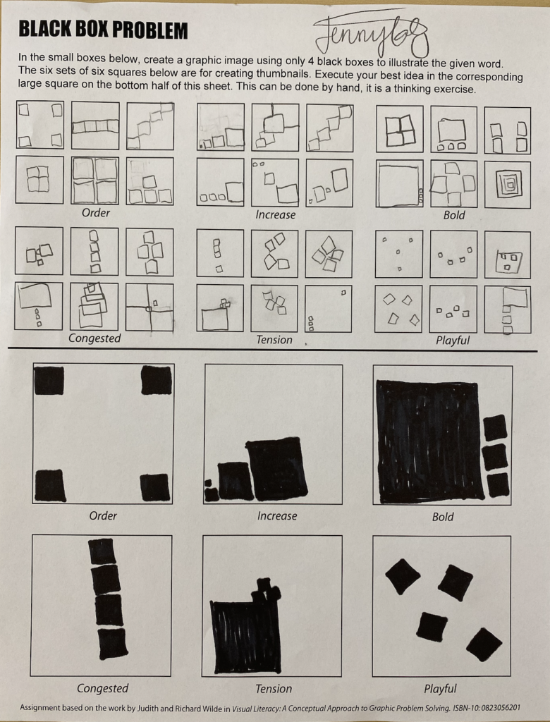
Black Box Problem

Categories
Uncategorized

Process Video