Moment of Inspiration
This is a moment of inspiration and mind dump of my reactions to watching BROCKHAMPTON perform a set at the NOVO in 2018 via Youtube.
I’m captivated by the sheer passion emanating from each member of BROCKHAMPTON as they command the stage. Their performances are a masterclass in creative expression, as they seamlessly blend genres, delivering powerful verses with unapologetic conviction. The intensity of their live renditions adds a whole new dimension to their music, amplifying its emotional impact and inviting the audience to embark on a chaotic and beautiful journey.
The diverse backgrounds and stories of the BROCKHAMPTON members contribute to the rich tapestry of their performances. Their authenticity and vulnerability are laid bare on stage, forging a deep connection between artist and audience. Their songs range from nostalgic ballads to politically charged hardcore rap, creating an unrivaled mashup of sounds and emotions. They talk firmly and openly about their feelings on love, brotherhood, hypermasculinity, and striving for their dreams while struggling. Witnessing their raw talent and their unapologetic celebration of individuality inspires a renewed sense of self-assurance and encourages me to embrace my own uniqueness. Kevin Abstract, frontman, chants “Why you always rap about being gay? Cuz not enough people rap and be gay”. They’re unafraid to stand exactly as they are.
They are all fitted in orange jumpsuits, a costume that marks the early era of their hunger and rise to stardom. Beyond the music itself, BROCKHAMPTON’s stage design, choreography, and visual elements are meticulously crafted to complement their artistic vision. The interplay between lighting, projections, and stage presence creates a multi-sensory experience that heightens the emotional impact of their songs. These captivating visuals, combined with their energetic performances, ignite a fire within me, leaving a lasting impression that extends far beyond this little youtube video’s runtime.
The camaraderie among the BROCKHAMPTON members is also a sight to behold. Their collective synergy and genuine connection are evident, as they seamlessly collaborate on stage, supporting each other and bringing out the best in one another. Witnessing this unity serves as a powerful reminder of the strength found in collaboration and the importance of fostering a supportive community. I tend to be a reserved guy like a lot of members in BROCKHAMPTON, and witnessing them work helps me dream about one day finding that community that elevates me and encourages me to push my creative boundaries.
Petcubes Moodboard
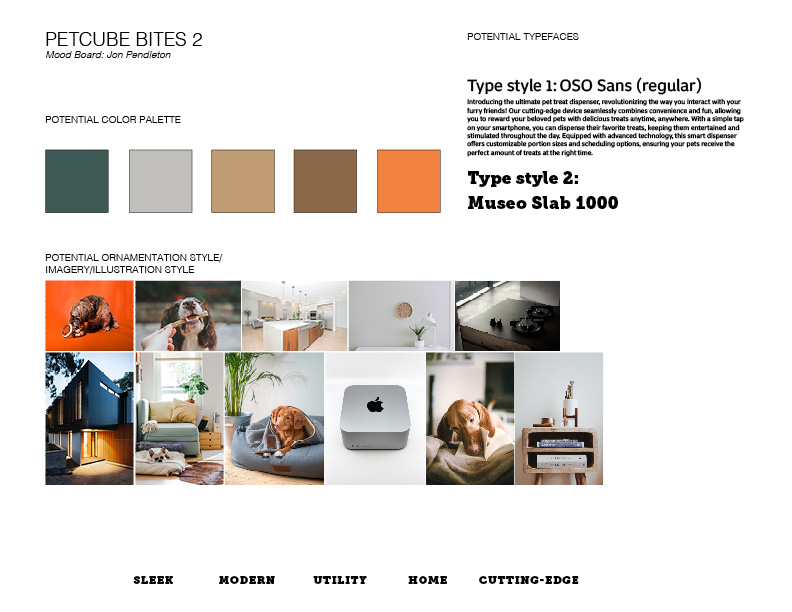
This mood board I believe captures the essence of this cutting-edge device, blending style and functionality into one visually discreet and sleek experience. The minimalist design and techy aesthetic and materials exude elegance, making it an accessory fit for the contemporary dog owner’s home. With a touch of sophistication, the curated color palette features muted and modern earthy sleek tones, embodying the spirit of modernity and luxury. The mood board images chosen represent the types of environments I envisioned that the product would fit. Modular shaped architecture and technology along with the comfiest most sophisticated dogs.
Types of jobbies
Freelance Pros:
- Flexibility – set your own schedule and work whenever you want
- Autonomy – greater job satisfaction with the ability of choosing which projects you really want to work on
- Higher earning potential – no set rate! You can charge what you want
- WFH – usually no required commute unless necessary for client. Think of all the gas money and time saved
Freelance cons:
- Lack of stability – since the work comes from your own network and is primarily project-based, work may be inconsistent. It can be difficult to predict when and where the next project comes from.
- No benefits – freelancers are solely responsible for their own health insurance, retirement savings, PTO, etc.
- Administrative tasks (could also be a pro to learn? Overall not ideal though) – The extra work of keeping record of finances. invoicing and taxes in contrast to working for a company.
Part-time designer pros:
- Reduced pressure – won’t be expected to put out as much of a high volume of work.
- Variety: working part-time I think gives you an opportunity to work on a bigger variety of projects, helping you build a more diverse portfolio
- Flexibility – can easier manage outside projects or freelance opportunity’s. A greater opportunity for diversity in work and job satisfaction
Cons of part-time designer:
- Less income – fewer hours means fewer dollars than the potential
- Limited opportunities – if you’re there less you may not be considered for longer form projects that require more focus than a part time designer could offer
- Limited benefits – often does not come with the same benefits (health insurance, retirement plans, etc) as a full-time employee
Pros of contracted/agency designer:
- Variety – a lot of bigger companies start with contract work, this can be a great non-committal way to try out different workspaces without feeling like you’re all the way invested. This also diversifies your portfolio with your varied types of projects
- Flexibility – this allows you overall more control over your schedule since contract workers are not usually on a set schedule
- Stability: Agencies typically have a steady flow of work and are less likely to experience layoffs or downsizing.
- Benefits: Agencies often offer benefits such as health insurance, retirement plans, and paid time off.
Agency/contract cons:
- Less control: Working at an agency may mean less control over the projects you work on or the clients you work with.
- Lower pay: Agencies may offer lower pay than contract work, as they have more overhead costs to cover.
- Limited benefits: Contractors typically don’t receive the same benefits as salaried employees, such as health insurance or retirement benefits.
Full time designer pros:
- Steady income: Full-time designers typically have a stable, reliable income with benefits such as health insurance and retirement plans.
- Creative control: Depending on the company you work for, full-time designers often have more control over the design process and are able to see a project from start to finish.
- Professional development: Many full-time design jobs offer opportunities for professional development, such as training and conferences, which can help you develop new skills and stay current in the industry.
- Collaboration: Working as a full-time designer can offer a wider range of opportunities to work with other designers, developers, and marketing professionals, making you a rockstar designer
Cons of being a full-time designer:
- Limited flexibility: Full-time designers often work regular hours and have limited control over their work schedule.
- Limited variety: Depending on the company, full-time designers may work on the same types of projects or within a specific industry, which can limit exposure to different design challenges and experiences.
- Office politics: Working in a full-time design job can come with office politics, including hierarchy, bureaucracy, and competition with colleagues.
- Burnout: Full-time designers may be required to work on multiple projects simultaneously or under tight deadlines, leading to burnout and stress.
Thrive Seattle creative design agency Social Media Strategist: https://thriveagency.com/jobs/social-media-strategist-paid/
Watson Creative Agency web/app development: https://watson-creative.breezy.hr/p/40cc6e6fdc29-agency-partners-in-web-app-development?source=watsoncreative.com/?utm_source=UpCity&utm_medium=referral&utm_campaign=top_local_agency&utm_term=top%20local%20agency
Virtuoso LTD Multimedia Designer: https://secure.indeed.com/auth?hl=en_US&co=US&continue=https%3A%2F%2Fwww.indeed.com%2Fthirdpartysignin%3Fviewtype%3Dembedded%26jk%3D5cb60771659d1a33%26from%3Dvjs%26from%3Djsfe-3pintercept-viewjob%26tk%3D1gvjubhv1iod7800%26advn%3D7301031138206269%26adid%3D410667565%26ad%3D-6NYlbfkN0BQq15HvvCAY_EqFodP-90jR6IrOPDi9daE7pRkYZYmufqpO74fGi3BzVoB5Xv-q8qGfMOAcaPxjpLvAqrKCZnSwt9eiUEPlY__zamn_zB5kPRApJ7AehhmRMpgJFh0-hHVHV2RKO8dwsnWEvgTLViaL0Rjt7Dv5HBg0gqlr95Fj_eqRT8tVsI4QzIzCOzRKUyyVinp8zOqxaFPEpp1LkhecGzEwsXas7DX00LgmhmC19sVJ8uYwBlCVGQhWb59xYZDyzAHYV_8NUI31QdDAuPiAN2Tcj6yajWYaSd8NCwJVIP5NfJmg_u2v3F2Xbc6KXj0gXF_o_owaHEN5aVfG3gBxLp2V-3Zl_XI8tapjj1gZ6IvM2tFIlNGa2eGr2dYzAf6AGAUJK6pXyqg3MAPxFuuAR_e_YY_q8jlBkv9e_q61rXFsDNazHlFzCr_scxMLGn7E7kzgmSjkO-DCgsSNTyybA80Km2Wo2dNs9-OxPADjzfP6ox1K86m5F1ZOYVfUK-uqTGFndxZx9t1NuEs0-OX23b0zouX-iFwUxdUkQj5DLHcnOaqhyaGNfWhockMPSL-H9t6MoD_qYn0Me_zMcH9fJKROUtapIz5203k4F-L0TV_zCOwx8OTUYl2kt0oItBVFZ_-xHMhy1noeL1vuVcPbngcWEsDTRUrTUWBNQzsRA2eUmxZHjo14PWcNkg6XIxLqFLl2C1MuVqAjMqEvuguAYStltdSW9_q-k1O1wGd-OlxLUGh2idf1V77nPLQ5Ut3KFM7t7WtNiP_D0xOhKtscWvFeUxh3SHcXHDsW_Ku8KMgu-CwJcfs%26xkcb%3DSoAc-_M3Qz0hmdzA4x0LbzkdCdPP%26continueUrl%3D%252Fjobs%253Fq%253DGraphic%252BDesign%252BAgency%2526l%253DSeattle%25252C%252BWA%26hidecmpheader%3D0%26vjtk%3D1gvjubnv7kc1d80i&from=jsfe-3pintercept-viewjob&branding=third-party-applies
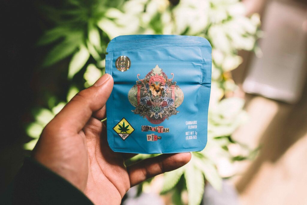
5 Images of Inspiration

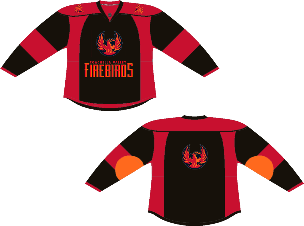
I think this redesign would be a good way to advertise for the festival because of the color palette and iconography. I think it matches the brand as well as shows the beautiful landscape at the festival with it’s semblance of sunsets and blacking out like the party-goers at Coachella. The palm trees on the shoulders are indicative of the California setting as well as the orange circle patch reminding us of the sun and it’s warm essence.
P.S. realized that my post saved only as a draft as I’m working on Week 2’s blog assignment. Sorry for not catching this earlier, but also I understand the penalty for late turn-in. Appreciate y’alls patience with me on this.
AR Panels – Nightlife
For the last project in the AR Module we were put into groups and tasked with creating a set of panels on Eyejack that would interact with our environment. This software was very easy to use and made me feel like I could approach more AR related stuff in the future.
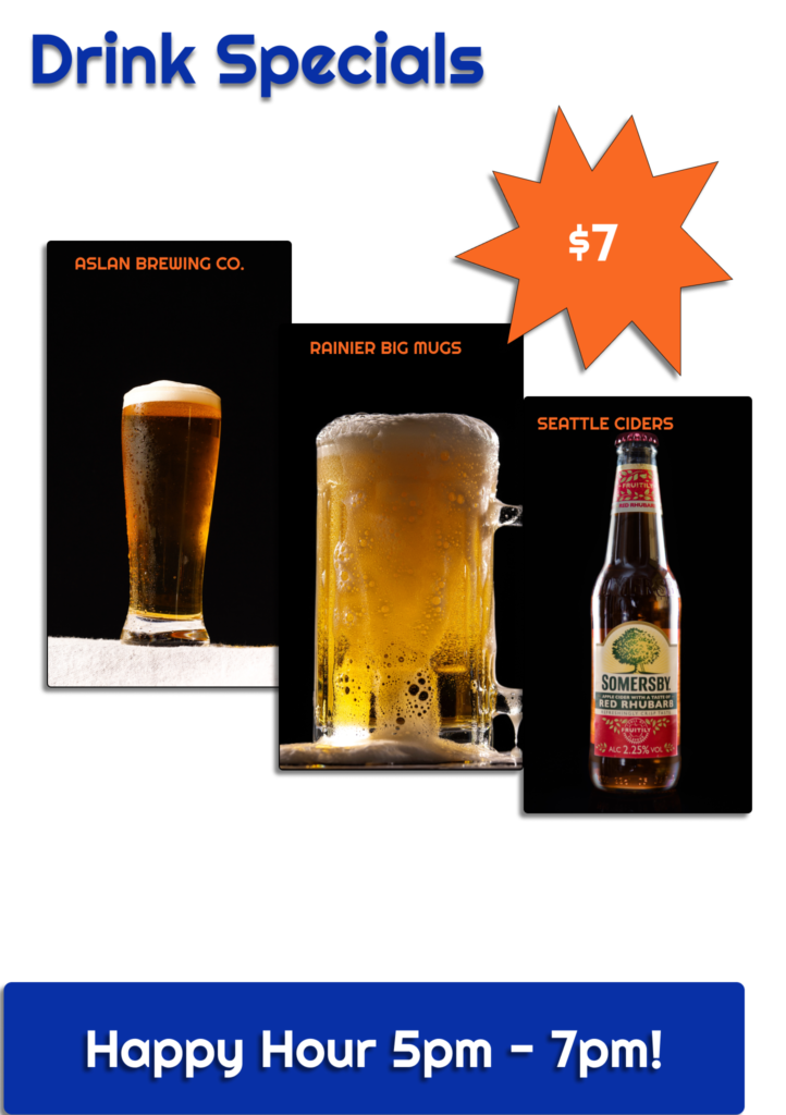
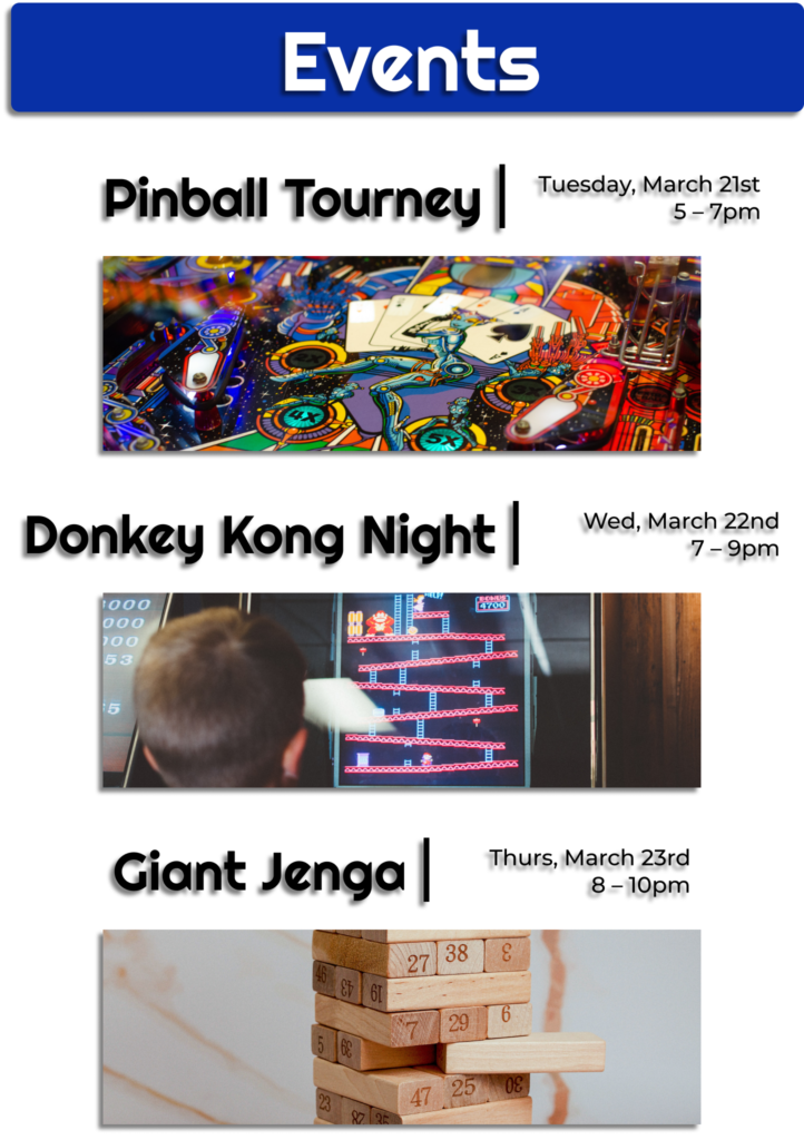
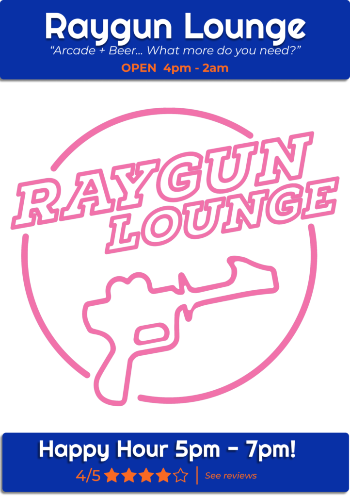
Our group decided to do panels that highlighted the nightlife in the area. It seemed really simple because there are so many in the area! For the bars and clubs in the area we made three panels that would give people information displayed on the outside of the club to get people to know more about the spot. The first panel would name the spot and provide a rating of where we were at, I chose the Raygun Lounge. The second panel (left) would be the drink specials of that day. The third panel (right) would be events that the bar hosts.
Here are the panels:
It was fun to experiment a few different ways of laying it out. Altogether we decided on a few different design approaches we wanted to keep consistent, Mark made a great template on figma for us to add our content to, and then we exported our panels from there as pngs! I think the transparent background was a nice touch because it kind of draws you into the realism of the panels and helps you feel more involved.
Here is the video of our panels in real life with eyejack
Overall this went smoothly and well. Everyone communicated when they were able to get things done and we all finished a bit earlier in the week. It was all about being decisive on that first day we got assigned the project and each of us knew how to proceed from there. This gave me time to slap the videos together into one! I want to try more little panels like this!
Who Are You?
What is it that you want to do?
Why?
Where do you want to go?
What would you want to say?
I’m a believer in creativity… I believe that everyone of us has an artist within. I think art and creation are some of the most important concepts that have given me purpose. I believe there is an art to everything that we say and everything that we do. I hold the truth that in order to progress and to explore, we need people who create. I also think there is as much importance to the technical side of life. We need science and tech to create complex tools to fuel innovation and discovery. Science/tech, art/creation are often seen as two separate worlds.
What I want to do is bridge that gap between it all with design. I want to bring those with technical skills a visual language to translate their ideas and affect their way of approaching problem solving. That could mean web design + branding/marketing for an engineering company who needs to reestablish their presence. I want to inspire artists and aide them on presenting their work. Web design and experiential design could play a hand in this approach. I am somewhat still in the generalist mindset that I want to pursue multiple avenues of design and get experience wherever they will let me. I won’t know if I like it until I give it a genuine try. The obstacle now is rounding out and focusing on these skills while in school. This is my opportunity to grow and gain those opportunities.
Why? Because I care. I care about creating an easier life for myself and others. Easier life for me means working really hard right now and earning a career that I respect/am eager to progress in. Easier life for others means they have a design problem or they have an ugly mess and I come in and turn it into a learning opportunity while transforming it into a spotless culmination of our ideas.
I want to go into the rest of my life bringing meaning to our work while letting people know I’m that DUDE. I’m THAT dude. I want to be able to confidently tell myself that with my chest. Then people repeat it back to me when I’m out performing. I want to have that oomph. That’s all I want. I’ll get there.
My Hungry Caterpillar
This is a love letter to the AR app My Hungry Caterpillar.
Dear My Hungry Caterpillar,
You are going to be a delight for my future kids (or an app that’s like it)… Might not have kids for a while… But your app is really fun and gets kids thinking about games in a new way.
Augmented reality games like this, I believe, will be the bridge between the ipad kids and the next generation of critical learners. This experience has you grow a caterpillar from start to butterfly. You are placed in each others worlds to adventure, play, and most importantly learn lessons about how to care for nature. These skills can be applied to raising and caring for a pet, and teaches responsibility to younger audiences.
I tried the game out for all of about 30 minutes and learned that this game is pretty cute and gives you an expansive experience.
One thing I thought the app did well was track the environment. The caterpillar was able to sense when things became available to it. Such as bringing out the toys and the bubble machine. Even though I brought out all the toys at once it knew only to interact with the most recent toy that I activated. The bubble machine was fun to play with and when I touched the apples from the tree and made them fall it knew to go eat.
I also thought this app taught a good lesson about caring for nature, skills which could easily translate to taking care of other things around you like pets, your siblings, your mom’s flower garden, etc. With a trackable progress of the caterpillar getting bigger the better you treat it, you give the user a sense of improvement and care.
It wasn’t a perfect app though. I wish there were more sounds! One thing I know would get users more engaged is a wider sound design. There weren’t many sounds that gave us queues on what we were doing was right. They kind of just place you in there and it’s somewhat of a soundless visual experience. Users would feel see and hear the environment, creating a more augmented and holistic experience. I would be more convinced that I am operating in the app’s world if I had more sounds to draw me in.
Another thing I would change would be to add more text or graphic queues that mark progress. From beginning to end of my experience there weren’t many text queues that told me I was doing the right thing. Maybe a level system or some sort of queue that says “great job, the caterpillar is growing, keep feeding and see what happens”. Something to draw me in and show me I’m using the app right. They kind of just place you in the environment with the caterpillar and let you do your thing. I think you can hammer home the learning aspects with more progress graphics and texts that pop up as you complete your journey.
Overall this is a cute app with fun implications on learning and caring for your world. I think the idea of this app is something I could see my kids using and would love to guide them through an experience like this in the future.
Here is a clip from my experience (excuse the crowded living room)
CUT Style SCCA Video Idea
After getting to know the people in my cohort, I’ve had many thoughts about where I could see my fellow classmates working. I feel like each of us are finding our strengths, and the way we create connects with each other totally differently. I think a really fun video idea/bonding exercise would be to get each cohort in a room (design, visual media, etc) and to have a few people volunteer to share those thoughts on where we think each other are headed. The specific prompt question could be pertinent to each cohort… For design students we may ask each volunteer to identify what kind of designer they believe suits each student best, and telling them “why” to their face! For visual media students we may ask each volunteer to identify the type of media role they see each of their peers fitting into. We would film with as many people that are willing.
I think this would be such a fun idea because it is an opportunity to tell each other through discussion what we think they’re good at. Maybe I’m just projecting but I feel like a lot of us feel like they don’t quite know which direction we will take with design… This exercise could be a bonding exercise but also an idea generating activity. Like maybe a student will tell another student that they see them working for Nike as a creative director someday… First off, it’s a confidence boost. This student may start to see more possibilities for themself after hearing from each other that they see them doing something big! This also reassures each other that we believe in and encourage each other rather than feeling in competition. I think CUT has a lot of popular videos based around interpersonal connection, wholesome content, as well as somewhat “baity” content… I think our idea from SCCA would be interpersonal, wholesome and maybe even make students emotional. Crying always gets views to be honest. Aside from the attraction of real waterworks, seeing such a wholesome activity done between students would attract more students and show SCCA in a sweet light. I would suggest this program to anyone wanting to work hard in the creative field, and this could be a great selling point because you get a sense of what people are up to and the types of support we provide to students between other students. This idea would portray our program as a really friendly and nurturing program, which is what I have found it to be.
I think we are stressed and there is a plethora of things always to be doing. We are making progress without really getting to acknowledge it as much because we have already moved onto the next thing. Making a video like this would have so much versatility, meaning and could be used for years beyond its creation to inspire future students and to provide a benchmark of nostalgia for current students.


