Winter2024_Blog Assignment #4 Illustration for advertisement moral of the Clarins X Le Petit Prince Collab

final work

Background

The Clarins X Le Petit Prince Collab advertisement moral illustration commission I received about a year ago was for Mainland China marketing. 

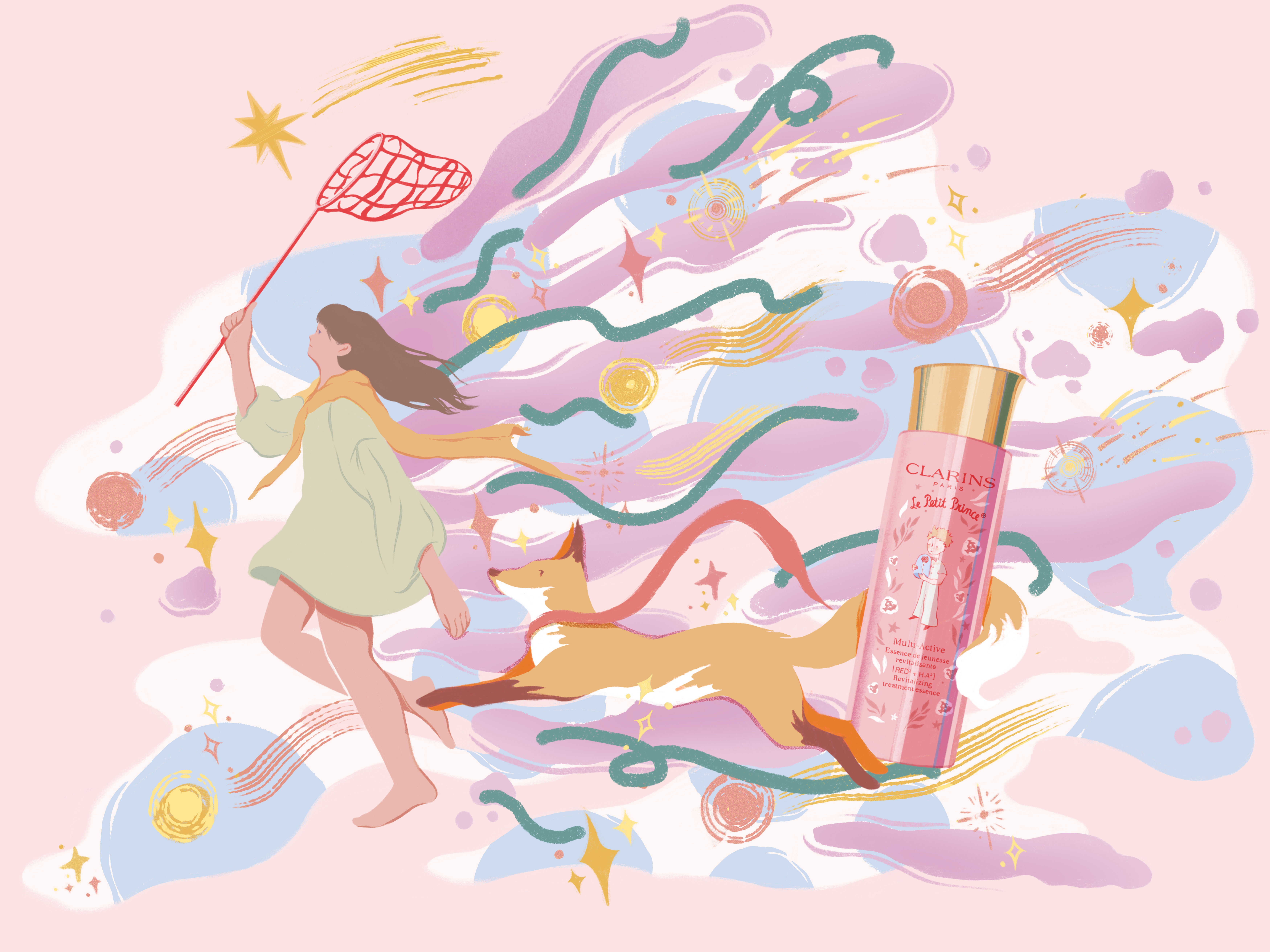
The Clarins skincare brand has teamed up with The Little Prince to launch an exclusive new collection to celebrate the Little Prince’s 80th birthday. Three skincare essences, plus hand cream, were on sale on September 2023 in France and around the world. This project requires depicting fantasy adventures of young women based on the product and the background story of Le Petit Prince, and the image must include the product’s appearance.
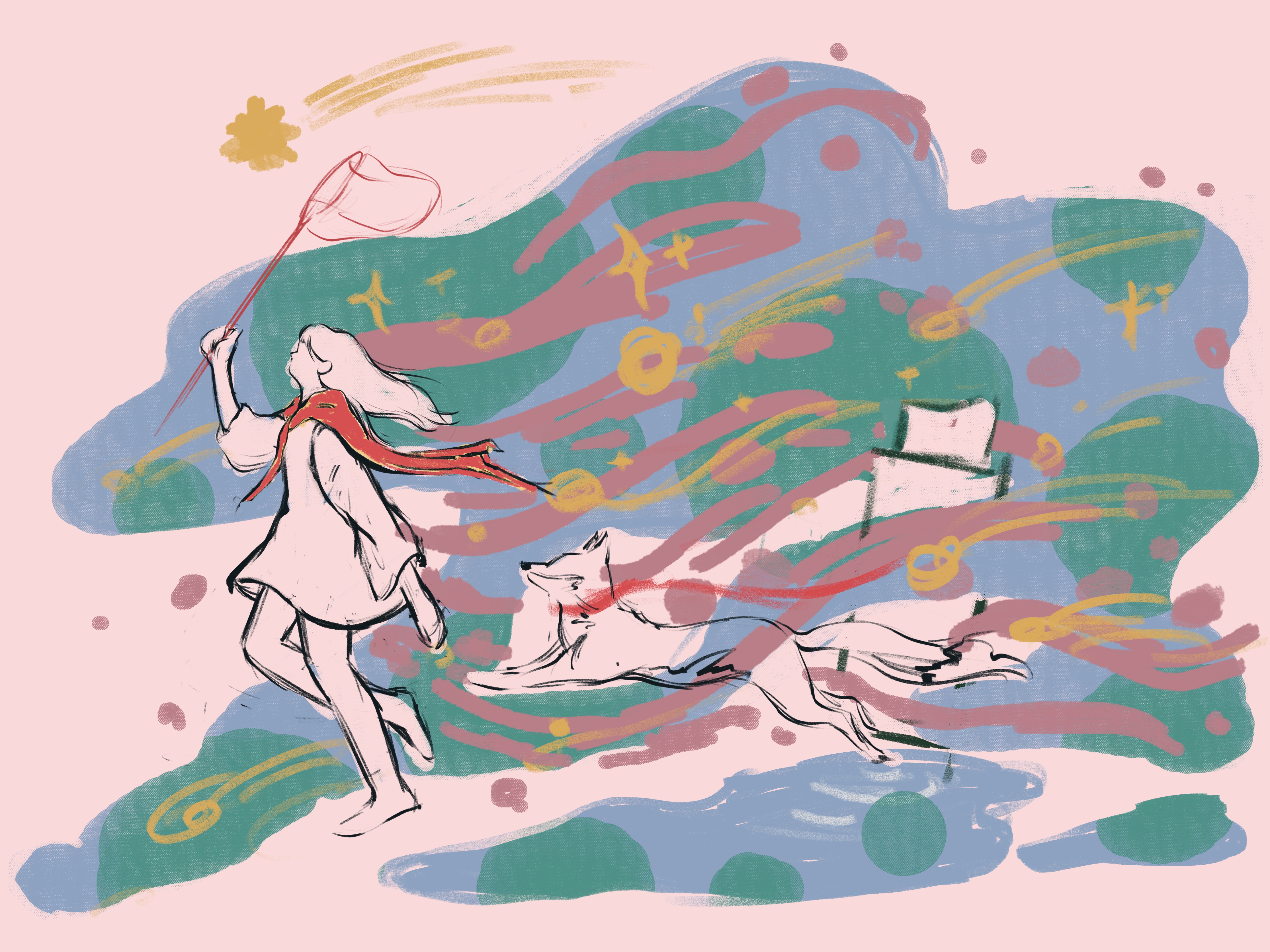
sketches

Actions

As a wall painting project, I needed to maximize visual impact with as few color blocks and details as possible, which was a challenge for my intricately detailed painting style. In order to achieve a wall painting effect, I kept the image simple, and clean and enhanced the visual contrast to be attractive. Beginning with the little fox and girl, based on the story of Little Prince, chasing dreams and catching stars in geometric colors on a background of stars and clouds.

We updated the sketch several times before finalizing the side view to emphasize the characters and products concisely. To highlight the theme, fresh and bright colors were chosen to match the products.
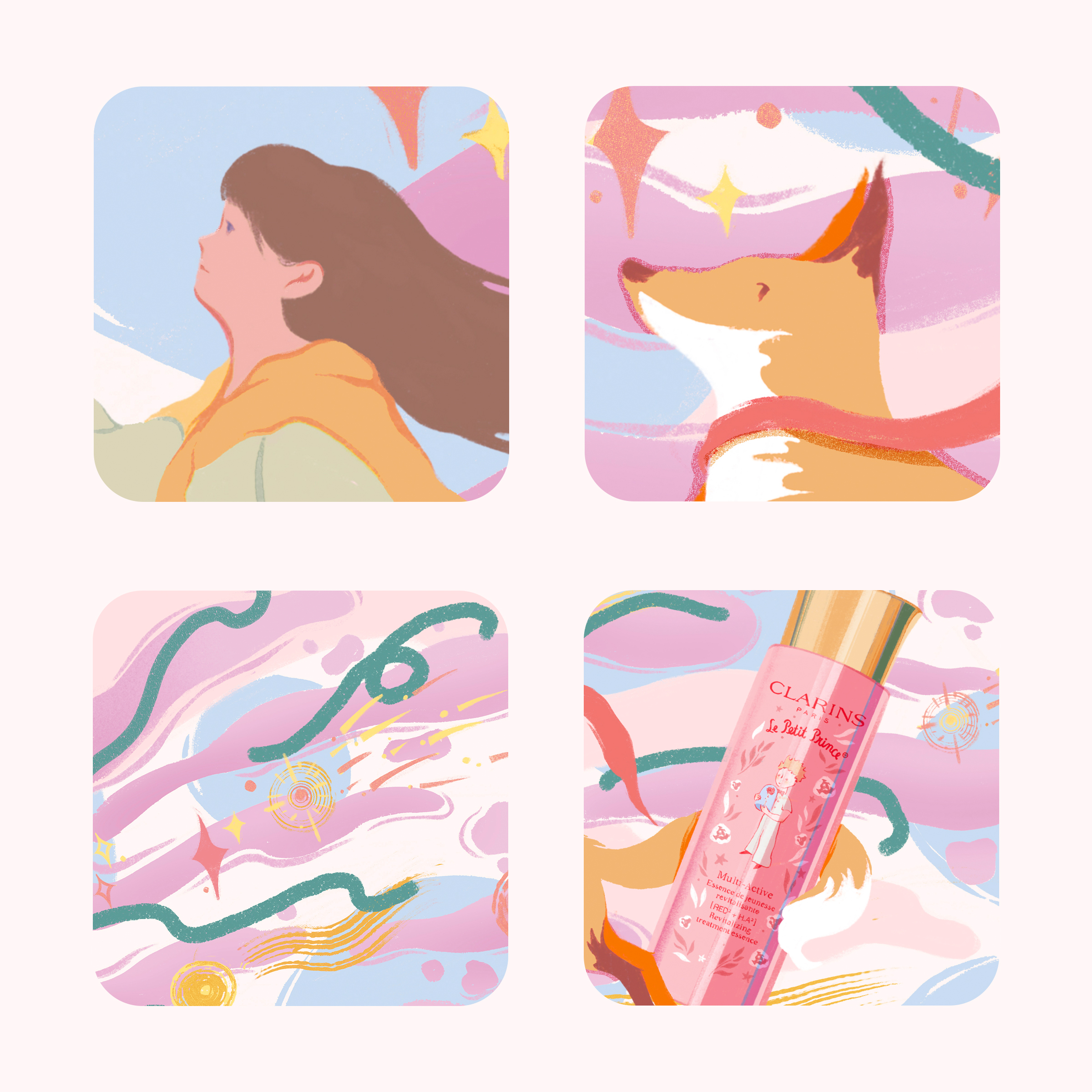
details

Results

Eventually, the project was successfully completed, and I don’t know if it was ever painted as a poster; the version I’ve seen is limited to print ads. But the client’s designer also showed me some mural mockups and I felt very accomplished when I saw them.

In this project, I was happy to be able to combine a book I read as a child with a commercial illustration and express my own opinions. In contrast to experimental painting, commercial projects are often characterized by “dancing in chains”, but there is always a different kind of fun to be had. Art always finds its way.

Additionally, the most important lesson in the creation is to back up and subdivide the layers. The subsequent modification and delivery will be much easier with subdivided coating management.
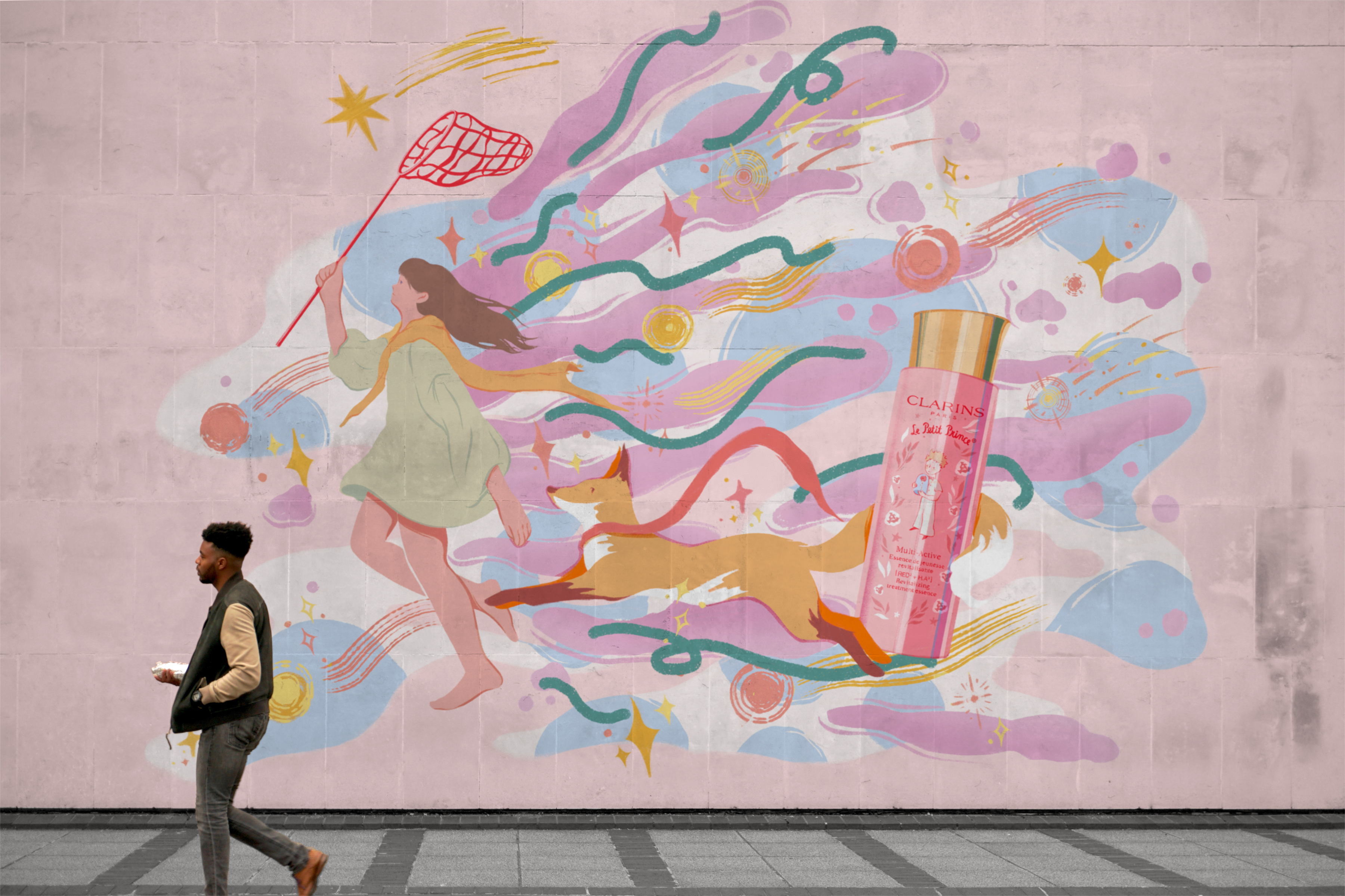
mural mockup

Winter2024_Blog Assignment #3 Mahjong Soul game review

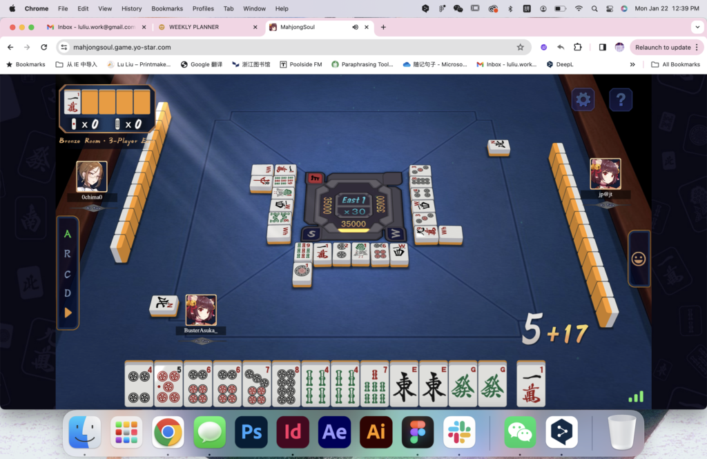
mahjong soul online
table top mahjong set

your review must include a description of how the game is played, what you enjoy(ed) about your experience (or didn’t), and some idea of who the ideal target audience for the game might be (even if that isn’t you).

Mahjong is a tile-based game that was developed in China and then has spread throughout the world. It’s a multiplayer game with different variations in different regions of China, Japan, and internationally. Like other card games, mahjong is a skill, strategy, and luck game.

MahjongSoul is a popular online multiplayer mahjong game developed by Yostar Limited. It’s a digital version of the traditional mahjong game based on Japanese mahjong rules, with additional features and an online multiplayer platform.

MahjongSoul features anime-style graphics and character designs, giving it a visually appealing and vibrant look. The game offers different themes and backgrounds, allowing players to customize their visual experience. The game is available on various platforms, including mobile devices and web browsers. Like many online games, MahjongSoul has an in-game currency system. Players can earn or purchase currency to unlock various features, customization options, and more. MahjongSoul has a community aspect, where players can interact with each other, join clubs, and participate in events and tournaments.

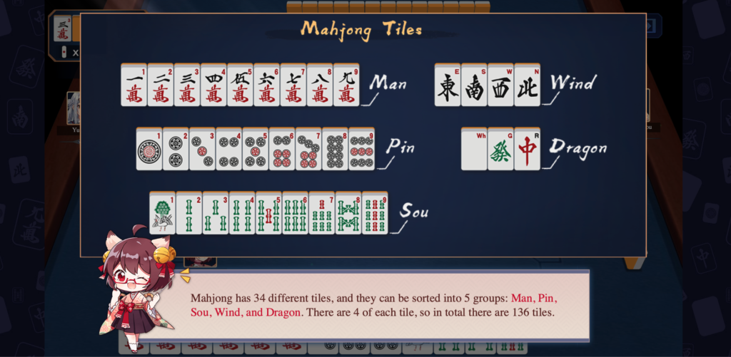
basic rule 1
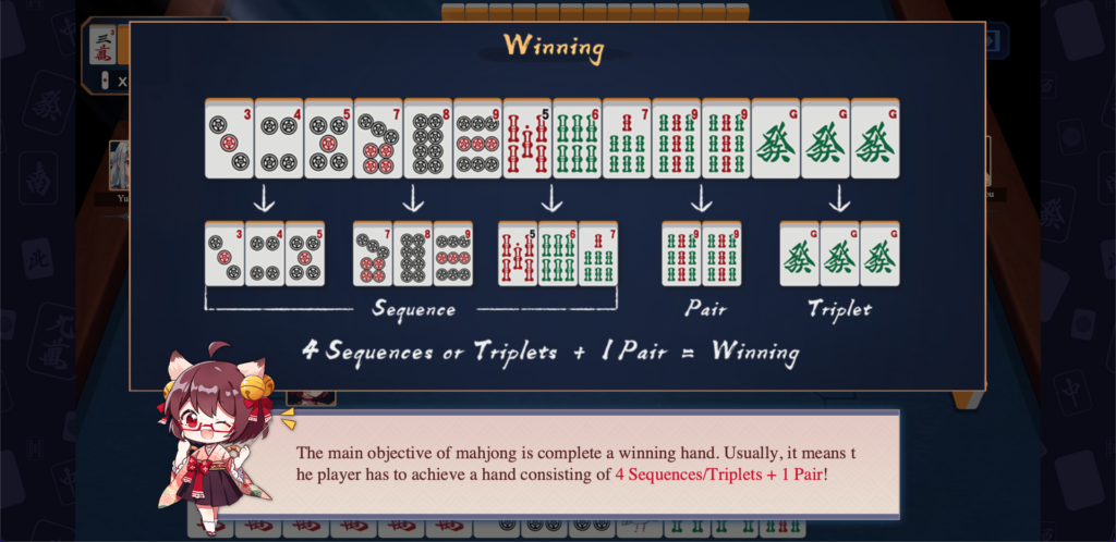
basic rule 2

For me, mahjong is a traditional game that families play together during family reunions. As a child, I played video games more than traditional Chinese mahjong. Nonetheless, Yostar has developed a mahjong game that cleverly combines mahjong and otaku culture, making traditional mahjong popular among young people once again. Making yaku is the biggest difference between Japanese and Chinese mahjong. Northern Chinese mahjong relies mainly on speed and luck and is played very fast. In Japanese mahjong, you must make a series of specific yaku to win, which is why I chose Japanese mahjong to minimize luck (although luck is still a crucial factor). There are more professional Japanese mahjong platforms than Mahjong Soul, such as Tenhou, but casual players like me prefer the relaxed and lively atmosphere of Mahjong Soul to the more professional and serious interface.

I think Mahjong Soul is aimed at anyone who wants to simply start playing mahjong, with its clear and easy-to-understand beginner lessons and step-by-step in-depth tutorials. In the different game modes, you can choose a formal four-player game or have a quick three-player game. I often play a quick round of three-player games, which is very enjoyable.

I find these types of games to be a great way to quickly relax, despite global culture’s bias against them, especially board games and games associated with gambling. Instead of focusing on winning or losing at gambling, it is about quickly figuring out the best combinations to play when luck is either good or bad. As people have bad luck occasionally, I often think about how to rationally match my resources to make the best decision under such circumstances. Rather than playing social mahjong, I usually play alone with online players of similar rank, so even though it’s a social game, I don’t have that experience.

In general, I like the game and will continue to play it, hopefully with friends playing Mahjong with me!

Winter2024_Blog Assignment #2 Being a Swiss Army Knife

  • Tools you currently have:
    • Drawing – Strong hand-drawing skills allow me to visualize and communicate concepts. In general, I can make any illustration I want.
    • Aesthetic sense – Eye for visual details, color coordination, and achieving overall visual harmony. Ability to make aesthetically pleasing designs.
    • Growth mindset – I’m willing to continuously expand skills, keep up with trends, and evolve as a designer—life-long learning.
    • Information search and collection – Research design inspirations, stock resources, fonts, tools, etc. Knowing where to find helpful assets.
  • Tools you have that need development
    • Typography – Mastery of working with fonts, arranging type, and using typefaces effectively in designs. Still a lot need to learn.
    • Layout design – Understanding composition, spacing, and visual hierarchy to organize elements in appealing layouts.
    • Digital skills – Proficiency with design software like Adobe Creative Suite (Photoshop, Illustrator, InDesign). Ability to execute ideas digitally.
    • Time management – Juggling multiple projects and deadlines requires being organized and efficient with time.
    • Creativity – Ability to come up with innovative ideas and fresh visuals. Developing unique designs requires a creative mindset.
    • Visual communication – can convey messages clearly through images, shapes, colors, and other graphic elements. Strong visual storytelling skills.
  • Tools you do not have that you need to learn
    • Collaboration – Working together with clients, developers, printers, etc. Communication and teamwork ability.
    • Business skills – Understanding of budgets, branding, marketing, etc. Ability to do the business side of graphic design.

Winter2024_Blog Assignment #1 Playing Frisbee with a cat at a park

  • Write a description of what you would like this image to look like:

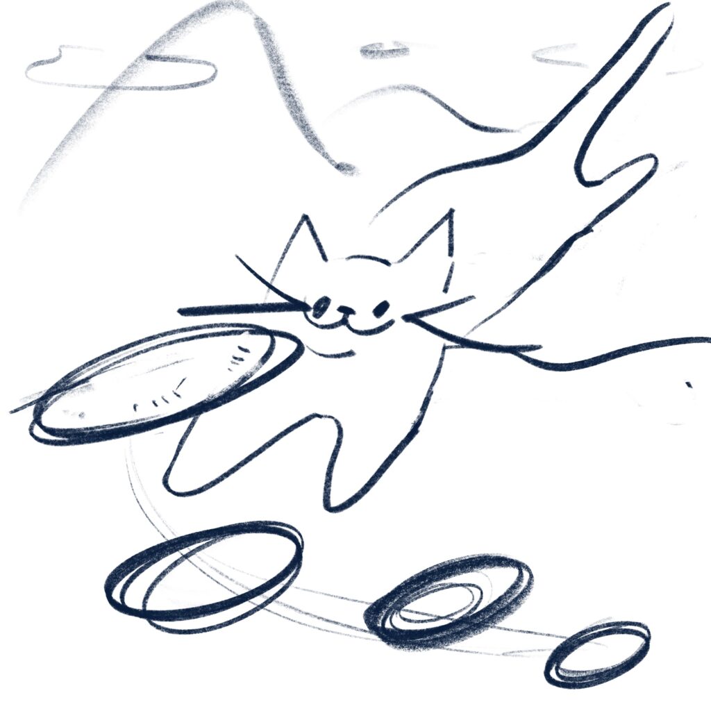
Playing frisbee with a cat in the park, with the park grass in the background and mountains in the distance, and the cat jumping up for the frisbee.

  • Draw a sketch of what you would like the final image to look like:
  • Choose one of the new Ai image generating programs (There are free options)

Midjourney Bot

  • Add some prompts to generate your image #1.
  • Save your image.
  • Now refine and tweak your prompt for Version #2.
  • Save your image.
  • Last chance to refine and tweak your prompt for Version #3.
  • Save your image.
  • Write a recap of your experience as well as a list of your prompts.

The theme I chose was “playing frisbee with a cat in a park”.
Midjourney gave some nice 2D images when I typed in the keywords for the description “Playing frisbee with a cat in a park, with grass in the park and mountains in the distance in the background, and the cat jumping up and grabbing the frisbee”. I eventually obtained an image with a relatively normal cat anatomy after a few iterations.

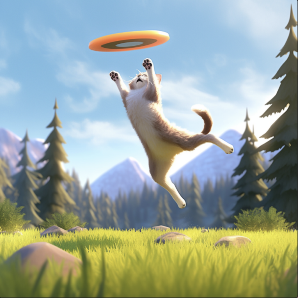
When I entered keywords a second time, I wanted to try a 3D Disney style. The keywords I added are Disney, 3D art, octane rendering, ray tracing, clay material, Pixar trends, animated lighting, depth of field, and Popmart blind box. I was able to get a logical image after iterating again.

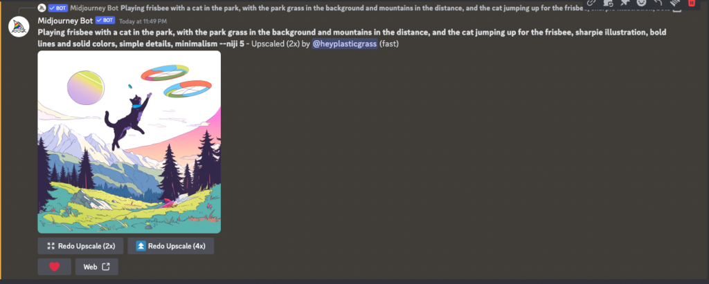
In the end, I decided to go back to 2D mode. To improve the keywords, I added more specific and precise descriptions: “Playing frisbee with a cat in the park, with the park grass in the background and mountains in the distance, and the cat jumping up for the frisbee, sharpie illustration, bold lines, and solid colors, simple details, minimalism –niji 5 ”.

  • Evaluate software you used and it’s as pros and cons.

Midjourney is an AI image generation system that has become very popular since 2022. It allows users to create intricate digital images simply by providing text prompts. Some key pros of Midjourney are that it can produce highly detailed and creative images, often surpassing what humans could design manually. The system is also fairly easy to use, even for those without much artistic skill. However, there are some limitations. While Midjourney images look impressive on the surface, they often lack coherence or meaning when examined closely. The system is limited by the data it was trained on, which can lead to bias and problematic outputs if not used carefully. Additionally, the wide use of AI image generation raises concerns about copyright and the value of human creativity. Overall, Midjourney demonstrates the rapid advancements in AI systems, but ethical considerations around its use remain. To improve coherence and prevent abuse, there is still work to be done.

Blog Assignment 7_Enhancing the Graphic Design Curriculum with 3D Modeling Skills

As a graphic design student looking towards the future, I believe learning 3D modeling skills should be a part of us and future students in the program. 3D modeling is becoming increasingly important across industries from product design to motion design to video games and VR. Having a foundational understanding of 3D modeling principles and being able to create basic 3D assets would make us more well-rounded designers ready to work in a variety of fields.

I propose we use part of the $2,500 budget to add a 3D Modeling elective class to the course schedule. This would cover the basics of modeling in a program like Blender which is free and open-source. Over a semester, students could learn:

The interface and navigation of Blender:
– Modeling tools and techniques like extruding, edge loops, sculpting
Materials, lighting, and texturing of models
– Basic animation principles
– Applications like product renderings, architectural visualizations, game asset creation


Rather than purchasing any one piece of hardware or software, dedicating the budget to an additional class would allow both current and future students to build critical emerging skills. As more industries utilize 3D digital content, having these abilities will make us much more hireable and capable designers.

While an advanced class would be great as well, dedicating the budget to an intro course ensures we establish strong fundamentals. Then students could choose to pursue more training later. This sets up both graduates and the program for success when interacting with 3D.

In summary, I believe using $2,500 of the budget to add a basic 3D Modeling course would greatly benefit current and future graphic design students by enhancing our skill sets. Let me know if you need any other details!

SCCA NME: AR MODULE_ Project 2: Adobe Aero

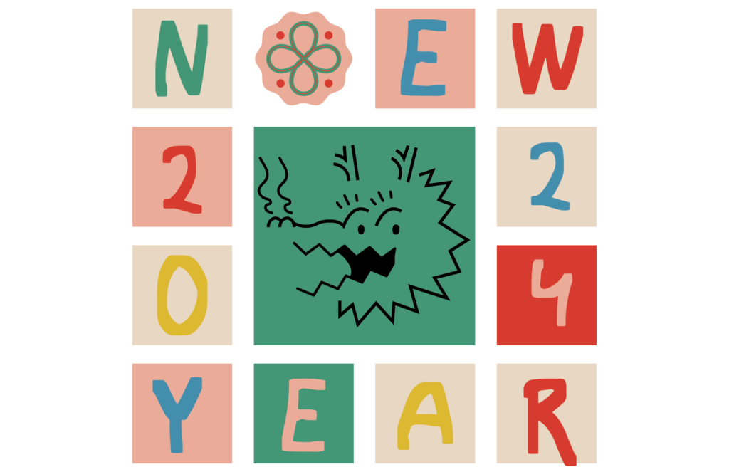
NEW YEAR CARD

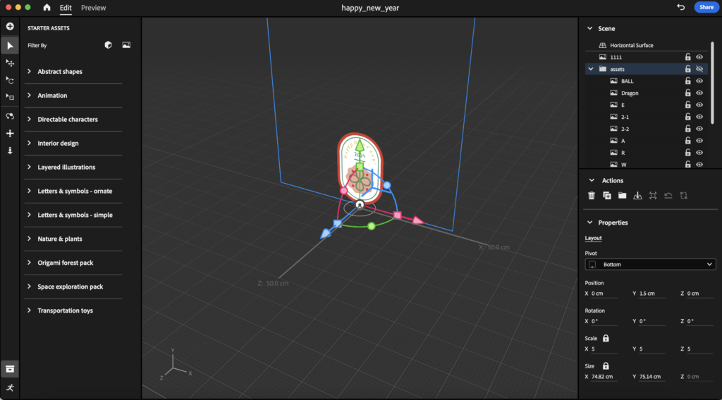
Every year, I make a New Year’s card based on a zodiac sign and the year. Adobe Aero was very interesting, it was also my first time with AR software, and I was happy to be able to make a New Year’s card with some new software.

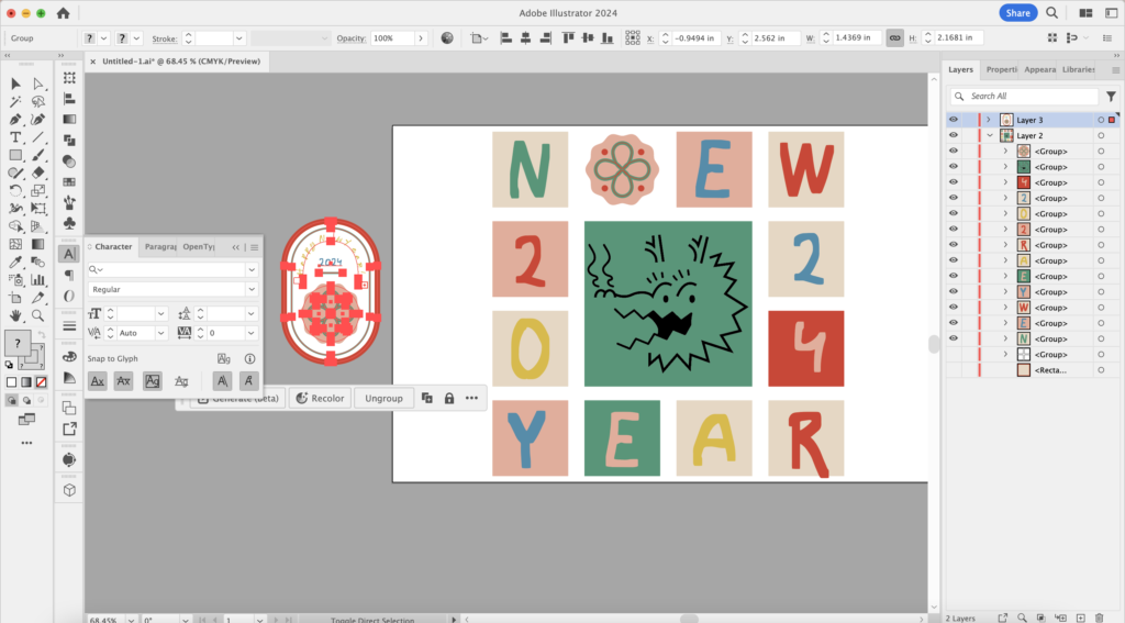
My first thought was to create small assets in 3D modeling, but I don’t know any modeling skills and Nomad isn’t that easy to get into in a few days. I tried rendering PNG files and JPEG files differently in Aero a few times, so I decided to draw illustrations in Illustrator before importing PNG assets.

To make this work more complete, I selected some free sound effects from the Internet. This dragon will feel more festive with Chinese-style music.

Blog Assignment 6_What makes me a disruptor?

What a great design by Gabriel Lopez! I really enjoyed his talk and his work and learned a lot. Likewise, as a foreigner, the impact of different cultures is a very valuable experience for me. A few years ago, I came to the United States to continue studying printmaking with a professor I admire. Every day I learn new knowledge and experience new cultural shocks, all of which trigger my creation. From the mechanical equipment and work processes of different printmaking studios, to different reagents and different technical means, to the history of Chinese and Western printmaking, I deeply realized that in artistic creation, proficiency in technical means is less important than a deep concept back of a work of art. Systematic learning is the fastest way to enter the industry.

In my printmaking and illustration work, daily life and the rapid advancement of technology are my greatest sources of inspiration. There is always a nostalgia aesthetic in my work, so I often use a mixture of mediums to create textures and surfaces that reference the architectural landscape I grew up in. I like making art that has more than decorative purposes. No judgment on people who just make stuff for kicks, though. You do you. Within my work, I always try to experiment with environments by manipulating the perspectives and space my figures occupy. Seasons are equally important. In my works, you can clearly feel the seasonality. I think my drawings can feel the seasons, tapping into a familiar feeling, like a reminder of a certain summer.

In addition, I often wonder where design and illustration will go in this era of rapid development of AI technology. As discussed in Benjamin’s “The Work of Art in the Age of Mechanical Reproduction”, he considered that mechanically reproduced artworks lack a sense of “aura”. In today’s world, printmaking is already an ancient fine art medium, and AI can easily create realistic characters and scenes in digital printing. So where does “aura” go? I decided to continue to explore the answer to this question through continuous in-depth study and practice. Although I always try to maintain a positive attitude, I inherently question the logic behind everything. Maybe this is the meaning of deconstruction.

SCCA NME: AR MODULE_ Project 4: AR Panel Project (Group Project)


The panels and/or video of your project.

What Point of interest (POI) did your team decide on?

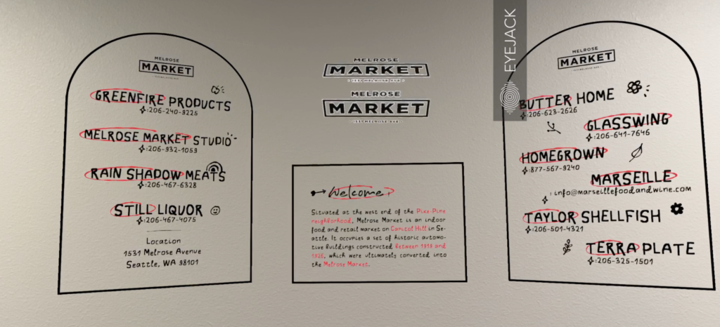
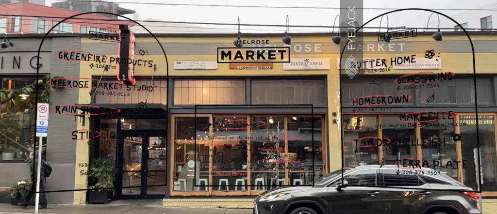
Our group decided to discuss MARKETS after a long discussion. For this thread, I chose Melrose Market as my project.


How did you create it (photoshop, Figma)?

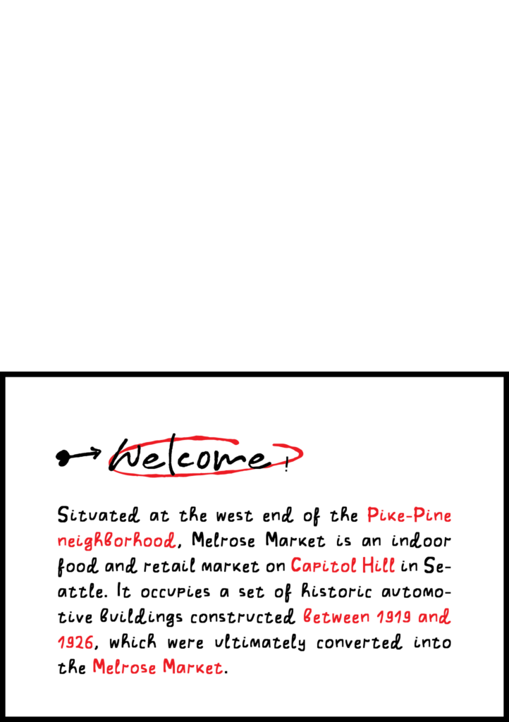
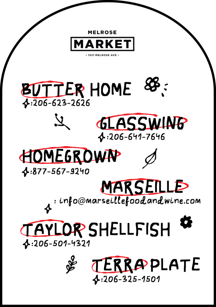
With a template, I make a motion gif in AE with three still panels created in Illustrator. In addition to these, I used a mouth sound effect as background music.


What assets did you use? (jpg/gif/audio/etc)

A gif. I export the motion effect as a movie, then compress it in Photoshop to a gif.

Visuals from the project:

SCCA NME: AR MODULE_ Project 2: AR APP – UI/UX Review

Introduction:

Reality Composer is an AR app by Apple that allows users to easily create interactive augmented reality experiences. With a simple drag-and-drop interface, users can add 3D objects, animations, audio, and behaviors to their AR scenes. The app is targeted towards designers, developers, and creatives who want to quickly prototype and build AR apps.

Experience:

Clear drag-and-drop interface

It follows Apple’s design style and has a simple interface. Use the plus symbol to create new compositions, or click the thumbnails below to open existing files.

Using a metal sphere and a couple of plastic spheres, I created a simple composition. Building the model and choosing materials is very simple with the software, but the options are limited. By overlaying behaviors, you can simulate different actions, and there is even a built-in base sound effect. By turning on the camera, we can observe the effect in the current scene and trigger the behavioral effect.

Checking out the tutorial for this app made me realize how powerful it actually is. Modeling software such as C4D, Blender or Nomad can be used to import and achieve amazing AR effects.

UI/UX Improvements:

  • The object library could be better organized to make finding 3D assets faster. Right now it’s just a long list that you have to scroll through.
  • More customizable controls and logic blocks for building interactions would allow for more advanced AR experiences. The current options are limited.
  • The interface relies heavily on menus and modes that aren’t always clear. This could be streamlined for better workflow. While the basic operations are very simple, more complicated special effects require a great deal of learning.

What They Did Well:

  • The drag-and-drop workflow for placing objects and building scenes is very intuitive.
  • It feels natural and expected to work with 3D objects, animations, and camera controls through intuitive gestures.
  • It is extremely easy to iterate and test projects in real time without having to compile or deploy to a device. This is intuitive and can speed up development.
  • The built-in objects are limited, but offer high-quality assets and visuals, allowing for polished, professional scenes.

Composition AR video: https://youtube.com/shorts/dgtlFCbboZY?feature=share

SCCA NME: AR MODULE_ Project 1: AR Poster

lollipops poster

Motion graphic:

https://youtube.com/shorts/SH3nFabY4lc?si=B7KpYrZW1hEBQOAH\

Pictures:

Idea…

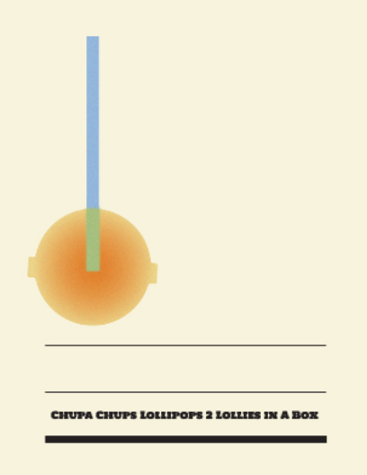
When I went to the grocery store, I saw candy in front of the checkout counter, so I decided to create an advertisement poster about candy. At first, I drew the objects using the simplest shapes. Once I tried several shapes, I decided that a lollipop was the easiest. Two lollipops were enriched with gradient colors, and noise was added to add texture to the content.

Program…

In the beginning, I created basic graphics and text in Adobe Illustrator. Then I imported it into AE used a script to create a lollipop transformation and copied and pasted an expression from a tutorial on YouTube to create bouncy texts. (tutorial: https://www.youtube.com/watch?v=WaKQkAZAMe4&list=PLpTdYyQlJ_kPTA-hbr_iwdpE0nCKAizd3&index=1&t=68s)

This lovely mouth sound effect is from my favorite game – Hidden Folks. I found the sound effects author’s share online and picked the right one.

Others…

After encountering many problems while making this short motion graphic, I finally decided to use existing scripts and expressions to complete it. AE is a very complex software. As soon as I’m done, I find this process to be very enjoyable. On my phone, I watched it over and over again, it was so cute! This assignment is awesome : ))