My Creativity Soars on the Wings of the Lowly Butterfly

One sunny afternoon, while sitting outside in my backyard, I noticed a small butterfly flitting around the flowers. At first, I almost didn’t notice it, as it was so small and inconspicuous. But as I observed it more closely, I began to be filled with a sense of wonder and imagination.
As I watched the butterfly, I couldn’t help but be struck by its grace and beauty. Its wings were a riot of color, with intricate patterns and designs that seemed to dance in the sunlight. In that moment, I was filled with a sense of awe at the power and beauty of nature.
But more than that, the butterfly sparked my imagination. Its flight was so carefree and whimsical, and it seemed to be exploring the world around it with a sense of curiosity and joy. Watching it fly around the flowers, I found myself feeling more creative and inspired.
In fact, I was so inspired by the butterfly that I decided to take out my sketchpad and try to capture its beauty on paper. As I began to sketch, I felt a surge of creativity flow through me. I was no longer just drawing a butterfly; I was creating a work of art that captured the essence of its beauty and grace.
Since that day, I’ve found myself drawn more and more to creative pursuits. Whether it’s painting, writing, or simply exploring the world around me with a sense of curiosity and wonder, I feel more alive and inspired than ever before. All because of one small butterfly in my backyard.
Mark Allender (Wrote the ChatGPT prompt)
Petcube Bites 2: 2 Pet Cubes 2 Bites
This week we were asked to create a mood board and marketing pitch, for the pet monitor, treat dispenser, radio, flashlight, and CPA, the Petcube Bites 2. Oh, what a world!
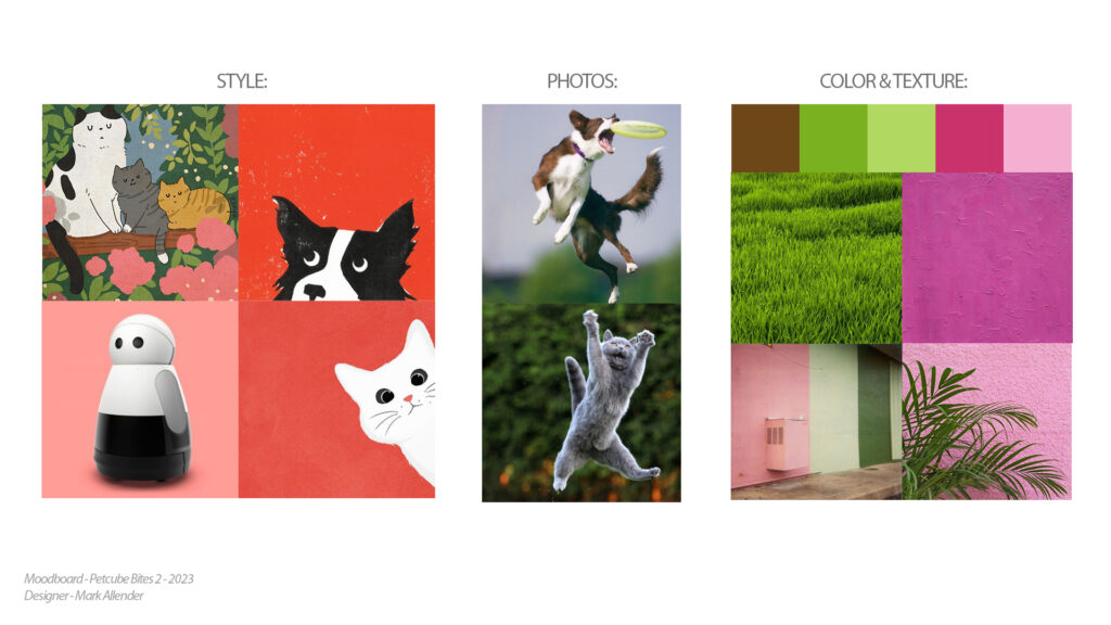
Petcube Bites 2 Brief:
Tone:
The tone for this mood board is focusing toward pet owners who love their pets and want them to be happy. I want pet owners to picture their pets jumping and leaping as they play and catch the treats. A happy sight for any pet owner! As well as their pets looking up excitedly as they hear their owner’s voice over the Petbite’s speaker, knowing that a treat is coming. A wonderful sight and feeling for every pet owner!
Color:
The color palette was selected to reflect the tone, by using colors that represent love, friendliness, and comfort While also, using colors that invoke an idea of the outdoors on a sunny summer day. I want the colors to remind the pet owner of times great times that they have spent with their pets and the feeling of love for their animals.
Texture:
The textures were picked to invoke a very tactile and comforting feeling. Textures that make the viewer want to touch and interact with whatever image is displaying them. I wanted these texture to remind them of holding or touching/petting something like their pet’s fur!
The Differences of Different types of Different Jobs
Here are the Pros & Cons of Different Design Jobs.
Freelance:
Pros:
1. Flexibility to work on multiple projects for different clients
2. Ability to set your own rates and choose your own clients
3. Opportunity to work from anywhere and have control over your own schedule
Cons:
1. Inconsistent workload and income
2. Limited benefits such as health insurance, retirement plans, or paid time off
3. Uncertainty around job security and long-term financial stability
Part-time:
Pros:
1. Flexibility to work part-time and potentially balance other commitments such as school or family
2. Potential for benefits such as health insurance or retirement plans
3. Opportunity to gain work experience and potentially transition to full-time employment
Cons:
1. Limited income and potential for variable hours
2. Limited opportunity for career growth and advancement
3. Potentially no job security or stability
Contractor:
Pros:
1. Potential for higher pay rates and the ability to negotiate terms of the contract
2. Opportunity to work on diverse projects with different clients
3. Potential to work remotely and have greater control over your schedule
Cons:
1. Limited benefits and potential legal or tax implications as an independent contractor
2. No job security or stability beyond the terms of the contract
3. Limited opportunity for career growth and advancement within a particular company
Full-time:
Pros:
1. Stable income and benefits such as health insurance and retirement plans
2. Potential for career growth and development within a particular company
3. Increased job security and stability
Cons:
1. Limited flexibility in terms of work schedule and obligations
2. Potential for burnout and reduced work-life balance
3. Limited control over work tasks and responsibilities.
Examples of “Part-Time” Job Listings:
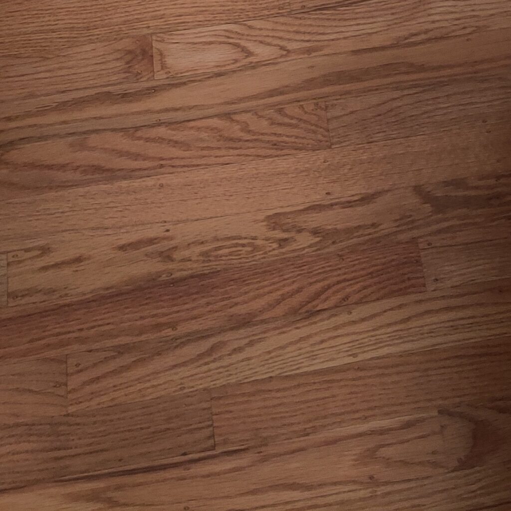
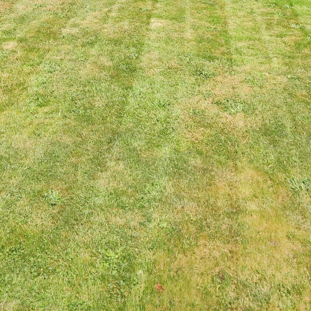
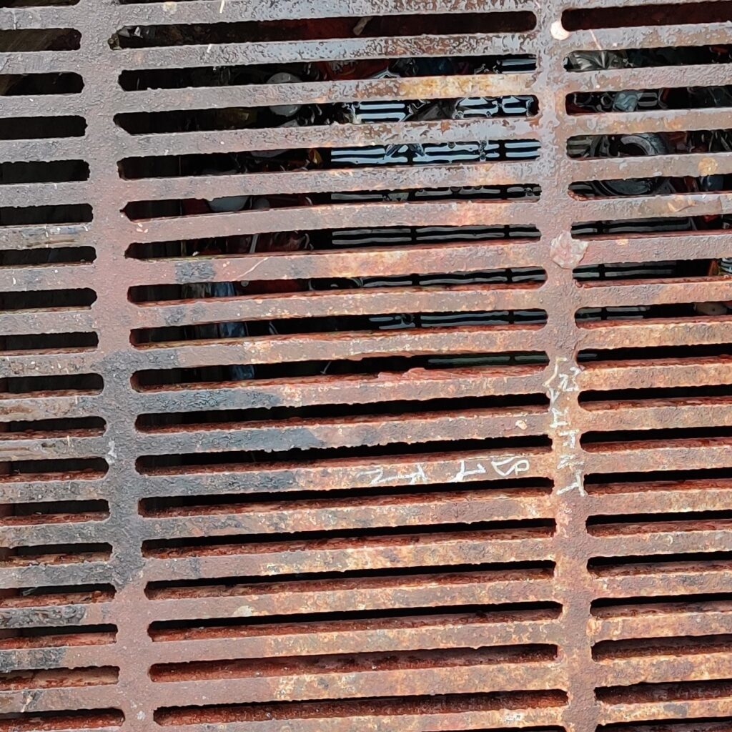
Textures


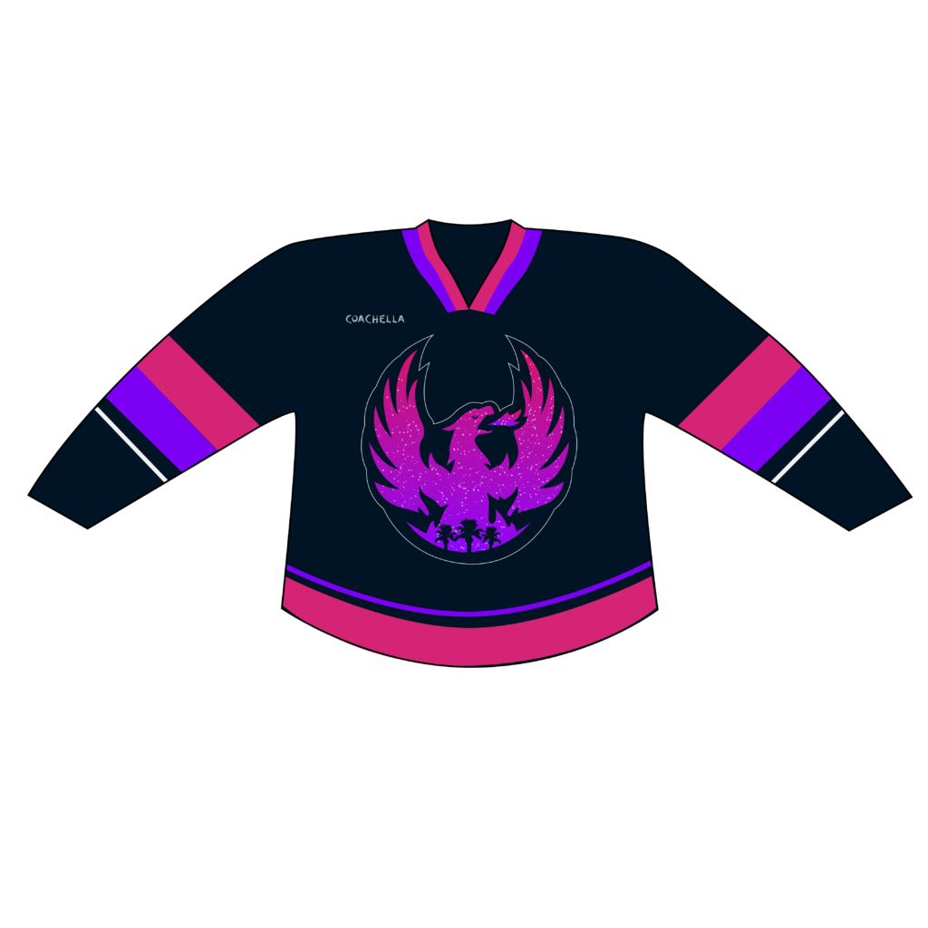
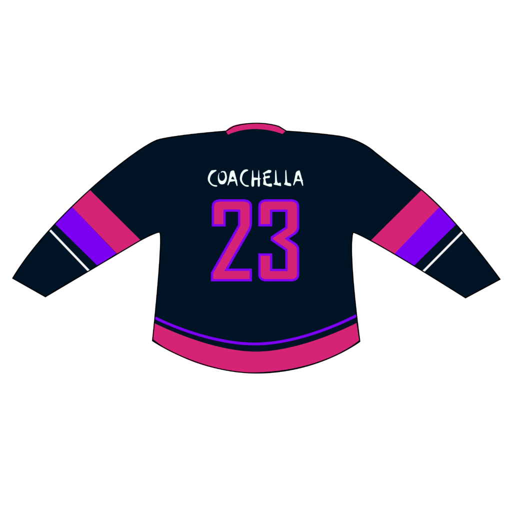
Coachella Valley Firebirds Promotional Hockey Jersey

For this week’s blog assignment we were asked to design a promotional hockey jersey for the Coachella Valley Firebirds, that promoted the Coachella Music & Arts Festival. After reviewing much of Coachella’s promotional materials and branding, they very heavily pushed that the festival took place outside under a beautiful desert sky surrounded by mountains.
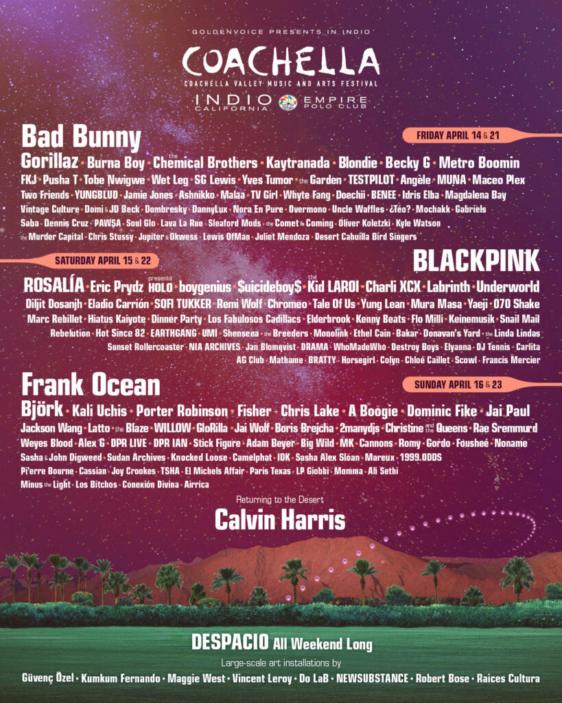
Since this was their main motif, I decided to go with a “desert sunset” theme. I basically used the exact same Firebirds logo, but gutted it and filled it with a colorful and starry desert sunset sky. I also threw in a few silhouettes of some palm trees in the foreground to help give it some depth. I pulled the colors for the jersey directly from a sunset picture in their latest festival poster to help make it match their most current marketing materials. I think my design really captures the look and feel that Coachella promotes and that it would appeal to their festival patrons.

AR Panels for Linda’s Tavern
For our final AR project my group decided to feature Bars / Nightclubs in the Capitol Hill area. I decided to go with Linda’s Tavern, since it is probably the bar I am most familiar with in the neighborhood. We decided to have 3 panels total in our design. One Header panel that shows the name of the establishment, one that shows the latest Drink Specials, and one that shows a list of upcoming Events at the venue.
We used Figma to layout our designs for the panels, so that we could all work collaboratively to ensure that our panel designs were cohesive between all of our team members.
I used transparent PNGs, so that you could see through the panels. I thought this would help emphasize the look of the AR and give the panels that 3D pop!



Final Thoughts:
Overall I think it turned out really well! Our simple design that featured bold colors and large images really made the panels standout from the background, even though they were transparent, and were easy to read.
The hardest part was getting the transparent PNG files small enough to get them to meet the file size requirements of the free eyejack account. Also, the panel placement broke a little bit at the end of the video, but I don’t think that had anything to do with our design, just a hiccup in the app.
See a video that demos the AR experience here: https://youtu.be/4-A5ZDBdHRY
SOME PRETTY BIG QUESTIONS!

Who are you?
Yeesh. That’s a pretty big question! As far as it relates to the SCCA program, I guess I’d have to say that I’m a lot of things. I’m an aspiring graphic designer, an illustrator, an animator, as well as a sub-par photographer and filmmaker. I love to tinker with various technical projects, like my e-bike, building computers, and working on the AV system at the Lariat.
What is it that you want to do?
As of now, I would like to do company branding and print design for posters and books. I would also like to work in the arts, like film and music, doing design work.
Why?
Those are subjects and industries that I am somewhat familiar with and interested in.
Where do you want to go?
I’ll go wherever I need to. I imagine that I’ll need to work for lots of different people in order to make a living doing design in the art world.
What would you want to say?
Not sure what I would want to say personally doing design work. I think I would just hope that my work helps other peoples’ work find a voice and communicate effectively what they need to say with their brands/companies/organizations.
SCCA Goes Viral!
For this post, we needed to come up with a pitch for a viral video concept based on the videos produced by CUT studios. In order to get my creative juices stewing I watched the following videos on CUT’s YouTube channel:
- Have you ever pooped your pants
- Kids Explain – Episode 4: Poop
- 100 People Try to Fart
- Would You Rather: Poop in Front of Strangers OR Livestream Going to the Bathroom
- Man Spends Entire Paycheck on Scratch Tickets
Ideas:
Based on the CUT videos I decided to watch, I came up with several ideas that I think would be good for SCCA to produce.
- 10 Poops Ranked from Hottest to Coldest.
- Who Farted? Special guest Billy Eichner puts on his detective hat to help solve this silent, but deadly crime.
- How Bad Did Your Exes ACTUALLY Think Your Poops Smelled?
- 100 People Lie About Having Never Shit Their Pants.
- Kids Explain – Episode 6006: Why Farts are So Funny.
- Truth or Fart. Things get Stinky when special guest Adam Conover RUINS the Game by Mansplaining Farts to Everyone.
- The Hopscotch While Pooping Experiment.
Final Pitch:
After a careful review of the assignment guidelines, I have decided on my final pitch!

Desired Response:
It’s the question everyone wants to know the answer to, but didn’t know it until now! This concept would help reveal all our common insecurities, as it pertains to the smell of our excrement. I’m hoping this video will result in acceptance of the smell of our poop and garner empathy for those who’s poop might not smell as good as ours. People need to be reminded that our daily bowel movements are natural and nothing to be ashamed of. Also, if your ex did not enjoy the smell of your poop, maybe it truly was not meant to be.
Participants Needed:
Since the CUT seems to be geared toward 18-35, we would need to make sure the majority of our participants fit into that demo. However, we should try and get at least one Boomer and maybe a few Gen-X people to share their poop smell opinions, if possible. We should be committed to making sure that the ethnicity, sexuality, and gender expression are as diverse as possible. In order to get a good cross section and enough content to edit together, we should shoot for 12 former couples, so that we have 24 interviews to pull from. I believe there is a potential for emotions to run high during this viral video experiment, so we will want to have mental health counselors on site and inform SCC security of the possibility of a Jerry Springer type scenario.
Closing Remarks:
Should my pitch be chosen, I have absolutely zero interest in being involved in the production.
Houzz – AR App Review
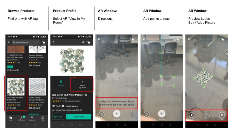
Houzz is an app designed to help consumers who are decorating or remodeling their homes. It can connect consumers to different contractors and designers. It’s main use is to shop for furniture and various building materials. Many of which you can preview in your home using a robust AR feature, which virtually places the furniture or materials in your home for you to preview.
“We provide the best experience for home renovation and design, connecting homeowners and home professionals with the best tools, resources and vendors.”
Houzz App
EXPERIENCE:
PROS:

CONS:

