Categories
Blog Post

Moment that Sparks (5)

Considering its finals week, many of my spare moments have been spent thinking about my approach to a few projects. The first project being an article about the current Renaissance of Printmaking, exploring how this traditional art and form of communication, once overshadowed by digital technologies, is making a remarkable comeback in the modern era. As I read about the intricate techniques and the passion of contemporary printmakers, my mind began to wander, envisioning a fusion of past and present within a single space.

In this imagined scenario, I saw a bustling printmaking studio where artists from different time periods coexisted. The air was filled with the aroma of ink and the sound of carving tools. On one side, skilled artisans meticulously engraved copper plates, employing age-old methods passed down through generations. On the other side, modern printmakers using modern influence with these age-old methods. What exactly would these two periods look like in my own translation?

The second project is centered around the idea of capturing a composite moment of light colliding with color. I aimed to explore the interplay between these two elements in a single frame, transcending the boundaries of time and space. Using a photograph I took many years ago as the foundation of this project, I envisioned a vast, open road at the golden hour, when the sun dipped low on the horizon, casting a warm, ethereal glow. A moment suspended in time, where hues of red, orange, and purple painted the sky, while the landscape is bathed in soft, golden light. I imagined fusing it with instances of vivid colors found in everyday life, and tried to visualize what exactly light colliding with color would look like.

This amalgamation of light and color in a single frame served as a visual metaphor for the interconnectedness of moments across time, while also acknowledging the fleeting nature of life and existence.

Conceptualizing my approach to both of these projects, in their own unique ways, brought together different spaces of time into a single creative space. They encouraged me to explore the intersections between past and present, traditional and modern, and to imagine the possibilities that arise when these elements collide.
Categories
Blog Post

Mood Board (4)

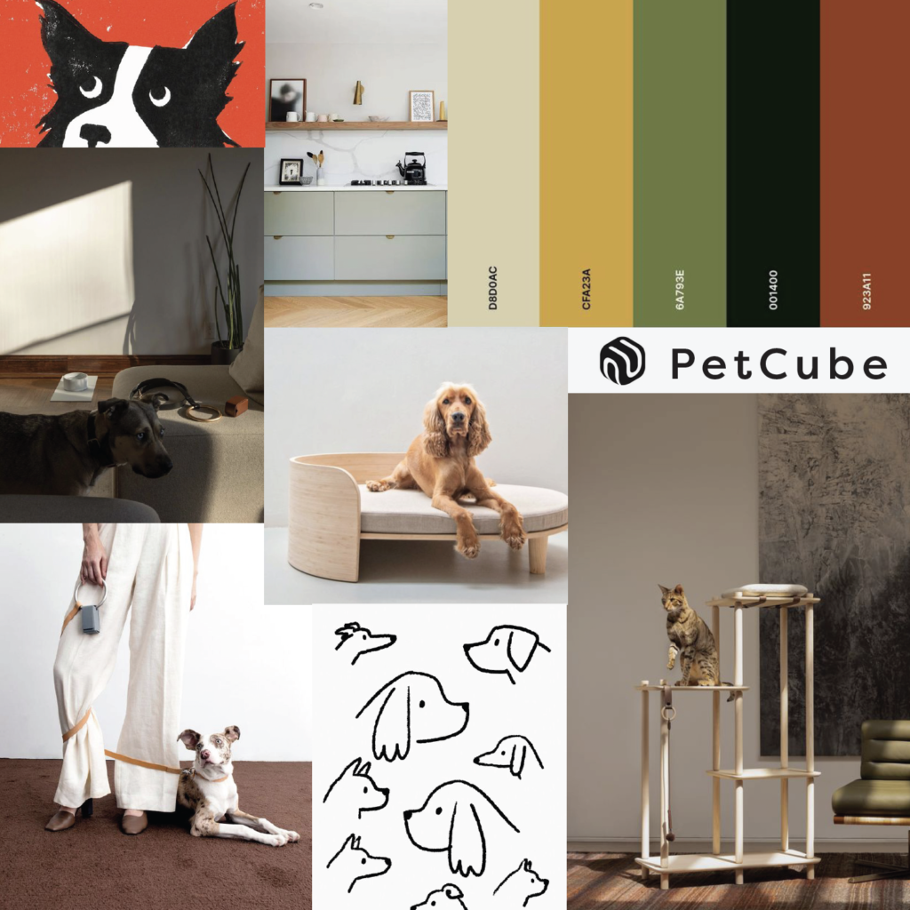
For discerning pet owners who appreciate the finer things in life, Petcube Bites 2 is the epitome of luxury and sophistication in the world of pet gadgets. Designed to cater to those who seek the utmost quality and style, this advanced pet camera and treat dispenser offers a premium experience that goes beyond the ordinary.

The choice of earth-tone colors, including green, yellow, cream, burgundy, and black, further enhances the allure for luxury pet owners. These colors convey a sense of exclusivity, sophistication, and a connection to nature. The combination of vibrant hues and deeper, moody shades creates a visually captivating palette that speaks to the refined taste of the target audience. Incorporating playful illustrations into the branding of Petcube Bites 2 adds an extra layer of approachability and charm, making the product even more appealing to pet owners. These illustrations serve as visual storytelling elements, capturing the joy, energy, and whimsy of the pet-human relationship.

By appealing to luxury pet owners who can afford a device of this caliber, Petcube Bites 2 offers an unparalleled experience that complements their refined tastes and high standards. It combines aesthetics, functionality, and advanced technology into a single elegant package, elevating the bond between pet and owner to new heights. Petcube Bites 2 is a testament to the commitment of luxury pet owners to provide their furry companions with nothing but the best.

Categories
Blog Post

Pluses and Minuses (3)

  • Freelance:
    • Pluses: Have the freedom to choose their projects, set their own rates, and work on a flexible schedule. They can work from anywhere and have more control over their work-life balance. Freelancing often allows for a diverse range of projects and clients, which can provide exposure to different industries and experiences.
    • Minuses: Responsible for finding and securing their own clients, which can involve significant marketing and networking efforts. Income can be irregular and uncertain, and freelancers often have to handle administrative tasks like invoicing and taxes on their own. Freelancers may also face challenges in maintaining a stable income and finding new clients consistently.
  • Part-time:
    • Pluses: Offers more flexibility than full-time work, allowing individuals to pursue other interests or responsibilities alongside their job. It can be suitable for those who need a reduced work schedule or have other commitments, such as caregiving or other responsibilities.
    • Minuses: May not receive the same benefits as full-time workers, such as health insurance or retirement plans. There may be limited opportunities for career advancement or job security compared to full-time positions. Part-time work may also result in a lower overall income due to reduced hours.
  • Contract/Agency:
    • Pluses: Can provide opportunities for individuals to work on specific projects or assignments with different companies. It offers flexibility in terms of project duration and exposure to diverse work environments. Contractors may also have the potential to earn higher hourly rates compared to full-time employees in similar roles.
    • Minuses: Lacks the stability and benefits associated with full-time employment. Contractors may not receive the same level of job security or access to benefits like health insurance and paid time off. Finding new contracts consistently can also be a challenge, requiring constant networking and job searching.
  • Full-time:
    • Pluses: Typically provides stability, a steady income, and comprehensive benefits packages, including health insurance, retirement plans, and paid time off. It often offers more opportunities for career advancement, professional development, and job security. Full-time employees may also benefit from a structured work environment and a sense of belonging to a team or organization.
    • Minuses: Can be more rigid in terms of schedule and may require longer working hours or overtime. It may offer less flexibility in terms of choosing projects or managing work-life balance. Some individuals may find the routine nature of full-time employment limiting or less suitable for their lifestyle preferences.

I generally prefer to have a more flexible schedule so I’d like to seek roles that allow for that. I plan to keep my living expenses as low as possible to allow for more flexibility and experimentation, which I hope would ultimately allow for a variety of work experiences. Then I’d be given the ability to refine to what works best for my personal goals, values and longterm needs as a designer.


Three job postings for Contract/Agency work:

  1. https://www.indeed.com/q-freelance-contract-graphic-designer-jobs.html?aceid=&gclid=Cj0KCQjwmZejBhC_ARIsAGhCqne3wFBoSYwinv0X5J3Mz1yoZeQ2n7YAZhaGtchmFolaL0q4BHjg6ZIaAttVEALw_wcB&gclsrc=aw.ds&vjk=361da37ed7b675b5
  2. https://www.indeed.com/q-freelance-contract-graphic-designer-jobs.html?aceid=&gclid=Cj0KCQjwmZejBhC_ARIsAGhCqne3wFBoSYwinv0X5J3Mz1yoZeQ2n7YAZhaGtchmFolaL0q4BHjg6ZIaAttVEALw_wcB&gclsrc=aw.ds&vjk=1ceca185daa88383
  3. https://www.linkedin.com/jobs/search/?currentJobId=3604504650&f_WT=2&keywords=graphic%20design%20contract&refresh=true

Categories
Blog Post

Textures, patterns, shapes (2)

Categories
Blog Post

Hockey Jersey (1)

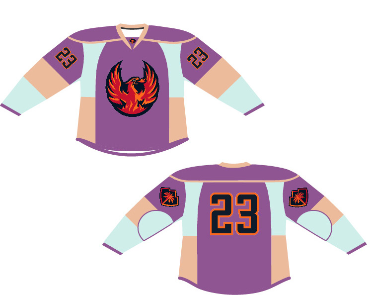
The color palette highlights both the location and the music festival: the blue and purple hues are on the Coachella Music Festival poster and the nude/tan represents the desert location. I think it stands out from a typical hockey jersey by using more subdued earthy tones rather than highly saturated colors. I did incorporate the standard pop of color on the key elements of Firebird jersey, the orange/black logos and numbers.

Categories
AI Module

AR Panel Project

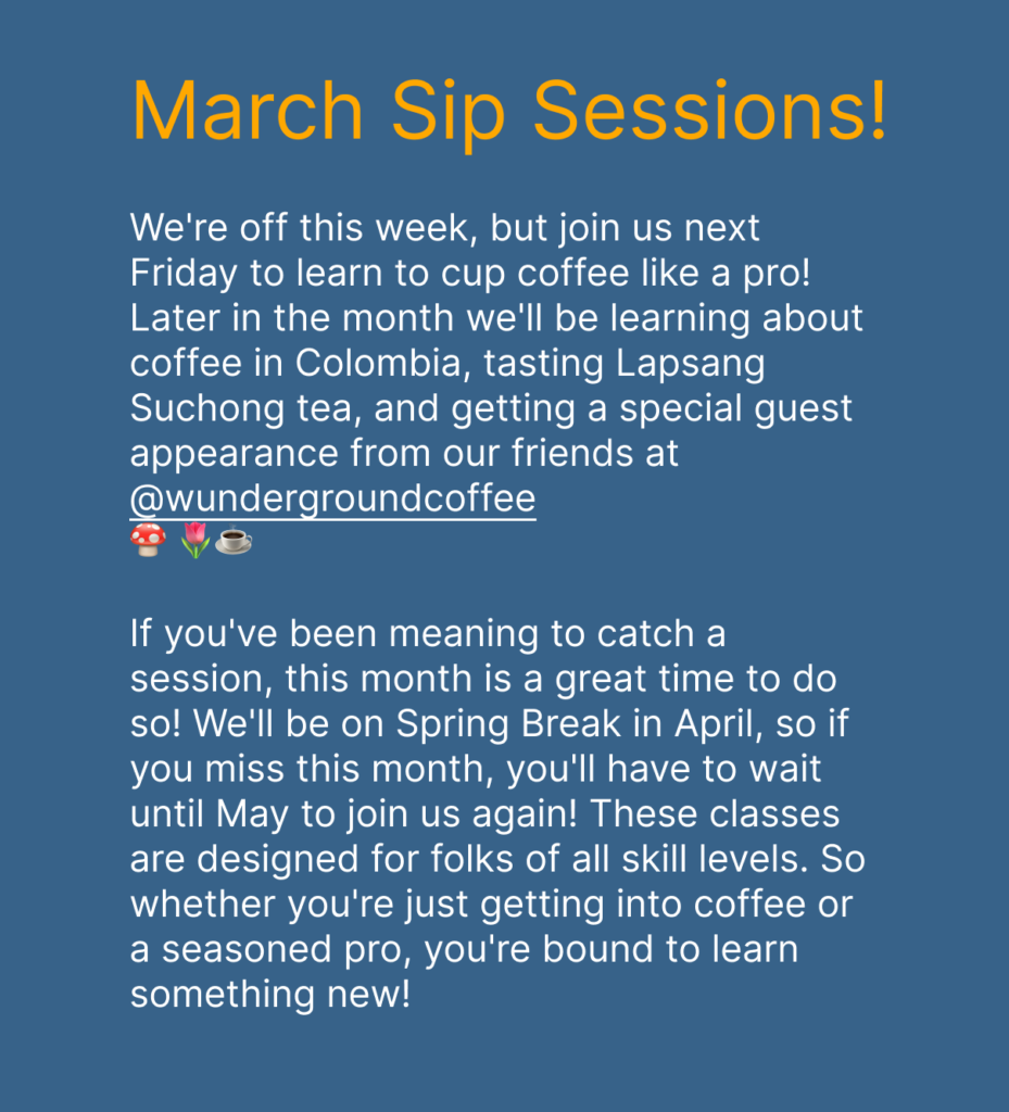
My team decided our point of interest would be coffee shops surrounding the Lake Washington area, showcasing events that might take place within these spaces. I created my panels in Figma and then exported the panels as png files into the Eyejack software, I also found a fun gif of a coffee mug dancing to place in the center of my two panels. My location is the coffee shop I work at on weekends and the event showcased on my panels are monthly educational events related to learning more about coffee and teas. These events are free of charge and completely open to the public.

Categories
Blog Post

Reflection (9)

A consistent theme I picked up on throughout my time listening to many of our guest speakers is embracing the unknown. For years I naively thought that my life would contain a series of events that would become a clear trajectory building a solid career for myself, and boy was I wrong. That may work out for a lucky few but many of our speakers didn’t have that experience and they embraced the unknown. That really resonated with me. They kept moving when something didn’t work out, taking time to process failures and pivot from there leading them to their next opportunity that would offer further clarity. That is what I consider true growth which deeply inspired me.

I do consider myself a lifelong learner and follow my intuition when it comes to deciding where I place my energy. With that being said, I think there are several routes where I could end up. I enjoy getting into the nitty gritty of developing a conceptual idea and seeing it to fruition, but knowing myself and my past experiences I struggle with day-to-day monotony and sometimes that scares me. Realistically I do need a lot of variety in projects to motivate and energize my creative well. I think I would like to work for a design agency that has a lot of diversity in projects, ultimately leading me to an Art Directing position. I often think about what I want to visualize when looking back on my career in 30+ years, one clear thought that comes to mind is never staying in anything until a bitter end and knowing when to move on. I know for certain I don’t want to look back and realize that I spent years of my life doing something that was not giving back to me energetically and only depleting my well being, or even contributing to something that doesn’t align with my personal values as a designer. So I would say trusting myself and my intuition is the most important factor in staying true to myself.

Categories
Blog Post

CUT Concept (8)

A concept that would be interesting to explore would be to engage people on the topic of gender. There are many perspectives on the topic and it would certainly create interesting conversation. It would illicit an interesting response because the perspectives will shift dramatically based on how people identify and their own specific background, whether that be where they grew up, religious affiliations or even parental values that were instilled. I think it would be wise to ask at least 20-30 subjects, along with collecting enough information about the participants background that could give the viewer a lead on how their perspective was shaped.

Categories
Blog Post

Metaverse Event (7)

The experience felt like being in a video game, I walked around the venue for a while and checked out the landscape of the area. I didn’t encounter many people, but it was fun to walk through the different experiences. That being said, I don’t have interest moving forward because there wasn’t much to interact with outside of just walking around and looking at things. For me it felt like I was in a video game without any purpose, if there was a game or activity that increased my engagement I would have interest moving forward.

I personally don’t think there’s much potential for advertising that would be impactful, largely due to advertising being broadly spread out throughout different apps and experiences. The only way UI could see it be successful is targeting a very niche demographic of people. Personally, I don’t get the point in entering a Metaverse to seek out that sort of consumption. As an entrainment tool, of course! Especially if they create more engagement with games and activities that give the user a purpose within the Metaverse.

Categories
AI Module

Ikea Place AR App – UI/UX Review

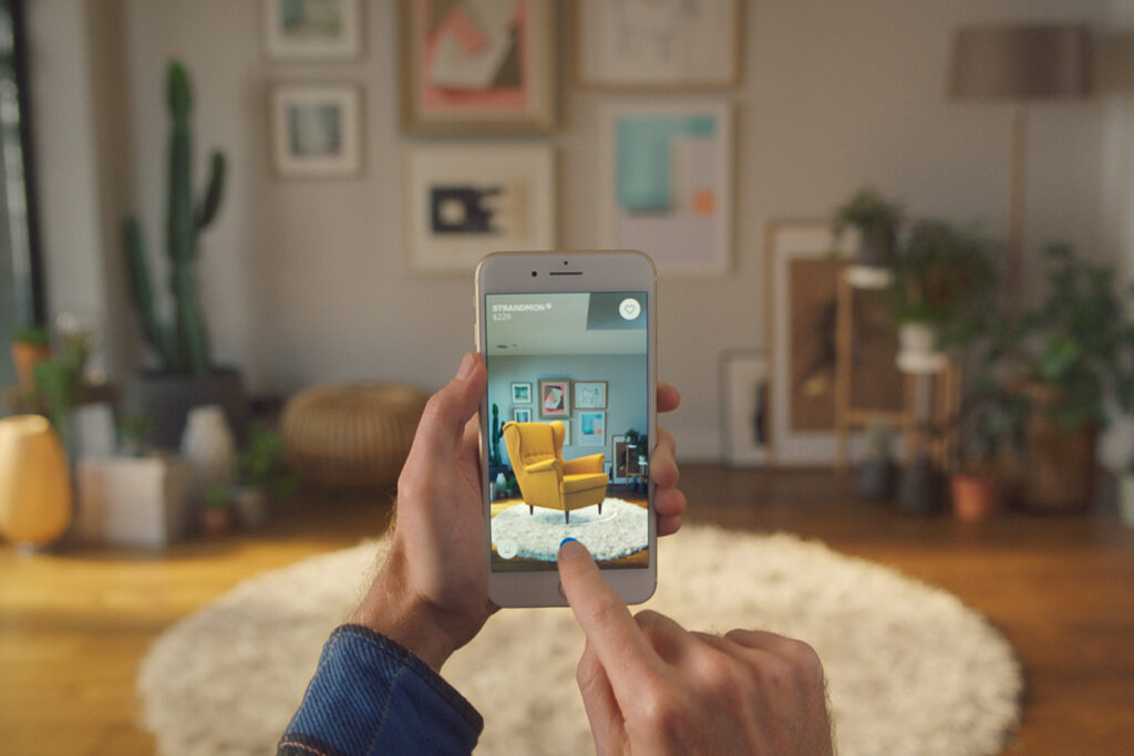
IKEA Place lets you virtually place true-to-scale 3D models in your very own space and make them appear as part of your world. Combining the latest AR technology and IKEA’s furniture catalogue this app allows you to visualize how furniture will fill a space with 98% accuracy. Users can browse through over 2,000 IKEA products on an online database, to make their selections. Once chosen, users must point the device to the desired spot in a room, then drag and drop the selected product onto the space.

I thought there could be room for improvement when initially setting up the app, I think it would helpful to immediately give the user a walk through of how to scan the space, select the furniture and place the furniture in AR. Even though this wasn’t provided it was relatively easy to figure out the features. I also found that moving the furniture around was tricky, when I moved an item it would be floating in mid air afterwards, so maybe a button to better navigate and place the furniture would improve this.