Blog, Dog, Bog

My creative process unfolds across three workstations, prominently featuring two analog desks that serve as versatile spaces for layout, sketching, collaging, and painting. At my digital station I work from a Mac mini with a 32″ monitor. I do most of my digital painting on my iPad, sitting on the floor or in bed.

Freedom to Express

Freedom to express means the ability to channel one’s innermost thoughts and emotions without constraint. In my creative sanctuaries, this liberty comes to life through the splashes of paint on canvas, the fluid strokes of a pencil sketch, and the experimental compositions of collage work. Each analog desk becomes a playground for raw ideas and unfiltered feelings, transforming them into tangible art forms. Here, I am unhindered by technical limitations or external judgments, allowing pure expression to flourish. Whether it’s the tactile sensation of mixing colors or the deliberate placement of paper pieces, every action is a declaration of self, a testament to the unfettered creativity that breathes life into my art.

Freedom to Explore

Freedom to explore embodies the spirit of curiosity and the relentless pursuit of new horizons. At my digital workstation, this freedom is represented by the vast expanse of the 32″ monitor connected to my Mac mini. It is a portal to boundless creative possibilities, where digital painting, graphic design, and multimedia projects take shape. With each click and swipe, I traverse diverse artistic landscapes, experimenting with new techniques and styles. The digital realm offers an infinite canvas, enabling me to delve into complex compositions and innovative designs. Here, exploration knows no bounds, and every project is a journey into the unknown, driven by the desire to discover and innovate.

Freedom from Expectation

Freedom from expectation is the liberation from external pressures and preconceived notions. This sense of freedom is most profoundly felt when I retreat to the comfort of my iPad, whether I’m sitting on the floor or lounging in bed. In these intimate settings, the act of digital painting becomes a meditative practice, unburdened by the need for perfection or adherence to standards. It is a space where mistakes are embraced as part of the creative process, and each stroke is an authentic expression of the moment. Free from the weight of expectation, I can create art that is true to my vision, allowing spontaneity and intuition to guide my hand. This freedom transforms my creative journey into one of self-discovery and genuine expression.
Briley’s BBQ

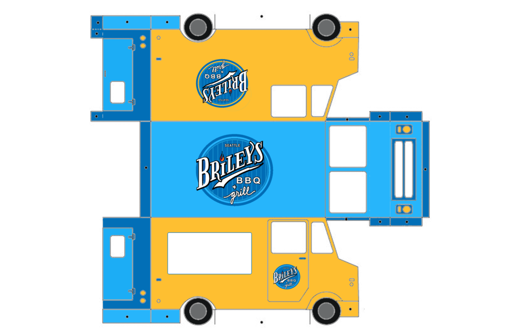
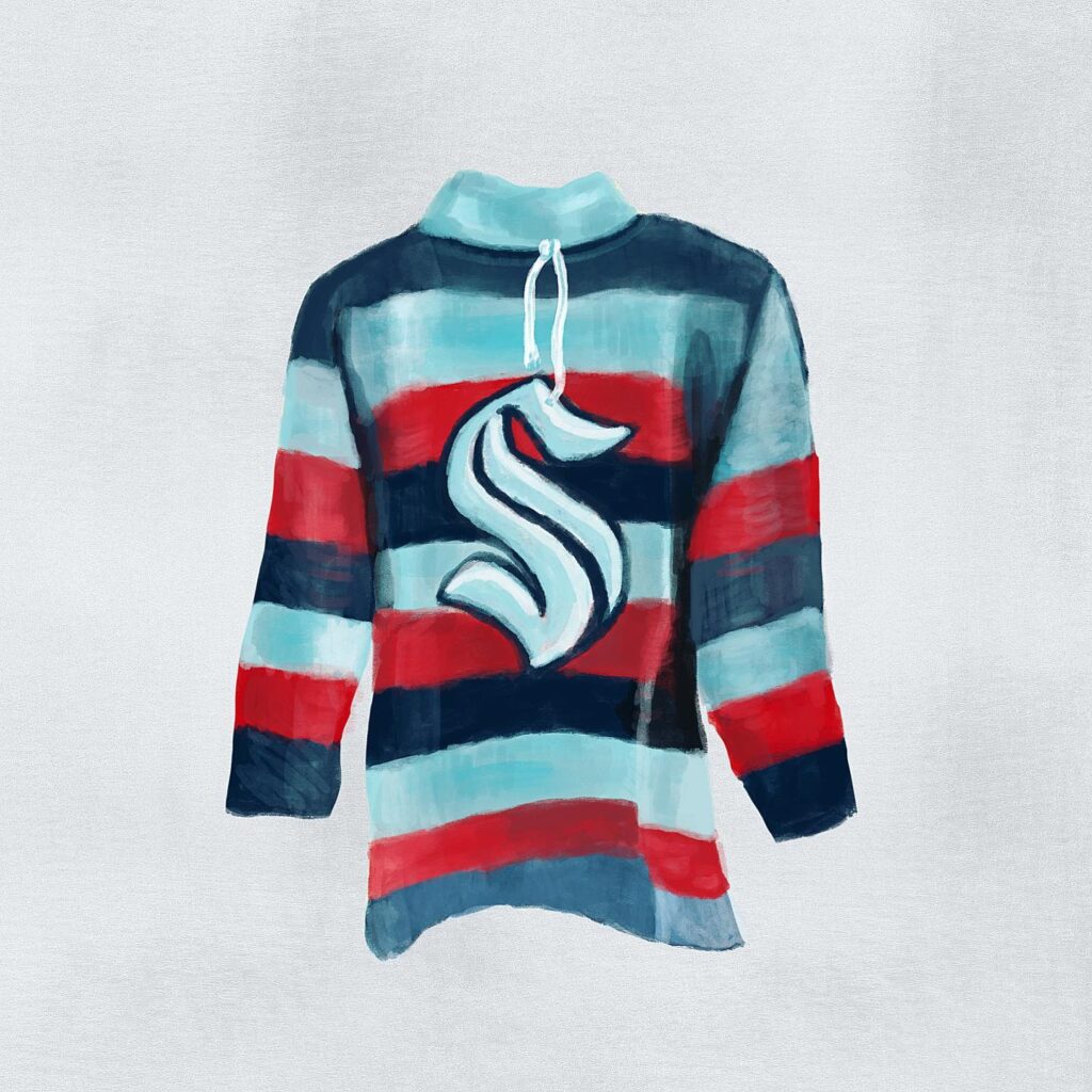
Just down the street, there’s this place serving up The Dorfman Platter. You get to pick two different half-pound meats and a slice of bacon. Their Baby Back Ribs, served in 3-4 bone portions, are super tender and flavorful, kinda like Carolina BBQ but with a twist of the Pacific Northwest.

So, for the food truck design, I noticed their logo has this flame thing going on. I decided to match it up with their brand colors—went for this mix of blue and yellow. The yellow’s supposed to make you hungrier and it kinda fits with the smoky vibe of the food.

Blender Project

Working alongside Timneet and Elan on the Blender project was truly a remarkable experience. Despite our limited time and budget, our collaboration from inception to completion yielded something we’re all immensely proud of. From brainstorming to final touches like audio and animations, each of us played a vital role in bringing the project to fruition.

Leveraging our collective strengths as illustrators, we decided on a blend of illustrated and live-action elements. Elan skillfully crafted the town of Sagebrush, providing backdrops and lively townsfolk. Timneet breathed life into our memorable main characters with their unique illustration style, while I contributed a medley of props, figures, and typographic elements to fill the scenes.

Elan’s dedication to their role as The Bartender Delbruck was exceptional, embodying the character with flair. Additionally, they took charge of audio editing and mixing, keeping us involved and seeking our input throughout the process. Timneet not only brought our illustrated characters to life but also ventured into directing for the first time, relishing the opportunity to be behind the camera.

The ideation and storyboarding phase emerged as the cornerstone of our workflow. Establishing a solid storyline early on provided us with a clear roadmap for development. Remarkably, we pieced together our narrative on the very first day of collaboration, maintaining a relaxed atmosphere while remaining open to creative possibilities. I’m truly proud of what we made. 

Grant Proposal

Addressing Racial Disparities in Homelessness: A Path to Equity

Organization: Mary’s Place

Amount Requested: $25,000

Introduction: Racism and homelessness are deeply intertwined issues, with Black and Indigenous Americans disproportionately affected. In King County, the disparity is glaring, with Black and Native American individuals representing a small fraction of the population yet comprising a significant portion of those experiencing homelessness, particularly at Mary’s Place. To effectively combat homelessness, we must first confront the structural racism that underpins it.

Project Overview: This grant seeks to address the root causes of racial disparities in homelessness through a multi-faceted approach. By tackling systemic racism and its manifestations in healthcare, economic opportunity, and housing policies, we aim to create a more equitable society where all individuals have access to stable housing and support services.

Objectives:

  1. Data Analysis and Program Evaluation: Utilize funding to enhance data collection techniques and analyze program outcomes to identify and address inequities within our services.
  2. Community Engagement: Engage guests in program reviews and exit interviews to better understand their needs and experiences, ensuring culturally relevant and responsive services.
  3. Partnerships with BIPOC-led Organizations: Forge partnerships with Black, Indigenous, and People of Color (BIPOC)-led organizations to provide holistic support and address the unique challenges faced by marginalized communities.

Budget Breakdown:

  • Data Analysis Tools and Software: $5,000
  • Community Engagement Initiatives: $7,000
  • Partnership Development and Outreach: $8,000
  • Administrative Costs: $5,000

Expected Outcomes:

  • Enhanced understanding of racial disparities in homelessness through comprehensive data analysis.
  • Increased engagement and satisfaction among guests through culturally relevant programming.
  • Strengthened partnerships with BIPOC-led organizations to better serve marginalized communities.

Conclusion: With your support, Mary’s Place can continue its vital work in addressing racial disparities in homelessness and advancing equity, diversity, and inclusion. Together, we can create a more just and compassionate society where everyone has a place to call home. Thank you for considering our proposal.

Design System Field Trip

Design systems are rad. Why? Because they establish rules for a shared visual language so that creatives can work more quickly and seamlessly. The practice of using a well-built design system can save teams tons of time. The top three probably most recognizable design systems belong to Microsoft, Apple, and Google. So, this morning I visited:

Apple’s HIG

Microsoft’s Fluent 2

Google Material Design

Apple’s HIG (Human Interface Guidelines) and Microsoft’s Fluent 2, have swapped color palettes. As someone who has been using both design systems for a long time, I HATE THIS. I may be hyper sensitive, but it is also very off-putting to land on an all black interface or all white interface. Material is the latest version of Google’s open-source design system and is my favorite because it is the easiest to navigate. I am not sure if it is because I am getting old, but the mid range of tones is much easier on the eye. 

Which reminds me, I still need to find an optometrist.

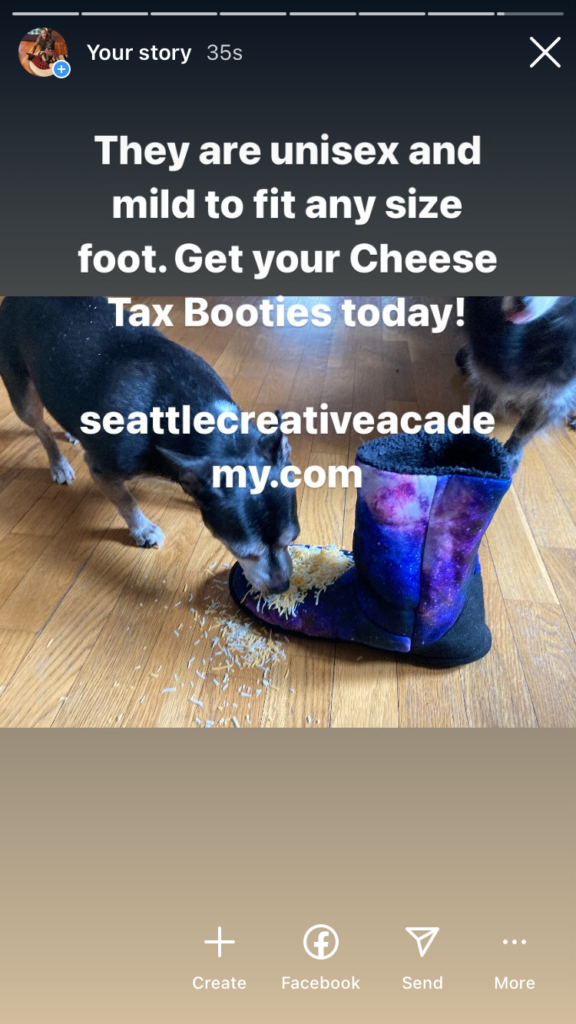
Cheese Tax Booties

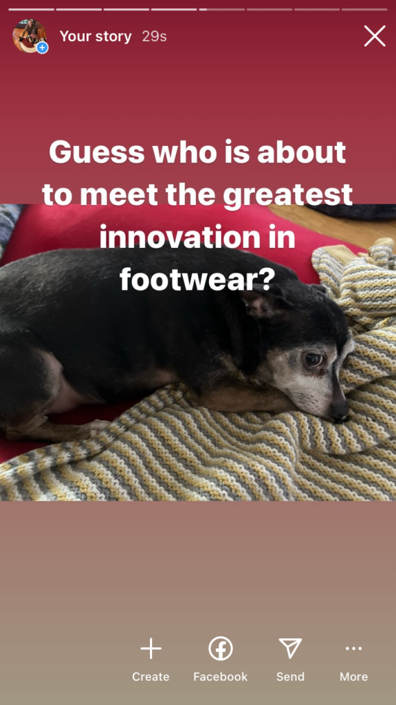
Make love come your way with your very own limited edition Cheese Tax Booties.

Everyone deserves love!

Introducing the Cheese Tax Booties, the ultimate fusion of comfort and style for your feet. Crafted with meticulous attention to detail, these booties are designed to elevate your lounging experience to new heights.

Features:

  1. Supreme Comfort: Slip into a world of unparalleled comfort with the plush interior lining of the Cheese Tax Booties. Whether you’re relaxing at home after a long day or gearing up for a cozy night in, these booties provide the perfect refuge for your tired feet.
  2. Cheese Tax Design: Adorned with a whimsical cheese tax pattern, these booties add a touch of playful charm to your loungewear collection. Each bootie features a unique arrangement of cheese tax symbols, making them a conversation starter wherever you go.
  3. Durable Construction: Built to withstand daily wear and tear, the Cheese Tax Booties feature a durable outer material that ensures longevity without sacrificing style. Say goodbye to flimsy slippers and hello to footwear that stands the test of time.
  4. Versatile Wear: Whether you’re snuggled up on the couch with a good book or making a quick trip to the kitchen for a midnight snack, these booties are your go-to choice for all indoor activities. Their versatile design makes them suitable for any occasion, providing comfort without compromise.
  5. Perfect Gift: Looking for the ideal gift for the cheese enthusiast or loungewear aficionado in your life? Look no further than the Cheese Tax Booties. With their unique design and luxurious comfort, they’re sure to be a hit with friends and family alike.

Indulge your feet in luxury and style with the Cheese Tax Booties. Treat yourself to the ultimate lounging experience and step into a world of comfort like never before.