Categories
Uncategorized

Blog Assignment #4- Blender

Our Blender Project, Bus World, was a pretty successful endeavor despite its rather large hiccups. 

We started out with much more ambitious plans- we had an entire storyline, where Suzy had a best friend named Tuzy, where Suzy’s journey through Bus World taught her lessons about life and following your heart. But Courtney snapped us out of our delusion and let us know that there is no way that we would have enough time to put all of that in 2 minutes. So, we simplified it, and despite the simplified version still being potentially a little too long, we (Clayton and I, who wrote the story), were determined to make it work. I think if Cedar was there for the planning and writing of the film, things would have been a little more normal… but it was Clayton and Sana. As Brit says, it was bound to turn out kind of bizarre. 

This project was simultaneously so fun and stressful. We totally underestimated the amount of time it would take to do the crafting aspect- especially because I didn’t know what tiling was, and was trying to make large props involving printed digital artwork. Courtney once again staged and intervention to let us know of the existence of tiling, which suddenly made things move so much faster… but I was having an absolute meltdown throughout that, since I was trying to manually figure out sizing (knowing what size paper to print different sections, accounting for proportion with the puppets and backdrop). 

Clayton made and brought the sock puppets- which turned out awesome. They also made them remarkably expressive, and the hand-acting was so well done. 

Throughout all this, Cedar was such a trooper. 0 complaints about the bizarre story and character ideas. She was basically like, “ok let’s make it happen”. She took on the task of finishing cutting the bus out of the foam core (and succeeded beautifully). And she knew exactly what she was doing when she finally started filming- it looked awesome. 

Fun project- I wish we had a little more time but it’s our fault for deciding to do something so labor intensive. But it was a much better alternative to getting in front of the camera and acting something out. 
Categories
Uncategorized

Blog Assignment #8

Freedom To Express

I am a pianist (or I was… I trained classically for 11 years from age 5-16. My god. It’s already been 6 years since I quit..??).

Freedom to express. I would play a piece how I see fit. I would play a piece how I envision the emotion it is conveying. Being rigorously trained classically, there was rarely room to add my own flare- a complete restrain of the freedom to TRULY express. Express, yes… but tasteful amounts only… there was always a fine line between “just right” and “too much”.

I would add unnecessary, necessary flairs. I would over or underexaggerate crescendo’s, decrescendos, slam the tips of my fingers into the keys to draw out the sharpest, most jarring, staccatos

That’s how I would depict “Freedom to Express”.

Freedom to Explore

Why, I’d improvise.

Today, in class, we were creating scenarios. User stories, if you will. Someone at my table said, “and then she walks into Timmy doing some WILD art”…

So, I would do some WILD art!

Maybe it means trying to create something alike to those pieces in museums that people see and go, “my 6 year old could do that”. Maybe it means picking up trash and glueing it to a canvas to create a sculpture. Maybe it means spitting on a drawing. Maybe it means tearing one up.

To explore is to go beyond. I would try to think of things that I had never even considered doing before.

Freedom from Expectation

Easy- I would do absolutely nothing.

I think this one especially is very subjective; expectations of someone are relative to those they surround themselves by. The people that surround me expect things of me. So, to be free from it, is to do nothing, and to be ok with it.

If this were to be a piece of art, it would be like drawing a blue line down the middle of a white canvas. “My 6 year old could do that”. Maybe it would be playing Twinkle Twinkle Little Star or Hot Cross Buns.

Did I do this assignment right? Do you even read these?

Categories
Uncategorized

Blog Assignment #6

My mother

loves the color yellow.

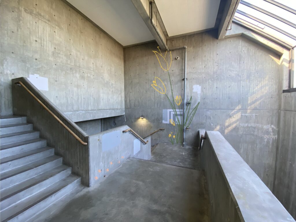
Her condo that she bought 2 Junes ago, is mostly white, save for splashes of yellow of the place mats on her glass table, the kitchen towels patterned with lemons, and the yellow tulips I got her for Mother’s Day.

She’s remodeling the kitchen and bathroom. When she moved in, she replaced the floors to be an ash gray wood- I don’t know what it is- but I asked her why she wanted everything to be hospital white and gray. She said she prefers to be able to build color on top of it.

My mom loves yellow tulips. I’ve never gotten any other type of flower for her.

My mom loves the color yellow.

The second part of the mural won’t upload… but it’s just more tulips

And, she has a cat. 🙂 which is why there are paw prints on the wall

Categories
Uncategorized

Blog Assignment #5

For my food truck, I decided to design one for Hiroshi’s Poke. I didn’t realize they had multiple locations before this assignment, nor did I know they had a logo!

I decided on this place because I was trying so hard to think of a favorite restaurant of mine, and I genuinely couldn’t think of anything (I don’t really go out to eat, it’s so expensive!). This is somewhere I used to go to with my family a lot (it was either here or 45th Stop, also very good).

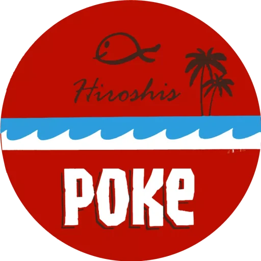
This is the logo:

Based on this, here are some rules that I decided on for the truck:

  1. the color of the truck shouldn’t overpower the logo.
  2. the logo should be on the back, and sides
  3. the waves should be a design on the sides of the truck!

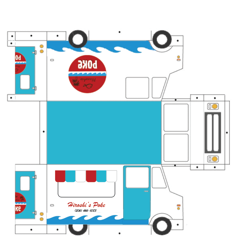
Based on #1, I decided it was best if the truck was left white. The accent colors should be blue, so that the only red on the truck is the logo, so that it stands out.

The logo on the back would be on the doors- so each half of the door would have half of the logo. Since there will be a “food window” on one of the sides of the truck, maybe the logo should just be blown up and put in the background as though it’s a texture. Or, we could toss all possibilities of a logo aside on that part of the truck, and just have the name “Hiroshi’s” written on that font somewhere. Maybe underneath the food window? Above? I’m assuming there’s going to be an overhead thing of sorts.

Now that I’ve thought about all this, I started to think about how to make the actual design.

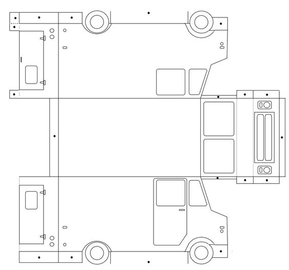
First, I decided to recreate the “dieline” in illustrator:

And then I realized… I built it poorly, and the main parts (like the body of the truck, the door), are not individual, connected lines. So this was basically useless.

I had a sudden flashback to something I learned in Jason’s photoshop class: the paint bucket tool. With “all layers” selected! I sat there wondering why I didn’t think of this before. I had wasted a lot of time rebuilding a die line.

So anyway, that’s what I did. Then I brought that into illustrator and build the rest of the designs and patterns.

Categories
Uncategorized

Blog Assignment 3 Q3

Something I’ve always been passionate about are animals, and for a long time, I was so sure that I would go into a career field involving them. 

In Spring/Summer of 2021, I interned for the PAWS Wildlife Rehabilitation Center full time. This was when I was planning on going into Veterinary Medicine, specifically for wildlife rehabilitation; I was scheduled 40 hours a week, but definitely worked “overtime”- I was an  unpaid intern. 

I loved that job, but oh my god- it’s insane I wasn’t getting paid everything for the amount of work I was doing. I believe this was before Washington passed a law that requires interns to be paid, so it was legal, but it still blows my mind that my payment was a $60 Visa Gift Card and a water bottle. And occasional snacks and otter pops. 

I’ve no clue what it’s like there now- I’m sure (I hope) interns now are getting paid. I also hope that the facility is still well equipped now that they have to put costs into paying interns… 

Overall, the facility was extremely understaffed and over reliant on volunteers. The summer months were extremely busy, since the public came into contact more with wildlife. This was also during a heat wave, where birds were falling and dying left and right from lack of water and heat exhaustion. The place rode on the backs of unpaid and underpaid workers; I recall my mentor, a rehabilitator, telling me he gets paid $25/ hour. This man was saving lives of native wildlife EVERY DAY and he was only getting paid $25/ hour….?!?! I was appalled. I am still appalled. 

So, if I were to have $25,000 of spare cash on hand, I would give it to the organization to pay their 3 rehabilitators on site just a little bit more. A bonus, if you will. This is probably the wrong way to be donating this money, but these rehabilitators deserve much better pay. They’re helping preserve, protect our native biodiversity, and are extremely underappreciated. 

Categories
Uncategorized

Blog Assignment #2, Q3

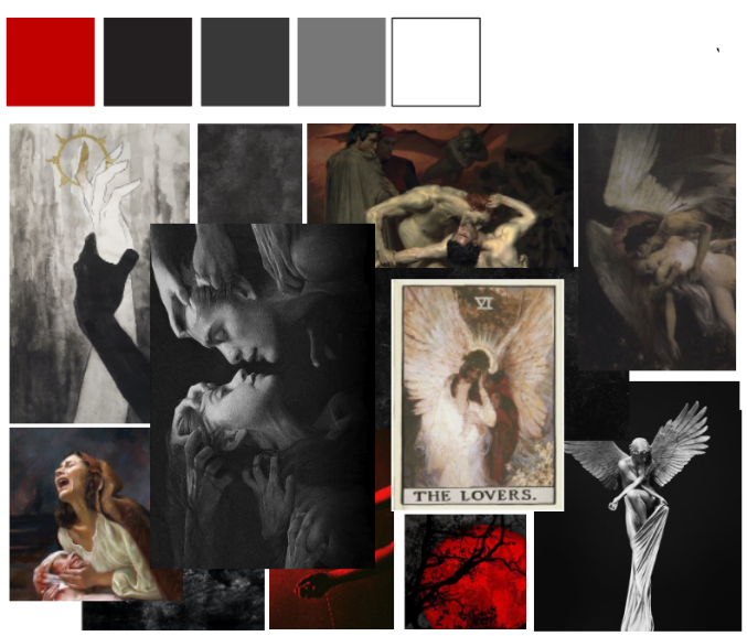
This Stanley will be for the Dark Romance girlies (or hims or theys or whoever is into dark romance). This is suitable for for the goth girlies (Or hims or theys or whoever) who wants to make sure that everything in their home has a cohesive aesthetic. The drama needs to exist everywhere. Including the dog bowl.

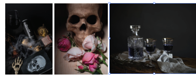
The dog bowl’s color palette is red and shades of black. The pattern on it will be a gritty, smudgy texture, mutch like the paintings portray. They will have “The Dog Bowl” written on it in a blackletter font, as shown below… they might even have wings on them. They might have some of these images printed on. Let’s just say the consumer can custom make these.

Categories
Uncategorized

Blog Assignment #1 (Q3)

Carbon Design System

  • Carbon Design System is not a company; it is a design system developed by IBM, a global technology company. They specialize in computer and technology solutions.
  • The design system is meant to be modular, meaning that components can be mixed and matched to suit design needs. The components are designed so that despite mixing and matching, consistency can be achieved.
  • It is open source! The code is available for the public to freely adjust and use. There is a community behind it, which I find cool.
  • Design tokens are used to define the visual properties of components, such as color and typography. This creates ease in updating and maintaining the design system.

The Guardian Digital Design System

  • “Thrashers are custom-designed containers usually promoting a single article or series.” This is new vocabulary for me! I guess it’s kind of like a highlight on a page.
  • “The desktop grid is based on columns of 60px with 20px gutters.” Is this a standard? I’m curious why there are no horizontal grid lines.
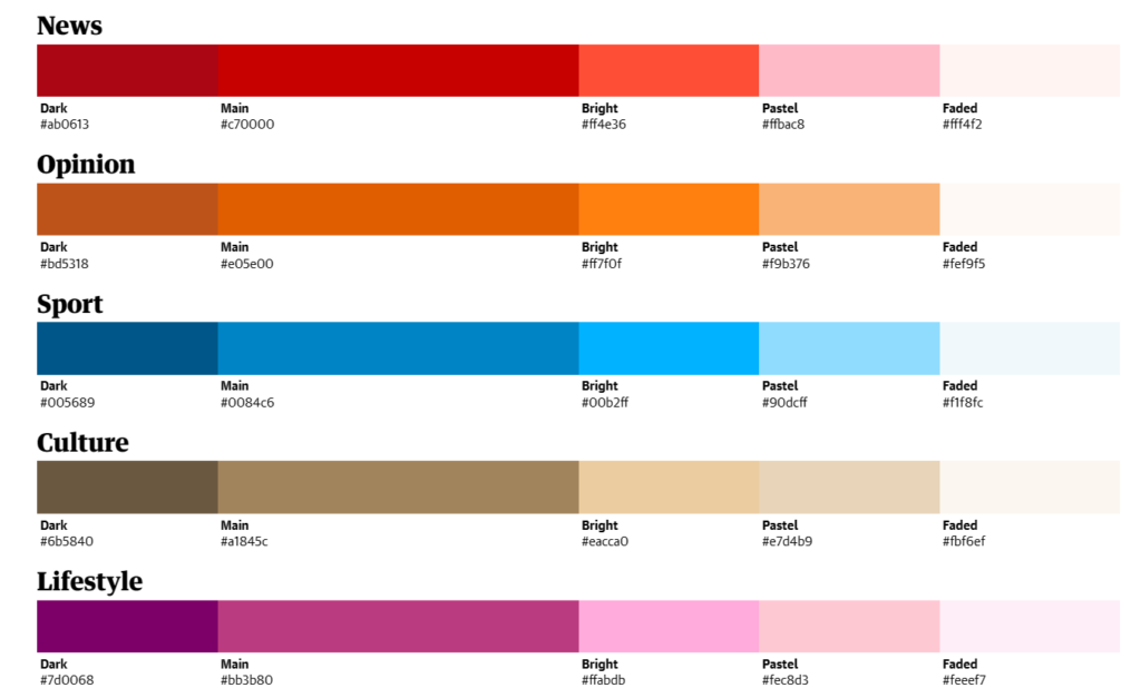
  • Color: “dark, main, bright, pastel and faded colour variant”. These colors totally make sense for each category… why? How were they decided on?

Atlassian Design System

  • It is customizable: designers can customize the design system to match their brand or specific application requirements while still maintaining consistency with Salesforce’s design principles.
  • The site offers recommendations for fonts, including sizes, and spacing, to ensure that text is legible and easy to read across different devices and screen sizes. They also offer guidelines for appropriate line lengths.
  • There is an entire system specifically for icons, with guidelines for sizes and color. There is an emphasis on accessibility and “Internationalization”.
Categories
Uncategorized

AR Panel Project

Third Place Books, Ravenna

Dymtro and I decided on local bookstores; my personal pick was Third Place Books, located in the Ravenna neighborhood in North Seattle.

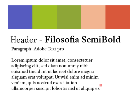
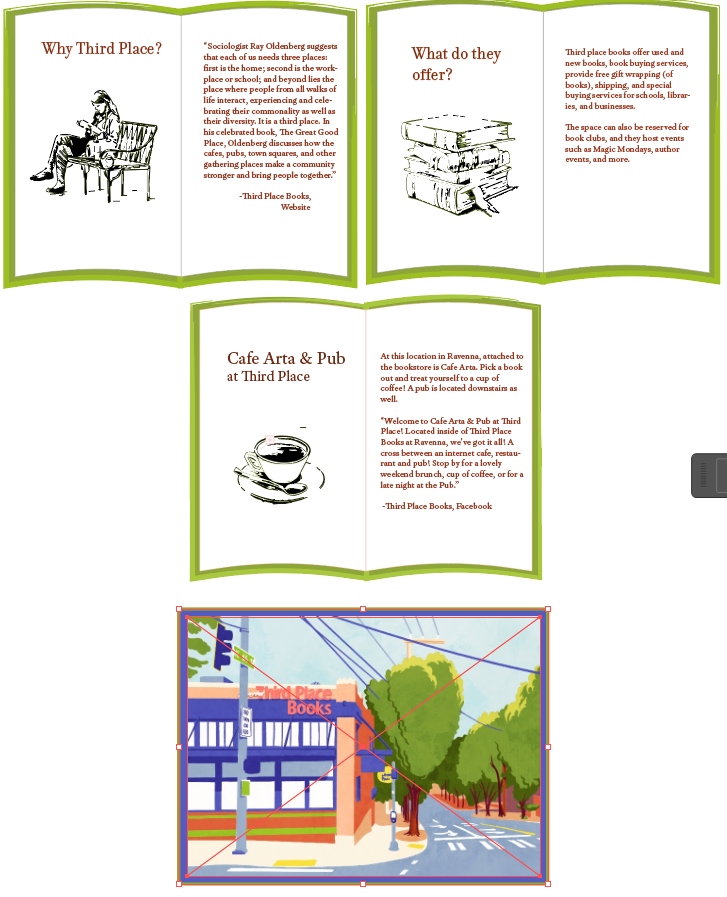
I used Adobe Illustrator for my portion of the project. I created a very vague style sheet for the two of us:

The color palette is created from an image from the bookstore website; I really loved how vibrant and warm it was. I thought it was perfect for the nice weather coming up this weekend.

I decided that I wanted to have my panels be books. I built the books in illustrator and sourced the images online. I image traced them, expanded them, and put the slightest outline in portions of the image with the same color green used on the cover of the books.

The video can be seen as a YouTube Short (better version, it has Clay Pigeons playing in the background):

https://youtube.com/shorts/LwnsVlMQRpE?feature=shared

Alternatively, this one.

Categories
Uncategorized

Blog Post #1

Description:

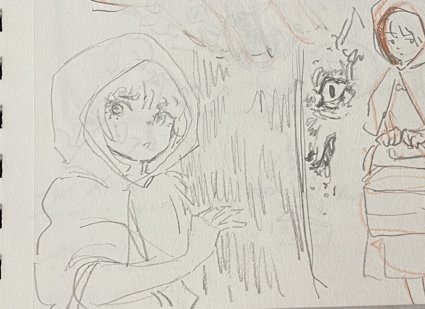
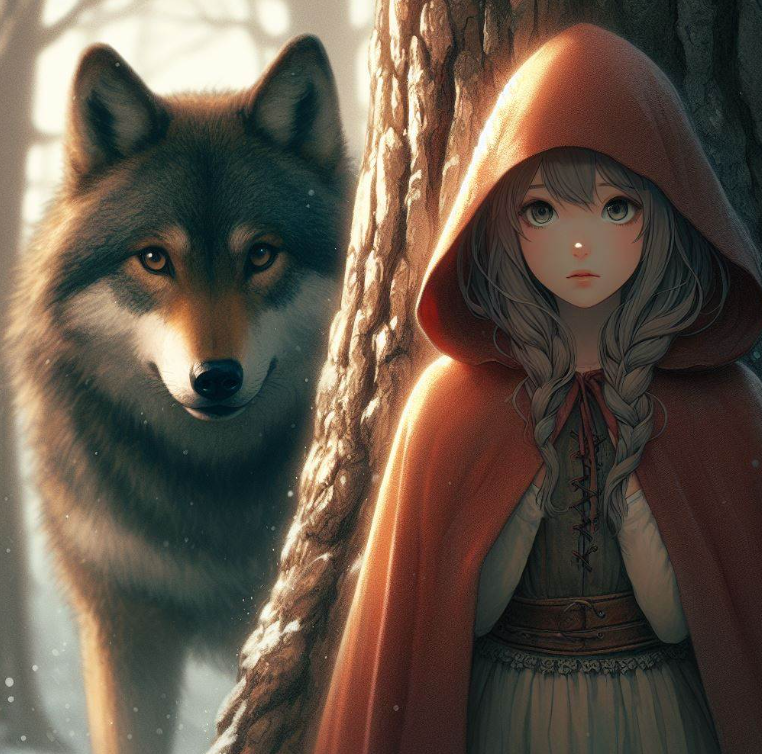
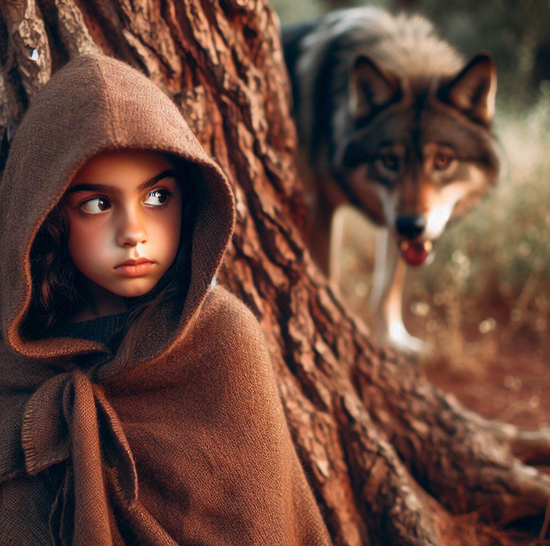
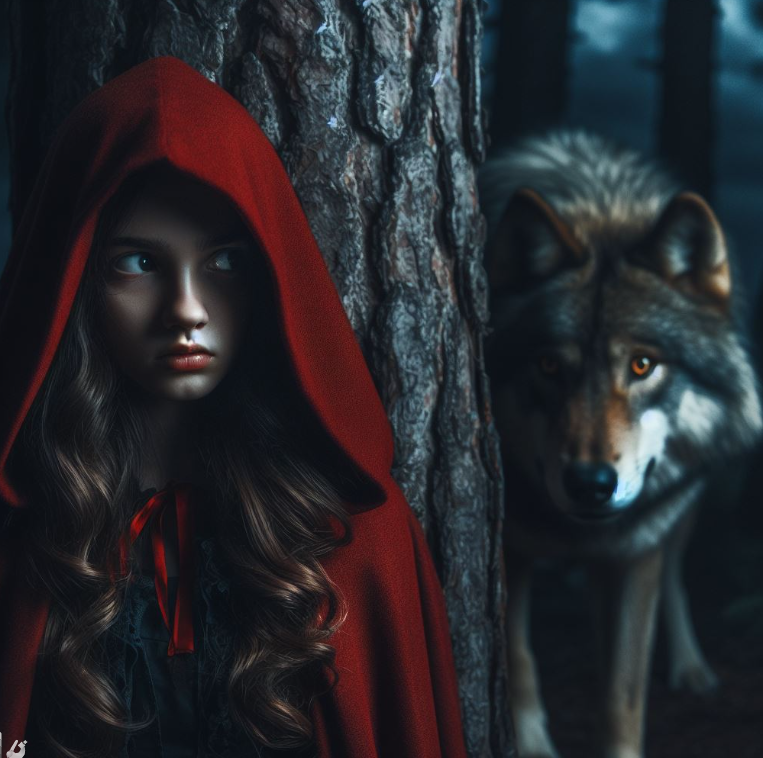
A girl in a hooded cloak, looking around wearily as a wolf stares at her from behind a tree. The scenery is dark and eerie, like it’s in a dangerous forest.

  1. a girl in a hooded cloak, a wolf staring at her from behind a tree

2. a girl in a hooded cloak looking around wearily, a wolf staring at her menacingly from behind a tree

3. a girl in a hooded cloak looking around wearily hiding behind a tree, a wolf staring at her menacingly from behind a tree, dark scenery

I decided to start with a simple prompt in order to gauge how close it can get to my vision. Adding a little more detail with each additional run seemed to be very effective!

The wolf did not turn out as scary as I wanted it to; I guess “menacing” was not a descriptive enough term. I thought about adding “snarling” and “drooling”, but I ran out of runs I can do. : (

I used Microsoft Bing. This is a great free AI image generating tool; I would say its biggest con is that the images are very obvious that it was AI generated. I do like that I can specify the artstyle of image that it generates, although I did not play with that for this assignment.

Categories
Uncategorized

Blog Post #8

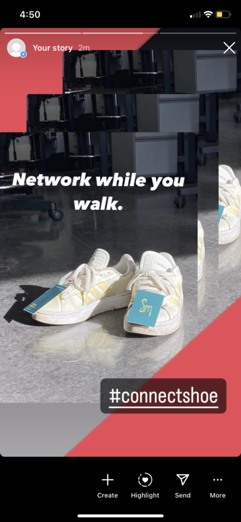
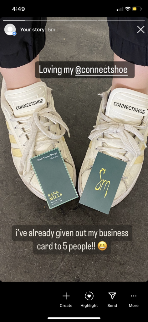
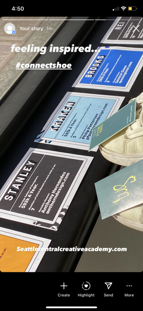
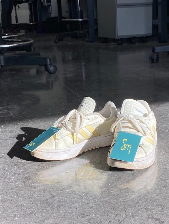
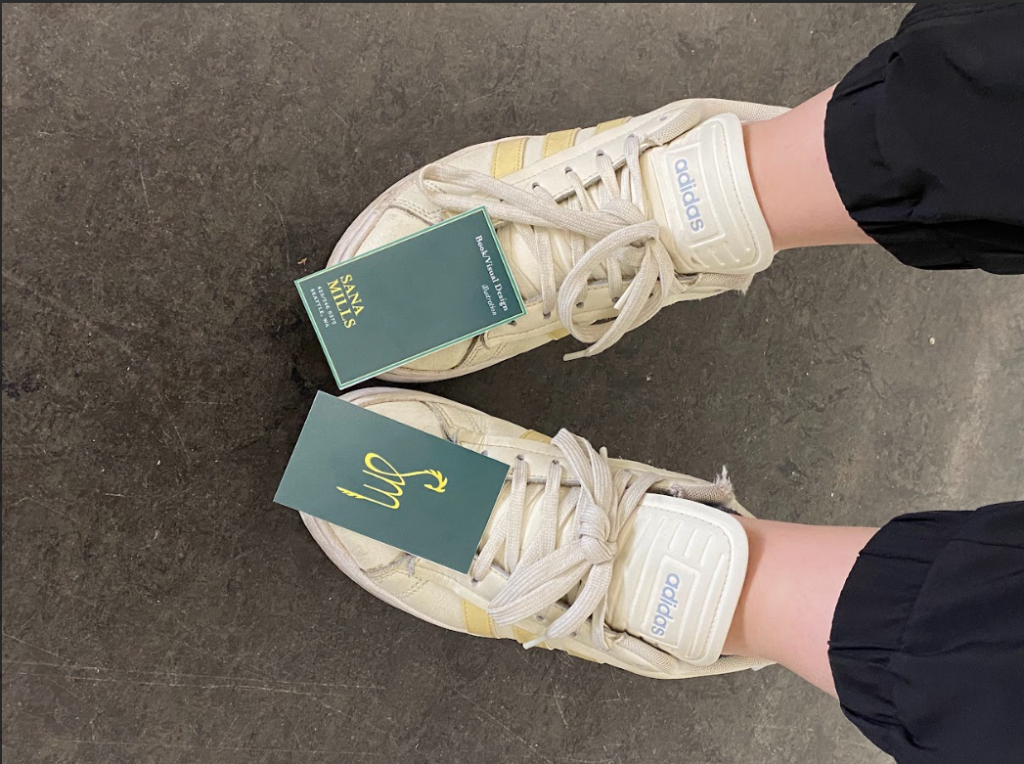
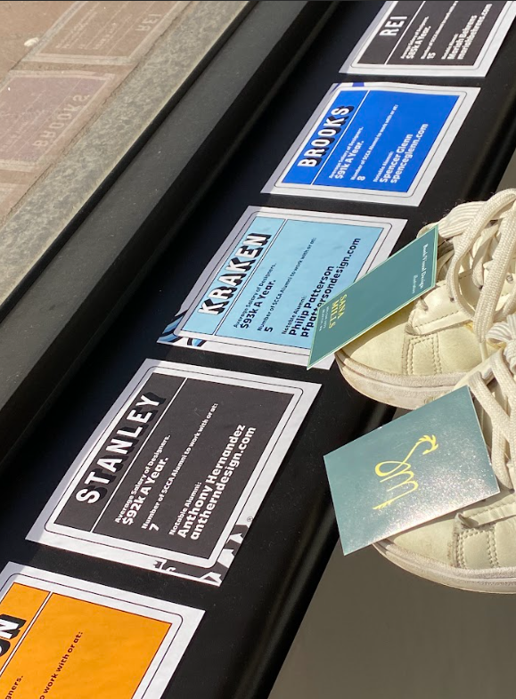
ConnectShoe: a networking shoe.

Product Description:

Stay connected on the move with our innovative ConnectShoe, designed to blend style with practicality. Crafted with premium materials for both comfort and durability, this shoe features a unique twist – a discreet slot to attach your business card.

Instagram Stories:

Photos: