Categories
Uncategorized

Blog Post #8 Freedom of Expression

Freedom to Express

In an installation to show the freedom to express, I’d get 100 people to paint a tree. All with the same paints, paper, and brushes. I’d make the individual paper size be 5″ x 5″ for everyone. I’d then collect the 100 finished tree paintings and I’d plaster them evenly on a 50″ x 50″ canvas to be shown in an art show. This piece would show all the ways to create the same thing highlighting the inclusivity of creation and expression.

Freedom to Explore

The freedom to explore, to me, is also the freedom to make mistakes. So, to depict the freedom to make mistakes, I would like to make a short film showing someone getting better at presenting. In the video, a student at college presents every week. At first, they are too quite, they stutter, etc but the keep failing but slowly get better. Eventually they’ve failed so many times that the fear leaves, they relax and find their voice and become a great presenter.

Freedom from Expectation

I would create a poster. This poster would show a person in a suit standing confidently, chin up, eyes closed, smirking happily, with a divine spotlight shining on them. Then there will be a large group of people standing behind the person. These people will be looking salty, unhappy, spiteful, and be in the shadow of the main “enlightened” figure.

Categories
Uncategorized

Blog Post #7 Kraken Year of the Snake Kits

Categories
Uncategorized

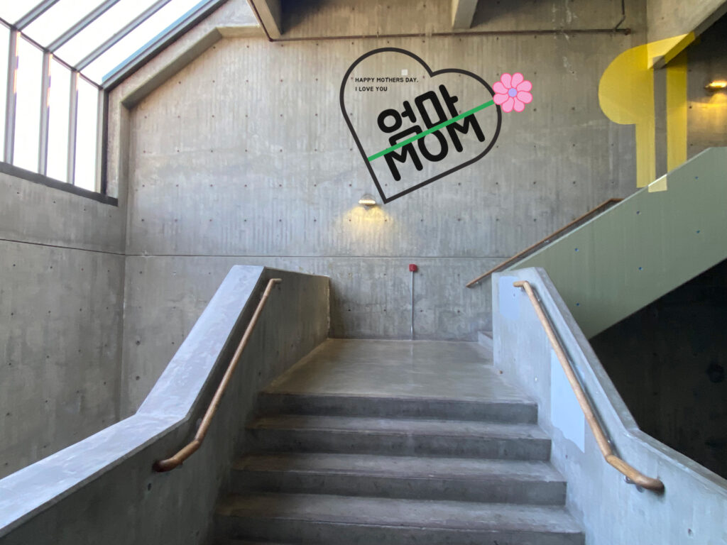
Blog Post #6 Mother’s Day Mural

Categories
Uncategorized

Blog Post #5 Food Truck Design

So, I chose to design a wrap for a food truck for the Galbi Burger restaurant. I chose Galbi Burger because one, they have cool branding, and two, because I order food from them multiple times a week and let me tell you, it’s really good. For the branding, I was drawn to their logo. The custom type they use resembles swords or some type of blade which is really cool. Also their colors black red and white are just clean and cool.

Design Process

First I gathered assets. I found a couple different logo variations and I chose the best, most clear one to run with for the rest of the projects. I could not find a png to download so I had to bring in a jpg to image trace. Image trace works well for the logo mark and large custom type but could not capture the subtext well enough. So I replaced their subtext with my own. I took a screenshot of the subtext and imported it to find the whatthefont website to identify similar fonts. The website said it was helvetica georgia thick which I did not have access to so I went over to Adobe fonts to find one similar. Which I did and used that font along with a little force justification to create an almost perfect recreation of their original subtext. Then I created different color versions of the logo so that I had one to go on a black, white, or red background. That was all the work I did on the logo.

Finally I gathered images of the menu to use as well and those were the only assets I took from online. Then I looked over at my classmate Jordan’s truck and noticed he added his own large food serving window with a canopy over it so I took his design and used it on my food truck as well. What was next was adding the logo wherever I could in a clean bold way so whichever angle you’re looking at the truck, you know what restaurant it’s representing. Then I made the canopy cycle between black and red which allowed the logo to contrast well against it. The food serving side’s base color is red and all other sides are black and white to put emphasis on the food serving side of the truck for the customers. I finally put the phone number, address, and hours on the door on one side and real large on the non-food serving side. So that concluded my design. I found it very fun, relaxing, and like design therapy. I folded up the model of it and I am happy with the results.

Categories
Uncategorized

Blog Post #4 A Reflection of making the Show Poodle

When first getting assigned this project, it felt quite daunting to be honest. A tight deadline, a video, new people, acting, script writing, and filming. A lot of unknowns and things I hadn’t done before. But, after I was assigned my group, Liz and Dean, I felt more confident. They both had such good energy throughout the whole project. 

We later found out what our three video prompts were, and soon after, quickly had many ideas for the plot of the video. Everyone was very “yes-and” which helped a lot. After day one, we already felt like we could start our story board. 

On day two, we set to nail down our plot and get approval of our storyboard. Collectively we liked what story we had written out but we knew it was lacking in clarity and meaning. Here I helped translate feedback that we got from Bliss to Liz and Dean explaining that what we have is good, but in certain areas, the plot lacked clarity of meaning. After working at it for another couple hours, we figured out how to make the story ‘make sense’ but also have an edge. 

After we finished our story board and received approval from the instructors, we did a full day of filming. Dean ran the cameras, lighting , and directing while Liz was the lead actor, and I played the small roles of the hair dresser and announcer. Since Liz graciously took the lead acting role, which we all knew she would absolutely kill even though it was daunting, it really lifted the weight off of everyone and we worked very well as a team, each playing our roles very well. I believe the final product reflected our effective communication, delegation, and selfless attitude as a team. I would 100% make another movie with my team.

Categories
Uncategorized

Blog Post #3 Donating to a Nonprofit

A cause that is near and dear to my heart is children’s daycare. As a kid whose parents both worked, I needed a place to stay after school until about 6:30 every school day. Luckily for me, my parents could afford to pay the membership cost for me to stay at the Boys and Girls Club at my elementary school. I made a lot of friends and formed deeper connections with my classmates who also had to stay after school. It was an experience and a service that I feel every kid with a working parent(s) should be able to participate in no matter their family’s financial status. Therefore, the cause I would like to donate $25,000 to would be to financially assist families who need help paying for their kid’s daycare or afterschool programs.

After doing some research into which area nonprofits work in the childcare sector, I have found there are many childcare nonprofits. 

The childcare nonprofit I would donate the $25,000 to would be to the Boys and Girls Club. I’m choosing to donate to the Boys and Girls Club because after my first hand experience being a member as a child myself, I can trust that they do a good job with kids. Boys and Girls Clubs have a good system that helps kids feel safe and comfortable. The staff back when I was there served as mentors and sort of second teachers to us. I remember learning a card game called Magic the Gathering from one of my counselors and me and my friends would play that game with eachother and the counselor a lot. I feel like they really cared if we were all happy and getting along as they kept a vigilant eye on us and made sure everyone was being friendly with each other at all times.

I would hope the money I would donate would go to the Boys and Girls Club financial assistance and discounts for qualifying families.

Categories
Uncategorized

Blog Post #2 Stanley Dog Bowl Mood Board

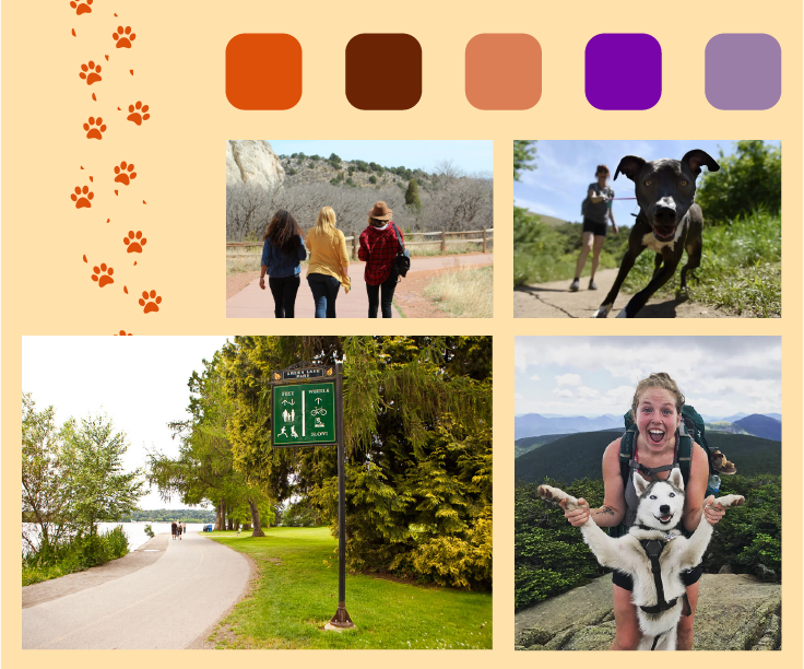
This new 32 oz. Stanley Dog Bowl will be collapsable and made of rubber. This dog bowl will be made to be portable enough to take on walks, hikes, and any other adventure. This product will be targeted towards 25-55 year old active lifestyle dog owners.

Categories
Uncategorized

Spring Blog #1 Design Systems

Fluent Design System by Microsoft:

The typeface used is highly legible and the bold contrasts very well against the regular or thin. It feels modern and current too. The colors contrast very well with the type making things highly legible. Buttons look very clickable, attention grabbing, and the text is legible as well. Overall, the Fluent design system by Microsoft feels new, fresh, unbiased, and very user freindly.

Carbon Design System by IBM:

IBM’s Carbon design system feels futuristic and inhuman. The font is overly futuristic/techy and reminds me of the Matrix movies. There are no rounded corners on the buttons, icons, and other graphical elements which gives that inhuman feel. So the lack of rounded corners, the use of an overly futuristic typeface, and a sterile color palette contributes to a design system that feels inhuman, boring, and hostile.

The Guardian Digital Design System

The Guardian’s digital design system is interesting because they mix a classic and a modern feel in one design system. The typeface being a serif brings a classic, established, and humanist feel while the creative grid layouts used and the coloring of it all make the design system feel modern as well. Almost every color on the color wheel is used in this design system which feels human centric, welcoming and discriminatory which are all ideas very important to society today therefore. reinforcing the modernity of this design system. So overall The Guardian’s design system feels like a good mix between classic and new creating a fresh, welcoming, and human-centric feeling design system.

Categories
Uncategorized

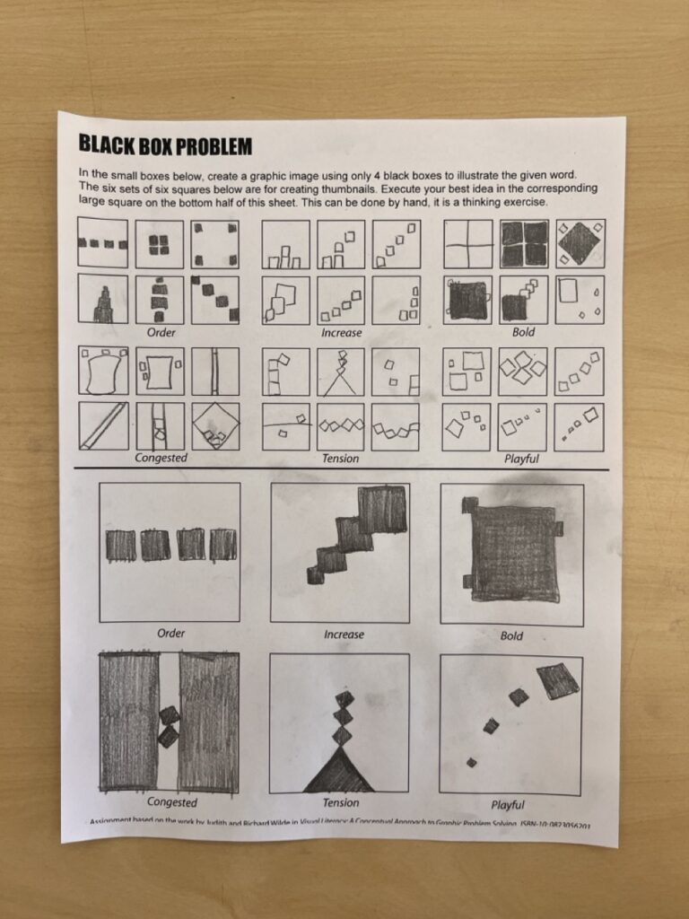
Blog #10 Black Box Problem

Categories
Uncategorized

Blog Post #6 Super Bowl Commercials

Here are 5 Super Bowl commercials I watched

  • Lindt “Life is a Ball”
  • CeraVe “Michael Cera”
  • Dove “Adolescent Women’s Body Confidence”
  • He Gets Us LLC
  • Pringles “Chris Pratt”

My 2 Commercial Reviews

CeraVe “Michael Cera”

This commercial shows actor Michael Cera acting as a conventionally attractive model that skin care products typically use for their ads. Since Michael Cera is known to be nerdy and goofy, him acting as a sexy model adds a comedic element to the ad. Not only does this add a comedic element, it also broadens CeraVe’s demographic by basically saying skincare is for everyone not just to the most conventionally attractive people.

2 Pros

  • Funny and unexpected to see Michael Cera in a skin care commercial *engaging*
  • Increases inclusivity by using Michael Cera as a model

2 Cons

  • No attention given to a specific product or feature that makes CeraVe a special skin care brand
  • No information given to why CeraVe is an effective skin care product

He Gets Us LLC “jesUS”

This commercial is for a pro-Jesus campaign called “He Gets Us” where it just promoted Jesus to everyone. This commercial showed people of very different demographics washing each-other’s feet and at the end said Jesus washed peoples’ feet too or something like that. This campaign is to united people rather than divide and to show worshipping Jesus is not a discriminatory matter, its for anyone.

2 Pros

  • Shock and Awe: dramatic scenes of people you would never think watching each others feet.
  • Clear messaging at the end: after the slideshow of pictures completed text showed up on the screen explaining the inclusivity of worshipping Jesus and finding God.

2 Cons

  • No call to clear call to action, unsure whether its a movement I could donate/contribute to in any way.
  • There were multiple “.coms” listed at the end, so I was unsure where to go to if I wanted to learn more.