this is what my process for doing assignments looks like.
Category: Uncategorized
AR project #2
aero was really simple to use and quite intuitive! i struggled with going from desktop to mobile and getting the interactive elements to work. there was also a weird glitch on the desktop app whenever i previewed and went back to edit that would cause certain images to disappear entirely. after stressing myself out about it and having a lil menty break over how little time i had to finish it, i decided to walk over to third and pine after work (that’s how discouraged i felt) and ate some chicken nuggets before getting back to work.
i worked on it some more on my laptop before deciding that i needed to just move over to mobile, so i rebuilt it there. i came across a few more problems, like an image not hiding even though all of the settings were identical to another image that was hiding. i couldn’t figure it out so i just got rid of that.
i struggled with audio too, i couldn’t get the song to play despite changing the formats of the file over and over. eventually, i changed it a last time to .wav and it worked fine. thank god.
i wish i had more time to fine tune it but nonetheless, here she is.
sea, swallow me
AR project #1
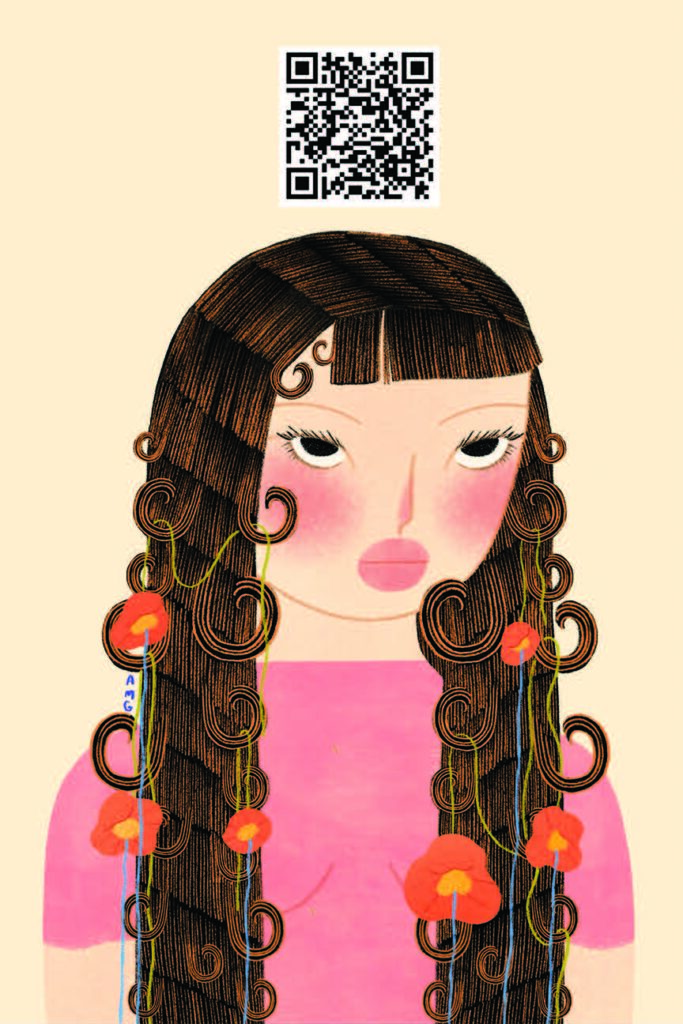
for this assignment, i made an animation on procreate. i started this illustration months ago and hadn’t felt inspired enough to finish it. last week, i came to the guest speaker lecture late so i sat in the back and decided to draw (i was still paying attention, promise). i managed to finish most of it by the time the hour was over.
i go through what feels like such extreme creative blocks with my illustrations. sometimes when i run out of ideas, i feel like i’ll never have them again. when i finally get over that and really get in the zone, it becomes physically uncomfortable to step away from the piece. so the hour was over, i had no choice but to put my ipad away. imagine my relief when i learned that we had to create a poster and that it could be of anything. thank you stephanie! i drew until i had 10 minutes to get to work (i was late).
this wasn’t the original animation, it was a lot shorter at first but it just didn’t feel complete. i really wore down procreate creating the final version. i don’t know how many frames there are, i lost count after 40. i lengthened it in aftereffects and added sea, swallow me by the cocteau twins and harold budd. i love this song. i worked on it all weekend, i might work on it some more, but for now, here she is.
bedside

not great lighting, i know, my apartment barely gets natural light.
for this assignment, i chose this candle as my product. i cleaned my bedside stand for the photo (it was about time i did that) and took this poorly lit photo on my phone.
i have my water cup, alarm clock that i have not set up yet, my poppy sonny angel, dried flowers and a few crystals as the supporting cast. oh and that weird unlit candle that i got at an estate sale last year.
i also have books that i’ve read and am in the process of reading below it alongside my journal.
i wanted it to feel cozy, feminine and a little witchy.
not a paid ad
ads i watched:
- uber eats (ross and rachel, friends reunion between jen anniston and david schwimmer)
- mountain dew (parks & rec reunion between aubrey plaza and nick offerman)
- popeyes (ken jeong)
- doritos dinomitas (jenna ortega)
- t-mobile (too many celebrities)
- hellman’s mayo (i have no idea who that person was but pete davidson made an appearance)
- starry (ice spice)
the ad i felt was the most successful was the mountain dew commercial with aubrey plaza and nick offerman. in the commercial, aubrey reminds us that she is americas sweetheart (she’s never told a lie), and wants to inform us that we can have a blast (code for mountain dew) anywhere. we can even have a blast in the most mundane or inconvenient environments. nick offerman makes a single line appearance, “and with anyone?” to insinuate that not only can you have a blast anywhere, but that it can even be had amongst friends.
i’ll start with the cons. first is that it was too short. i think i can speak for us all when i say that we would’ve loved more aubrey. second is that mountain dew is awful and the bottles are even worse. perhaps they should consider a product redesign. why can’t aubrey have a blast but in a nice chilled glass? a blast but she’s poured it into a hard liquor bottle? a blast but she’s poured it into the half & half pitcher at your local coffee shop? it’s like the writers don’t even know her.
pros?
a reunion commercial is smart marketing. it’s hard to do it successfully though and in my opinion, they pulled it off. i can almost forget that mountain dew is making millions of dollars off of this.
having someone like aubrey who, as far as we know, isn’t going to:
1) pretend she loves something 2) give us a perfectly rehearsed sales pitch that leslie knope herself would’ve written or 3) try to convince us to buy something, helps lower our guards because it feels more authentic. our parasocial relationship with her and nick offerman (because of the huge success of parks and rec) makes us feel like we know the people on screen, so we trust them. it doesn’t feel like an ad, really. it just feels like another episode of a show we love and miss.
the second commercial i’d like to judge is the t-mobile commercial with various celebrities because i think it failed to do what the mountain dew commercial did so well.
pros:
– laura dern! love her.
– they had a nice cast of actors and the idea had potential. bradley cooper seemed to have the best script to work with (the only one that didn’t require much acting, which i don’t mean as a drag to him, the writing was just bad! i think he’s a great actor).
cons:
– it didn’t feel like a superbowl commercial. it’s also hard to believe that any of them are using t-mobile or auditioning to be part of something that is readily accessible to us non-celebs.
– the writing was theatrical and off putting. nothing about it felt authentic and none of them interacted with each other so it felt inconsistent on top of the inauthenticity.
in a nutshell, i think the t-mobile commercial did too much and they did too much badly. like, laura dern probably can cry on cue. why couldn’t we just have laura dern tell us about all of the things she can do? maybe have t-mobile audition for her? logistically, not sure how that would work with whatever it is they’re trying to sell but it would’ve been worth the effort to figure out. ***sidenote: that also proves my point about how bad the commercial was because what were they even trying to get us to do??? i learned nothing and i watched it twice*** alternatively, they could’ve kept it simple and just had her step back into her renata klein role. if laura dern is there, do you think we care about the guys from suits? we don’t!
in loving memory of: ancientwtr

the idea for my personal project is a personal project i’ve already started but have had to put on hold since starting school. it’s also too cold outside to drill shells and pearls. it’s my own little jewelry brand, ancientwtr. the moodboard is the vision i had for it but i don’t have the technical skills or the materials necessary (yet). it’s something that i dedicated a lot of time to during the past summer, so maybe i’ll be able to visit it again this upcoming summer.
skills that i would gain from continuing this project would be learning how to be my own client and (graphic)designer- how to brand, package, market things. how to put together my website, (which i did through shopify). the work we do here in school is digital, it would be cool to have something in my portfolio that you can see in person, touch and feel, wear it even. it was healing to create pieces.
ideally, i would work with real gold (maybe silver)and would know how to do so well. i don’t think i would want it to be a business, just something i do for myself and maybe if people like it, i could share it with them as well.
i’d hope to gain more technical skills for handcrafting and i’d like to be okay with imperfect and asymmetrical designs. i’d also pay more attention to color and shape, which would help my graphic design eye.
i miss gabriel
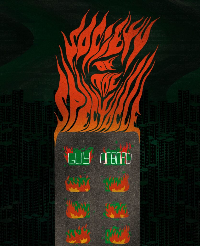
I miss Gabriel. During his class last quarter, I learned a lot about the psychedelic art movement. My table was assigned the topic pretty early on into the quarter and we kind of stuck with it for the entirety of the course. For our last assignment, we had to redo a cover, book or music. Maybe there were other options.
I chose a book called Society of the Spectacle by Guy Debord. It’s based on Marxism. What Karl Marx refers to as a commodity, Debord calls a spectacle. He basically says that there’s an overproduction of images, that we’re sold the representation of something. I got into it because of MJ Corey, the tiktoker behind Kardashian Kolloquium.
Anyway, I took inspiration from a psychedelic movement icon, Wes Wilson. He has this really cool poster with fire hand lettering.
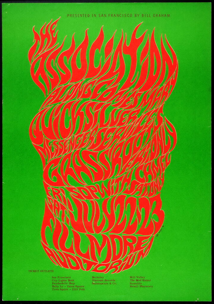
I started by studying the way Wilson hand drew each letter, trying to find a pattern that I could mimic. I picked out letters I needed for the title and traced each one in separate layers, then lined them up next to each other, started erasing lines and redrawing them over and over until they fit.
It turned out that there wasn’t really a pattern, each letter was different, even if it was used twice. Some letters leaned right and others leaned left in the same word. Eventually, I stopped referencing his altogether and pieced it together myself.
I added a city in the back mostly by just duplicating layers and then I added a few effects that I can’t remember to make them feel dystopian and matrix-y. I originally wanted to draw an entire city on fire but after getting some feedback in class I decided on a single building as the main focus.
I started it around 7pm the night before it was due and finished the entire Crying in H-Mart audiobook while drawing.
I’m really proud of it.
rave at the dentist
it’s been a few years since i’ve been to a rave so please bear with me.
first, i had to sketch what i thought this rave would look like. obviously, the building entrance has to be a mouth. the LSD tab is a tooth. here’s the best illustration i’ve ever created:

i used microsoft bing image generator and asked for a simple, rave at the dentist image. one with the word cursed, because the event sounds cursed, and another without it. it wasn’t really what i had in mind but it’s a nice starting point.


okay, here’s a more specific generated image. i searched, “dentist office but the building door is a mouth.” i mean, yeah, that works?
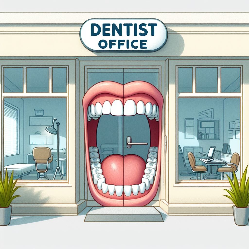
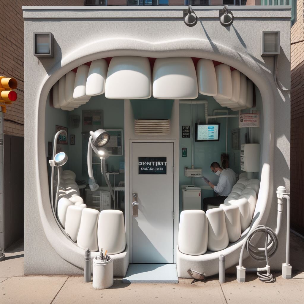
okay, next search was “dentist office but the building door is a mouth with lipstick on.”
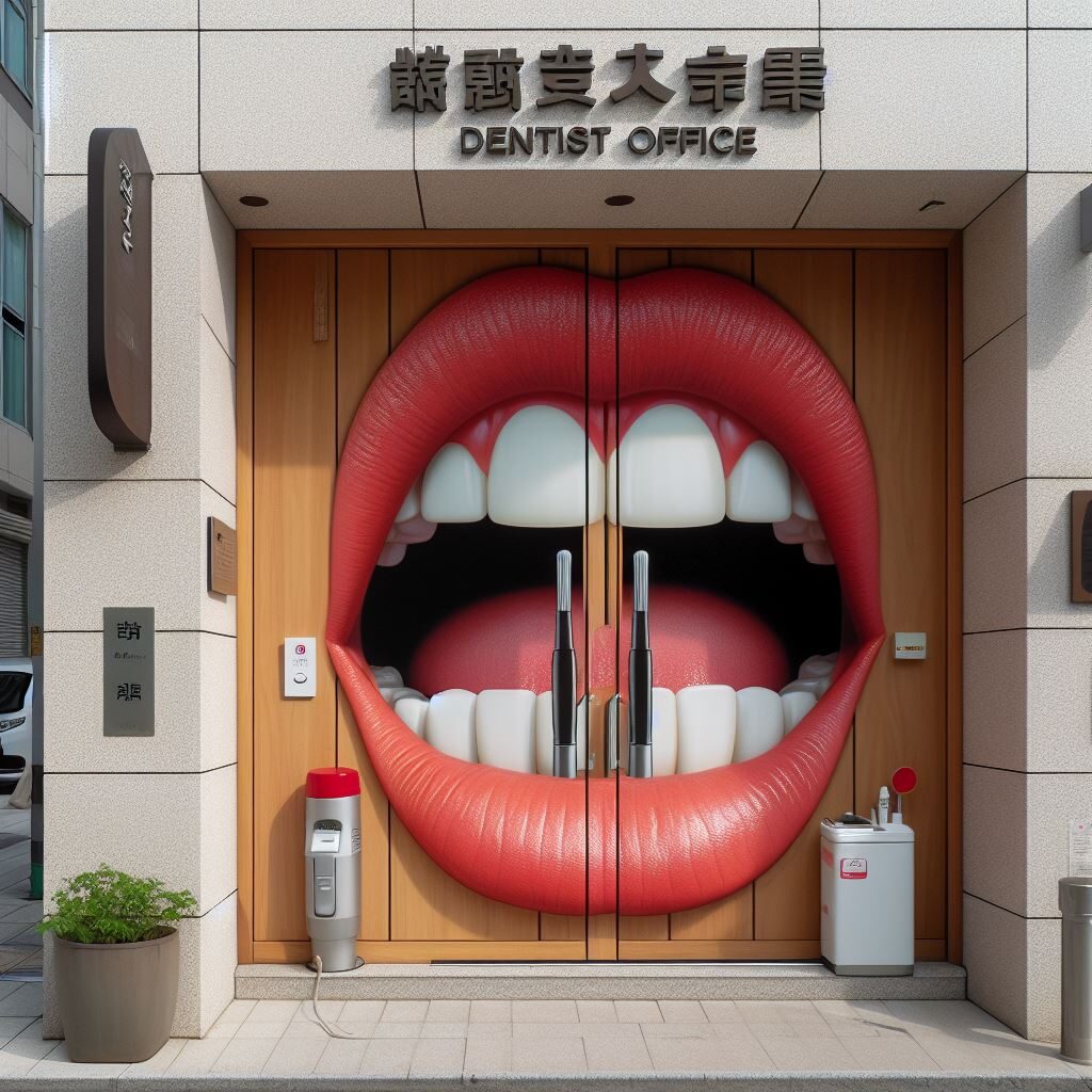
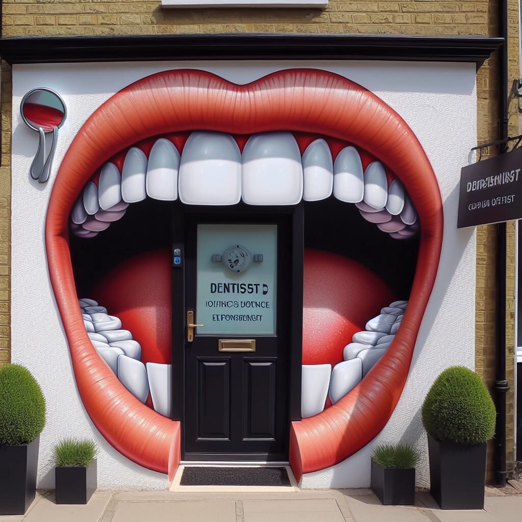
now we’re just adding words. it’s getting weirder, isn’t it? “dentist office but the building door is a mouth with lipstick on with an LSD tab on the tongue.”

okay, lets make it darker, literally. “dentist office but the building door is a mouth with lipstick on with an LSD tab on the tongue and it’s nighttime.”
okay, wait a minute. i didn’t even mention the tooth tab yet??
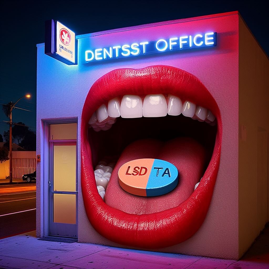
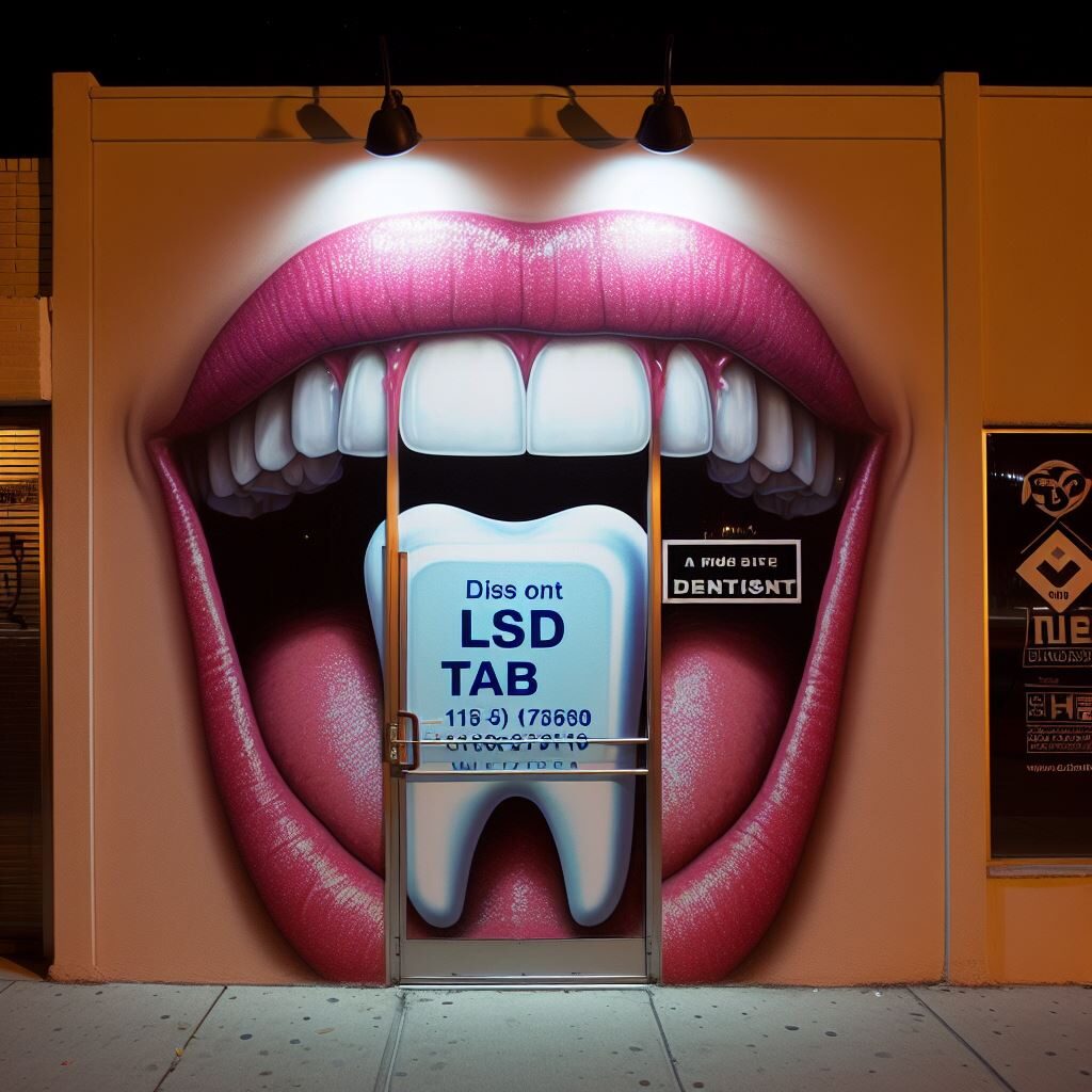
alright, AI just came up with my idea on its own and i’m now having a small creative crisis because of it.
“dentist office but the building door is a mouth with lipstick on with an LSD tab on the tongue and it’s nighttime and a rave is happening inside”

last one, “dentist office but the building door is a mouth with lipstick on with an LSD tab on the tongue thats shaped like a tooth and it’s nighttime and a rave is happening inside”
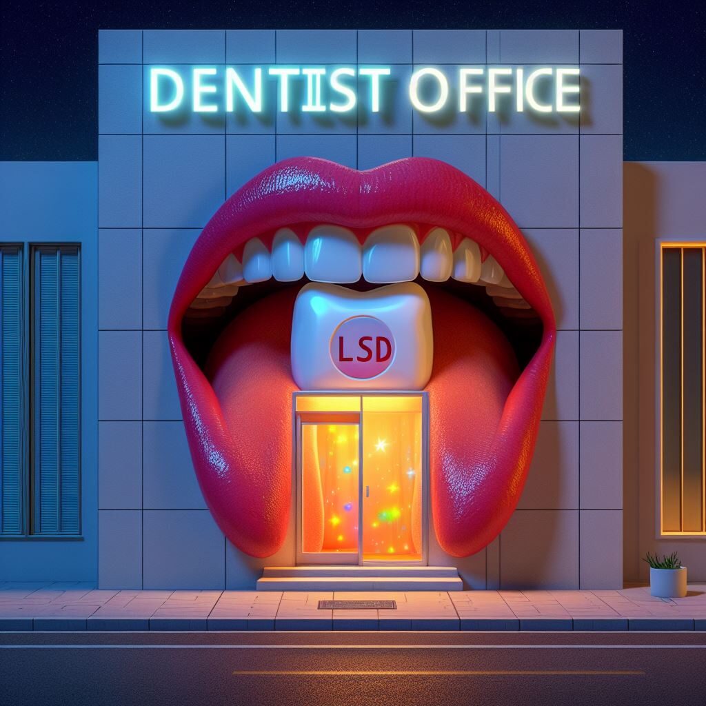
i mean, unless you knew this event was taking place, you probably wouldn’t think this was a rave. but it’s kind of beautiful, isn’t it?
swiss army man (2024)
okay, not the movie, but the blog assignment. the 2016 movie, which i loosely remember, stars daniel radcliffe (and another man i do not know of) and is about his character, a corpse, teaching man how to live. perhaps i should revisit the film and learn a thing or two myself.
last week, we had a very much alive alum and guest speaker tell us about life post graduation. he said a few things that resonated deeply with me, the most compelling being that the work we’re doing isn’t always about us. that we’re not the only ones with a stake in this. a truly shocking revelation to an only child like myself.
so, reader (if you’re there), what would my tools be if i were a swiss army knife? i wish you could decide for me.
tools i have:
i’m an illustrator, i have good interpersonal skills (big shout out to years of therapy), i refer a lot to cultural iconography and community for inspiration, i’m creative and eager to incorporate various ideas, learn more and collaborate.
tools i will need:
time management, a better understanding of illustrator, self discipline, confidence in my abilities and voice, patience and self compassion when things don’t automatically click or i’m struggling to learn a new skill or program.
these skills will obviously change and evolve over time, but right now, this feels accurate for this part of my life.
a bit rowdy
as someone who’s actually been referred to as disruptive at my previous two jobs, you’d think writing a few words about what shapes my vision would be easy. i’ve successfully campaigned to unionize one of those workplaces and created a powerpoint (yes, a powerpoint) explaining to my cis white male boss why he could not pay me, the only woman (and woman of color) on my team, less than the men who were hired on after me for the exact same position at the other. writing them out though, i don’t think these things necessarily make me a disruptive person, perhaps just an employers walking nightmare.
it’s hard to find the balance between sharing things that are too personal and just personal enough. i’m not sure who will read this post but if you are, well, hi, thanks for being here. if you’re choosing to learn more about me and my history, it’s only fair that i show up authentically.
I
up until recently (pre-IOP) i checked off every characteristic of an adult who was the product of a turbulent and dysfunctional home. without getting too into it, my history as a once damaged and self-destructive person now makes me an advocate, intentional and soft (not to be mistaken with weak). it makes me good with people; i’m adaptable and receptive.
II
if you haven’t already noticed by my name or appearance, i’m also a woman of color. i’m afro puerto rican and japanese, aka waisan and blaisan, aka a nightmare. although my latinx roots aren’t as apparent in my work, my identity as an asian person is. this makes my vision unique by default, especially in a white cis male dominated field.
III
i’m an illustrator! although this makes shutting off my creative brain and odd desire to make everything have tears feel nearly impossible in design, it brings a lot of ideas and solutions to problems. it also means that working with more analytical and structured people requires me to learn and understand that creativity in itself is vast. that when we come together, we can create really cool shit that we wouldn’t have if we had to do it on our own.
IV
okay, this is an odd one but another thing that makes my vision unique is that i’m a high school dropout. despite how much i’ve struggled as a student before, i’m still choosing this path, i’m choosing this program. i’ve had an unconventional path but unconventional has began to feel like a gift lately.
it’s taken me 27 years (which is not that long, my life is really just starting) to realize that school is the best part of what will become my career. the learning is the most important part and the part that makes me feel most alive. i’m still finding my rhythm but nothing has felt more empowering than committing to being here. i think that’s what feels most unique to me, that i’m not coming into this with big plans of what my future will look like. just operating on blind faith that i’ll find my way to where i’m meant to be and what i’m meant to do as a creative.