Categories
New Media

Blog Assignment #1

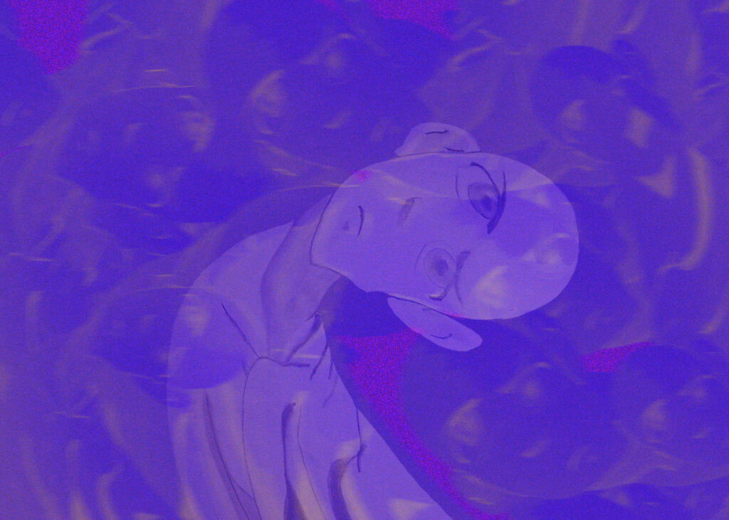
Not quite sure if this is uploading, but it is a GIF. to represent how I am feeling in this program. It is a lot of heads twirling and seemingly being in a whirlwind. The three elements are drawing with the original image, photoshop work with creating the effect on the image, and then creating an animation of the image.

Categories
New Media

Blog #5

In this week’s blog assignment we are being tasked with talking about our exposure to the visual media side of the world. As a design student who has had two modules thus far that have been design focused I originally saw this blog assignment and was worried about how I would be able to even answer this question. But as I read on I was able to breathe and realize it was any exposure whether in this program or not. My experience with visual media has actually been an interesting one and a lot more eventful than I ever thought. When I moved to Seattle in May of 2021 I lucked out and had a house full of creatives. Two of which were photographers, one of them actually going through the visual media program here at SCCA. Because of her I was able to become involved in the production world and have worked two fun PA gigs on sets. My first one was a commercial filmed for Microsoft on their campus in Redmond. I worked with Mighty Media Production. I was able to see what goes into a film production behind the scenes. From lighting, to camera setup, to working with talent and briefing them on the flow of the specific day. I got to help setup and breakdown and saw professionals doing what they do best. All the setup and hard work culminated to the filming day and the general feeling of relief once that day was over. Seeing all of the practice and intricate details that went into this day and how on track it was was amazing. And even when things went a little bit off track the producers and other staff were able to bring things back pretty quickly or able to adjust to what was happening. The second PA job was a live event for Amazon held at the Seattle Convention Center. I worked for TGR or The Green Room production company. This time I was lucky to see the workings of how a live event is handled. It has its similarities and differences with a pre recorded event  but a much higher level of stress and practice. I was able to see how lighting was meticulously set up not only for the in person crowd but the livestream being filmed. This time the producer and associate producer were two experienced individuals and I was able to watch them walk people through how the show would go. I believe we had a total of 8 shows and each one was different with a different cast. And the ease at which they balanced that load and how organized they remained throughout was amazing to watch. Also got to see how a large pixel screen works and the back side of that and all of the amazing people that are running it while shows are actually happening. Overall my first impressions were that Visual Media people are hyper obsessed with how things look on camera and I related that to how I feel about anything I design.

Categories
New Media

Blog # 4

Our presenter this week was Principal UX Designer at Amazon Margaret Darcher. She spoke about her experiences at amazon and approach to making decisions. In this weeks blog assignment we are being tasked to pick 3 leadership principals that we have exuded recently and one that we might have trouble with showing.

First principal I am choosing is Think Big, my most recent example of this is in our UX/UI class where we are being tasked to develop a Fashion App in Figma. My partner was giving out strong ideas towards the main structure of the app, meanwhile I was thinking big about what could separate us from competitors. Not going to share what those ideas were because I may want to run with them in the future :).

Second Principal is Invent and Simplify. It goes well with the previous principal because even though I tend to think big, I usually am able to keep that core idea and simplify it to a more functional idea. Latest example of that would be again in our UX/UI design class, I originally wanted to redesign a website for a project from the ground up, Had all these wonderful ideas that would have taken someone with my skill level months to figure out, instead I shrunk down those ideas into something structurally sound and aesthetically what I was hoping for.

The third principal would be to Learn and Be Curious. Most recent example would be in my AR/VR class, I had no interest in this field until this module and once I learned about it I am now more curious than ever.

One I see myself struggling with is Have Backbone: Disagree and Commit, sometimes I let others opinions outweigh mine, I am trying to get better about it but it is still something I struggle with.