Categories
New Media

Winter Blog 5

In this week’s blog assignment we are asked to list our top three hard skills and top three soft skills and expand on each. I will start off with my list of hard skills that I have developed throughout my years in the workforce.

My first hard skill I would list is Graphic Design, specifically html and css. I have been able to build somewhat of a passion for html/css and would list that as my top hard skill within graphic design. I would keep the actual skill as Graphic Design to broaden my opportunities. My second hard skill would be Project Management. I am comfortable speaking and assigning roles to others in order to get the job done but also to ensure that people are in roles that give them creative power. Last but not least I would list Risk Management, I have had to weigh out the risk reward in many workplace scenarios, specifically at a super busy coffee shop that I work in. If I am busy but know I need to refill something, is it worth it to make people wait and how much time it would take to do whatever it is I need to do in such a busy environment.

My soft skills are things that I believe would seal the deal for me in interviews and in the workplace. I am a very outgoing outspoken person but also know when and when not to speak up. My first soft skill would be just that, communication. I have worked numerous jobs that require a high level of communication in order to be efficient and successful. I also am a very communicative person when it comes to my peers, I allow others to approach me and give them the attention needed, I do not come to them and hound or look over their shoulder, rather I communicate, let them handle what they can and if help is needed I am here to communicate. Secondly I would list Critical Thinking as a soft skill of mine. I work well under pressure and I do so because I think critically before a scenario and while the scenario is in full swing I am quick on my feet and can pivot if necessary. My third and final soft skill would be Stress Management. I understand how damaging stress is to people, so that stress is ten fold when applied to a job where being creative is a requirement. 

Two soft skills I would like to improve upon are my body language, and Time management. I think sometimes my aura gives off the vibe that I do not want to be approached when in reality I love talking and can do so for hours. Time management is something I constantly struggle with, it is something that plagues me and I know that in order to be successful in this career that needs to change.

Two hard skills I would like to improve upon is social media. I have been off of social media for a very long time and need to relearn how to use it in a way that is promoting my work. Second hard skill would be Data analysis, by that I mean how to gather data and use it to adapt to what is going on.

Categories
New Media

Winter Blog 4

For this weeks blog assignment we were tasked to create and film an elevator pitch about ourselves. See video attached!

https://www.dropbox.com/s/m8rei57ij1wmczj/Movie%20on%202-6-23%20at%207.58%20AM.mov?dl=0

Categories
New Media

Winter Blog 3

In this week’s blog assignment we are being tasked to talk about a personal project we could work on while at Seattle Central Creative Academy. This blog comes at a perfect time because I have been considering doing this project for myself for sometime and having to describe a timeline and process of this project will get the ball rolling for me. 

The project I have decided to work on while at SCCA is creating my personal design website. I am currently using SquareSpace to do this for me and while it is very simple to use I now feel comfortable enough to create my own site from scratch. Some of the features in SquareSpace are lacking and therefore I have the desire to leave. 

The timeline for this project is as follows;

  1. Winter Quarter 22, Begin researching other portfolio sites, any interests and dislikes from each site written out, find interesting color pallets, begin prototyping the website in figma.
  2. Spring Quarter 23, Figma prototyping, possibly research with classmates, send out a prototype to friends, family and classmates for input. 
  3. Summer Break, Depending on work/ internship begin adjusting prototype in figma, possibly begin coding in dreamweaver.
  4. Fall 23, CODE CODE CODE, code the figma prototype in dreamweaver goal is to finish by the end of Fall Quarter.

The project would not cost me any money, I already own my own domain, I would just need to learn how to apply that into my website.

Categories
New Media

Winter 22 Blog 2

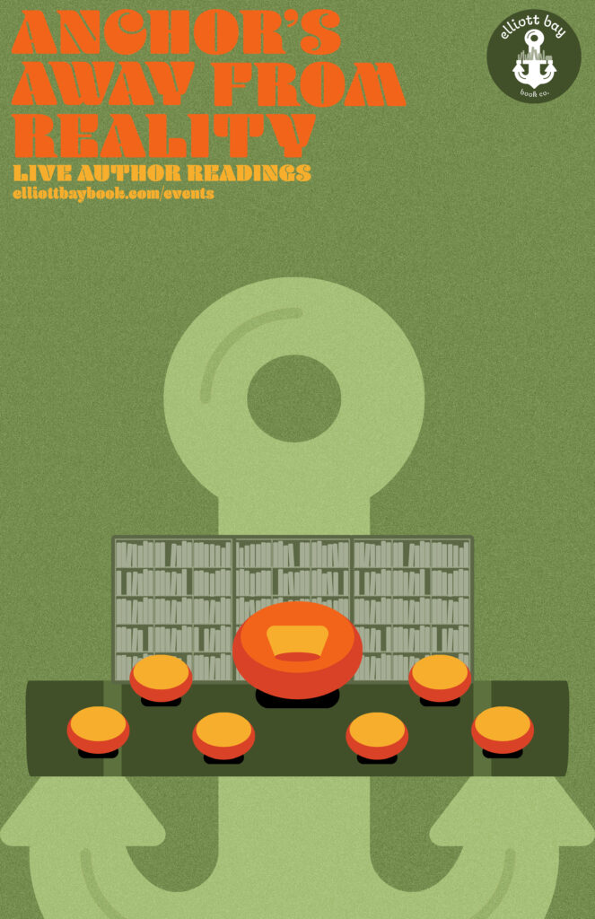
In this week’s assignment we are being tasked to write about an experience we have had at SCCA with a project that we had prepared for and had to deal with some circumstances that caused us to adapt. I have had a few things go on while at SCCA that have caused me to adapt while in the middle of a specific project but one in specific was during our final project in Intro to Design. After a wild semester of getting my laptop, glasses, an audio recorder, and other personal belongings stolen in the middle of the quarter and figuring out money while being full time here. I think my brain was just fried, specifically the creative part of my brain. As we began work on our final project for Jill I was feeling fine in terms of my ideas, created a logo for Elliott Bay and loved that logo, began brainstorming for a poster to promote their live author readings and had some lovely ideas. Fast forward a few weeks and we are doing group critiques. I am panicking about not having much to share with my group, because I could not quite make my ideas come to life. I was stressed and decided to message Jill about this creative block I was feeling and thankfully she was very understanding. I decided to pivot and completely redesign my poster. I started with using an actual photo of Elliott Bay Bookstore in the foreground with the Seattle Skyline in the background, and completely flipped it to what it is now. I decided to use the anchor from the logo and create something on theme with the logo. The logo was an anchor with the crossbar being a bookshelf, this time I used the anchor and the cross bar was a seating area with open comfy looking chairs, one “grand” chair in the middle with a bookshelf in the background. This created a friendly looking environment while also connecting the logo to the actual poster design. I was extremely happy with how it turned out and am glad I faced that adversity in order to get where I finished.

Categories
New Media

Winter 22 Blog 1

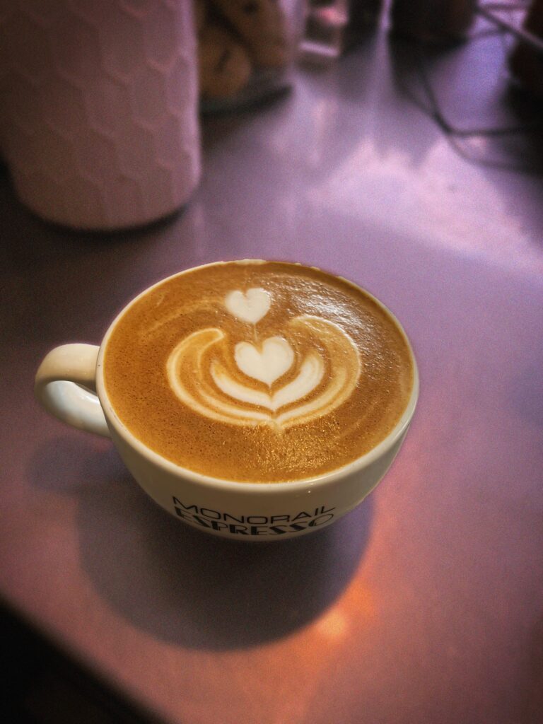
In this week’s assignment we were tasked with taking a food item, or beverage in this case, and editing it to become aesthetically pleasing. For this specific assignment I chose to go the simple route and do basic photo editing, as someone who is not a photographer and/or in the visual media program here at SCCA. This is not my strong suit but it seemed like the approach that made the most sense. I simply used photoshop to touch up any of the latte art that had any imperfections, specifically using the clone stamp tool to fix the top heart in the latte. Then I used a quick selection tool to separate the latte from the background, added some noise, blur and color overlay to the background and added a slight contrast boost to the latte. Finalized some small details with the mask tool and was happy with how it turned out.

Categories
New Media

Blog Assignment #6

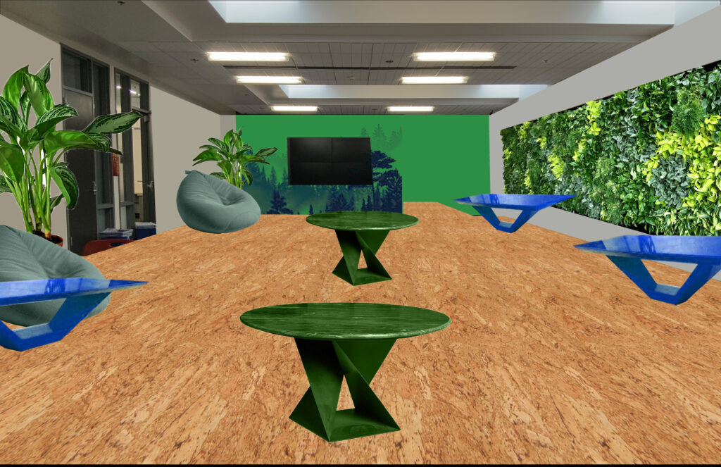
In this week’s blog assignment we are being tasked with redesigning a human space within Seattle Central Creative Academy’s area of Seattle Central’s Campus. With this work I was inspired to bring in some color found out in the natural world, Greens and Blues. Both colors provide calming effects and go very well together. On one wall to the right I have a “living wall” full of plants to provide fresh scents and air into the space. While the planters shown in the space are some of the most popular plants for improving air quality, the Chinese Evergreen. There is also still plenty of tables and space to perform critiques, while the left wall is still left blank for that reason. The bean bags and tables are all easy to move around in order to perform group critiques. Also allows the sunlight that enters through the windows and ceiling to feel more natural thanks to the actual greenery. While the back wall with the TV on it is a mural of a beautiful forest common to the Pacific Northwest.

Categories
New Media

Blog Assignment #1

Not quite sure if this is uploading, but it is a GIF. to represent how I am feeling in this program. It is a lot of heads twirling and seemingly being in a whirlwind. The three elements are drawing with the original image, photoshop work with creating the effect on the image, and then creating an animation of the image.

Categories
New Media

Blog #5

In this week’s blog assignment we are being tasked with talking about our exposure to the visual media side of the world. As a design student who has had two modules thus far that have been design focused I originally saw this blog assignment and was worried about how I would be able to even answer this question. But as I read on I was able to breathe and realize it was any exposure whether in this program or not. My experience with visual media has actually been an interesting one and a lot more eventful than I ever thought. When I moved to Seattle in May of 2021 I lucked out and had a house full of creatives. Two of which were photographers, one of them actually going through the visual media program here at SCCA. Because of her I was able to become involved in the production world and have worked two fun PA gigs on sets. My first one was a commercial filmed for Microsoft on their campus in Redmond. I worked with Mighty Media Production. I was able to see what goes into a film production behind the scenes. From lighting, to camera setup, to working with talent and briefing them on the flow of the specific day. I got to help setup and breakdown and saw professionals doing what they do best. All the setup and hard work culminated to the filming day and the general feeling of relief once that day was over. Seeing all of the practice and intricate details that went into this day and how on track it was was amazing. And even when things went a little bit off track the producers and other staff were able to bring things back pretty quickly or able to adjust to what was happening. The second PA job was a live event for Amazon held at the Seattle Convention Center. I worked for TGR or The Green Room production company. This time I was lucky to see the workings of how a live event is handled. It has its similarities and differences with a pre recorded event  but a much higher level of stress and practice. I was able to see how lighting was meticulously set up not only for the in person crowd but the livestream being filmed. This time the producer and associate producer were two experienced individuals and I was able to watch them walk people through how the show would go. I believe we had a total of 8 shows and each one was different with a different cast. And the ease at which they balanced that load and how organized they remained throughout was amazing to watch. Also got to see how a large pixel screen works and the back side of that and all of the amazing people that are running it while shows are actually happening. Overall my first impressions were that Visual Media people are hyper obsessed with how things look on camera and I related that to how I feel about anything I design.

Categories
New Media

Blog # 4

Our presenter this week was Principal UX Designer at Amazon Margaret Darcher. She spoke about her experiences at amazon and approach to making decisions. In this weeks blog assignment we are being tasked to pick 3 leadership principals that we have exuded recently and one that we might have trouble with showing.

First principal I am choosing is Think Big, my most recent example of this is in our UX/UI class where we are being tasked to develop a Fashion App in Figma. My partner was giving out strong ideas towards the main structure of the app, meanwhile I was thinking big about what could separate us from competitors. Not going to share what those ideas were because I may want to run with them in the future :).

Second Principal is Invent and Simplify. It goes well with the previous principal because even though I tend to think big, I usually am able to keep that core idea and simplify it to a more functional idea. Latest example of that would be again in our UX/UI design class, I originally wanted to redesign a website for a project from the ground up, Had all these wonderful ideas that would have taken someone with my skill level months to figure out, instead I shrunk down those ideas into something structurally sound and aesthetically what I was hoping for.

The third principal would be to Learn and Be Curious. Most recent example would be in my AR/VR class, I had no interest in this field until this module and once I learned about it I am now more curious than ever.

One I see myself struggling with is Have Backbone: Disagree and Commit, sometimes I let others opinions outweigh mine, I am trying to get better about it but it is still something I struggle with.

Categories
New Media

Blog Assignment #3

In this week’s Blog Assignment, we are being tasked to write about our own life experiences, and decisions in which we said yes to an opportunity even though we were not quite prepared to step up to the challenge. In my career thus far I have done a decent job at not overloading my plate, except once. That one time was actually pretty recently, I was offered a job as a Graphic Designer for Highline Heritage Museum. I was so extremely excited when I got the offer, I did say to them that I would need some time to think about it, that was just me playing hard to get. I said yes probably within the next 48 hours and finished all the paperwork necessary to begin. Got my first few jobs for the museum and away I went… crashing into the ground. I have very little knowledge of this museum, I am getting some direction but they trusted my creative vision so I was sitting staring at my screen for what felt like hours. Thought it might just be a small creative block and it would be fine after a day or two. Well a day or two turned into weeks, turned into months and I had not delivered anything they would have used. I felt so ashamed and disappointed in myself. I was working 6 days a week, every week, as a barista for two high volume coffee shops. I tried to use that one day off to design but then realized I needed to use that day to do actual human adult tasks. Clean my apartment, buy groceries, drink water, socialize, the list goes on and on. I soon found myself extremely burnt out and no longer enjoying myself. The only thing I could do was turn in my resignation, I was so scared to do so, I felt like if I did this I do not know when my next opportunity will come. Thankfully I got a lovely email from Seattle Central Creative Academy congratulating me on getting accepted into the Graphic Design Program. Told them I would no longer have time to work for them, which was true, but in reality I could not work for them with my current work schedule. In hindsight I wish I would have considered taking down some hours at my two jobs to spend more time on that opportunity but my hope now is that this program will be the thing that opens all the doors into the design world.