Categories
AR Module

Project 4 AR Panels

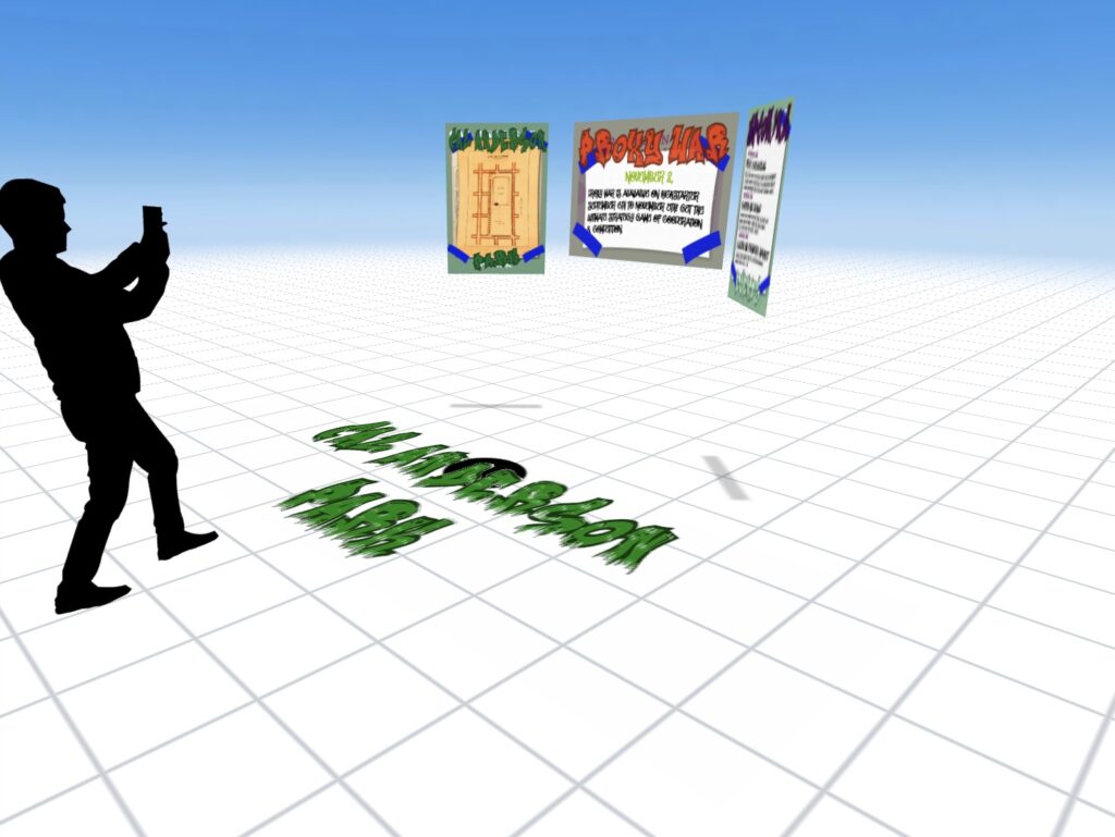
In this project we were tasked to create an AR Panel experience for our own theme. My team chose to do Seattle Parks, my partner covered Volunteer Park and I went for Cal Anderson Park. My partner finished his before me, so I asked him to send over his PSD files to color match and get the sizing down. Once I opened his files I sat there trying to figure out what I wanted to do different to make the experience tailored to Cal Anderson. It hit me pretty quick, I decided to take the graffiti art all around the park and let that inspire my work. So instead of deleting all of my partners content, I kept all of his work in the background and graffiti’d and placed “posters” over his work. This route took way too long but I was too far in to turn back at any point and I am very happy with how it turned out.

Categories
New Media

Blog Assignment #02

In this week’s Blog Assignment, we are being tasked to write about where on the spectrum that Joe Hallock presented and spoke about, we currently aspire to do work. The spectrum includes High Information Density to Low Information Density and Broad Audience to Specific Audience. This is something I have been questioning since the beginning of my graphic design career. Actually this is a big part as to why I have decided to apply for this program in the first place. The truth is I do not know, I know the type of work I would probably like to avoid but as for having a preference of work I currently am working toward, I do not have one. I understand where the money lies in these fields, but I am not someone with the desire to chase money. I want my work to be fulfilling while also paying my bills and allowing me to live comfortably. I have had these feelings before this program but now being introduced to so many different things, I have thoroughly enjoyed all of them. Yes, even coding is something I can see myself doing. That may be something I do very little of due to my lack of knowledge but the possibilities of that excite me. I am terrible at drawing and was terrified of learning Illustrator for that reason. I came to find out Jason is teaching us ways to never have to actually draw in Illustrator, just create. And even if I did have to sketch something out beforehand I feel one hundred times more confident because of Jill teaching us the process of doing so and how to create feeling with simple design choices. I know I should pick some kind of answer, so if I was offered all of these things on the spectrum and told I can only choose one it would be around the same area as video games. I enjoy designing things for the purpose of design, but I also love solving problems and visually communicating with the world. I believe that level of High Info Density and a broader audience is something that appeals to me.
Categories
AR Module

Ar Module Project 3

In this assignment we had to complete a UX/UI Review of an AR App. I approached this as a simple user and what I enjoyed and did not enjoy about the app. The app I have chosen is ARvid, which is available on Android and iOS. My overall experience was positive, a few key things that I believe could be changed including the overall aesthetic of the design. However it is a rather fun experience using this app and has the reviews to back it up.

Categories
AR Module

Ar Module Project 2

In this project I decided to go with a space theme, started out with a star and used the tap trigger. On tap the star scales down to nothing while the astronaut, earth, sun and satellite all scale up into the frame. The sun, earth, and satellite are all tap triggers to begin their animation while the astronaut is a proximity enter trigger.

Categories
AR Module

AR Module Project 1

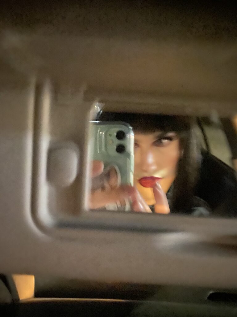
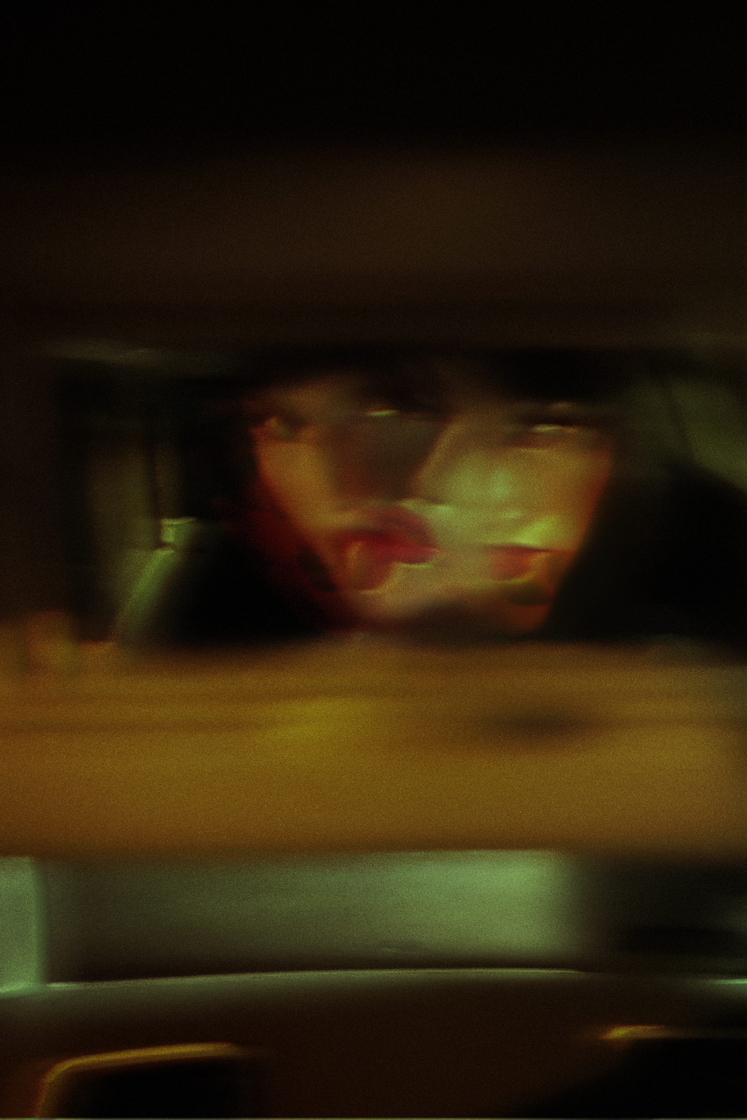
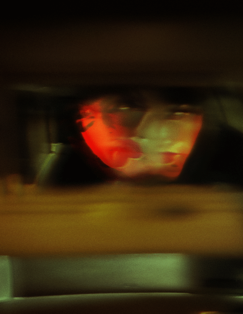
My creative process for this specific project was quite simple. As soon as the presentation and discussion ended for this project I knew exactly what piece I wanted to use. This is a project I made a few weeks ago of my partner in drag, they sent me several pictures and I immediately got my creative juices flowing. The theme of this project was then named Drive and Drag, a play on the Drive In Drag shows during the pandemic and the fact that the subject is in drag while being driven around. The original pictures were all relatively dark and one or two was slightly blurry already so I took that and enhanced both of those things. I wanted to create motion already with the still image I created so when we were making animated posters it only made sense to use this project and bring it to life. The process for me creating movement was with a transparent layer of another image of them in drag, slightly blurred out, and shifted in front of their face so the original skin was peeking through. Because of that I decided the best route for making this GIF would be to utilize the same idea and add another floating layer of them and apple the zigzag tool while also lowering the opacity slowly.

To make the GIF, I used Photoshop, created a new layer for each new frame and created the gif using the timeline window.