Categories
Uncategorized

Blog – Week of 10/27

Funnily enough, keeping track of my time for a week was a deal I had made with my friend to prove how busy I was (mostly as a joke), so this project was actually a very good way to stay motivated with that!

Most of my time throughout most weeks is dedicated to school+work almost exclusively, although this week due to a mix of illness and my work week being wonky at my part-time, I ended up having more time than I usually do

NOTE: times are rounded to the nearest 0:15 unless pre-scheduled (i.e. work, school)

SATURDAY:

Wake up: 10:15 AM
Getting dressed, brushing teeth, etc.: 10:15-10:30
Breakfast: 10:45, ate breakfast on the light rail to work
Thrift store work (folding clothes, helping customers, etc.): 11-3pm
Lunch break, working on client work while eating: 3-3:30pm
Thrift store work: 3:30-5:30pm
Break 2: 20 minute nap in the break room 5:30-5:50pm
Thrift store work: 5:50pm-7pm
Lightrail home: 7pm-7:30pm
2 Hour nap: 7:30pm-9pm
Cooking dinner (rice w/ orange chicken): 9pm-9:45pm
Shower: 9:30pm-9:45pm
Client work + dinner (physical assets creation, back-and-forth with client): 9:50-11:37pm
Playing games with friends: 11:37pm-1:34am
Laying down, getting ready for bed: 1:34am

SUNDAY:

Wake up: 10:15 AM
Getting dressed, brushing teeth, etc.: 10:15-10:30
Sick – called out of work (10:30)
Sleep: (10:30 ~3:30pm)
Client work (social media advertisements): 3:30-5pm
Call with mom, ordering breakfast: 5pm-6:30pm
Watching YouTube: 6:30-7:15pm
Eating breakfast, watching YouTube: 7:15-7:45pm
Playing games with friends: 7:45-10pm
Homework (starting for Tuesday, Monday did not require homework that I had not done in-class): 10-10:30pm
Get in bed, watch more youtube to fall asleep: 10:30+

Monday:

Wake up: 7:15 AM
Getting dressed, brushing teeth, etc.: 7:20-7:45
Making, eating breakfast: 7:45-8:30
lightrail: (8:30-8:59 [late lightrail])
History: 9:05-10
Coffee break, client work + coffee (9:40-10)
History, studying slides, taking notes + presenting homework: 10-11
Lunch: 11-12:15pm
Finish out + talk about slides: 12:15-1
Free classtime, print out mouse for Tuesday, sketch; client work: 1-2pm
Lightrail home: 2pm-2:20pm

NOTE: I decided to recount and rewrite this blog from memory over the span of two sessions – admittedly, it probably would have made more sense to record live, but this is how I had done schedule write-ups in the past. Unfortunately, with the sicknesses + slight overload of client work + lack of organization, I had forgotten to continue the 2nd half of this, which is my fault. That being said, I do intend to finish writing out this project on my own time.
Categories
Uncategorized

Gameworks

Gameworks Panels Eyejack Demo

The point of interest our team decided on was arcades.
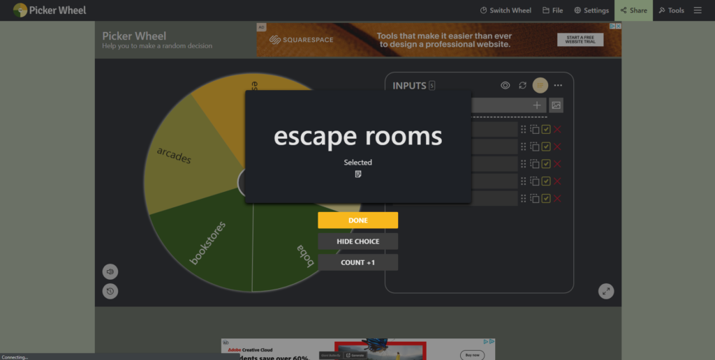
Originally, we were not sure what POI would work best with our group – we went through a lot of ideas and almost landed on libraries/bookstores, but decided it would be best if we left it up to chance – so we created a wheel and let fate pick.

wheel #1

After some researching though, we realized that if we wanted to get any hands-on experience that it would cost $40+, as well as most escape rooms in Seattle being not-the-most accessible via transit. As such, we spun again and landed on arcades.

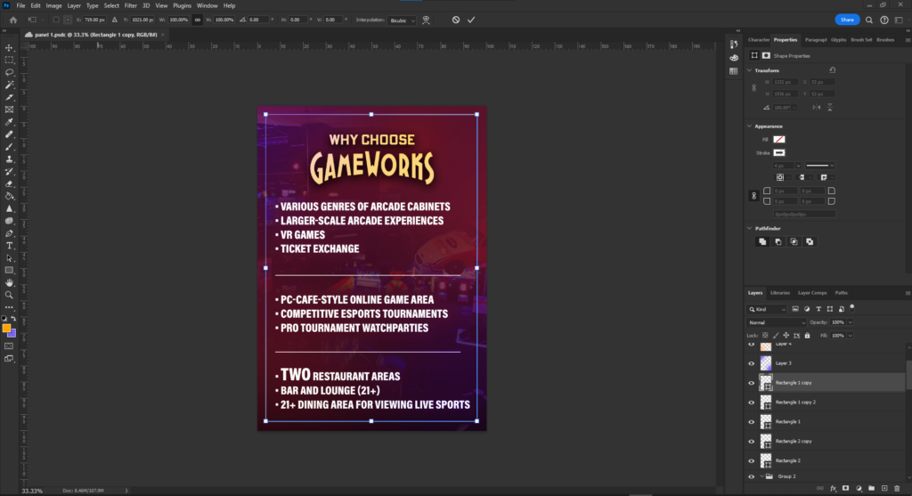
I created my project using a mix of Photoshop and After Effects – Photoshop for the panels and to set up the layers for the AE composition, which only included the gif animation of the logo spin + shine effects.

The panels are both PNGs while the logo is a gif – although in the video demo it does not play past the first frame for some reason.

Thank you for reading! I had a lot of fun with this project

-Avila

Categories
Uncategorized

Beat Saber

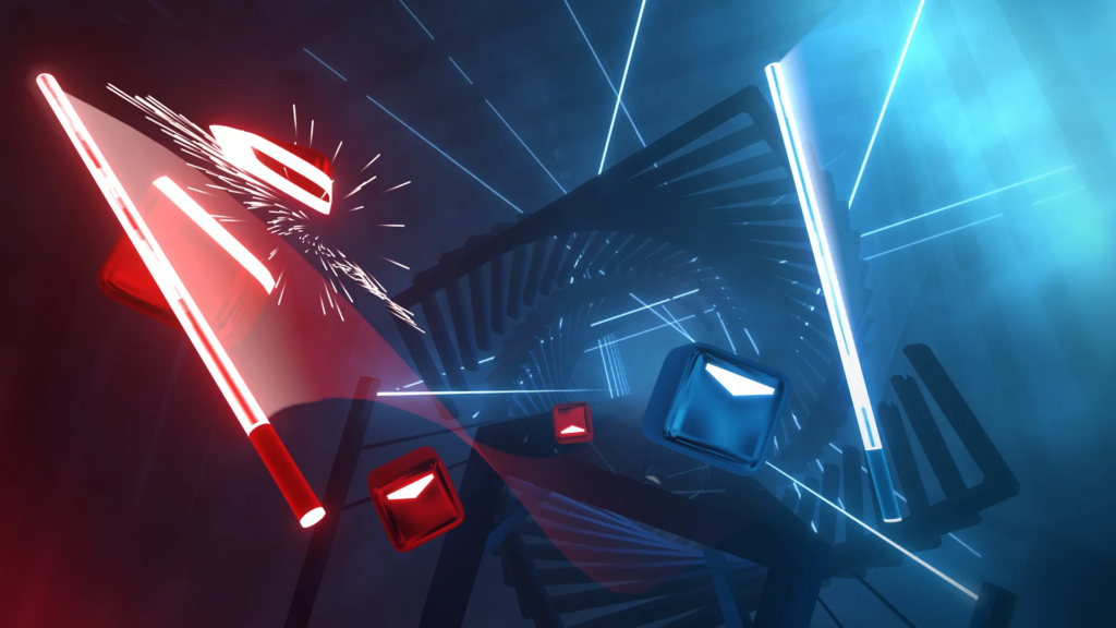
In-game screenshot of Beat Saber

Thought Process

I have always found rhythm games to be very fun, and as such I have always been a big fan of spending time at the arcade ever since I was little. Games such as Beat Saber always seemed to draw my attention, and even though I have never personally owned a VR headset, I got the opportunity to try out the game at my friend’s house a few years ago and was instantly hooked. The only issue at the time, though, was that I still had no headset and there was no other place to play it, so my interest in the game died down a bit. Soon after though, the Gameworks near Westlake that I had gone to tens of times in the past had reopened after covid-related closures with a brand new Beat Saber machine.

The reason I chose Beat Saber was partially due to the fact that I was already familiar with and interested in the game, but also because our group project for the same class ended up having a theme of “arcades”, meaning I could do a bit of research and work for my arcade of choice: Gameworks.

Further research for the game included both playtesting for personal experience, as well as finding videos/images of gameplay online to best illustrate my points.

.


Problems

As I, again, did not and still do not have a VR headset, it meant I had to find alternatives to recording gameplay myself. Luckily, there is a pretty strong-going Beat Saber online community that posts gameplay videos on YouTube and such, so finding what I needed ended up being not as hard as I initially thought. Furthermore, some gameplay elements and UX/UI elements are present in one version of the game and not the other (i.e. portrait mode arcade screen vs. at-home landscape screen), so finding a way to combine those experiences into one thought took a bit of effort.

Categories
Uncategorized

CHBP Poster

by Avila Armstrong

The Concept

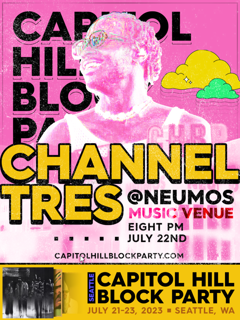
I had never heard of Channel Tres before this assignment (sorry to Channel Tres fans), and as much as I initially wished I got Denzel or Wavedash, I really liked this guy’s vibe upon a first search on Google Images, for lack of better wording. Listening to his music, it gave the same kind of laid-back, warm, but cool, confident, and funky energy that he seemed to exude visually. As such, my goal was to combine that with the fun, bouncy feel that the CHBP branding had this year. I used some elements (such as the clouds and color scheme) from the CHBP posters I found from my research, plus emulating the text to a certain extent as far as deciding which kinds of font to use and how to style it. For every element I borrowed or took inspiration from, I ended up adding my own twist on it in some way or another, from the clouds now having audio-adjacent waves coming from them or the “CAPITOL HILL BLOCK PARTY” wordmark style being instead used for the artist to direct more eyes towards the selling point.

The venue is real, and when doing some research and asset-searching for CHBP, I found Neumos to be a common factor, so I decided it would be fitting to use it as the venue for this.

Not a part of the Block Party branding, but I thought the “Seattle=Grunge” idea would be good to incorporate here, so I added some grain and grunge textures to the poster itself to further give that “underground” Seattle-y feel to hopefully make it feel more inviting and as not-corporate as possible while still looking (hopefully) professional and (hopefully) good-looking.

A main objective I had was to make the poster a Channel Tres poster that would then lead people to go to the Block Party, rather than the other way around. This is further pushed by some of the hypothetical setlist being present on the poster itself in the form of some of Channel Tres’ album covers (or, in the case of Ambrosia, a cover for a song that he is featured in. This performance is hypothetical, so who knows!).

The CMYK-adjacent colors the pinks and yellows bring were easy to work with, as neons and pastels are my own favorites – same with bold, round sans-serifs. I thought exaggerating these colors a bit by adding extra saturation to the find-edges-ed picture of Channel Tres would both bring more attention to him in a subtle way as well as add a bit of pop to the composition as a whole.

I tried my best to really make “BLOCK” a common, but subtle, theme throughout this poster – each element, group of elements, and the piece itself is in some way very much on the grid, in its own little box. Furthermore, non-text shapes are all boxes save for the clouds, and boxes are even used as a decorational visual element toward the lower third to double as a divider as well as a way to balance the piece out from the extra information on the right side of the screen.

I ended up spending more time on this than I thought I would, simply because I found the project very fun and a good chance to spread my wings a little and do something I do not normally do – music posters. I have done posters, but I have always wanted to do something for an artist and this gave me a reason to, finally.

Music:

Ambrosia – Erick the Architect ft. Channel Tres

1st and most foremost album cover on the poster

(fun fact, this came out literally within the last 6 hours as of Oct. 13th 2023!) I definitely did not wait until the last possible second to start this)
Song off of the 2nd album cover on the poster
Song off of the 3rd album cover on the poster

(I am a bit surprised I had not heard of Channel Tres until now, as I am a fan of Tyler’s)

I highly recommend listening to more of CT’s music! After this project, I am a big fan of his. I hope I get to go to a concert of his next time he is in Seattle.

Categories
Uncategorized

Adobe Aero

by Avila Armstrong

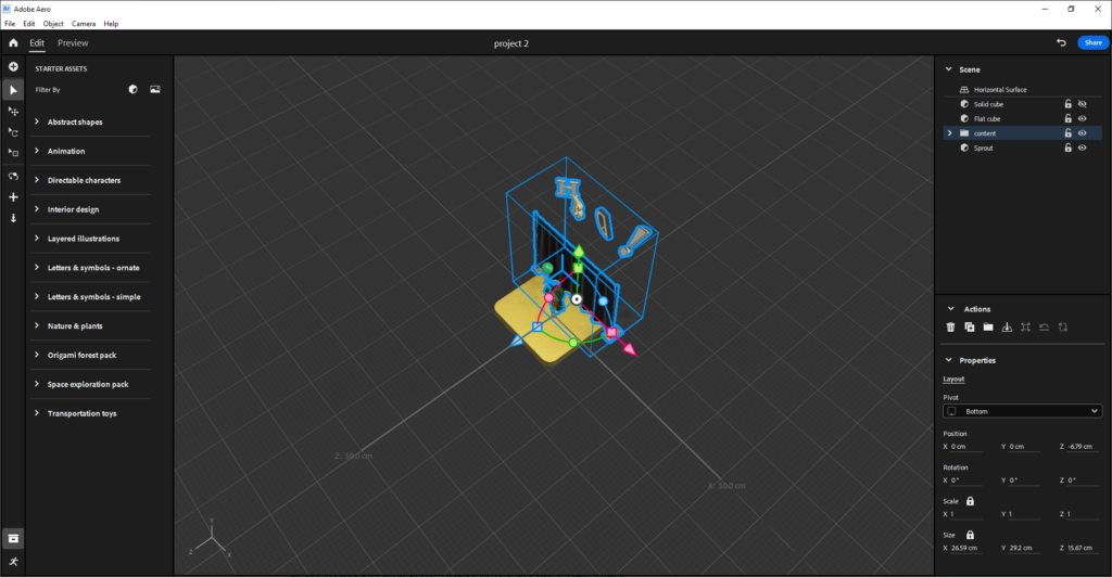
Screenshot from the process of creating the AR Experience

Thought Process

So, when I was looking through the rubric, “birthday card” stuck out to me for some reason. Although I think from a mix of me being really into Halloween during October and me being sleep deprived, I thought it would be fun to make it a creepy, “ghost story”-style birthday card. This was further reinforced by my finding of the default “balloon kid” model being a bit creepy to me, especially when animated.

I think there are inspirations from various spooky stories I’ve seen online throughout the years, but it’s not very original. In fact, just now that I am writing this, I realize that the story of “kid chases balloon and disappears” is even present in Pokemon of all things, although that was not in the slightest intentional at any point during the creation of this.
When I placed the plant and added the fade-in, I debated even keeping it in because, for a school project, it’s a bit dark considering it’s a pretty solid confirmation that, well, the kid’s some kind of ghost. Overall though, I decided that it fits the spooky season so I kept it.

The letter “D” in “HBD” being off-style and inverted, overall not together with the rest of the text was made to further increase the creepiness factor, since it’s off-middle. I find slight alterations in things such as text a bit jarring, so on top of this I also made the text very non-uniform.

When debating on my transitions and actions, I decided a delayed “jumpscare” was very fitting to set the tone, and fade-ins/outs for everything afterward would make sense considering the ghost theme.

.

Problems

The process was surprisingly smooth considering this is a new program to me, although I think my small bit of experience in Blender helped me out a ton as camera movement and sizing/positioning/rotating objects and setting parameters was very intuitive. Plus, the universal Adobe shortcuts (especially ctrl+shift+z instead of ctrl+y) made me feel right at home.

I had some problems during the initial tutorial in class, but I remembered those issues throughout the creation of the homework and was lucky enough to dodge any bugs. That being said, I really wanted to animate the curtain in some way, and the lack of animation presets for it left me stumped as to what I could do with it – I wish I could do more but with my current toolkit there was not much I could do but redo my mental storyboard a bit – this is where the introduction of the plant came from, actually, as well as the balloon kid fading/disappearing into the floor.

Categories
Uncategorized

AR Poster

by Avila Armstrong

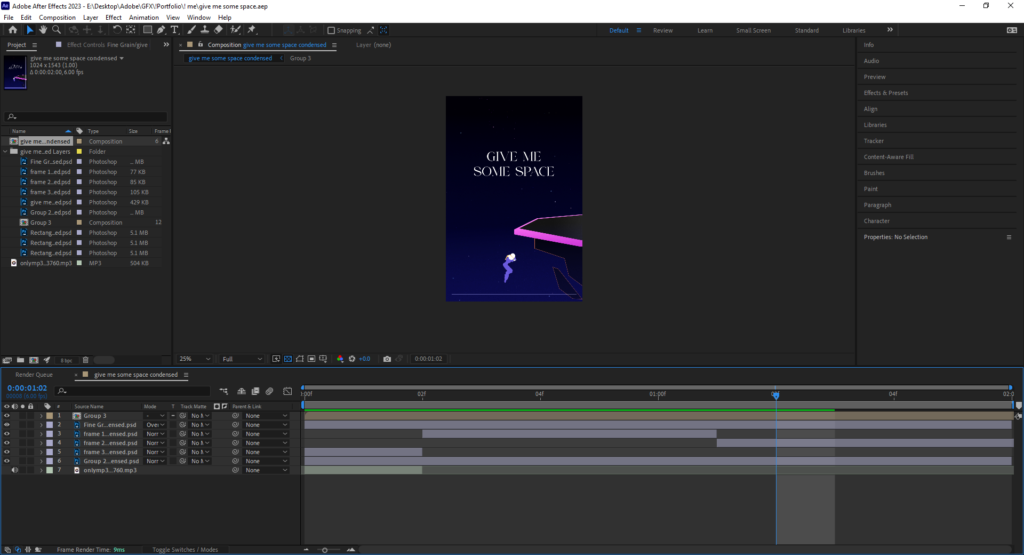
After Effects animation + keyframing process

Thought Process

My main hobby (besides design) is playing competitive video games and going to various video game tournaments for fun. I’m not very good relative to professional players, but I’ve met a lot of very close friends throughout my time playing and have so far gotten to experience many things I would not have otherwise had the chance to experience. One of my favorite characters in one of my favorite games, Super Smash Bros. Melee (the one on the GameCube, which is still very much played), has a technique where you can stall and become temporarily fully invincible, which gives you time to stall for time, think, strategically prepare for a good hit, etc. This technique is found annoying, but I find it quite useful as somebody who likes to have time to think in high-pressure situations.

When I thought of what poster to make for this assignment, this was one of the very first ideas I had, along with other similar depictions of other fighting game scenarios. But, the depiction of Final Destination, a well-known and extremely popular stage to play on in competitive Smash Bros., came to mind, and the thought of “give me some space” just clicked. After drafting this situation with the various characters that can do similar techniques, I went with sheik partially due to her being one of my favorites but also because the other characters were harder to illustrate, to be honest.

Programs

As much as I would have ideally used Illustrator for the… illustration… I ended up using Photoshop for all of the illustration and initial composition purely because that is what I am most comfortable with. especially when paired with After Effects.

I used After Effects for all animation. The video is at 6fps – I use 12fps often purely for the aesthetic so I figured that less frames would be a bit easier considering the other projects I have to finish this week, and also it being divisible by 6 makes it a smoother transition from the standard 60fps when working with an originally-60fps animation (which was pretty much traced, handpicking 3 specific frames from the animation in question)

Problems

The process was honestly pretty smooth – the biggest issues I had were with getting eyejack to work but once I figured it out via trial-and-error things seemed fine from there. That being said, the audio never played from eyejack no matter what I did. In the video itself, there is a sound effect from Melee that plays – albeit not in this situation – but from the same character at a similarly-common time.

Credits –
Super Smash Bros. Melee; audio, image inspiration
Super Smash Bros. Ultimate; image inspiration

Categories
Uncategorized

Hello world!

Welcome to New Media . This is your first post. Edit or delete it, then start blogging!