by Avila Armstrong
The Concept
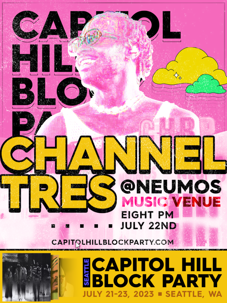
I had never heard of Channel Tres before this assignment (sorry to Channel Tres fans), and as much as I initially wished I got Denzel or Wavedash, I really liked this guy’s vibe upon a first search on Google Images, for lack of better wording. Listening to his music, it gave the same kind of laid-back, warm, but cool, confident, and funky energy that he seemed to exude visually. As such, my goal was to combine that with the fun, bouncy feel that the CHBP branding had this year. I used some elements (such as the clouds and color scheme) from the CHBP posters I found from my research, plus emulating the text to a certain extent as far as deciding which kinds of font to use and how to style it. For every element I borrowed or took inspiration from, I ended up adding my own twist on it in some way or another, from the clouds now having audio-adjacent waves coming from them or the “CAPITOL HILL BLOCK PARTY” wordmark style being instead used for the artist to direct more eyes towards the selling point.
The venue is real, and when doing some research and asset-searching for CHBP, I found Neumos to be a common factor, so I decided it would be fitting to use it as the venue for this.
Not a part of the Block Party branding, but I thought the “Seattle=Grunge” idea would be good to incorporate here, so I added some grain and grunge textures to the poster itself to further give that “underground” Seattle-y feel to hopefully make it feel more inviting and as not-corporate as possible while still looking (hopefully) professional and (hopefully) good-looking.
A main objective I had was to make the poster a Channel Tres poster that would then lead people to go to the Block Party, rather than the other way around. This is further pushed by some of the hypothetical setlist being present on the poster itself in the form of some of Channel Tres’ album covers (or, in the case of Ambrosia, a cover for a song that he is featured in. This performance is hypothetical, so who knows!).
The CMYK-adjacent colors the pinks and yellows bring were easy to work with, as neons and pastels are my own favorites – same with bold, round sans-serifs. I thought exaggerating these colors a bit by adding extra saturation to the find-edges-ed picture of Channel Tres would both bring more attention to him in a subtle way as well as add a bit of pop to the composition as a whole.
I tried my best to really make “BLOCK” a common, but subtle, theme throughout this poster – each element, group of elements, and the piece itself is in some way very much on the grid, in its own little box. Furthermore, non-text shapes are all boxes save for the clouds, and boxes are even used as a decorational visual element toward the lower third to double as a divider as well as a way to balance the piece out from the extra information on the right side of the screen.
I ended up spending more time on this than I thought I would, simply because I found the project very fun and a good chance to spread my wings a little and do something I do not normally do – music posters. I have done posters, but I have always wanted to do something for an artist and this gave me a reason to, finally.
Music:
1st and most foremost album cover on the poster
(fun fact, this came out literally within the last 6 hours as of Oct. 13th 2023!) I definitely did not wait until the last possible second to start this)
(I am a bit surprised I had not heard of Channel Tres until now, as I am a fan of Tyler’s)
I highly recommend listening to more of CT’s music! After this project, I am a big fan of his. I hope I get to go to a concert of his next time he is in Seattle.