I experienced some technical difficulties recording and uploading a video to this blog post, but I have an audio recording for you to listen to that is what I would say if I was stuck in an elevator with someone who could hire me 😂
Adjusting the Plan
This blog post is in response to the prompt: “Talk about a time when you had a plan but had to make changes.”
The example that i’m thinking of was in first quarter, for the final Illustrator assignment which was to make a recipe infographic. I use this example because it was the first time I had to really go off course from my plan, while also not having that much time (a tight deadline). Up until that project, I had managed my time perfectly, but it was at this project that I took my sweet time asking for feedback until about halfway to the due date. I thought I was going in the right direction but Jason’s feedback was basically to tell me that I was not, and that I would have to really course correct. This of course was stressful because my plan assumed that I would have the whole time and be making progress steadily. I hadn’t accounted for the scenario where I was going to have to scrap my entire initial design drafts. In the end, I still made something that I’m pretty proud of and that satisfied the communication goals of the brief, but I suffered for my project mismanagement.
Now as I’m writing this, I’m thinking of another, more recent example of where something similar has happened. This is a design project from outside of school. A couple weeks ago, I was hired by my friend to create a poster for her. Again, I mismanaged my time and showed initial drafts far too late. Well, it wasn’t too late. But it was too late under the assumption that I wouldn’t have to revise any of the drafts and start from a totally new concept. Eventually, I busted my ass to produce the poster by the deadline, and once we got past the initial ideation stage (getting down the general aesthetic direction) it was a breeze, because all I had to do was to tweak the copy and make other slight changes.
Here’s the first draft I gave her:

Then, I produced two more drafts.

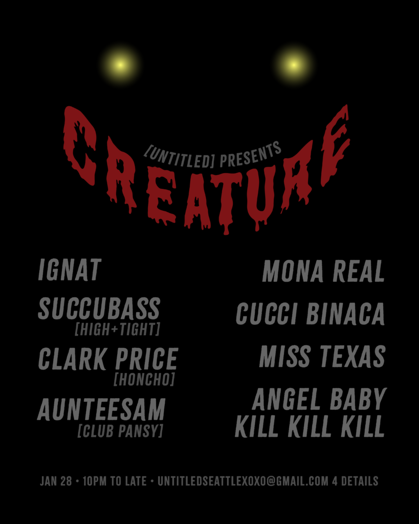
My client seemed still not too happy with what I had made, but they said that the first option was the best so far. I asked them why, and they said they liked the “distressed look” and the “vibe of the fonts”. So I then went further with the direction. Producing these two subsequent drafts took another day.

This was the fourth draft I made, and my client was still unhappy, saying it was too difficult to read. So I produced another draft to overhaul the layout, while keeping everything else the same.

This is the final version of the poster that got approved. Upon seeing this version, she was extremely happy with it, which also made me happy. I really spent a lot more time on this entire process than I was planning for, and it caused my schoolwork to suffer as I had a monetary as well as social incentive to prioritize making this poster.
Anyway, this is all to say that the lesson I have learned about planning in the project management sense, is that I should start my initial drafts and concepts and get feedback as early as possible, and set myself up to have enough time and flexibility to account for changes in direction. Additionally, I should be hasty with ideation, because it’s probable that I may not be going in the initial direction I set out for.
Now I know.
XR.4
For this week’s project we were tasked to create an AR tour experience.
My group decided to do a series of panels that can be activated at Sound Transit stations around the city. I did mine at the King Street International District Station near my house.
The process we used was to create a template on Figma that had a unified color scheme, lifted from the Sound Transit branding. We then modified each of the templates in our own unique creative directions for the stations we wanted to do.
I wanted to keep it simple, and so I focused on wayfinding. I imagine that someone could activate this AR experience at one of the station maps and it would show you clearly which direction you need to go.
XR.3
For this week’s project I made an AR experience using Adobe Aero.
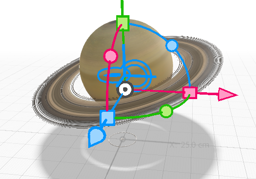
My idea was to create a card that you could send to your friends who are ending their Saturn return this year, which includes me. It’s a very monumental time for the world of astrology, because Saturn is leaving its home sign of Aquarius. I saw that there was an existing Saturn asset, so I had to do this as the experience.
You can check it out if you have the Adobe Aero app on iOS, using my QR code below.
Basically, when you approach the Saturn, it disappears and reveals some golden mathematical objects floating in space. Then if you tap some of them, there is a sign that appears to congratulate you on enduring another transit of Saturn.
I thought it would be cool to have them float around in a “trippy” way as it suited the cosmic vibe of the card.
One issue I had was to hide some of the assets until I wanted them to appear. However, I decided to just hide them inside of the Saturn instead of making them appear from nothing. This seemed to be a suitable workaround for me.
Enjoy!
Personal Project Musings
I have been thinking about personal projects since I started this program. I’ve been particularly inspired by Steve Hansen’s presentation about 3-D. I think I want to take on some project that involves using 3-D modeling to create 2-D still images, aka single frames or shots from a 3-D scene. In this way, I would be using 3-D in a similar way to Steve, where it is a tool for a different graphic end.
I am not sure of the actual medium of the final artifact, but I think it may be a zine or a poster. Something in print. I’m wanting to explore the techniques of 3-D modeling software. So this project would be an excuse to learn that software, but with a context and a purpose that would orient my self-learning. This context and purpose would be something that I get to choose that is tailored to my personal interests. So it would be free of the normal constraints of a school project, or a client’s brief, hopefully inducing more creativity.
I think it would take about a year to execute this project. Because I’d need a good amount of time to plan out what I want to do at first, then have time to learn the tools, and then to execute, then time to modify my execution as I run into inevitable problems.
Other than time, I’d need to acquire the necessary software and tools, and also materials for print. I think it’s a great idea though and I want to try and do this for special projects next year. In the meantime, I’d need to figure out what the topic would be. There’s a lot to figure out.
XR.2
This week for my AR/XR module I reviewed the Google Lens/Google Translate app. Google Lens is a new app from Google that basically utilizes all of Google’s capabilities with the phone camera to interact with the world around you in helpful ways.
The Google Translate feature of this app allows you to point your phone to written text in the real world, and have the translation appear on your screen superimposed (covering up) the IRL text.
I found the app very sleek and user-friendly, which is something I have come to expect from Google’s apps. At least, I found this to be the case for the Google Translate feature of Google Lens. I don’t know about the other features because I did not try them out.
One of my favorite parts of this app was how intuitive the usage of AR was. There wasn’t any frills – it was just point it at the thing you want translated and see the translation. To me, this has a clear real world advantage of using AR over the vanilla Google Translate app. When you are traveling in a foreign country, you may not have the language skills nor the technology to input foreign orthographies into your Google Translate app. Being able to point your phone at what you want translated is such an elegant, precise application of AR. This made me happy, because I think that many AR apps can feel contrived, or simply aesthetic (not that there’s anything wrong with that, but I personally am more moved by the functional nature of this app).
I can imagine that for someone who isn’t already familiar with the basics of AR, such as the fact that you can point your phone at anything at all, that this kind of technology may be confusing. There is no tutorial for the totally new user. Since I am already familiar with the general concept of AR (my first experience with it was on the Nintendo 3DS, probably back in like 2011), I understand that you have to point the camera at something and sometimes wait a little bit for the software to do its thing. If you didn’t know that, you might think that nothing was happening, and move the camera away too fast. To account for this type of user behavior, the app would benefit from a tooltip that informs the user to wait until the translation is complete.
XR . 1
For the first assignment in the XR module of New Media, I chose to implement a scannable animated emoji in EyeJack.
This is the initial still from the emoji. When scanned in EyeJack, it animated to reveal that it is the kissyface emoji and plays a kissing sound effect.
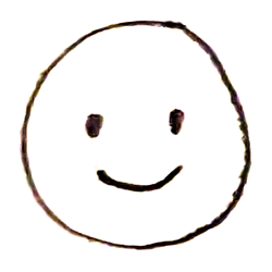
I landed on this idea while thinking of what I could do that would be a simple showcase of the EyeJack AR app’s capabilities of scanning a flat image to then animate it. I chose to do this because I like how you can’t tell what it is from the still. It’s kind of cheeky. Like you’re getting a little delightful surprise from an unassuming smileyface.
I created the animated GIF by drawing each frame and compiling in Photoshop.
This project went smoothly without any hitches. I was actually quite surprised at how easy it was to upload, and how well the AR worked.
Here’s the QR code to be viewed with your EyeJack app.

Environment
I chose the back most hallway for my environmental design.
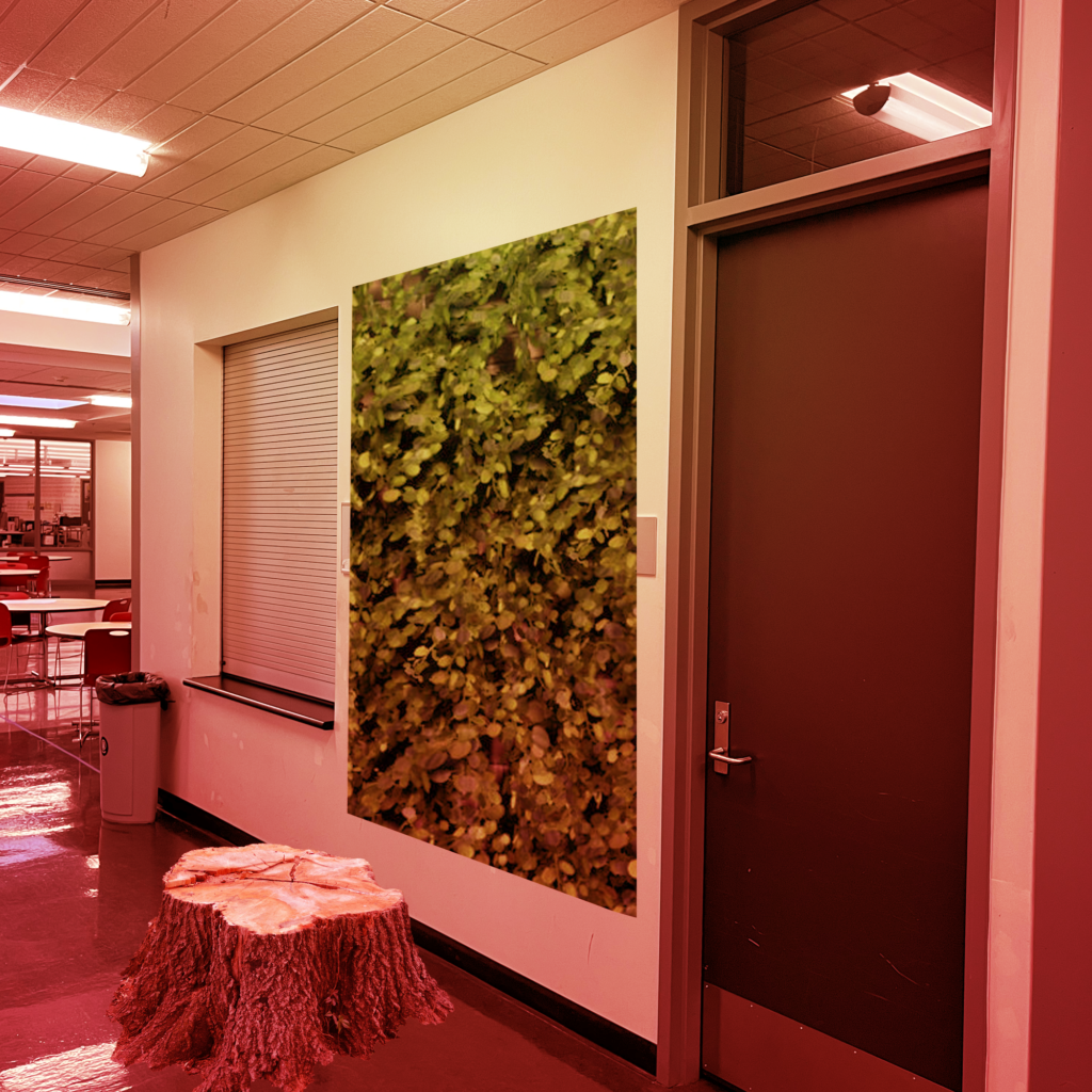
I chose this area because it is basically the dead end for the entire building. It’s our sanctuary, if you will. Here, I envision a very literal construction of elements from the natural world. It’s important to me that they are as realistic as possible. Perhaps the green wall of ivy is actually a living wall, supported by grow lights. And the stump is a real, disembodied stump of wood. The overhead lights, so white and harsh, have been replaced by warm red and orange bulbs, as if to mimic the low angle golden sunlight of the late afternoon.
I think it would be highly therapeutic for us to have this oasis of natural elements. Not only is it a proven aide to reduce stress and anxiety, but it’s also inspiration, a resting spot. I already feel quite safe on the 5th floor, but this is that extra je ne sais qois to induce a true container of safe introspection.
If I had my way, the whole hallway would be like this. Lined in green, all chairs replaced by wood stumps. Someday, perhaps.
VME is cool
I have greatly enjoyed getting to know the VME students and learning about what their field entails, through New Media speakers and interactions with my classmates. It’s cool because though we have different mediums and methods we share a lot of the same motivations for what we want to get out of our careers – namely, we are all creatives of some kind looking to integrate what might have been our hobbies or passions more coherently into our paid work.
For the first New Media module, I was in Vanessa’s Narrative Filmmaking class, which was really fun, despite it definitely being out of my wheelhouse. I appreciated what I learned in this class for several reasons. For one, I think it will be super helpful for me down the line just to have a broad exposure to all of the Adobe products, and so to get a rudimentary grasp on Premiere has already shown benefit. I’m noticing the ways that skills from one of the software products transfer over to another, and helps to cement my understanding of the tools overall. Furthermore, I can easily see a situation in the future when I might have to call upon my knowledge of the program in order to complete some problem, which I have no doubt I’d be able to rise to the occasion of even if it’s not part of my regular design practice, now that I’ve had some exposure to it.
Besides learning the technology, I also really appreciated how we spent time discussing and talking about camera and editing techniques that are specific to the filmmaking discipline. I had never learned about film in a class before, and I was totally unaware of the ways you can dissect the director’s camera and post-production decisions – for example, the differences between different kinds of cuts and movies that have used them to effect, or the different types of shot angles and the emotional flavors that they impart on the viewer’s experience. It is now valuable knowledge for me. I can see how I would be able to apply some these same principles to visual design. Really, photo and graphic design have lots of overlap when we think of the viewport or canvas for an image as the “camera” for a designer. So, it’s not too much of a jump to bring in, for example, the sense of scale provided by a super wide shot in film, to a “super wide” composition on an image, when my goal is to imply breadth and emphasize the relationship between a subject and an environment in some visual story.
The final aspect of Vanessa’s class specifically that I really am grateful for is the exposure to film in general. I actually came into this program with very little knowledge about film – I often joke that I have huge gaps in my cultural knowledge because I missed out on so many famous films. After this module, I actually have an interest in film now. It’s honestly really rad because I had tried to motivated myself to watch films before (like, not just casually with friends at the theater as a way to hang out – that’s something I of course did, but to really consume film as an artform, as inputs for my internal creative toolbox) but it’s never stuck until now. I think it’s a result of me also being a design student. It wouldn’t have been the same if I had just taken this class solo, out of context. The fact that now I’m thinking about images and design is providing a natural outlet, a generative need, for film.
And I’m so not surprised! I think the cool thing about VME and DES is that these are very practical, applied disciplines. In our other design classes, we’re learning about how important it is to put intention behind what we produce – how the design must serve the human goal, whether it’s a client’s business imperatives, or a user segment’s needs. In that sense, VME is similarly placed in the real world. How is photography and videography actually being made and consumed by people today, and what is it’s role in our current media landscape and society? That’s what I imagine they are learning over there. It’s the same with design.
I wonder if I will end up working in the film industry. I could actually consider it now. I lived in LA for 8 years, so that whole vibe is something I’ve thought of before. I’m not putting any pressure on myself to know what exactly I want to do for a job just yet, but it’s definitely a door that if open, I will peek behind.
leadership?
To be honest, when I hear about “leadership principles”, or any other sort of corporate kool-aid value system, I get upset. I think it’s because I had really terrible jobs all through my 20s where I had to snuff out part of myself in order to acquiesce to these norms. I hated doing that. I found it so difficult to pretend like I cared, and I was often very bitter in those jobs.
I think now, my perspective has matured and shifted a little bit. I am still committed to my own truth and to being myself, but I am willing to play the game. It was inspiring to hear from Margaret about her experiences actually, because she really put it nicely. She said that she focused on Customer Obsession, because that was an actual area of overlap between her values and the company’s values. I think that’s key. Where do my strengths actually align with the leadership principles? Determining that would in effect be working with the current rather than against it. That would be a departure from my old habits of cynicism.
With respect to Amazon’s company leadership principles, I think the three most relevant to me are:
- Have Backbone; Disagree and Commit
- Insist on the Highest Standards
- Customer Obsession
It sounds kind of contrarian, but it’s honestly true that for the corporate/professional white collar style jobs I had in my 20s, I felt like I was constantly arguing with my bosses to maintain a meager baseline of quality in my organization’s work. I have always been good at sticking to my guns when I feel like the work produced is not up to par. To fight in this way has caused me a lot of heartache in the past, but I suppose it is a strength if you look at it according to these leadership principles.
The hardest of these principles for me to adopt would have to be “Success and Scale Bring Broad Responsibility”. It’s simply too kool-aidy. It would feel like I’m lying through my teeth if I had to pretend to profess this value in the context of a company where my primary goal is to make a living. All of the others, I think I could find a context in which they aligned with my actual values as a person, but this one is in direct contradiction with how I feel about Amazon, and corporations in general.
That said, I have no qualms about working for a corporation like Amazon. But I think I would have to meet in the middle by picking and choosing those company values that I can realistically heed without feeling like I’m betraying myself.