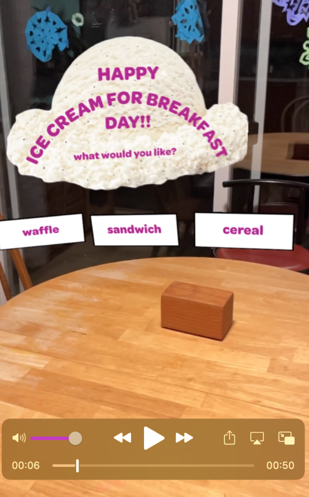
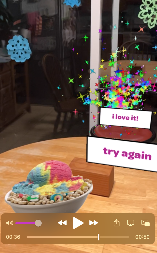
This week’s augmented reality experiment was to create a greeting card using Adobe Aero. I decided to make my card a greeting card for National Ice Cream for Breakfast Day, which is coming up soon (It’s the first Saturday of February each year. My family celebrates it extra because my daughter was born on Ice Cream for Breakfast Day!).
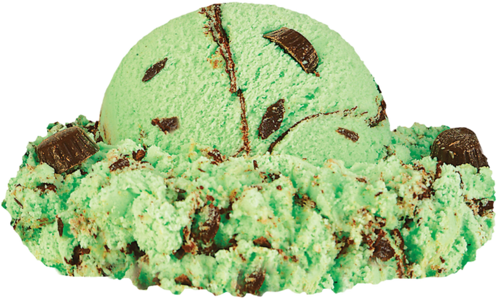
There were no pre-loaded assets in Aero that I wanted for this project, so I did a combination of finding images online and creating .pngs in Adobe Illustrator. I wanted the card to have a loop effect, so I decided to find three different breakfasts that someone might like with ice cream, then found pictures of ice cream to put on top. I added some text to guide the viewer through what to do, and then I wanted a “reward” for a happy ending, so I also included a little firework .gif.
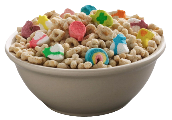
The main challenges that I encountered were aligning the flat images so that they could sort of work in the 3D space and getting the .gif to work correctly no matter how many times someone wanted to play the game. For the images, getting them to look okay just took a lot of tweaking of the pull-handles and making sure that ice creams were not falling behind the food that they were supposed to be on top of. For the .gif, I realized that I had set it to loop infinitely, and it wouldn’t re-load until after the animation was finished playing, so that’s why it wasn’t going to repeat properly. Once I changed the settings so that you could re-start the animation immediately, it worked!
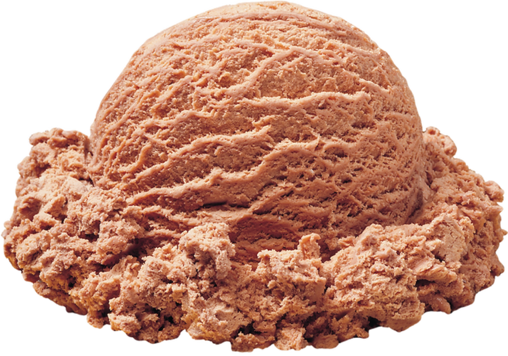
This was a really fun little project, and I think it would be much more fun if I could create my own 3D images to work with rather than just the flat ones.
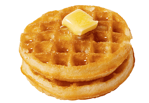
Happy Ice Cream for Breakfast Day, everyone!!
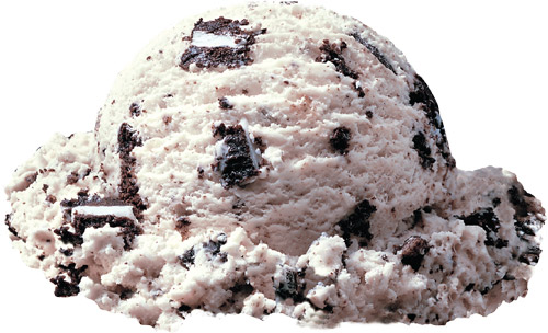
UPDATE: Oh. My. Gosh! This was NOT as easy as I thought originally! After writing the blog post, I tried out my work on my phone so that I could watch the video… it did NOT look good! The images and text were all over the place. I had thought I did such good work placing them, but some were way across the room, some under the table, and some way up over my head. Some were surprising teeny-tiny sizes or really big! I did a lot of work to clean it up by moving items around through the phone app. It helped to be able to move around the objects to see where they are placed from different angles, and now it looks MUCH better! And I learned that designing on the phone is much more fun and easier for placement of objects. I will definitely do it this way in the future! Here are a couple of screen shots from the finished product:
