This week’s post is inspired by Mara Stokke, an SCC grad who is currently working in the field of environmental design. One of the concepts that she mentioned in her talk, although I’m not sure she used the term, was biophilic design. The concept of biophilic design is to design environments that foster a close connection to nature, and it turns out that there are many health and wellness benefits to this in addition to aesthetic value. Our challenge for this blog is to re-imagine a component of Seattle Central’s 5th Floor as if it were to make use of biophilic environmental design. This actually seems like a huge task, beyond the work of a single blog post; in Mara Stokke’s talk she discussed how environmental design projects are often on a timeline of many months at minimum, or even a few years to complete and that’s from experienced folks who work in the field! So I’ll really just be scratching the surface here with a few ideas and moods rather than a comprehensive design.
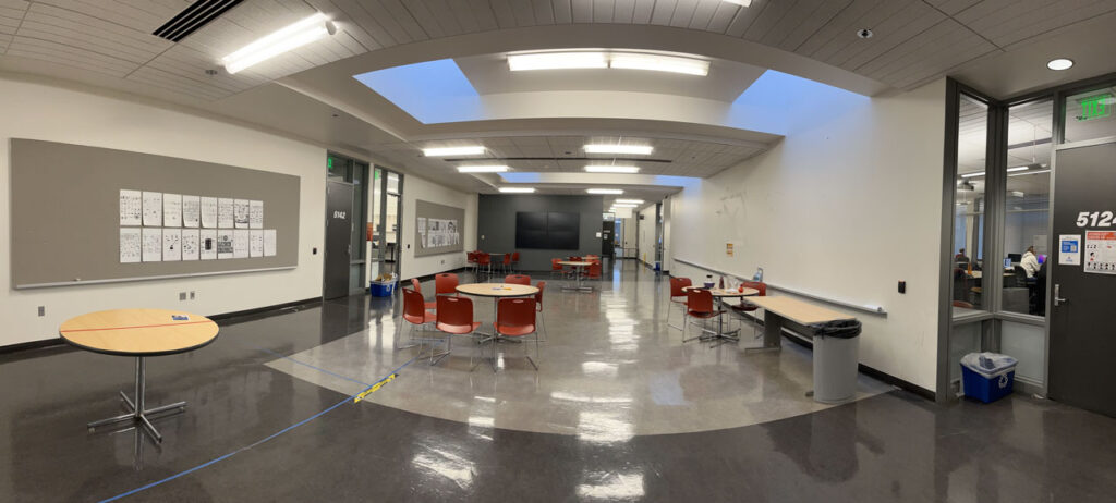
For this thought experiment, I decided to focus on the large empty crit space just outside of the everyday Graphic Design classrooms. This is a large space that has important uses but is mostly under-utilized on an everyday basis. Here is the scene:

There are a few interesting things to consider about this space before diving right in to design brainstorming. Although this space has a definite empty feel and is absolutely not succeeding as a cozy and comfortable space that makes us reflect on nature, this space (and, actually, most of the 5th Floor) is one of the areas that feels most professional and sleek within the college building. Although we would want to soften the space with natural elements, it would also be great to keep an implication of that high-tech feel since the Graphic Design program has such a heavy focus on software applications and current tech. Although there are no conventional windows in this space, there is a very interesting ceiling with skylights. The current lighting interferes with a natural feel, but if the lighting were changed, the peaceful feeling of the natural light could become a focus here. There are several walls that are available for student work to be hung and critiqued or used as an area for portfolio shows. However, as things are more digital now, there are fewer cases where instructors require printing, and these critique areas are often empty.
Given these unique challenges and assets, here are some of my ideas for a biophilic design in one corner of this space:
- Enhance the assets of the ceiling in a way that improves natural lighting
- Create interest on the large empty walls while also ensuring that space is available for hanging student work when needed
- Develop spaces that allow students to relax comfortably while stimulating creativity through nature
- Balance between organic forms and the suggestion of the natural environment and the feeling of a cutting-edge high-tech workspace

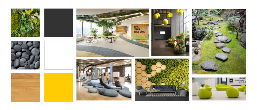
I decided that a zen garden would be a good fit for the theme of this space. The feeling of a zen garden is peaceful and balanced, and although zen gardens are small, they have a lovely sense of openness that I think this area would benefit from since the ceilings are low. I also want to include more texture sensory experiences but not be too overwhelming or overstimulating. The colors would include natural green mosses, bamboo, and stone, as well as charcoal gray, white, and a highlight of bright yellow. Of course, in this short time, I couldn’t include every element that I would wish, but a few highlights are:
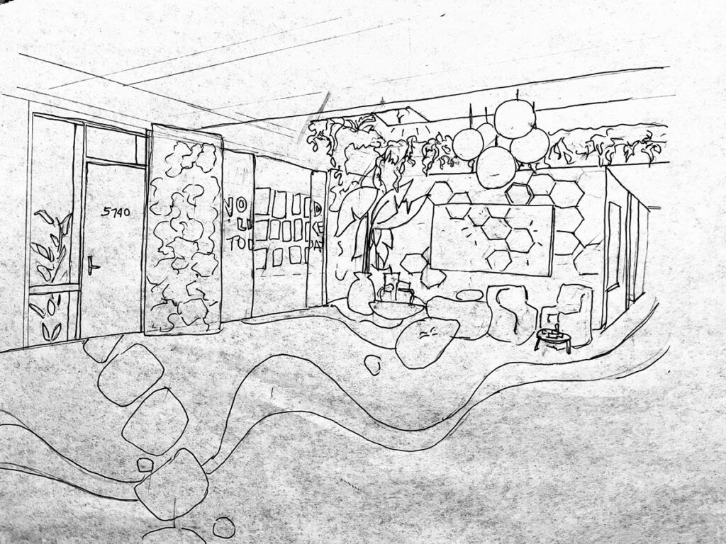
- Ceiling: removing the harsh fluorescent lighting and replacing it with light in a more natural spectrum – some from the sun through the skylights, some through inset ceiling lights, and some through the yellow orb-shaped hanging lights. Hanging plants would be installed around the edge of the ceiling alcove, and the institutional white ceiling tile would be replaced with bamboo slats.
- Seating area: replacing uncomfortable plastic chairs with more armchair-like chairs with coffee tables for a living-room-like feel. Include movable large stone-shaped soft seating to add an element of play as well as to make the zen garden theme more interactive. Some eating/working-height tables would still be available as well.
- Crit wall: The crit wall is overlaid with sliding panels that have bamboo and live mosses growing. When no artwork is displayed, the panels can be closed and would either form a solid living green wall or could have a simple bold inspirational statement (not corny) framed by the two moss panels. When artwork is displayed, the panels collapse to reveal the student work.
- Interactives: The interactive wall (adjacent to the crit wall) keeps the large media screen display and surrounds it with interactive hexagonal shapes that respond to touch, giving out light, soft sounds, and images. When not being used for other purposes, the interactive screen continues the pattern. Students, staff, and other visitors can relax by using touch to change the pattern of shapes in a playful or meditative way. This interactive is meant to release stress and spark creativity.
