This week’s post is inspired by Robin Holloway’s talk about the creative process and what he called “cosmic attractors,” or sources of inspiration for art and design. Two of mine are color and nature, so I stepped out of my comfort zone to make a little video blog about it here:
https://drive.google.com/file/d/1tGUq40YjktVBr6B8BrvIoZREGG5W12MV/view?usp=sharing
I have to admit, I’m a little uncomfortable and awkward about the video blog as I’ve never done this kind of thing before, and I didn’t remember to say everything that I’d meant to say, but it was a good exercise in trying something new! I don’t think this will become my new creative habit, though, ha!
Author: slinger
Ettie Wahl: Bioluminescent Films
This week’s post is inspired by our speaker, Ettie Wahl, who challenged everyone to take time this week to find something in nature that inspires or sparks our imagination. It’s been a very busy week of design for me (probably everyone!), so it’s been a bit hard to find extra time, but luckily, some inspiring nature appeared in my mailbox, literally! I love to garden and to experiment with colorful foods, so when my favorite seed company had a last-minute sale, I had to indulge, and I bought two blue turmeric plants! They arrived, and they’re super cute!
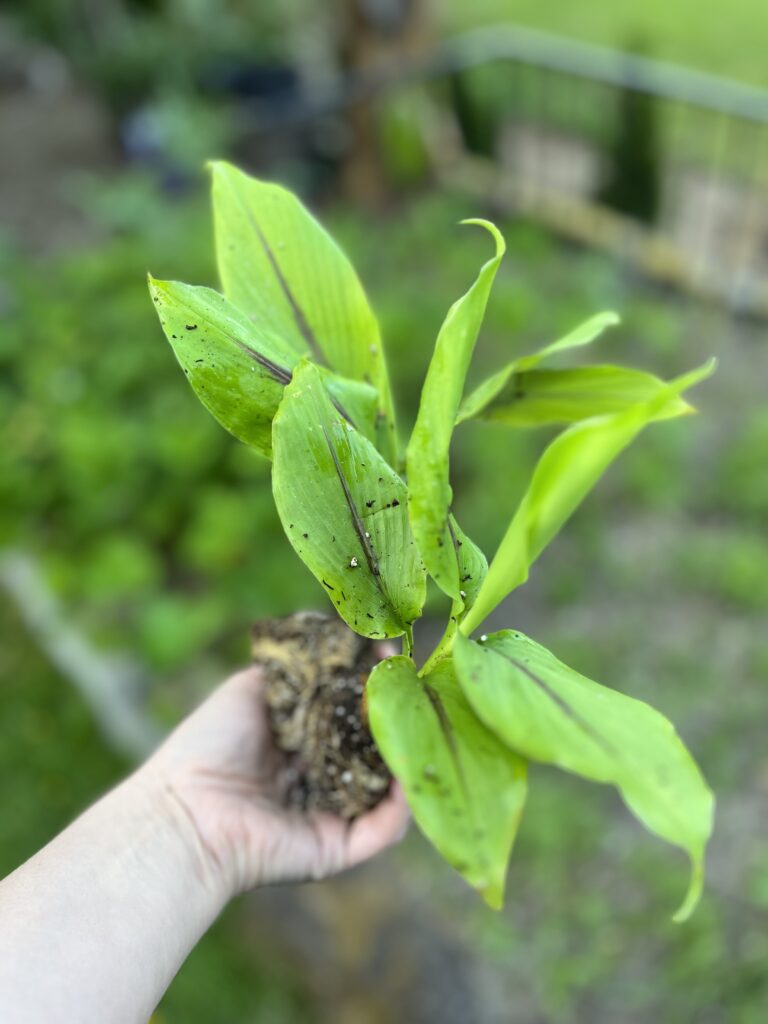
Here is what blue turmeric is going to look like once it grows big, at least according to the plant catalog:

And look what else I found in my garden that I’m excited about!

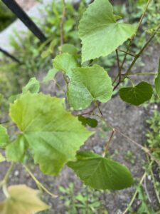

So, what do these moments in nature say about me? I’m really into my garden, I suppose! When I was little, my grandpa and his garden were an important part of my life, and now growing a garden still makes me happy. Flowers are fun, but I especially love to grow foods. It’s rewarding to see the plants grow, and harvesting makes me feel like an urban homesteader, like I’m somehow more of a provider for my family. Even before the harvest, working in the garden is such a great way to clear space in my mind and feel more of a connection to the earth around me. When I can spend time in the garden that way, I feel healthier and more grounded and connected, and I think of so many great ideas while I’m working. I think it’s really good for my mental health and my creative process to spend time working with something that has materiality and life that way. I also especially love and connect with colors, the greens of new growing things are especially luscious, and excitingly-colored fruits and vegetables are a favorite of mine for experimenting with cooking and baking. I love making things with beets because they turn pink! Spirulina is great for green and blue, and butterfly pea flower tea is another fun blue. Purple carrots are a favorite of my kids, and I’ve also tried purple tomatoes and purple sweet potato waffles are super fun. Turmeric is usually great for yellow, but I’m excited to find out what it will be like to try out the blue kind!
Daniel Shapiro: Mood Board
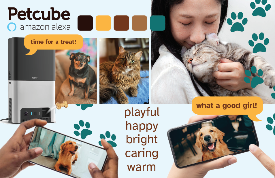
This week’s post is inspired by the talk by photographer Daniel Shapiro who showed his work and process on a wide range of artistic and product photography. One component of his work included creating mood boards for concepting the style for photography shoots and campaigns for his clients, so we’ve been challenged to create a mood board for Petcube, an app-controlled product that allows pet owners to watch and interact with their pets when the pets are home alone. The product can support remotely talking with your pet and throwing treats to the pet, and it also has all of the functionality of Alexa such as playing music, looking up information, etc. When I was brainstorming about this product, I thought about how many pet owners have recently spent a lot of time with their pets since they were likely working from home during the pandemic, and now that everyone is beginning to go back to the office, many pet owners might be feeling sad or even guilty about leaving their pet at home alone. Maybe they are concerned that their pet is lonely or that they could lose the connection that they feel to their pet. This product aims to solve those problems by allowing pet owners to see and interact virtually, giving the feeling that they are not truly leaving their pet entirely. Because of this, I designed this mood board to be pet-forward rather than technology-forward. In contrast to the clean, functional look that the product’s advertising seems to have had in the past, this advertising strategy appeals to the pet owner’s emotions by emphasizing the playfulness, warmth, and connection they feel for their pets. The color palette reflects the warmth of that relationship and emphasizes hues of the pets themselves, and likewise, the photography is generally warmly-lit with emphasis on pets’ facial expressions for connection as well as imagery and messaging reflecting the love that they wish to express for their furry companion.
Spencer Glenn & Todd Durboraw: Types of Jobs
This week’s post is inspired by Spencer Glenn and Todd Durboraw, and I feel a little bit bad for them because they talked about some really interesting design work they are doing at Brooks… I was particularly interested in how their designs for their brand had applications across so many platforms: web, print, environments, design on the products themselves, and more. Getting to do so many kinds of design sounds like lots of fun and super interesting. I suppose that I’d thought of being an in-house designer as perhaps a little more boring because you’re working on just one brand, but this talk definitely got me to think about how in-house design could actually allow a designer to create applications across all kinds of materials and environments in a way that someone who works in a web design or advertising firm might not. I’d like to think about this more, and it’s definitely increased my interest in doing in-house work… however, instead, Todd and Spencer were pulled into a discussion about the pros and cons of contract work and agency work, so here are my thoughts on some of that:
Full-time work: This kind of work feels the most “standard” to me. This is when a company directly hires you to do a job for a salary or wage, working typically about 35-40 hours per week. This kind of job comes with benefits such as vacation, holiday, & sick time, partial or full health insurance coverage, and often options for 401k plans. In terms of taxes, the company pays a portion, and the employee also pays a portion, and the company holds liability coverage as well as ownership rights over the work. In Washington, if your salary is below a certain amount, you are eligible for overtime pay, but if your salary is higher, you may be expected to work overtime for no additional pay depending on how your position is categorized. Full-time work is stable in that income is steady on a per-week/per-month/per-year time period. When working full-time, the company usually finds its own clients or has its own in-house work; this provides some security because the designer doesn’t have to go out seeking work constantly, but also may have drawbacks as the designer might not always have the option to say no to work that isn’t desirable. Full-time workers are also entitled to some federal/state level job protections such as FMLA or Washington State PFML.
Part-time work: Part-time work is essentially the same as full-time work, just with less hours per week. In Washington, as long as the worker is working more than 20 hours per week, they are still entitled to benefits like healthcare coverage, PFML and FMLA, etc. The major drawback of part-time work as opposed to full-time work is that you get paid for less hours, so there is less total income, and if you drop below 20 hours/week, you might lose eligibility for some benefits. Part-time work can be a great solution for people who have a lot of life in their life outside of work, such as taking care of family members, personal projects, other freelance work, and so on. Working part-time can also allow someone to maintain multiple jobs if they like mixing it up.
Agency contract work: Agency work is when you are hired by an agency not to work at the agency itself, but to work for different companies that the agency contracts with. The agency is like a middle-man who brings the employer and the employee together. Typically when you work for an agency, the agency receives a high rate of pay from the company, and you get a cut of that. Then, your benefits fall to the agency to provide, so you’d be on their holiday schedule, healthcare schedule, etc. If your position ends, then the agency can try to find you another placement. This can provide more job security than freelancing but less than working full- or part-time.
Freelance work: Freelance work is when you are essentially your own business. You gather your clients, manage the finances, do the work, and pay yourself. If you make enough, you will need a business license. You have to fully fund your own benefits and taxes, and a company would pay you the rates that you charge them (or negotiate with them) under a contract. Freelance work can be very… well, free, in the sense that you get to determine your own hours, type of work, and quantity of work, but you must also hustle to find enough work and to gather clients on your own as well as managing the business of the company in addition to doing the design work itself.
For myself, I’d most prefer to work in a full-time or part-time design position at a company. I’m quite open to in-house vs. creative agency work, but I like the stability of having a steady job and not having to market myself constantly. In the beginning, I may need to take some agency contract work or some freelance work, but my goal would be to find that steady position. In addition to finding steady work, I’d like to find myself at design agency or on an in-house team that is at least medium-sized with a range of experienced designers around me because I think, at least at first, it is super helpful to have folks to go to for mentoring. I also find that I do better work when I’m around other folks who are thinking creatively so that we can bounce ideas off of each other and be inspired by each others’ creative process. I have a pretty full life with a family, so part-time work would be the dream, but coming out of school also might mean that I need full-time work for a while to pay the bills. Full-time positions also seem more plentiful, so that’s probably what I’ll seek right out of school.
Here are a couple of postings that I found for currently-open full-time jobs:
Sounders FC (on LinkedIn)
Peter Novelli (on LinkedIn)
Cameron Karsten: Photographer
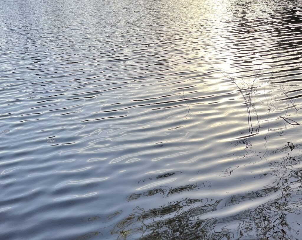
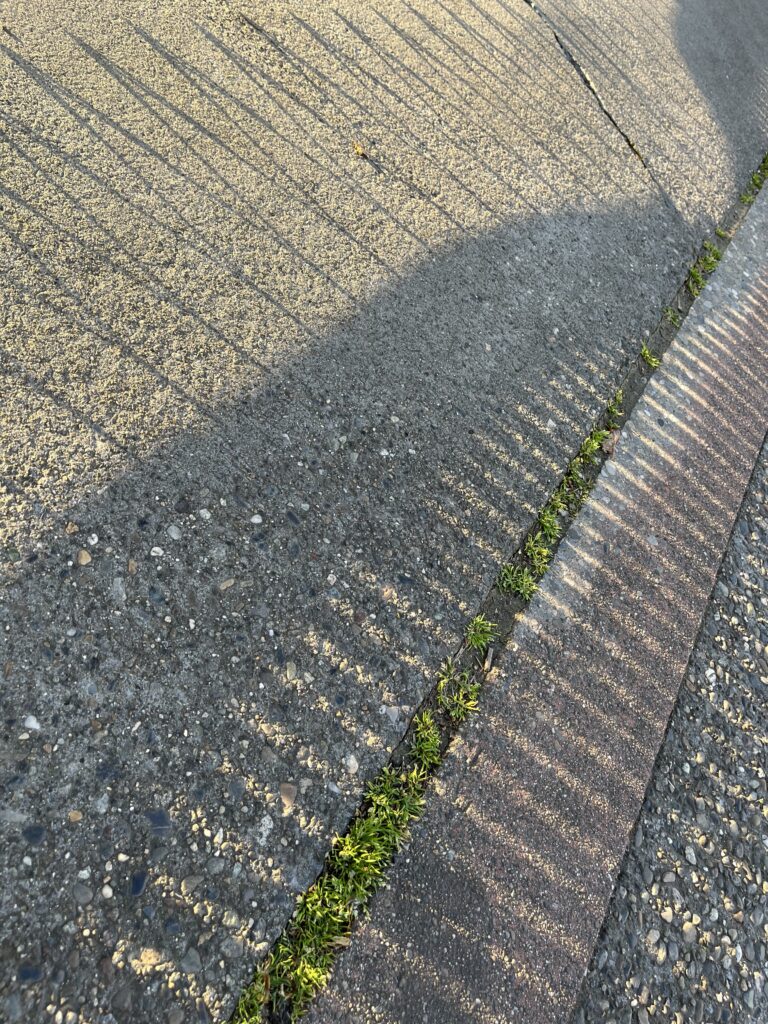
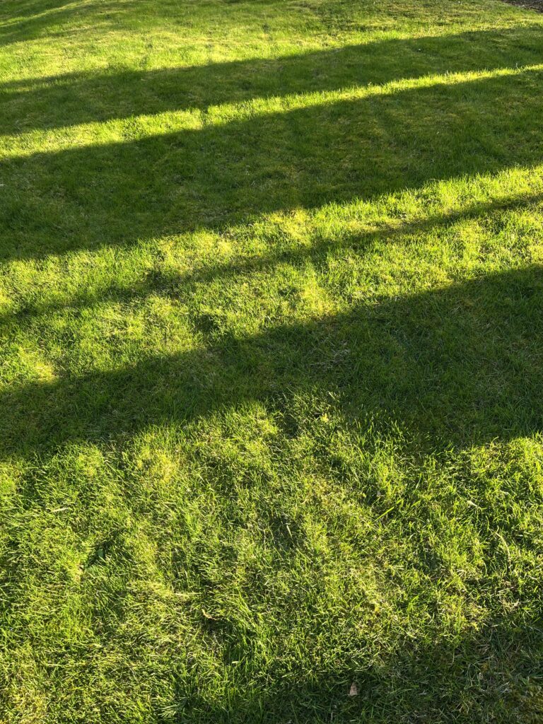
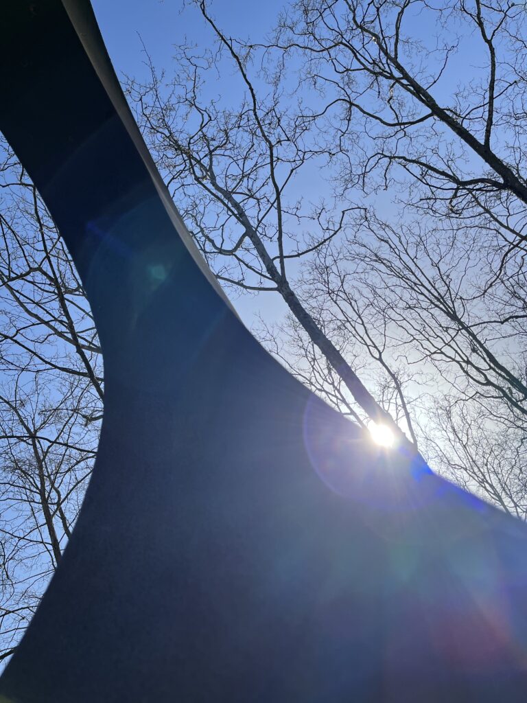
This week, inspired by Cameron Karsten’s photography talk, I took a few photos focusing on shape, pattern, and texture. Photography isn’t my comfort area, but I tried to have fun creating images that showed the lovely sunlight this week while focusing on those 3 design elements.

Drew Hamlet: Seattle Kraken
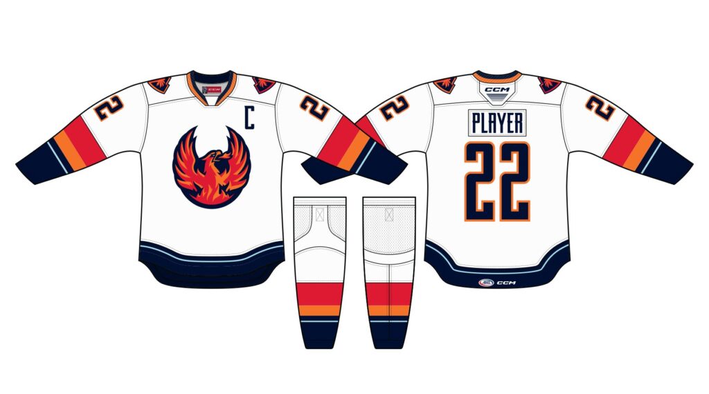
This week’s post is inspired by Drew Hamlet, who is the Art Director for Seattle Kraken; we then received a prompt to create a hockey jersey to for the Coachella Valley Firebirds, the Kraken’s affiliate team in California, and this jersey is meant to promote the Coachella Valley Music and Arts Festival. What a mashup of different ideas! One challenge of this design problem is many Firebirds fans are residents of the Coachella Valley area, and they might have very mixed feelings about the Coachella festival because it is a big disruption in their everyday lives and their experience of their home town.
My design is here:
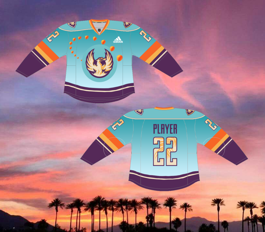
To create this jersey, I first did some research on branding for both the Firebirds team and the Coachella Festival, searching for examples of real Firebirds jerseys and Coachella 2023 promotional materials. I noticed that the Firebirds jerseys have the same general layout as Kraken jerseys with similar proportions of stripes and that the Firebird logo always has a dark outline/background no matter what color the logo is placed on.
Although Coachella doesn’t have an official style guide for this year published yet, I found some key promotional materials on the web that I used as inspiration for the color palette and design elements on my jersey:
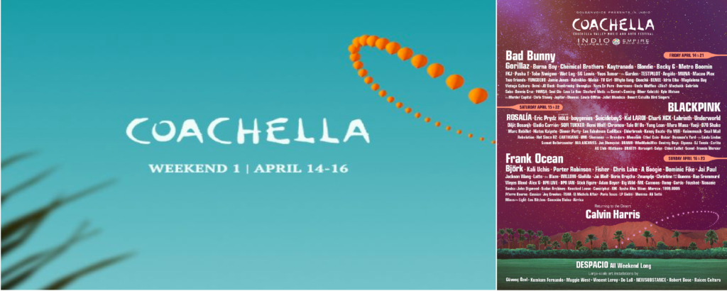
I noticed the the Firebirds and Coachella both have a fairly bright orange and a light blue in their color palettes, so I decided that using these colors would be a way to begin to establish a natural connection between the two brands. I decided to generally stay true to the Firebird logo and design elements on the jersey but to integrate Coachella’s color palette and three key design elements, the background gradient of the blue sky, the swooping line of balloons, and the palm leaves. While the orange balloons make the reference to the Coachella Festival really clear, the sky, palm leaves, and sunset-inspired color palette reflect the gorgeous natural setting that the Coachella Valley is known for. This setting makes the Festival extra magical for festival attendees who are visiting the area but also reminds local residents of the Coachella Valley area of a source of pride for their home. Natural beauty is something that everyone can celebrate and be inspired by!
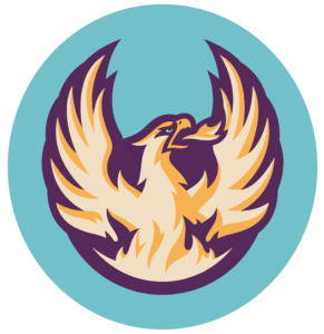
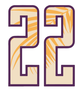
To make my design, I tried some of the new selection techniques that I just learned in Photoshop class this week, and I felt great about being able to cement in a skill that is new and useful. I also used the freeform gradient tool in illustrator to create my balloons, and I was pretty excited to discover that this new way of working (for me) produced a result that I really liked. So, in addition to the design itself, this project was pretty successful for me because I was able to practice some technical skills that I enjoyed and hope to use again.
Last Blog of Winter Quarter: A Reflection
Ever since I was a kid, I’ve loved creative projects – art, crafts, illustration, just making stuff in general. I didn’t go down that path in my education/career initially for numerous reasons that seemed important at the time but silly now, and because of that, I’ve always felt like there was something missing. Work takes up so much time and space in life, and I found that I just wasn’t happy spending that time not making, not engaging in creative work. So I ended up on a long and bumpy road that finally led back here to Seattle Central Creative Academy. I picked up some skills and experience along the way, and I’m hoping to find a way to mash it all up and move forward as a designer whose work is richer because of that life experience.
Prior to this year, I had taken a couple of classes in landscape architecture that included some pretty intensive scholarly reading and theory about design. While it was not particularly graphic design-focused, two ideas that I found really compelling from that experience were:
- Experiences can be designed to help people develop a deep connection to a place that acknowledges the complexity of the history and the present, and having that connection to place can make a huge difference in how we experience, interact with, and care for our environment.
- We often talk about design being for the purpose of advertising a product or solving a problem, but design has capabilities beyond just problem-solving. At its best, design is a tool for us to lasso our imaginations and really dream of possibilities in the world. Some of the best design thinking might be imagining the world that we’d like to live in and creating pathways that make that world a little more possible, a little more real.
I’m hoping that these two concepts can stay in my consciousness and become a foundation in my design practice in some way even though I’ll probably be working with branding or advertising or some of those more overtly problem-solving-centered areas of design most of the time.
Now that I’ve completed two (three?) quarters here in the design program, I’m not sure that I’ve 100% determined exactly where I want to go in design yet, but I have some ideas that feel like they’re beginning to take shape. I’m really interested in accessibility in design, and it’s important to me that my work reflect representation and inclusion for all sorts of people. I’d love to explore design work that has more materiality to it because that physical connection is really satisfying. I’ve begun to discover that I really appreciate lovely type, and as I move forward in the program, I’d love to experiment more with creating work with interesting typefaces and using type to speak in particular voices within my work. This year, I also learned that experiential design is a sub-field of that exists within or adjacent to graphic design, and there’s so much work in that realm that’s so interesting and inspiring. For now, I want to see if I can get a little experience in that direction because I think that working on memorable events or special environments would be incredibly fun, meaningful, and exciting. I’ve realized that it’s an area that integrates some of my past experience (like museum education, technical illustration, data management, and interfacing with a really wide diversity of people) quite well with design. It’s is one path to using graphic design to deepen connections between people and places and improve quality of life, and it integrates many aspects of that materiality that I find so satisfying. However, even though I’m most interested in experiential design right now, there are so many areas of design that I think I’d be happy exploring and that I could really dive into, learn a ton, and make work that I’m proud of, and I’m starting to really look forward to some of the deep dives that might be possible with second year classes and special projects.
Brooke Montgomery at Cut
I really loved hearing from Brooke Montgomery at Cut in class this week, and it’s definitely dangerous to start down the rabbit hole of watching Cut videos… there are so many that are so engaging! So, we’ve been prompted to suggest some ideas for videos in the style of Cut that could be done with graphic design students or with SCC students in general. Here’s my best idea:
Portrait art
The concept for this one is that we could have design, media, or maybe even fine arts students do figure drawing sessions and create art of other students. The idea would be to get a variety of students who’ve never been the subjects of an artwork before, with lots of different kinds of appearances & demographics: age, gender identity, race, physical size, fashion, subject studying in school, etc. I’d try to match them with art/design/media students who seem like they’re from very different demographics than them. Then, the video would go like this:
- Interviewing the design/media/art students to see how they feel about making an artwork about another student. My guess is that visual media students are pretty comfortable recording or photographing folks, but maybe design students might have a range of experience creating portrait artwork, so there could be a wide range of feelings there. Are they nervous? Confident?
- Interviewing the students to find out if they are nervous or what they think of being an art model. Do they think they’re beautiful enough to be the subject of art? What do they think of people who do art for a living? Do they value having art in their lives? Do they do anything creative? This would help to kind of establish the relationship between the artist and the student and also help the viewer of the video to relate to them a little.
- Introduce the student to their artist(s). I think it would be ok to do 1:1 or to have a couple of artists per student, but not too many to make it overwhelming. This could have some get-to-know you question prompts or icebreakers, etc. The idea would just be to begin to get to know each other and to really listen to who the person is, what they love, etc.
- Sketch/photography session: where the student poses, and the students creating the artwork do photography or sketching or a combination. If you wanted to get maximum provocative, there could be nude figure drawing, but that might be hard to film in a way that work for school, and I don’t think it’s necessary for this video to work. In the final video, I’m imagining that this would be a little montage-y.
- The artist/design/media students have some time (a couple of weeks maybe?) to create the artwork about the student. They should be making the artwork to try to really celebrate something beautiful or interesting that they noticed about the person during their session with them and try to make it true to who that person is from what they’ve learned about them.
- Art/design/media students present the artwork to the person. They get to chat a little with each other about it.
- Interview each person separately about how the experience was. Questions might include:
- Was it what you expected? What surprised you most?
- Did you enjoy it? Why or why not?
- What made you most nervous?
- What was it like working with the other person (artist/designer/media student or with the other student)?
- Do you like the artwork?
- For the student who made the artwork: What was it that you wanted to highlight about this person? What did you find beautiful about them? Are you happy with your result?
- For the student who’s having the artwork made about them: How does the artwork make you feel about yourself? Does it make you see yourself differently? Do you feel like it reflects who you really are?
The drawback of this idea is that it would take longer to create than many of the Cut videos because the process of making the artwork could be time-intensive for the media and design students. I know that we all have a lot on our plates, and this would be the kind of thing that would not be acceptable to do a half-ass job on, so it would be a commitment we’d have to have bandwidth for. However, I think there’s a lot of potential here to explore the idea of how people view themselves and others. I’ve done a lot of figure drawing exercises in a very art school way before, and although I’m not a figure artist, one thing that I really appreciate about a regular practice of figure drawing is that you begin to really notice what’s beautiful about people in a very artistic, non-sexual way even if you’re drawing nude figures. It might be how someone’s hair catches the light or how the bottom of their foot happens to be curved at that moment that’s really lovely, and everyone is beautiful in this way constantly, but we just move through life and almost never think of these little things. I also think that the power of seeing someone and being seen for who you are is so, well, powerful, and maybe this could be a way to bring that to a few students who might feel like they aren’t always seen at school.
Michael Pierce: Metaverse Architect
This week’s post is inspired by Michael Pierce who calls himself a “metaverse architect” and who invited our whole class into the metaverse experience that he designed. For the blog post, we were invited to attend a metaverse event and write about it. I attended two different events while they said they were happening “Now,” but neither event had many people in it. The first event was “Crazy Golf and it’s leaderboard is LIVE in LaLigaLand!” and the second was “Taco Bell Metaverse Wedding.” Both events were on Decentraland.
Since I’d not tried out any metaverse events here before, it first prompted me to create an avatar, which was fun and different than the metaverse we experienced in class with the generic silver-looking avatars. In this universe, you can choose your hair color, skin color, glasses, and more, and you can pick an outfit instead of starting out naked like in the in-class experience. This seemed like an improvement over the other metaverse experience because, even if you’re logged in as only a guest, you’re now a little more invested in your online persona and in making the experience interesting for your character.
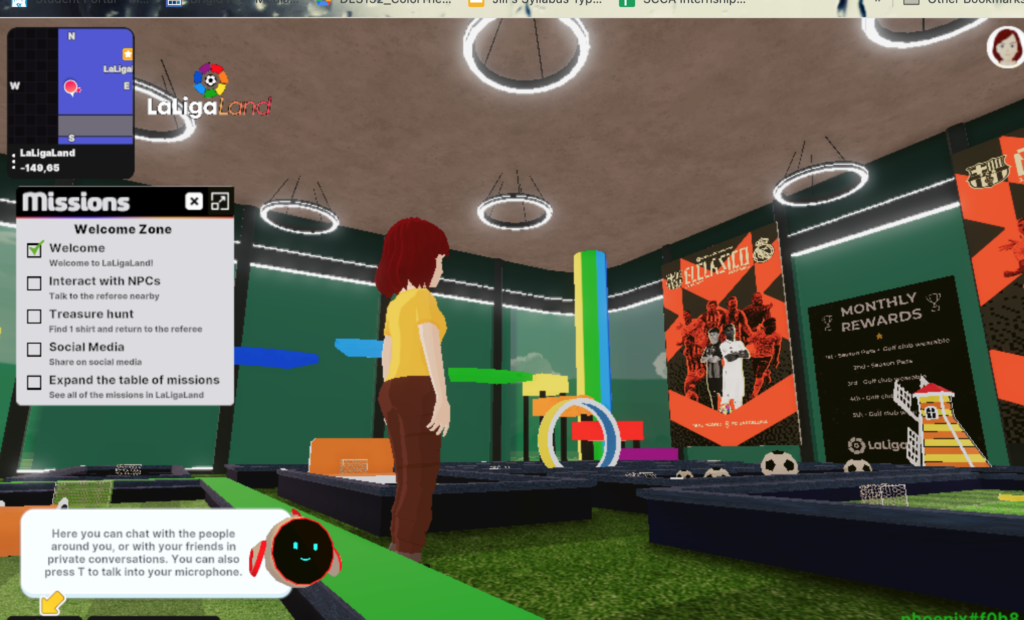
When I entered the golf event, there was a room that immediately had some goals for my character. It wanted me to get acquainted with the space by talking with a “referee” bot who had some very canned phrases to say and to find a shirt that was hidden somewhere in the location. I think having a planned goal with a reward is a really great way to pull new visitors in because it gives them something to do and look for instead of just wondering around without interacting with anything in the environment. Spoiler alert: I did not find the shirt. So for me, the down-side of the metaverse is that I find it really challenging to maintain a useful point of view and to navigate my character around the virtual space. In class, I was less successful at this, but I find it pretty hard to walk without bumping into walls and things or without getting stuck in a corner for a while. Instead of finding the shirt, i found a “portal,” so I clicked on it, and it sent me into the downstairs (i think) area of the virtual building where I could try playing mini golf virtually. So I tried it! Spoiler alert: I did not win. Oh well!
After trying the golf and wandering around the event space, I was bored, so I left the golfing event and moved over into a different event, the Taco Bell Wedding. This event was over, and although the tiny map showed a cluster of other people, I could not find them because of my bad metaverse navigation skills, so I just wandered around by myself to see what was all around the little world, then I watched a little video clip about the wedding that gave a recap of what it was like. I especially liked the elephant!
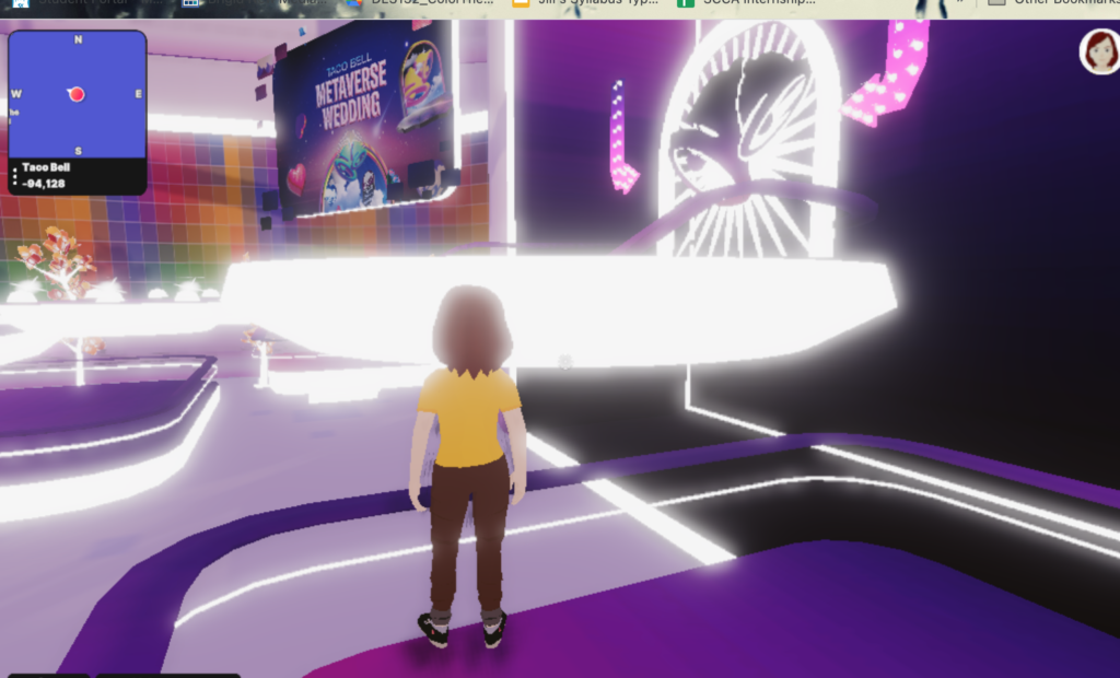
What I enjoyed about the metaverse exploration was that different spaces had fun designs and the process of personalizing my character. What i didn’t like was that it was hard to navigate, both in the sense that you don’t have a point of reference about where to go and in the sense that you keep walking into walls, running into barriers, and falling off of stairs.
I don’t think that exploring the metaverse like this is necessarily up my alley. I didn’t really find it beautiful, and it was frustrating to move around. Maybe in a few years when it’s easier to navigate, I will enjoy it more, but I was fairly bored in these settings even with established goals of an activity. I also was kind of relieved that there weren’t any other people at these events. While this wasn’t exactly a design space I’m excited about, I do think this is already a space for entertainment; it seems that that’s what people are already using it for! So of course, it’s also a place where people and companies are placing advertisements and selling things. I noticed that the Taco Bell wedding was heavily advertised on Taco Bell’s regular official website, and it seems fun to have a promo event that’s in the metaverse as something unique and novel at this point. I think that, as the metaverse gets easier to navigate (i.e. a smoother interface, an experience that takes less memory and is faster and easier to load in the browser, etc), more people will get involved, so it will become more viable as an advertising space but also less novel. However, things like the Taco Bell wedding seem impractical for more than just the novelty factor. Although the metaverse offers the option to include people who are remote in a unique way and also options to create fantasy environments that don’t exist in real life, it also doesn’t feel like real life and, at least for me, doesn’t offer a sense of truly having done something the way that attending a real wedding or other event would. (During the pandemic, I’ve been to some Zoom weddings, and this had the flavor of that. I participated a little and was “in the know” about what happened, but I didn’t feel that I was fully included.)
Adam Knight: Expectations of the Job
Oh wow for this post, I’m having trouble thinking of a time when I didn’t live up to the expectations of a job or project. I’ve always been the kind of person who’s a bit of a perfectionist and a people-pleaser, so I sometimes will really bend over backwards to make sure that work for someone else is done well, even if it’s a struggle for me. Most of the times when I had struggles meeting expectations, it’s been around meeting the deadline, and it’s always something that I’m communicating about as soon as I realize the problem. When thinking about failing to live up to expectations, truthfully, the main thing that comes to mind is trying to balance life with being a parent. Parenting is hard, man, and it’s the most important project of my life. I want to do so many things like teach my kids to be kind and play with them and feed them healthy food and get them to learn different skills and help them through their tantrums and the list goes on and on and on. But I’m also myself, and for a long time, I just left my own identity to be a mom. I took care of the babies and didn’t hang out much socially (the pandemic definitely impacted this too), and I didn’t work, and everything was for them, but I kind of forgot who I was. I didn’t do any creative work for a long time, and I forgot what I even like to do for fun for myself. Finally now, I’m “waking up” again and doing more things that are mine and not just kid-focused. For a while, I had a job. I did a few very small garden projects. Now I’m going back to school. Whether balancing family with work or school, I’m learning that whatever I do, it’s literally never enough. I could sweep the gross kitchen floor or I could play with the kids. I could make a really nice dinner but then it will take time and the kids will want to watch tv. I could spend more time with them at their bedtime but then I have less time for homework. I want to plan outings and activities but I fall asleep and then someone gets sick and there’s a big project due and something in the house needs repairs… whatever I do, it’s too much and never enough at the same time. So, I’m someone who likes to get things done completely and really well, and the life lesson here is that I have to become a little more zen with never being enough. Accepting that I’ll never be able to meet my hopes for all of the projects I want to do, everything I want to provide for my kids, taking care of the house, school, and keeping up relationships. The goal instead is to choose priorities and try to be true to those.