Brit Zerbo: Hard & Soft Skills

This week, we heard from Brit Zerbo who shared her journey through life and her design career, and our prompt was to think about our own skills – both hard skills and soft skills:

3 top hard skills

  • Data management: In my most recent work, I managed a LOT of data. Like really, a LOT. And it wasn’t all organized, and it was organized in all different kids of ways. Sometimes it was super confidential, and sometimes it came with a lot of legal ramifications. Managing a lot of data can be tedious and can require intense organization skills in different software programs or in hard copy, and I’ve done this in numerous ways in different scenarios and can show examples of organization systems I’ve created.
  • Illustration: I have a certificate in science and wildlife illustration and can showcase illustrations I’ve done, some of them technical (like anatomical diagrams), and others more artistic. I’m comfortable with oil painting, watercolor, gouache & colored pencil, papercut, screenprinting, block printing, and Adobe Illustrator. Although for design work, I lean on Illustrator the most, I also really enjoy projects that have some materiality about them. Of course, this is an area where, although I consider it to be one of my strong hard skills, I hope to always keep learning.
  • Project Management: I’ve done types of project management in different environments, and I can showcase different projects that I’ve completed. Some examples include:
    • Creating an engaging performance experience for the public about epidemiology containing interactive video media and live theater components with a zombie theme
    • Planning and executing a prom-like event for homeless teenagers
    • Developing 4 themes of a week-long “road trip” summer camp experience that does not have a physical location but travels from place to place, including educational fun for middle schoolers
    • Implementing all aspects of a newly negotiated union contract across many departments for a few thousand employees across many job classes

Hard skills to work on:

  • UX: There’s an element of UX embedded in every design project that you’re making for an audience. Whether you’re making an app for a phone, a physical product in someone’s hand, or environmental elements like wayfinding signs, there’s almost always an opportunity for the designer to ask themselves how they can design the project to improve the experience for the end users. How can this project improve quality of life? By being beautiful? More functional? Safer? More inclusive? I think this is the ultimate role of UX and one of the ways in which design can make a difference in the world in little and big ways, and I’d like to get some more real-life hard UX strategies and experiences under my belt to become even better at this.
  • Figma: Figma is a new program for me this year – I’d never even heard of it before coming back to school. Over the past couple of months, I’ve gotten some practice with it, but there’s so much functionality I haven’t figured out yet, and it sounds like this is pretty much the industry standard right now, so I definitely want to make sure I learn to use this well enough so that I don’t have to think about it during everyday projects.

3 top soft skills

  • Adapting: Somehow, in many of my past jobs, I’ve had to suddenly step up to the plate to quickly learn new things or take on new responsibilities in an unexpected way, and I have a track record of success with hitting the ground running in that way. Maybe it’s a more common work scenario than we’d all like to think. I’ve had supervisors who quit right after I started, times when my job description changed unexpectedly, situations where I had to clean up after the person before me didn’t do the job correctly, projects where I had to suddenly learn new technology to make a project work, and work that required constant improvisation on the fly. These situations can be stressful but also can be great opportunities to showcase your creativity, learn something new, and make yourself valuable to your team. I think these are the situations that can really help me to shine when I get asked an interview question like “Tell me a situation when you had to deal with an unexpected challenge?” or when someone asks a person to give a recommendation about me.
  • Inclusivity: Since I’ve had a lot of varied past jobs, I’ve worked with all kinds of people. Like, really all kinds of people. Homeless teenagers, top hospital and university administrators, professors, elementary school students, union organizers, hospice patients, people in crisis, volunteers, artists, English language learners, folks from underserved backgrounds, folks with all kinds of abilities and needs for support… the list goes on. In one of my early jobs, which was at a museum, one of the most impressive things I noticed was that there was a place for everyone. We had a lot of volunteers, and we worked really hard to find a niche for quirky personalities, the very shy and the very outgoing, folks with mobility challenges, folks on the spectrum and with all kinds of developmental challenges, and folks who were very old and teens who were just starting high school. This was such an amazing experience and definitely helped me to understand how in a practical sense, diversity is such an asset. All of this experience has given me a very inclusivity-centered mindset that I can bring to any job as an asset, whether it’s being applied to an actual accessibility project or as an element of a project that has a different overt goal. When we include more people, it benefits everyone!
  • Dependability: The more I am out in the world, I notice that there are so many situations in which people just don’t show up or can’t be consistent. It’s frustrating, and being dependable is SO important in every relationship because without it, you can’t really have a sense of trust. One of my first jobs was working with homeless kids, and they’re a group who’s typically been impacted by a lot of broken promises, so it was really important to always show up, always do what you promise, and never promise unless you’re absolutely sure you can follow through. That experience really impacted who I am as a worker, and as a result, I’m super committed to being reliable, and this is something that I’ve noticed can definitely set someone apart. As they say, someone who’s reliable and has medium skills will often get chosen over someone who’s not reliable but who is super talented (but of course, I can definitely aspire to be both!).

Soft skills to work on:

  • Charisma: When I was a small kid, I was VERY shy, and I’ve grown so much from then into being someone who can do presentations and network, but I definitely feel like I don’t have a strong charisma like some people do that makes conversations with new people easy or that inspires people to work with or for me. For a little while in my career, I was teaching and at another point, I was mentoring students, and I had to work really hard to seem fun and real instead of aloof and distant just because I was maybe slightly socially awkward. I was never the kind of person that a student would come to for support or just to talk, and I struggle to be social in a work setting with adults too sometimes, until I get to know the people well, but it sure would help to be better at this.
  • Persuasiveness: This is a bit related to charisma, but for design it feels like a different skill because this is specific to the situation that’s the “pitch,” when you’re marketing yourself or your idea. I’m pretty comfortable with using persuasive methods that rely on data (i.e. “You should choose this design because it’s backed by research or because it’s working for you or others in these measurable ways…”) and not so comfortable with persuading in the sense of getting people emotionally invested, which I know is actually more compelling. Having to market yourself is definitely not my favorite part of creative work, and one of the big reasons that I’d rather not rely too heavily on freelancing. For now, I’d be happy to just get more persuasive in my cover letters and job applications!
Jacob Christenson: Every Content Creator Needs a Voice

This post is inspired by Jacob Christensen, a video professional who spoke about the power of storytelling and also touched on networking. I loved what he said about developing real relationships in the field over business-only networking, both because people are going to remember, recommend, and hire someone they have a relationship with and because it’s just much more pleasant to connect with people in a genuine way. That being said, there are definitely situations where it might be appropriate to do a quick career-focused introduction to sort of ‘hook’ a person into chatting with you for networking purposes. For example, for an old job of mine, I went to a few conferences, and I felt like I was constantly needing to do a quick blurb about myself and the program I worked for as I was meeting a lot of people in a way that was sort of rapid-fire, either introducing myself in workshops or when walking around to presentation booths or when there were social events connected to the conference that I attended. It’s easy to make a connection in those situations because everyone is looking for connections already and most people are looking for someone to hang out with socially too since people have traveled alone across the country to attend the event in the first place. (This was before the pandemic…) This can also be the case when hosting a table about your work (like we might at the Portshowlio eventually), and it can even come in handy in an interview when they say “Tell us about yourself…” at the beginning. It’s like speed dating for careers. Although it’s good to have a blurb in your back pocket if needed, I think it also helps to try to make a personal connection whenever possible; it helps the other person to buy in and also provides a little platform where an actual genuine relationship can start to form down the road. So here’s a little formula that I might riff off of when doing an “elevator” introduction:

  • Introduction: Hi! I’m Brigid! I’m a graphic design student at Seattle Central, which is a really exciting career pivot into creative work from the project management and science education that I was doing before.
  • Intent: I’m hoping to eventually be doing some work in… [Insert the relevant topic that ties my interests to the person. Currently I’m most interested in UX related to accessibility and inclusion, experiential or environmental design (also could call this “design that builds connections between people and place” or “designing for events or immersive experiences”), and design for a social cause. I am also curious about a branding/packaging path and really about any design work that has an aspect of materiality to it in addition to the digital.]
  • Connection: Insert something to directly connect to the other person here such as: “I’m so interested in the work that you’re doing on X project because…” or “So-and-so recommended that you might be a great person to get in touch with because…” etc.
  • Call to Action: Ask a question about their work or knowledge or ask for what you want from them. [Examples: “Would you be up for sharing a little more about what it’s like to work for X company?” or “I am working on an accessibility-focused project right now and would love your feedback if you have time! It would be so helpful to have some input from someone who’s actively doing this work in the field.” or “I would love to get some first-hand experience related to experiential design, and my program requires an internship/special project. Do you think there could be a possibility of working with your team in some way?”]

Here’s an example recording (although hopefully in real life it would go a little more conversationally than this and I would definitely be more comfortable with asking to chat more before jumping straight to asking for an internship!):

AR Panels in the Light Rail Station

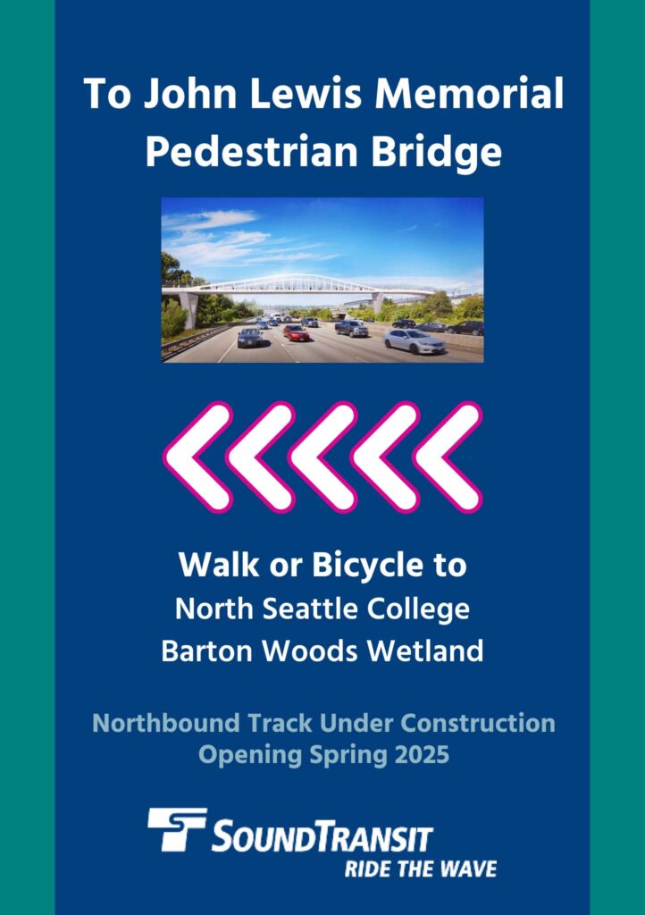
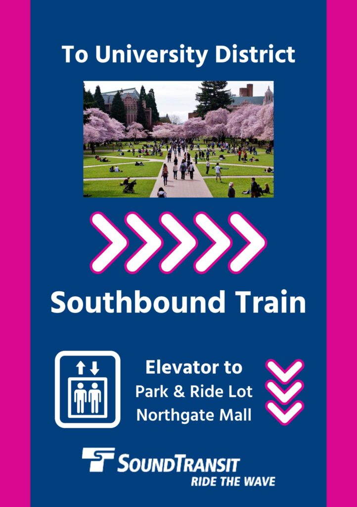
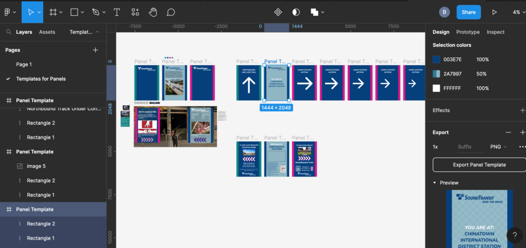
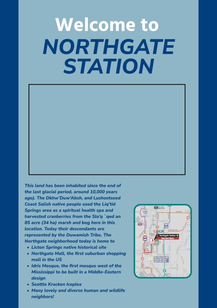
This week’s augmented reality project was to create a little experience with AR panels in a Seattle location in collaboration with a 3-person team. I worked with Ben Kim and Fawn Chen to create panels for different light rail stations around Seattle. We decided that the light rail would be an interesting location because different stations embody different neighborhoods around the city and because it offered us an opportunity to use AR for wayfinding. We worked together to come up with a consistent look and feel based on the real Sound Transit branding, but we also decided that each person’s set of panels could be unique while sticking to the brand colors and using a consistent panel size. We built our panel assets in Figma so that we could share our file and see each others’ work as we went along.

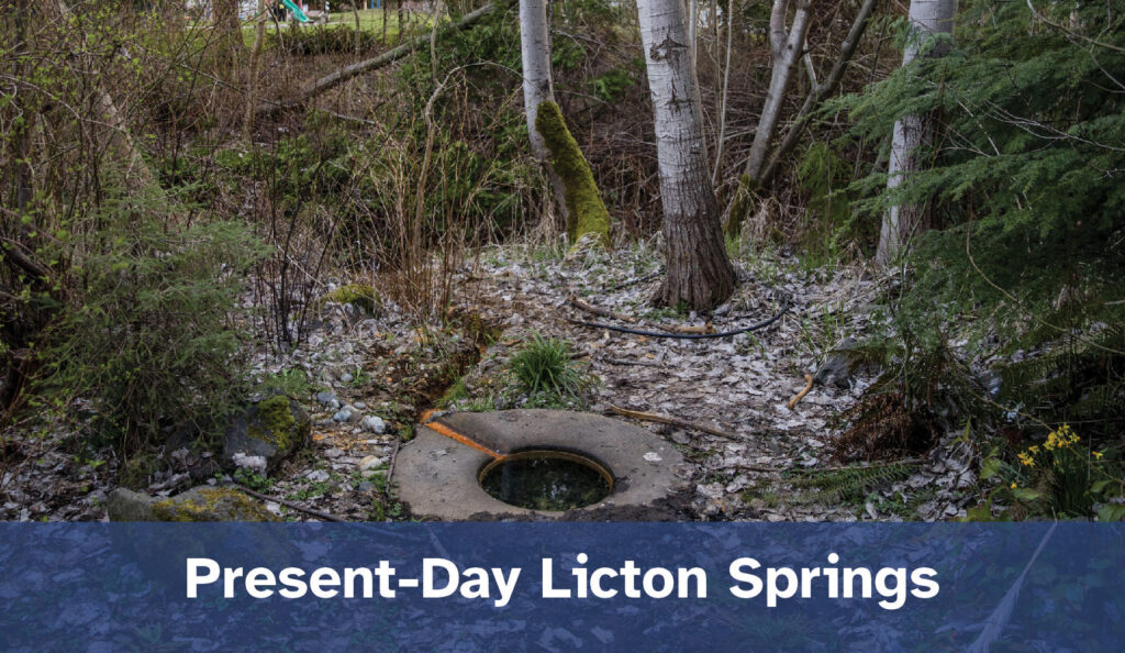
I chose to focus on the Northgate station because it’s near my home, but I also think that Northgate is an interesting neighborhood. It’s been quite developed for a long time but also has an unusual amount of nature for being a bustling city area, and there are a few sites that are historical Native American sites in the neighborhood as well. Because of this, I thought it would be interesting to focus my project on historical sites and other places of interest around the neighborhood, so that’s how I came up with the video and copy for the center panel.

Then, I thought about how disorienting it can be to step off of the light rail. Especially when you’ve just come through an underground tunnel, you might step out into the station and feel a bit confused as to which direction you’re facing. If you’ve stepped off of an escalator from street level, it’s easy to get confused about which train is going in the direction that you want to go. Because of this, I decided that I’d use my side panels for wayfinding. Since the Northgate station is the northernmost station on its line at the moment, I used one side panel to orient the viewer to the trains that are leaving to head southward, and I used the other side panel to direct travelers to the bridge that leaves the station and crosses the highway. The bridge at Northgate station provides a unique link between the two sides of the highway and allows for connection between the North Seattle College campus and its wetland area and the Northgate Mall, which were previously hard to travel between. Both of these areas were historically a connected wetland, and under the bridge, there is work being done to restore that wetland environment today.

To create the panels, I used .png images from our Figma file and an .mp4 video of slides that I compiled in Adobe Premiere. I considered adding music to the AR experience but in the end decided to keep it silent. Light Rail stations are bustling places in the daytime, announcements happen every few minutes over a loud speaker, and the trains add to the din. I felt that it would be difficult for a traveler to experience music or audio sounds in the light rail station, especially so close to where the trains are coming and going, so that’s why I kept audio out for this project.

All in all, I’m pretty happy with the result of this project and how it looked projected in the real light rail space. If I were to do it again, I might break the center panel out into more than one panel because some of the text got kind of small, but it was still readable if you walk up close to it. I am excited to someday take the class on environmental design, and I’ll bet after that, I’ll be much better at creating high-quality images for wayfinding, but this was a fun little intro experiment in both environment-specific design and AR, and I think it was successful.

Andrew Nedimyer: Passion Projects

This week’s post is inspired by Andrew Nedimyer, a graphic designer with tons of varied experience in web, branding, and more. Some of the projects he spoke about were for his employers, but he also spoke about passion projects that he’s worked on, especially ones that grew into a big deal compared to how he started out. Next year, there will be a special projects studio, and we’ll get a chance to dive into passion projects of our own, so for this blog, I’ve been thinking about some possible passion projects that could be fun and help me to build serious skills at the same time.

One project that I’ve wanted to try for a long time and that could be really great for this is designing and illustrating a pop-up book! Why a pop-up book? So many reasons…

  • Illustration: I love illustrating, and a pop-up book could be a great way to showcase my illustration style and capabilities in a unique way that sets my portfolio apart.
  • Materiality: Sometimes, it just feels good to be working with real paper and real art supplies, not just working digitally (although digital is cool too). A pop-up book would let me work with real paper and cutting tools and have something to hold in my hand and be proud of upon completion. I like that.
  • 3D: Envisioning how shapes interact in 3D is sometimes really hard for me. A pop-up book requires 3D work as well as flat work and a small component of motion. This would really force me to stretch my thinking… so educational.
  • Applying skills: The skills needed to design and print a pop-up book are a lot like the skills needed to design and print special packaging. That would be a really great practical skill to hone and show off! Plus, maybe I could work on a design that would work for the fancy-schmancy laser printer and get to use that… oohhh!!! I’ve been wishing to try that out for ages, and this would give me a reason!!

What is going to be the topic of my pop up book? I’m not sure yet! That’s definitely one component I’ll need in order to make this project work! I want to do something fun and fanciful, but I don’t want to repeat a topic that’s already out there. Also, I’ll need to do some research about different ways that pop-ups work and how to make them successfully pop out. I’ll have to get some training on the laser cutter (eeeeep!!!) and probably learn more about die-cutting too.

How long will this take? Hmm. It really depends on the scope of the book. Maybe this could be a 1-quarter project next year? I could start imagining my story and researching paper pop-up strategies now… How long will this book be? Maybe 5 or 6 pages to start with?

I think that this is a relatively low-cost project because it’ll mostly include supplies I have now such as Adobe programs to design the pages. I might use some manual supplies like watercolor or ink for my illustration work. Printing and cutting can be done at school, but I will also probably need special paper, which could be a cost. I would definitely want to make this book nice and durable so that it can be handled. The cost will depend on size of pages, number of pages and complexity of design, how many mistakes I make (ha! Probably a lot along the way…), and what paper ends up being the best choice. There’s another thing I can research now!

What are some other passion project ideas? I’m going to make a mock website for interactive class soon about wheelchair-accessible travel. I’d love to blow that out into a full-on in-depth project! I’d also love to create something that would be a good example of environmental design, like a mini-exhibit or something related to accessibility and wayfinding. And I’d love to think about a project that is creative for a cause that I care about such as solutions for homelessness, food justice, human trafficking, and the human connection to nature. Lots of ideas to flush out and explore in the future!

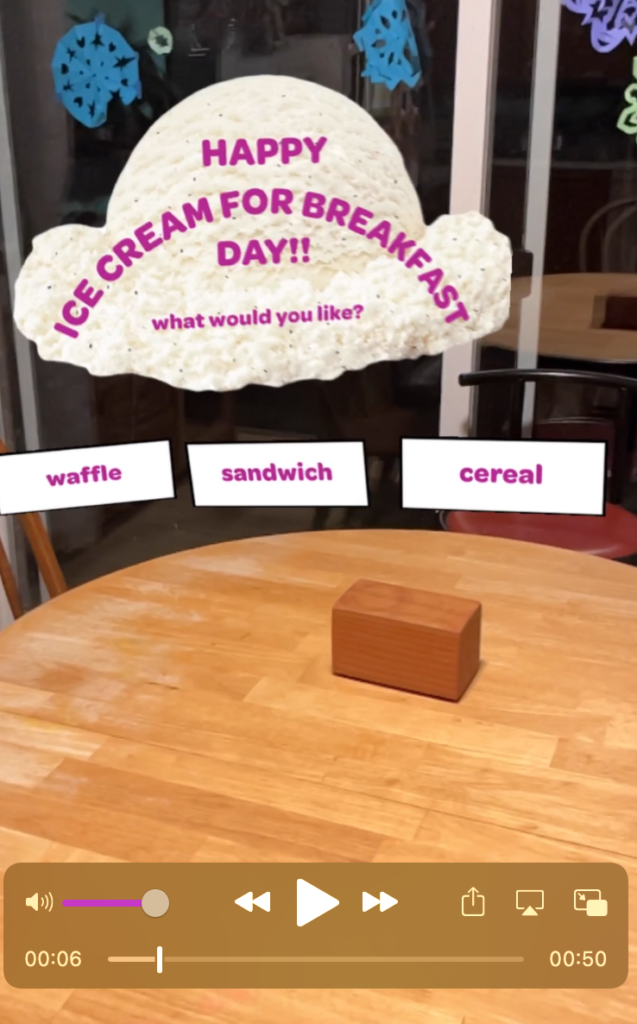
Adobe Aero: Happy Ice Cream for Breakfast Day!!

This week’s augmented reality experiment was to create a greeting card using Adobe Aero. I decided to make my card a greeting card for National Ice Cream for Breakfast Day, which is coming up soon (It’s the first Saturday of February each year. My family celebrates it extra because my daughter was born on Ice Cream for Breakfast Day!).

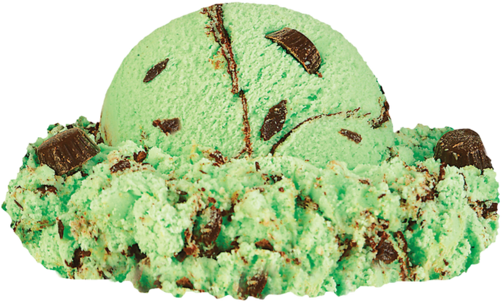
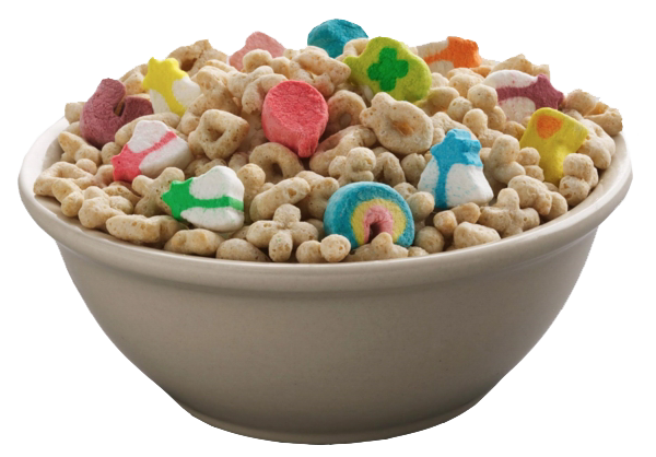
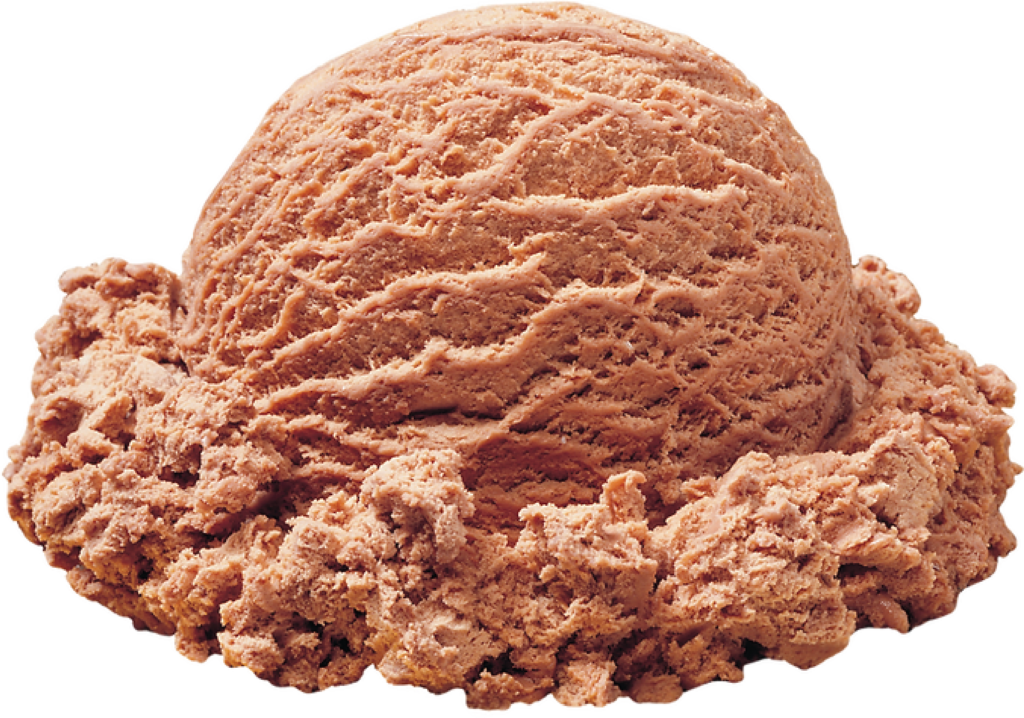
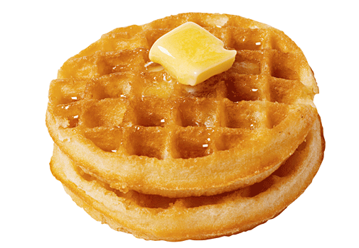
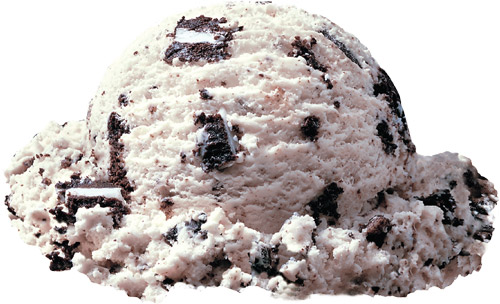
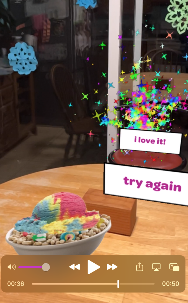
There were no pre-loaded assets in Aero that I wanted for this project, so I did a combination of finding images online and creating .pngs in Adobe Illustrator. I wanted the card to have a loop effect, so I decided to find three different breakfasts that someone might like with ice cream, then found pictures of ice cream to put on top. I added some text to guide the viewer through what to do, and then I wanted a “reward” for a happy ending, so I also included a little firework .gif.

The main challenges that I encountered were aligning the flat images so that they could sort of work in the 3D space and getting the .gif to work correctly no matter how many times someone wanted to play the game. For the images, getting them to look okay just took a lot of tweaking of the pull-handles and making sure that ice creams were not falling behind the food that they were supposed to be on top of. For the .gif, I realized that I had set it to loop infinitely, and it wouldn’t re-load until after the animation was finished playing, so that’s why it wasn’t going to repeat properly. Once I changed the settings so that you could re-start the animation immediately, it worked!

This was a really fun little project, and I think it would be much more fun if I could create my own 3D images to work with rather than just the flat ones.

Happy Ice Cream for Breakfast Day, everyone!!

UPDATE: Oh. My. Gosh! This was NOT as easy as I thought originally! After writing the blog post, I tried out my work on my phone so that I could watch the video… it did NOT look good! The images and text were all over the place. I had thought I did such good work placing them, but some were way across the room, some under the table, and some way up over my head. Some were surprising teeny-tiny sizes or really big! I did a lot of work to clean it up by moving items around through the phone app. It helped to be able to move around the objects to see where they are placed from different angles, and now it looks MUCH better! And I learned that designing on the phone is much more fun and easier for placement of objects. I will definitely do it this way in the future! Here are a couple of screen shots from the finished product:

Abdul Kassamali: Producing Films

This week’s post is inspired by Abdul Kassamali who is a video producer and shared some stories about film shoots he worked on that had major challenges, among other topics. We are being asked to share a time in this program when we’ve been forced to deal with pivoting on a project. This happened for me in the New Media videography module on the first project. For that project, the assignment was to create a video about characters stalking or following each other. We started with storyboarding, and because I have a 6-year-old child who loves creative projects and who I spend a ton of time with, I thought it might be fun to let her “star” in the video. I asked her if she wanted to, and she said yes, if she could wear her fairy wings. I storyboarded a whole concept about her hiding in the trees in the park and sprinkling fairy dust and working with a friend who isn’t sure if a fairy is watching her, then follows the sparkly trail until they meet. I thought it would be a super fun storyline and that my daughter would love looking like a fairy in a video. When it came time to shoot, however, she was NOT happy. She had a giant melt-down about having to wear fairy wings (which was her own idea), having to go to the park instead of a parking lot (whyyyy???) and not getting to make the story up herself. Then we needed snacks, and then it started to rain, so the whole project was shot. I realized it’s a really bad idea to plan on a young child doing anything that you actually want them to do on film. Great life lesson!

So I re-planned the whole thing. Luckily my friend was up for trying again on a different day. She’s a theater actor who does a lot of little sci-fi productions, so we decided to shoot a story about Luke Skywalker and BB-8 instead, in the graveyard near my house. This time, I knew that my talent would be up for doing my story, and she had some great ideas to contribute too. However, again, there were challenges that I didn’t anticipate. I’m not super experienced at shooting videos, so this was new for me, and one factor I didn’t really plan for was how the weather would impact the project plan. For example, to make the shots work, I had to make sure that the light was hitting from a reasonable angle so that there wasn’t too bright of a glare in my actor’s eyes, and I didn’t account for the changing light conditions as the sun got lower in the sky, so it was a bit of a challenge to make the shadows match up in some of the shots. There were also tech challenges. BB-8 was played by my husband’s app-driven robot, and you would think that this would make things very controlled and easy, but no. We were shooting in the graveyard, but BB-8 was unwilling to drive through the grass, and he fell over surpisingly easily. His head also fell off often. Finally, while we were shooting, I realized that my friend who was starring in the show was a theater actor-very used to doing large gestures and emotions to be seen from the audience on an in-person stage, but she had trouble with doing subtle facial emotion shifts for the close-up and extreme close-up shots that were a requirement of the project. I hadn’t anticipated this, and it really surprised me, so I did a combination of giving her a couple of suggestions like a director would and just going with the best footage I could get. We were also interrupted by a bystander who was convinced that we were shooting a Game of Thrones video despite our obvious Yoda backpack, and he followed us around and asked us a bunch of questions, which was awkward and took a lot of time. In the end, I took lots of shots, more than I had planned in my original storyboard, and even went back with my husband on another day to re-shoot some of the tricky BB-8 scenes so that he could help to drive the robot. Because of this, I spent a lot of time editing in Premiere afterwards and was pretty happy with what I was able to put together, even though it was a bit corny and definitely not at a marketable level! If I were to do a similar project again, I would definitely spend more time in the actual on-site location while storyboarding to get a better sense of what would be possible with the spatial layout and lighting and everything. I’d also do more prep ahead of time to be sure that I know how to work the robot confidently instead of spending so much time on that. Realizing that there were so many more factors to think about in terms of weather and lighting, camera angles, actors, and tech in even this simple project, I have even more respect for people who are able to pull off super professional video projects on a regular basis!

My Very Hungry Caterpillar AR

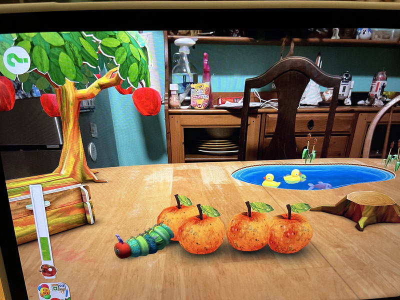
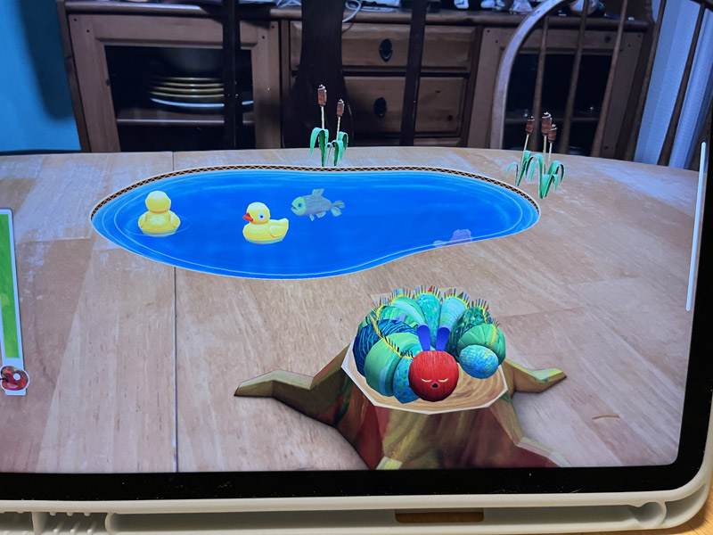
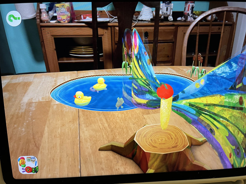
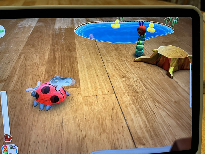
This is a view of the augmented reality app “My Very Hungry Caterpillar AR” for iPhone and iPad.

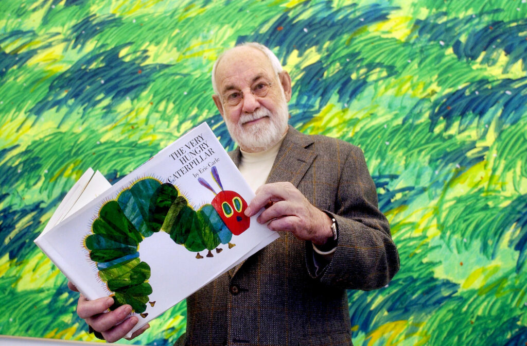
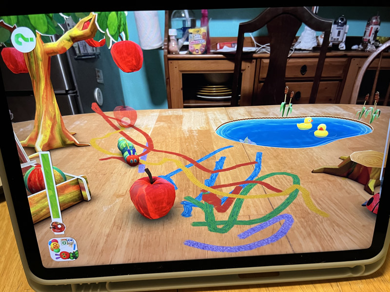
This app is based on the book The Very Hungry Caterpillar by Eric Carle, and it’s targeted at preschool kids (and their parents). In the app, the player sees everything happen in their own environment, which should be a flat surface such as a table, carpet, or the ground. They can hatch a caterpillar from an egg, play with the caterpillar by painting, blowing bubbles, and bringing out toys

Feed the caterpillar fruits

Put the caterpillar to sleep at night

And help the caterpillar to grow into a beautiful butterfly. After the caterpillar becomes a butterfly, the game starts over with all of the same options.

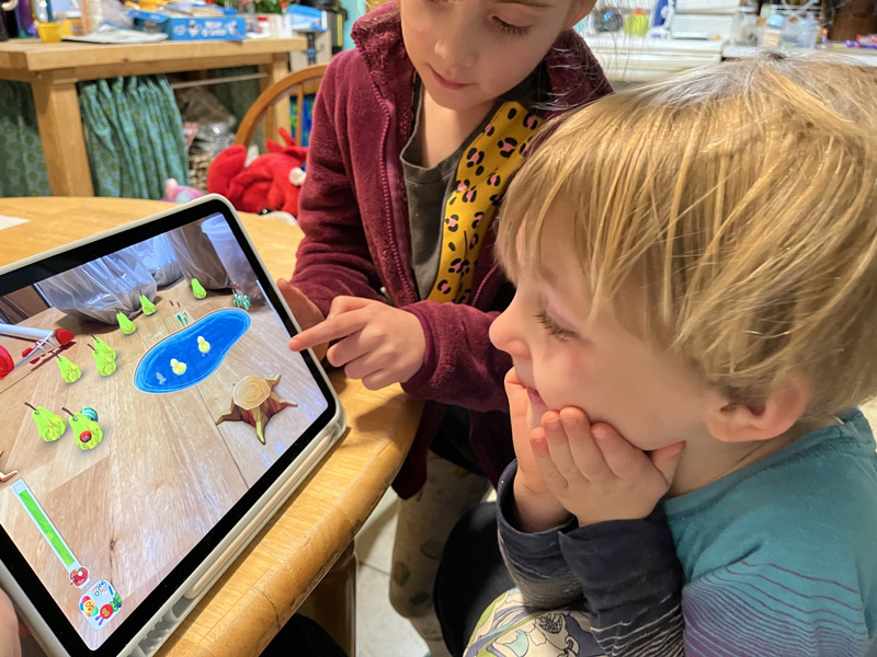
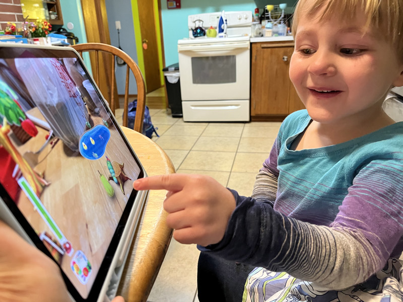
To test this app out, I tried it out in two different environments, and I had my kids try it. The app has many things that are very well done. Most importantly, the kids loved it; they squealed, were charmed, and fought over who got to touch the screen. They thought that the caterpillar was very cute and especially loved feeding him fruits, discovering what the fruit would be each “day” (Fruits change based on fruits in the real book each time the caterpillar wakes up.), and painting with the paintbrush. There were plenty of different activities to try to be fun for the duration of the game. The kids were also able to figure out how to use the app very intuitively, and it was perfect for a young preschool age level because it included simple steps and no need for reading to complete the activities.

The app also has gorgeous graphics that really honor the visual spirit of the book, and the visuals stayed bright and beautiful and reasonably realistic in multiple different environments.

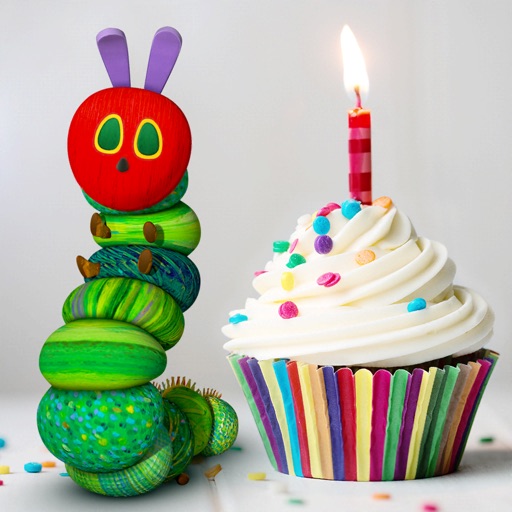
Several factors could be improved about the app as well. First (and most importantly, ha!), the icon for the app shows a caterpillar with a cupcake, but there is NO CUPCAKE anywhere during the game! This is very disappointing for a preschooler!

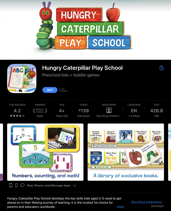
More importantly for parents, the game is marketed in the App Store as educational and states “develops nurturing skills and a love of nature.” I am not convinced that the game really does this. It is true that the caterpillar turns from an egg to a caterpillar, then makes a cocoon and comes out as a butterfly, but it doesn’t make a point to teach this, and there doesn’t seem to be any actual content beyond that. It also just might be encouraging love of technology just a wee bit more than love of nature. That being said, the app itself seems fun and entertaining as a game, and these are really more problems with marketing than with the app itself.

Within the app, there are a couple of functionalities that could be improved – mainly the ability to put away the “toys” that the caterpillar plays with. Once you bring out a toy, you can play with the caterpillar for a little while, but then it is hard to put the toy back in the toybox or set it down on the table. This wasn’t a huge problem, but slightly distracting.

Another minor problem with the app is that it’s clearly been designed to hold in your hand, but when playing on a large iPad, it would be much nicer to let the iPad rest on its stand while playing. Unfortunately, this angle wasn’t designed for, which means that many things happening with the caterpillar are off-screen when it’s resting upright, so I propped the iPad up with a block to get a better angle.

One other thing that I noted about the app is that game play is relatively short. You can make the caterpillar into a butterfly in just 10 minutes, and then the game repeats with nothing new to offer. This made the game boring for me as an adult, but the kids didn’t seem to mind and weren’t bothered by playing the same game over and over again. It is difficult to tell if this is truly an area for improvement or if it’s just fine as an age-appropriate “feature.”

Finally, although the AR features looked very nice and worked quite well, they didn’t seem to offer any added value to the game play. I’m not even sure that my kids noticed that the background of the game was our actual kitchen table, and they definitely didn’t seem to care. The caterpillar didn’t interact with the environment other than crawling across the floor, so the main purpose of the AR was really just to create a backdrop for the scene. I noticed that the same game developer has another app based on Eric Carle books that is not AR and includes content from several books, actual educational activities such as counting, alphabet, and numerous more activities, so I’m not sure that the AR feature is providing anything particularly useful here.

Despite a few criticisms, I felt that the app was successful overall primarily because the kids were able to use it easily and they really liked it. It really feels like perhaps this app is a bit of a prototype, as if perhaps the developer created it to see if they were able to create a small simple project that would be viable in the AR scope, so that they could see if it would be marketable and feasible to produce a bigger project later on down the road.

Steve Hansen: Food Photography

This week’s post is inspired by Steve Hansen, who’s a food photographer who uses 3D and motion graphics to enhance his food photography and video. His work includes photographing food with traditional photo methods, but he also branches out into 3D modeling and motion design, and he shared numerous insights into different software options that he uses as well as stories about his images.

In response, our assignment was to create a gustatorily appealing image of food. I’m pretty comfortable with doing illustrations, and drawing food-related images can be fun and imaginative or have super artsy effects, but if I think about the kinds of images that really make me hungry or make me think of the taste and feel of the food the most, they are photos. I’m also less confident with my ability as a photographer, so I decided to take this chance to try a low-pressure photoshoot.

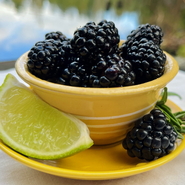
I chose blackberries as my main subject for this little project. I wanted to use a simple fruit or vegetable that I could get close-up with and could show the texture and juiciness. I happened to have a little yellow bowl, and inspired by color theory class, I thought playing with the complementary colors of the dark purple berry and that yellow dish would be fun.

blackberries in a yellow dish with reflections from a lake in the background

To set up the shot, I put a lot more effort into creating a scene than I normally would for a casual photo, including finding a time when the weather conditions were right: the natural outdoor lighting was especially lovely, and the wind was still enough to get a smooth reflection on the lake. I found and ironed a linen that I thought would complement the look and put some effort into arranging the scene with complementary green things and the reflection of the lake at a flattering angle even though the lake is actually surrounded by houses and buildings. I brought along a spray bottle to try to get water droplets on the berries for added juiciness. After taking many photos, I settled on one that I liked and experimented with different croppings and balances of light and hue in Photoshop to get an image that I was happy with.

I’m not sure that my image is perfect or even if I made the right choices that someone in the photo program would instinctively know, but it was a fun little exercise, and I’m fairly happy with the result. My goal was to give the feel of an early morning breakfast at a wilderness lodge or something similar, and imagine that it would be something that could be instagrammed, and I think this was successful overall. I think that practicing taking photos of different kinds of subjects in this way could slowly help me to be a more confident photographer, which would potentially be super helpful as a designer.

Virtual Poster Project

This new module is all about Augmented Reality, which is a media I’ve never explored before, but I’m very curious about! The first project was to create a virtual poster using the EyeJack app. Here’s mine!

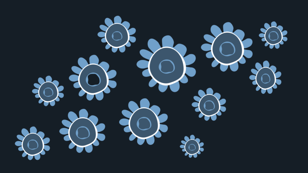
To make this poster, I used a video I had been working on in Adobe AfterEffects to practice animating shapes. I built my shapes in Adobe Illustrator, imported them to AfterEffects, and set them to a clip from the song True Love by Fred Frith. When I came up with the idea, I was experimenting with moving animated shapes to a beat. I picked that particular song because it reminds me of a friend who I love a lot and a time when life was hard but she helped me to get through it, so even though it’s kind of a crazy tune, it has a lot of sentimental happy feelings for me, so it was fun to work on. Because the song is so wild, I wanted to pair it with some really colorful and groovy-looking graphics, and I just riffed on that idea. I was doing the project for myself and my own learning, so I didn’t think too hard about what an audience would gravitate towards in the piece; I was just enjoying the process and exploring.

For this AR project, I wanted to create a poster that would be graphic and have very little information for someone passing by, just enough information that might make someone curious enough to pull out a phone and try the QR code, and then watching the video would have a big payoff with the colors and playfulness. I’m really glad that we started with a simple program like EyeJack because, even though the interface is easy with not many steps, this is all new for me, and I had to do some thinking to make the parameters match. For example, I’d been making my video in a 30 fps format, and I had to change it to 25 fps for EyeJack. It’s a little problem, but a great reminder about how important it is to be really professional with all those little production details and keeping files organized, etc.

I’m definitely happy with how this little poster experiment came out, and I want to try more! It would be super fun to create a series of animated posters like this. I think the most challenging part would be assembling videos for each because I’m learning that animating is really intensive, and a huge amount of work and thought goes into creating a clip that might be only a few seconds long. On the AR/VR side, I’d love to experiment with creating visuals that play with the boundaries of the paper poster in interesting ways, and I’m curious about what is possible in terms of depth (like images that appear to be layered above or below the plane of the paper poster). I wonder if there’s a way that this could be more quickly accessible – like is there a way to set up an AR poster like this where people could just scan the QR code without downloading a particular app or signing up for an account? I think that would be necessary for most applications of this in the real world because it just takes too much investment to go through all of those steps just to see a poster. So much more to learn!

Mara Stokke: Environmental Design

This week’s post is inspired by Mara Stokke, an SCC grad who is currently working in the field of environmental design. One of the concepts that she mentioned in her talk, although I’m not sure she used the term, was biophilic design. The concept of biophilic design is to design environments that foster a close connection to nature, and it turns out that there are many health and wellness benefits to this in addition to aesthetic value. Our challenge for this blog is to re-imagine a component of Seattle Central’s 5th Floor as if it were to make use of biophilic environmental design. This actually seems like a huge task, beyond the work of a single blog post; in Mara Stokke’s talk she discussed how environmental design projects are often on a timeline of many months at minimum, or even a few years to complete and that’s from experienced folks who work in the field! So I’ll really just be scratching the surface here with a few ideas and moods rather than a comprehensive design.

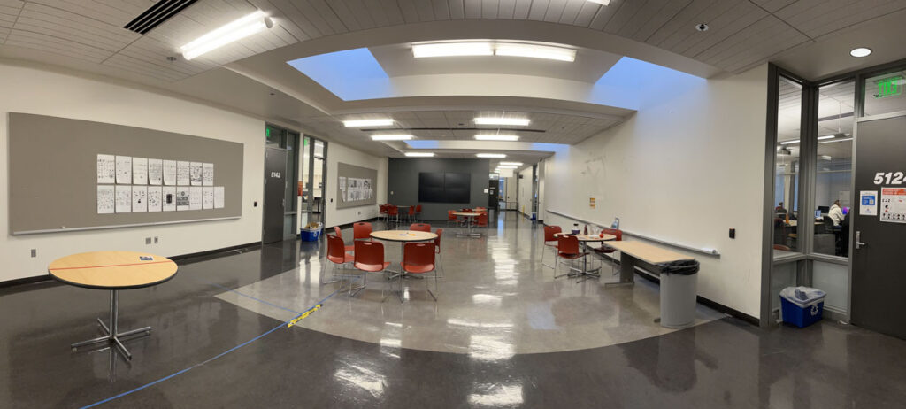
For this thought experiment, I decided to focus on the large empty crit space just outside of the everyday Graphic Design classrooms. This is a large space that has important uses but is mostly under-utilized on an everyday basis. Here is the scene:

There are a few interesting things to consider about this space before diving right in to design brainstorming. Although this space has a definite empty feel and is absolutely not succeeding as a cozy and comfortable space that makes us reflect on nature, this space (and, actually, most of the 5th Floor) is one of the areas that feels most professional and sleek within the college building. Although we would want to soften the space with natural elements, it would also be great to keep an implication of that high-tech feel since the Graphic Design program has such a heavy focus on software applications and current tech. Although there are no conventional windows in this space, there is a very interesting ceiling with skylights. The current lighting interferes with a natural feel, but if the lighting were changed, the peaceful feeling of the natural light could become a focus here. There are several walls that are available for student work to be hung and critiqued or used as an area for portfolio shows. However, as things are more digital now, there are fewer cases where instructors require printing, and these critique areas are often empty.

Given these unique challenges and assets, here are some of my ideas for a biophilic design in one corner of this space:

  • Enhance the assets of the ceiling in a way that improves natural lighting
  • Create interest on the large empty walls while also ensuring that space is available for hanging student work when needed
  • Develop spaces that allow students to relax comfortably while stimulating creativity through nature
  • Balance between organic forms and the suggestion of the natural environment and the feeling of a cutting-edge high-tech workspace

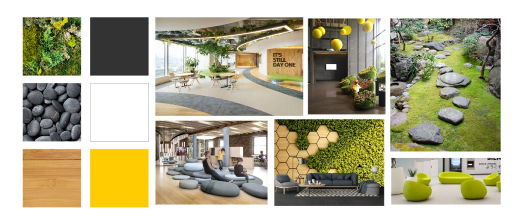
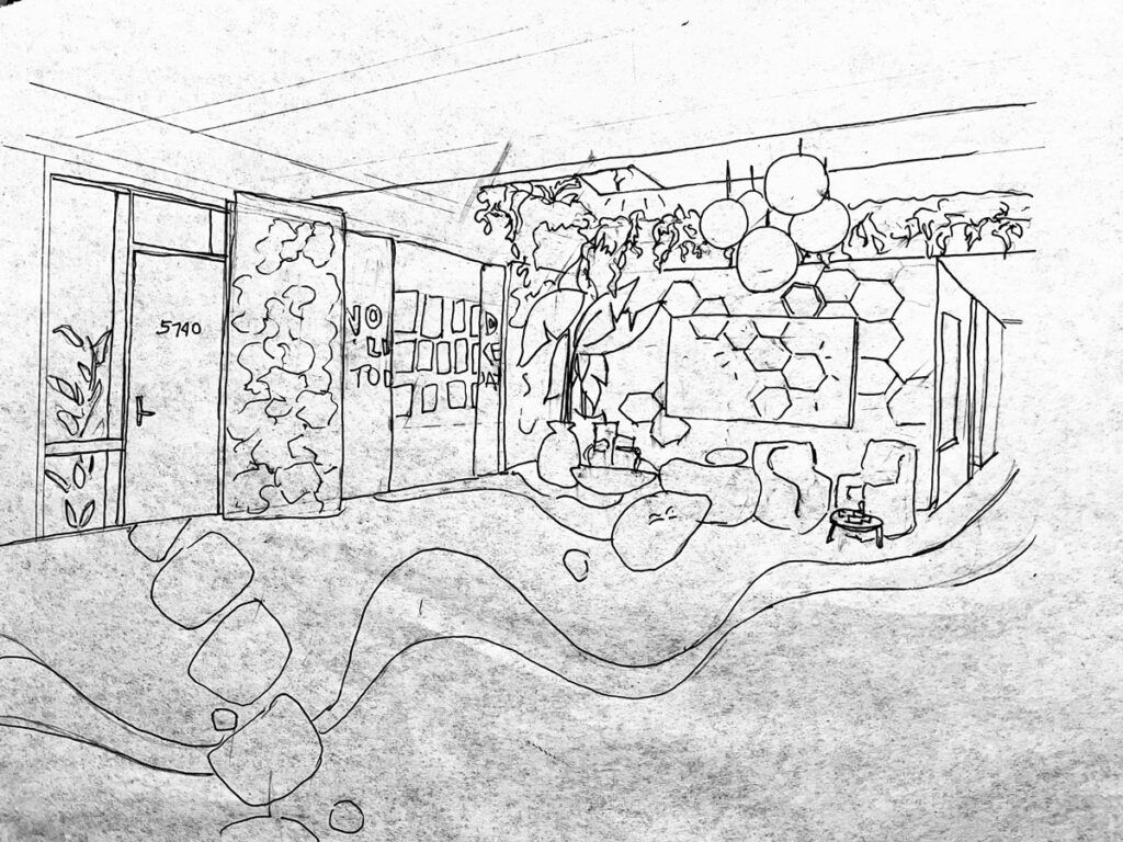
I decided that a zen garden would be a good fit for the theme of this space. The feeling of a zen garden is peaceful and balanced, and although zen gardens are small, they have a lovely sense of openness that I think this area would benefit from since the ceilings are low. I also want to include more texture sensory experiences but not be too overwhelming or overstimulating. The colors would include natural green mosses, bamboo, and stone, as well as charcoal gray, white, and a highlight of bright yellow. Of course, in this short time, I couldn’t include every element that I would wish, but a few highlights are:

  • Ceiling: removing the harsh fluorescent lighting and replacing it with light in a more natural spectrum – some from the sun through the skylights, some through inset ceiling lights, and some through the yellow orb-shaped hanging lights. Hanging plants would be installed around the edge of the ceiling alcove, and the institutional white ceiling tile would be replaced with bamboo slats.
  • Seating area: replacing uncomfortable plastic chairs with more armchair-like chairs with coffee tables for a living-room-like feel. Include movable large stone-shaped soft seating to add an element of play as well as to make the zen garden theme more interactive. Some eating/working-height tables would still be available as well.
  • Crit wall: The crit wall is overlaid with sliding panels that have bamboo and live mosses growing. When no artwork is displayed, the panels can be closed and would either form a solid living green wall or could have a simple bold inspirational statement (not corny) framed by the two moss panels. When artwork is displayed, the panels collapse to reveal the student work.
  • Interactives: The interactive wall (adjacent to the crit wall) keeps the large media screen display and surrounds it with interactive hexagonal shapes that respond to touch, giving out light, soft sounds, and images. When not being used for other purposes, the interactive screen continues the pattern. Students, staff, and other visitors can relax by using touch to change the pattern of shapes in a  playful or meditative way. This interactive is meant to release stress and spark creativity.