Categories
Uncategorized

Spring – Blog #8 – Freedom

Prompt:

  • “Freedom to Express, Freedom to Explore, Freedom from Expectation”
  • In a paragraph for each separate portion of the phrase, describe how you would depict each concept. These can be a narrative story, a picture, a graphic design, or other….

My response:

  • To express:
    • Expression is such a vast concept, so to depict it I would need something that feels boundless. To me freedom to express “looks like” freedom within relative isolation. Your ideas may come from that place of solo thought, but it’s also unimpeded by the ideas or opinions of others. I would visually use a sense of being engulfed by one’s ideas in a way that feels like an embrace. A single, smooth object surrounded by an aura that flows with its movement.
  • To explore:
    • Free exploration always reminds me of the idea of “the fool” in tarot. The idea that a character within the story is undertaking a new journey down a path they have never been. I think visually the ways I would show this would include placing an item in the close foreground, and placing my representation of dreams and goals in the background as apart of the infinite explorative directions that could be taken. A tarot card would also be a nice use.
  • From expectation:
    • Freedom from expectation is a very heavy concept in itself. I feel like my visual representation of this idea would include something to depict how expectation can carry so much weight and overshadow so much of what we seek to experience and see. I feel expectation is like a pure black anvil, something that feels like cast iron. The texture of this darkness reminding us how heavy it can be. With a small tunnel or bubble formed towards the middle with a few rays of light to shine thru this darkness. Possibly even expanding the bubble to take up more space than the expectation.
Categories
Uncategorized

Spring – Blog #7 – Kraken Jersey Design

Prompt:

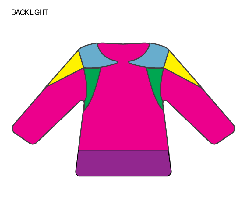
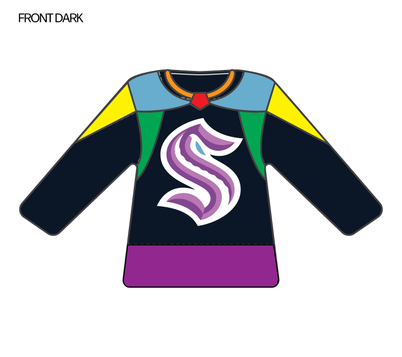
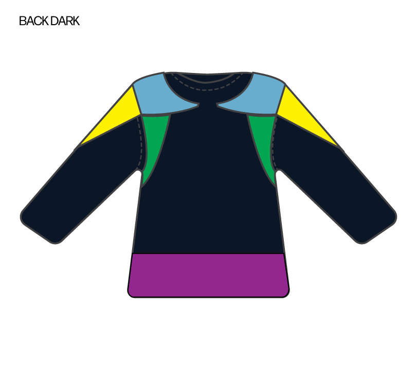
  • Today is your opportunity to design a hockey jersey of your own!
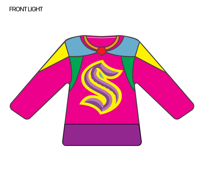
    • Choose a social cause or topic from the list below, and create the front and back design for the Kraken jersey using the blank template included here. Have fun with it, and get creative!
    • Causes:
      • Women in Hockey
      • Green Night (Climate Defense Initiative)
      • LGBTQ+ Pride
      • Hispanic Heritage
      • Indigenous People’s Day
      • Lunar New Year

My response:

  • My cause: Pride! <3
Categories
Uncategorized

Spring – Blog #6 – Mothers Mural

Prompt:

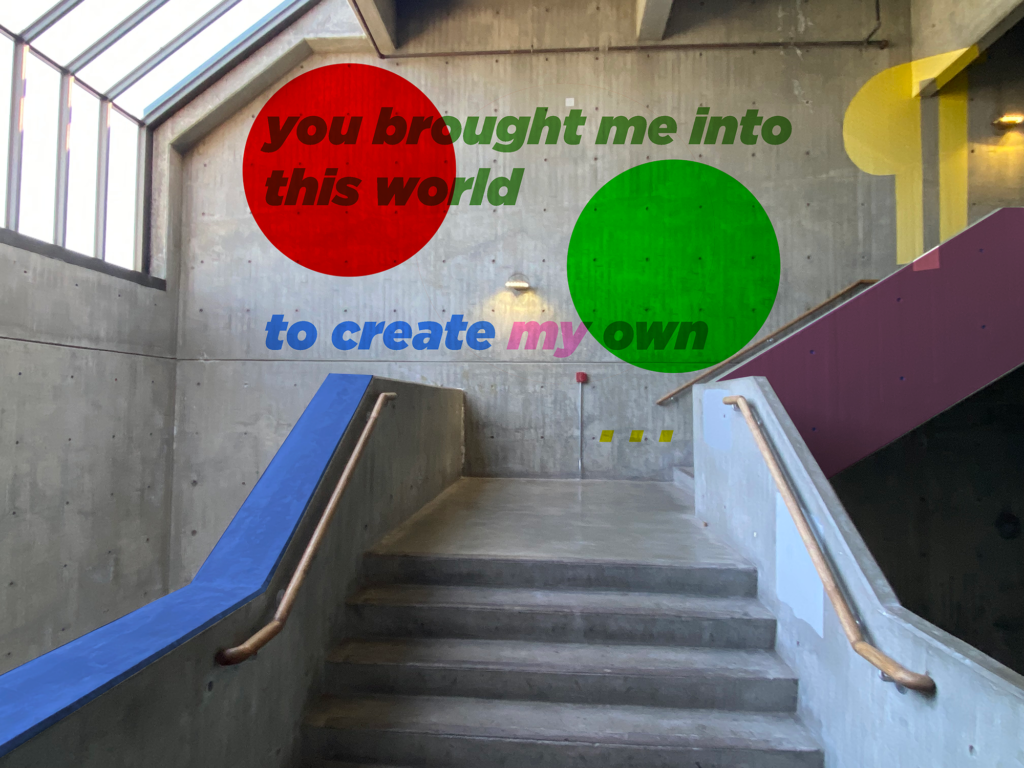
  • For this week’s blog assignment, you need to design something that is inspired by your mother, that would be installed in the central staircase.
    • You have the entire staircase, but do not need to use the entire staircase.
    • It could be a mural, but it does not need to be a mural.
    • You need to work with the existing structure and lighting.

My response:

Categories
Uncategorized

Spring – Blog #5 – Food Truck

Prompt:

  • This weeks blog assignment is to design a Food Truck.
    • Pick a restaurant and design a food truck for it
    • Post your digital solution and a 300-500 word description about your solution.

My response:

Explanation:

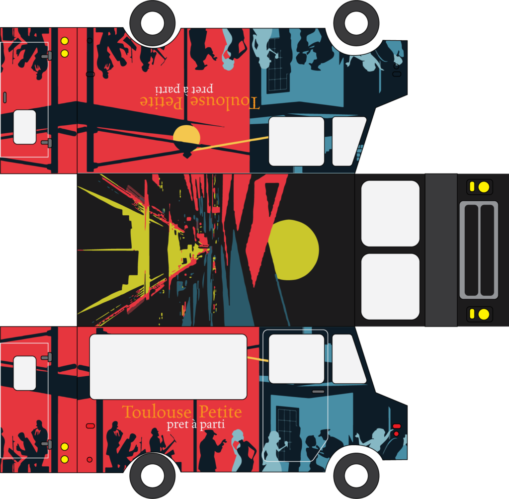
  • I have been going to Toulouse Petit since my 21st birthday. In my primary education, I studied French as a foreign language, and instantly became enamored with the culture and the ways that it has been adapted throughout the world. Something that is particularly interesting to me is how in so many ways the food that has been derived from these cultural intersections is almost always better than either of the two things that are combined on their own. 
  • I for a long time have wanted to do work for restaurants and businesses that I’ve had an impact on my life in the way that to Toulouse Petit has. I grew up in the neighborhood of Queen. Anne, and to see some thing become a staple in the city and stick around through all of the turmoil that we have faced, including the pandemic, and many other fiscal shutdowns of restaurants and other businesses throughout the years. 
  • Toulouse Petit, a New Orleans-themed restaurant, opened on November 11, 2009, in Lower Queen Anne, Seattle. Helmed by Chef Eric Donnelly, formerly of Oceanaire, and owned by Brian Hutmacher, the restaurant’s launch menu included housemade charcuterie arrangements, fried alligator, and a decadent seafood tower. Designed to cater to diverse dining preferences, they have offered some of Seattle’s most well-known happy hour specials from 4 to 5:30pm and 10pm to midnight, with dinner starting at 5:30pm (but many of the dinner items “lunch-afied”). The interior, created by Hutmacher and his team, featured intricately inlaid tables, around 40,000 intricately laid glass tiles, and floor-to-ceiling windows reminiscent of New Orleans architecture. Hutmacher, who also owned the former Peso’s Kitchen and Lounge next door, envisioned a versatile dining experience and I think the city agrees that he was successful.
  • For Toulouse Petit’s food truck, my design solution focuses on delivering a fast and efficient menu that captures the vibrant Cajun Creole street food vibe. The streamlined menu highlights quick-to-prepare favorites like seafood kebabs (a play on the original menu item of the seafood tower), jambalaya, beignets, and more! The truck’s exterior features bold, colorful graphics reminiscent of New Orleans street scenes, creating an inviting, lively atmosphere. Inside, the layout maximizes efficiency with dedicated stations for each dish, ensuring quick service without compromising quality. This design encapsulates the essence of Toulouse Petit while bringing a taste of New Orleans to the streets.
Categories
Uncategorized

Spring – Blog #4 – Blender Review

Prompt:

  • You all recently screened your Blender Project videos, and all us readers instructors feel that collectively they were among the strongest sets of videos we’ve seen for this project. You obviously worked well together, despite being thrown into random groups and in many cases working together for the first time.
    • Please write about your collaborations, and especially focus on what went WELL. This is your chance to pat your teammates (and yourselves) on the back!
    • 300-500 words.

My response:

  • In our blender project for the West Seattle Tool Library, my team and I worked exceptionally together to create our final product. We combined graphic design elements with design thinking and multimedia to deliver what became a very cohesive rebrand. Despite some hiccups in communication with the client, I believe we all did an amazing job.
  • I’d like to give a special shout-out to my teammates for their incredible contributions:
    • Ty: She brought some much-needed comedic relief to our presentation. Her humor was a hit and really helped keep things light and engaging. Her website was also astounding and she had it complete over a week before it was needed which was spectacular for building our brand around.
    • Sami: She worked tirelessly on our animation, finishing it close to the deadline. She also had a great many awesome ideas and personal anecdotes that helped to increase our connection to the topic. Her dedication and skill made a huge difference in the final product.
    • David: His episode of ‘Non-Profit Cribz’ was unintentionally hilarious and turned out to be one of the highlights of our project. This humor added a unique and entertaining touch to our work. He also tried to make real screen prints for our merch but got kicked out of the screen print lab before he could finish but I appreciated the idea and dedication. 
  • Working in a team of four, we all played to our strengths, supporting each other to meet our deadlines and deliver high-quality work. This project really showcased the power of teamwork and the importance of individual contributions.
  • While better communication with our client could have streamlined our process, our ability to adapt and collaborate ensured we still produced great results. The experience highlighted the value of effective teamwork and the impact of bringing different skills and perspectives together.
  • Overall, the rebrand for the West Seattle Tool Library was a success, thanks to the hard work and creativity of my teammates. It was a fun and rewarding project that underscored the importance of collaboration and leveraging our individual strengths to achieve a common goal. I plan to continue to pull the visual media team into my projects (if they want) moving forward because of how this came out.
Categories
Uncategorized

Spring – Blog #3 – Non-Profit Donation

Prompt:

  • You have $25,000 of spare cash on hand. You can choose ONE Seattle-area non-profit to donate the money to.
    • First, do a little thinking and find a cause that is near and dear to your heart.
    • Then, do a little research into which area non-profits work in that sector/field.
  • Finally, write about which non-profit you would choose, and why!
    • 300-500 words.

My Response:

  • Donating $25,000 to Byrd Barr Place is a heartfelt decision for me, driven by the profound impact they’ve had on my life. They’ve been there for me during some of my darkest times, helping me avoid eviction twice and providing energy assistance three times. Their support has been a true lifesaver, allowing me to keep my home warm and secure, and giving me the stability to move forward.

    Byrd Barr Place has been a pillar in our community for over 50 years, offering essential services like housing and energy assistance, a food bank, and personal finance resources. These programs are crucial for helping people break the cycle of poverty and build self-sufficiency. I’ve experienced firsthand how their emergency assistance can prevent a crisis from turning into a catastrophe, and I’m incredibly grateful for that.

    One of the things I love most about Byrd Barr Place is their inclusive approach. They serve a diverse range of clients, including refugees, immigrants, the elderly, and the disabled. In a city as varied as Seattle, it’s vital that everyone has access to support, regardless of their background. Byrd Barr Place’s commitment to understanding and addressing the unique needs of all community members is truly admirable.

    Their efforts go beyond just meeting immediate needs. Byrd Barr Place actively engages with the community, conducting citywide assessments to ensure their services remain relevant and effective. Their involvement in the Washington State Community Action Partnership highlights their dedication to addressing broader social and economic issues, ensuring they can provide the most impactful support possible.

    What also stands out to me is their advocacy for equity, particularly for Seattle’s African American community. Byrd Barr Place works tirelessly to tackle systemic challenges and improve access to education, housing, jobs, and healthcare. Their leadership in the Seattle Community of Practice and collaborations with other organizations are inspiring. They’re not just providing short-term relief; they’re driving long-term change and empowerment.

    This donation is my way of giving back to an organization that has given me so much. Byrd Barr Place’s unwavering support, commitment to inclusivity, and drive for systemic change make them an invaluable resource for our community. I’m honored to support their mission and contribute to their efforts in helping Seattle’s most vulnerable residents build better lives.
Categories
Uncategorized

Spring – Blog #2 – Stanley Bowl

The Assignment

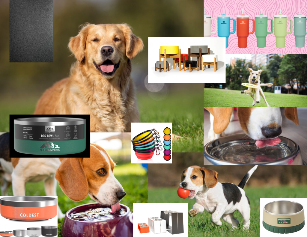
“MARC: For your blog assignment you need to create a mod board for a “new” Stanley product: The Stanley 32 oz Dog Bowl.Write a short description of the bowl. And create a mood board to convey the look and feel of a product photo shoot.”

The Process

Search Terms:

  • Futuristic dog bowl
  • insulated dog bowl
  • silver dog bowl
  • matte metal
  • silicon accessories
  • neon colors
  • dogs happy
  • colored metal
  • titanium
  • chrome
  • Stanley
  • Stanley Quenchers

The Production

My dog bowl would be based on the Stanley quenchers and would imitate the Hydrapeak option that I used in my moodboard. It would be a matte metal texture for ruggedness and protection against whatever adventures you and your furry friend get into! Additional options would include a silicone bottom for extra stability.

Categories
Uncategorized

Spring – Blog#1 – Design Systems

Prompt:

  • A design system is a collection of reusable components with clearly defined standards for use. These components combine pattern libraries, colors, and fonts with standardized design principles to help companies achieve consistent visual design at scale. Design systems embed these building blocks of design into teams and workflows to create consistent user experiences even when design is distributed among numerous designers and other creators.
  • In your own words share a few insights from what you observed.
    • Name the three sites you visited, and three specific things you learned about that company.

My response:

  • Nike Digital Design System
    (previously known by: “Podium”)
    • Key Features/Design Principles:
      • Unified Design Language
        • NDDS offers a unified design language that maintains consistency across various digital touchpoints
      • Scalability
        • The system is designed to scale effortlessly, supporting everything from small mobile interfaces to extensive desktop applications
      • Flexibility and Customization
        • Allows for flexibility and customization. Designers can adapt components to meet specific needs without compromising on the overall brand integrity
      • Responsive Design
        • The NDDS supports responsive design, ensuring that all components and layouts adapt smoothly to different screen sizes and orientations
      • Accessibility
        • Nike places a strong emphasis on accessibility. The NDDS includes guidelines and best practices for creating accessible digital products, ensuring that all users, including those with disabilities, can interact with Nike’s digital platforms effortlessly
  • Google Material Design
    • Key features/design principles:
      • Material as a Metaphor:
        • Inspired by real-world materials, Material Design uses surfaces and edges to provide visual cues and a sense of physicality
      • Bold, Graphic, Intentional:
        • Emphasizes intentional use of color, imagery, and typography to create a bold and vibrant aesthetic
      • Motion Provides Meaning:
        • Animations and transitions are used to guide the user’s attention and provide feedback on their interactions
      • Inclusive Design:
        • Ensures all components are accessible, with guidelines for color contrast, touch targets, and screen reader support
      • Accessibility:
        • Tools and resources to help designers and developers create accessible products, including ARIA (Accessible Rich Internet Applications) practices and accessibility testing tools
      • Very robust and flexible design system that not only serves Google’s ecosystem but also provides valuable resources and tools for everyone to access
  • Apple Human Interface Guidelines:
    • Key Features/Design Principles:
      • Clarity:
        • Ensures that text is legible at every size, icons are precise and lucid, and adornments are subtle and appropriate
      • Deference:
        • Uses fluid motion and a crisp, beautiful interface to help users understand and interact with content
      • Depth:
        • Layers and realistic motion convey hierarchy, impart vitality, and facilitate understanding
      • SF Symbols:
        • A library of over 1,500 configurable symbols that integrate seamlessly with Apple’s system fonts
      • Design Kits/Documentation:
        • Provides resources like Sketch and Adobe XD kits containing UI elements and templates for rapid design and prototyping
        • Extensive documentation covering all aspects of UI design, including best practices and implementation details outside of just their format
      • Inclusive Design:
        • Ensures that all users can use Apple products. VoiceOver, Dynamic Type, and other accessibility features
      • Accessibility:
        • Provides developers with tools to make apps more accessible, including APIs for adding accessibility information to custom UI elements
      • Fluid Motion:
        • Similar to Google, guides for creating smooth, natural animations that help users understand the app’s flow and transitions
Categories
Uncategorized

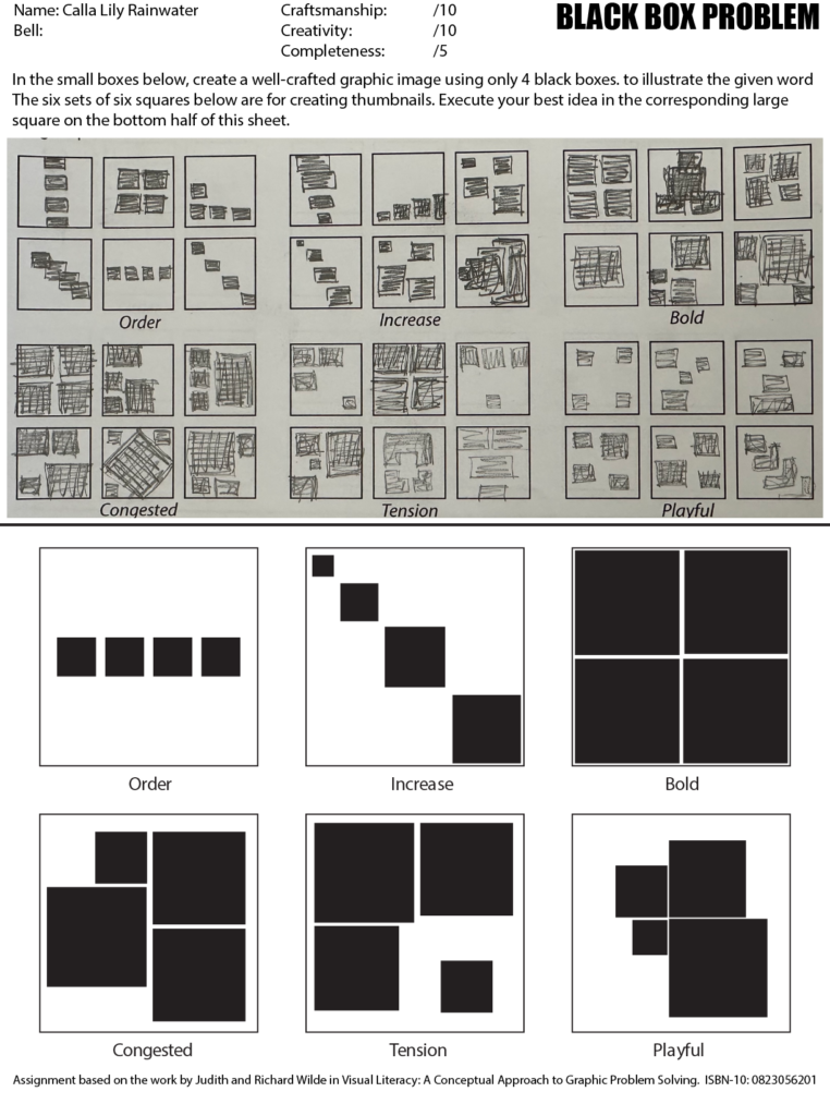
Black Box Assignment

Categories
Uncategorized

Process Video

Here is a little fun voice over and timelapse of me doing some of my blog posts and still life work.