Categories
Uncategorized

Spring – Blog #3 – Non-Profit Donation

Prompt:

  • You have $25,000 of spare cash on hand. You can choose ONE Seattle-area non-profit to donate the money to.
    • First, do a little thinking and find a cause that is near and dear to your heart.
    • Then, do a little research into which area non-profits work in that sector/field.
  • Finally, write about which non-profit you would choose, and why!
    • 300-500 words.

My Response:

  • Donating $25,000 to Byrd Barr Place is a heartfelt decision for me, driven by the profound impact they’ve had on my life. They’ve been there for me during some of my darkest times, helping me avoid eviction twice and providing energy assistance three times. Their support has been a true lifesaver, allowing me to keep my home warm and secure, and giving me the stability to move forward.

    Byrd Barr Place has been a pillar in our community for over 50 years, offering essential services like housing and energy assistance, a food bank, and personal finance resources. These programs are crucial for helping people break the cycle of poverty and build self-sufficiency. I’ve experienced firsthand how their emergency assistance can prevent a crisis from turning into a catastrophe, and I’m incredibly grateful for that.

    One of the things I love most about Byrd Barr Place is their inclusive approach. They serve a diverse range of clients, including refugees, immigrants, the elderly, and the disabled. In a city as varied as Seattle, it’s vital that everyone has access to support, regardless of their background. Byrd Barr Place’s commitment to understanding and addressing the unique needs of all community members is truly admirable.

    Their efforts go beyond just meeting immediate needs. Byrd Barr Place actively engages with the community, conducting citywide assessments to ensure their services remain relevant and effective. Their involvement in the Washington State Community Action Partnership highlights their dedication to addressing broader social and economic issues, ensuring they can provide the most impactful support possible.

    What also stands out to me is their advocacy for equity, particularly for Seattle’s African American community. Byrd Barr Place works tirelessly to tackle systemic challenges and improve access to education, housing, jobs, and healthcare. Their leadership in the Seattle Community of Practice and collaborations with other organizations are inspiring. They’re not just providing short-term relief; they’re driving long-term change and empowerment.

    This donation is my way of giving back to an organization that has given me so much. Byrd Barr Place’s unwavering support, commitment to inclusivity, and drive for systemic change make them an invaluable resource for our community. I’m honored to support their mission and contribute to their efforts in helping Seattle’s most vulnerable residents build better lives.
Categories
Uncategorized

Spring – Blog #2 – Stanley Bowl

The Assignment

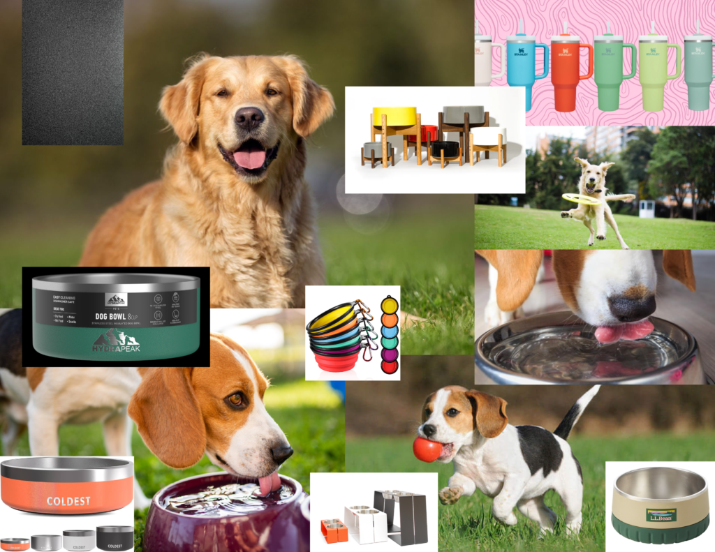
“MARC: For your blog assignment you need to create a mod board for a “new” Stanley product: The Stanley 32 oz Dog Bowl.Write a short description of the bowl. And create a mood board to convey the look and feel of a product photo shoot.”

The Process

Search Terms:

  • Futuristic dog bowl
  • insulated dog bowl
  • silver dog bowl
  • matte metal
  • silicon accessories
  • neon colors
  • dogs happy
  • colored metal
  • titanium
  • chrome
  • Stanley
  • Stanley Quenchers

The Production

My dog bowl would be based on the Stanley quenchers and would imitate the Hydrapeak option that I used in my moodboard. It would be a matte metal texture for ruggedness and protection against whatever adventures you and your furry friend get into! Additional options would include a silicone bottom for extra stability.

Categories
Uncategorized

Spring – Blog#1 – Design Systems

Prompt:

  • A design system is a collection of reusable components with clearly defined standards for use. These components combine pattern libraries, colors, and fonts with standardized design principles to help companies achieve consistent visual design at scale. Design systems embed these building blocks of design into teams and workflows to create consistent user experiences even when design is distributed among numerous designers and other creators.
  • In your own words share a few insights from what you observed.
    • Name the three sites you visited, and three specific things you learned about that company.

My response:

  • Nike Digital Design System
    (previously known by: “Podium”)
    • Key Features/Design Principles:
      • Unified Design Language
        • NDDS offers a unified design language that maintains consistency across various digital touchpoints
      • Scalability
        • The system is designed to scale effortlessly, supporting everything from small mobile interfaces to extensive desktop applications
      • Flexibility and Customization
        • Allows for flexibility and customization. Designers can adapt components to meet specific needs without compromising on the overall brand integrity
      • Responsive Design
        • The NDDS supports responsive design, ensuring that all components and layouts adapt smoothly to different screen sizes and orientations
      • Accessibility
        • Nike places a strong emphasis on accessibility. The NDDS includes guidelines and best practices for creating accessible digital products, ensuring that all users, including those with disabilities, can interact with Nike’s digital platforms effortlessly
  • Google Material Design
    • Key features/design principles:
      • Material as a Metaphor:
        • Inspired by real-world materials, Material Design uses surfaces and edges to provide visual cues and a sense of physicality
      • Bold, Graphic, Intentional:
        • Emphasizes intentional use of color, imagery, and typography to create a bold and vibrant aesthetic
      • Motion Provides Meaning:
        • Animations and transitions are used to guide the user’s attention and provide feedback on their interactions
      • Inclusive Design:
        • Ensures all components are accessible, with guidelines for color contrast, touch targets, and screen reader support
      • Accessibility:
        • Tools and resources to help designers and developers create accessible products, including ARIA (Accessible Rich Internet Applications) practices and accessibility testing tools
      • Very robust and flexible design system that not only serves Google’s ecosystem but also provides valuable resources and tools for everyone to access
  • Apple Human Interface Guidelines:
    • Key Features/Design Principles:
      • Clarity:
        • Ensures that text is legible at every size, icons are precise and lucid, and adornments are subtle and appropriate
      • Deference:
        • Uses fluid motion and a crisp, beautiful interface to help users understand and interact with content
      • Depth:
        • Layers and realistic motion convey hierarchy, impart vitality, and facilitate understanding
      • SF Symbols:
        • A library of over 1,500 configurable symbols that integrate seamlessly with Apple’s system fonts
      • Design Kits/Documentation:
        • Provides resources like Sketch and Adobe XD kits containing UI elements and templates for rapid design and prototyping
        • Extensive documentation covering all aspects of UI design, including best practices and implementation details outside of just their format
      • Inclusive Design:
        • Ensures that all users can use Apple products. VoiceOver, Dynamic Type, and other accessibility features
      • Accessibility:
        • Provides developers with tools to make apps more accessible, including APIs for adding accessibility information to custom UI elements
      • Fluid Motion:
        • Similar to Google, guides for creating smooth, natural animations that help users understand the app’s flow and transitions