Spring 2024 Assignment #1
Spectrum, Adobe
https://spectrum.adobe.com

The Adobe Spectrum website uses mainly blue, yellow, and white colors. In the psychology of color blue represents dependability, intelligence and depth and people tend to feel more secure when they see the color blue, probably why so many websites use it.
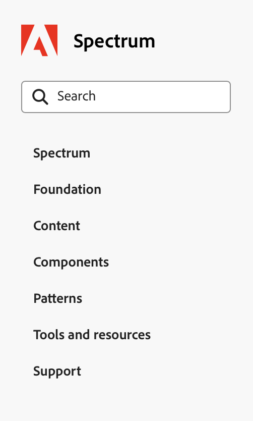
The website has simple/intuitive icons that makes navigating easy along with a simple and straight to the point menu. Design elements are consistent, maintaining brand identity, such as the Adobe logo, color scheme and similar graphics throughout the website.
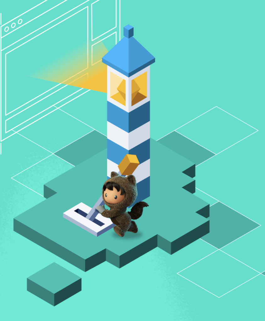
Lighting Design System
https://www.lightningdesignsystem.com
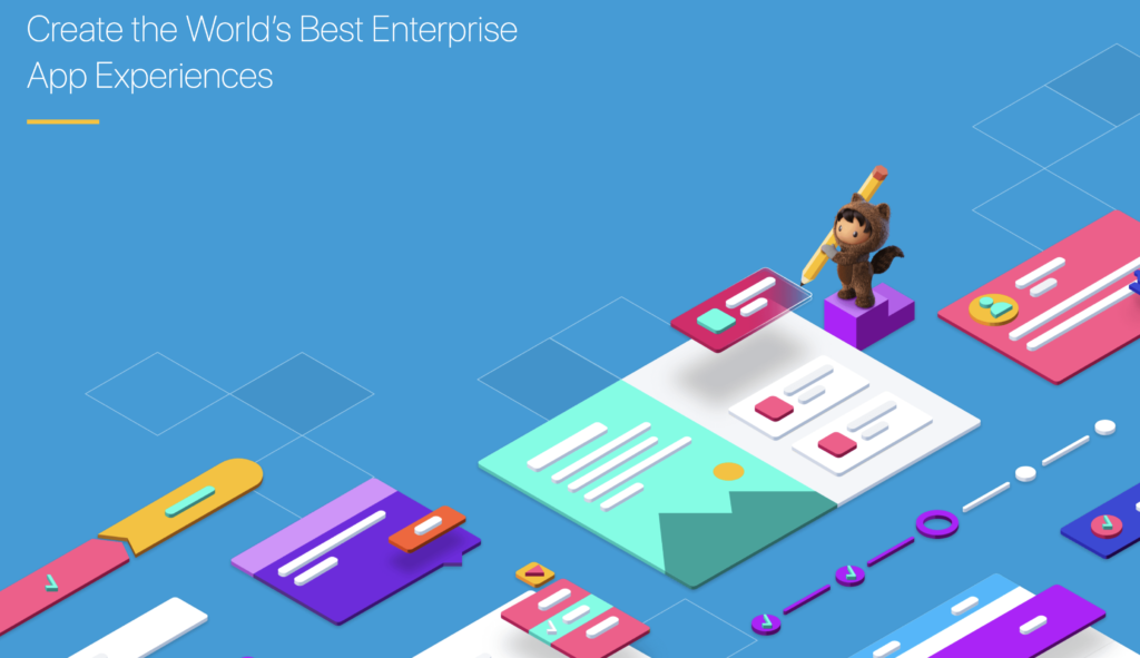
The Lighting Design System website follows a pretty minimalist design approach, the home page is very fun, cute and colorful but the rest is kinda bland and again lots of blue!
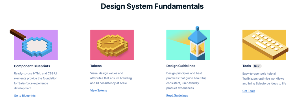
The website uses a grid system for a consistent layout, the typography is clear and easy to read, and well-designed icons are used throughout. The website is responsive and adapts to different devices (works just fine on my iPhone). The navigation is pretty easy to use, clear labels and a solid menu structure very similar to Spectrum, Adobe.
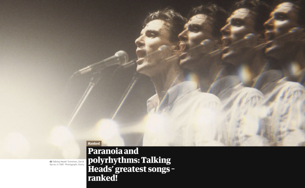
The Guardian
https://www.theguardian.com/us
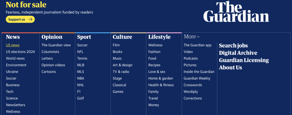
The Guardian website uses attention-grabbing, bold typography with large headings, and clear fonts to grab the attention of readers. It organizes articles and news stories in a card-based layout to present articles and news stories.
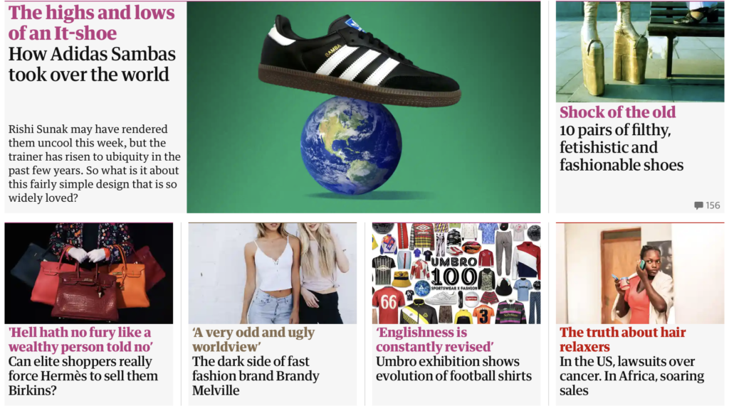
There are lots of images with the saturation cranked up a tad, and I noticed a lot of primary colors throughout the website in the images and text. The design includes interactive features like sliders, videos and social sharing buttons to engage users and provide a fun user experience.