Categories
Uncategorized

Blog Assignment 2

The range I currently aspire to do work is in the broad audience and high density quadrant. I say this because I would love to work in the video game industry. Video games by nature draw in an audience of people from all walks of life, thus landing it in the broad audience category. Video games are also highly visually intensive, with several different visual aspects and functions, landing it in the high density category as well.

Working in this quadrant comes with its own set of issues. First off, it’s high density, meaning there will be a lot of work required. High density means that the audience will have a large range of visual input, and all of this input needs to be intuitive. This in turn requires more work from a designer to ensure that the design work they are doing is not only functional, but easy to understand. Building off the easy to understand notion, the audience is very broad. The design work needs to be easy to understand for several different groups of people, not just one. This requires even more work from the designer. Designing a large array of assets that are nice to look at but also easy to navigate for many different groups of people is no easy task.

Despite these issues, working in this quadrant can be highly fulfilling. Your work, by the nature of it falling into the broad audience category, will be seen and used by more people. Again, not only more people but more kinds of people as well. This allows for several different opinions, viewpoints, and feelings surrounding your work. Additionally, working in this field by nature needs collaboration. Collaboration is a highly useful tool to help gather different opinions and perspectives, as well as help to divide the work and create new ideas.

Overall, I think work in the broad audience and high density quadrant is intense and rigorous, but also highly fulfilling. It requires a lot of effort put in, but the output and process of working with others towards said output is rewarding.
Categories
Uncategorized

A.R. Review

For my A.R. app review, I decided to review the app ‘INKHUNTER Try Tattoo Designs.’ I chose this app because I myself want to get tattoos eventually and I thought this app was an intriguing way for an individual to preview how a certain tattoo might look in their desired location.

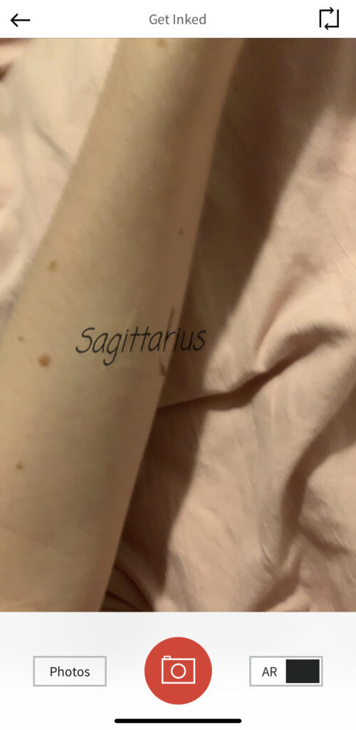
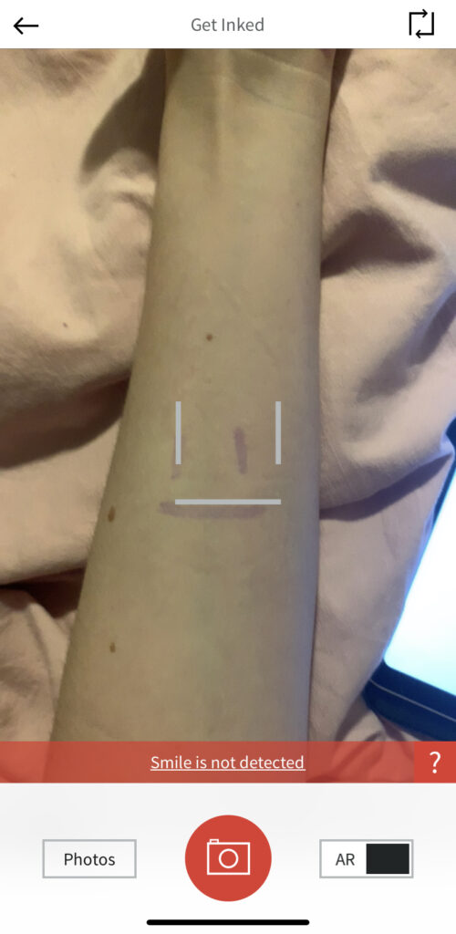
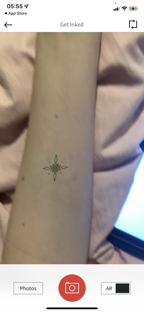
When I opened the app, I was greeted with a screen detailing that the user has to first physically draw on their skin for the A.R. function to work which I wasn’t enthused about but complied nonetheless. Then, I was presented with a screen full of different tattoo designs that were pre-made which the user could choose from to preview on their skin. I selected one of these designs, and drew the marking necessary for the A.R. function on my arm. Doing this, I learned that the app does not work if you use any color besides blue or black.

I traced over my purple drawing with blue and the app recognized the shape. The tattoo was overlaid in A.R. onto my skin! As cool as this was, I could not help but immediately notice the clipping of blue pen underneath the tattoo. This irritated me greatly.

I then tried to move the design around, which I was flat out unable to do. This means the user has to draw the design exactly where they want it on their skin, or redraw it on every part of their body they want to preview it on.

Next, I went to the tab to the left which allowed users to upload their own photos or input their own text to preview on their skin. It was through doing the text function which I discovered that upon turning the part of the body the tattoo was overlaid caused it to seemingly “float” off of the user’s skin.

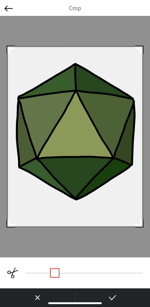
The upload photo function was very intuitive, after selecting the photo of choice the app allows you to crop the image to your liking. Additionally, it has a slider bar at the bottom to remove the background of the image to a desired threshold so it can appear on the skin the way the user intends.

Overall, the layout of the app itself is good and easy to navigate. The only improvements needed are surrounding the A.R. function. Users should be allowed to freely move the tattoo regardless of the template on their skin, the A.R. shouldn’t “float,” and the template drawing shouldn’t peak through the A.R. tattoo.

Categories
Uncategorized

A.R. Card

For the A.R. Card, I decided to do make a card for Halloween seeing as it is coming up soon! I knew that I wanted to do my own calligraphic text that said “Happy Halloween,” and include something that would move when you tap on it and when you get close to it.

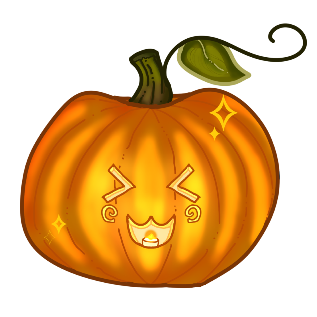
The first thing I decided to draw was a cute jack-o-lantern. I didn’t want it to be scary, but instead light-hearted. I went into ProCreate and drew the base of my jack-o-lantern. I then lined, colored, and added a bit of shading. I turned on animation assist and added some sparkles to the drawing that would shimmer when you tapped on it. Here is the first frame of the gif (WordPress isn’t allowing the gif to be attached for some reason):

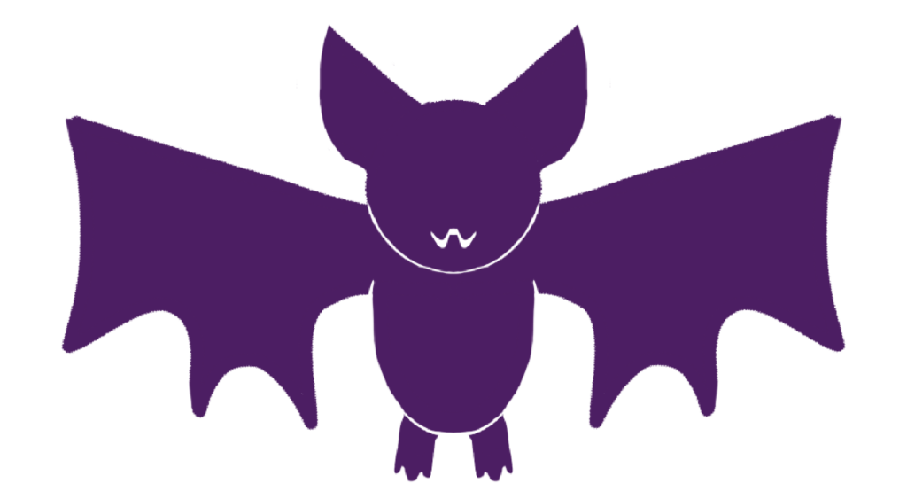
Next, I wanted to include a bat for the element that moves when you get close to it. Again, I went into ProCreate and drew up a purple bat. I wanted to go with the cute feel again more than the scary feel. I turned on animation assist and made the wings move. Again, here is the first frame of the animation:

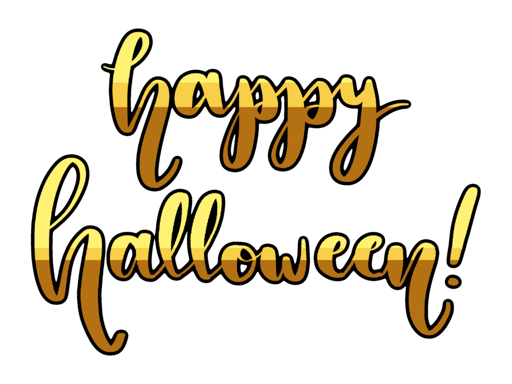
Finally, I hand wrote the message “Happy Halloween!” and saved that as well.

I then opened Adobe Aero and imported all of the elements. The scene felt a bit empty, so I added 2 trees from the Aero assets to make the scene a bit fuller. I positioned the elements where I wanted them, and then added the triggers to each drawing I did. Voila, I was done!

Categories
Uncategorized

A.R. Poster

When we were assigned to make a poster in augmented reality, I was really stumped at first. It’s not that I didn’t have enough ideas, rather that I had too many. I couldn’t narrow down what exactly I wanted to do. Later in the week though, I was scrolling through Twitter and I came across a tweet with a gif of different coffees flashing rapidly attached to it. The tweet read something along the lines of “screenshot for your coffee order.” This made my nerd brain light up and I knew what I wanted to do — a gif of a D20 flashing different numbers that the user would screenshot their phone screen for their roll.

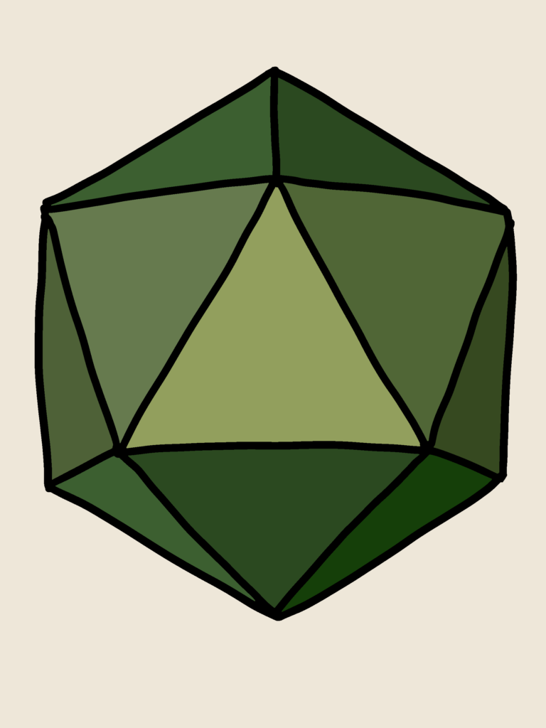
My first order of business was drafting up a D20. To do so, I took a photo of one of my physical dice at home and imported it into Procreate on my iPad. I traced over the general shape of it and filled it in with the green I use in my D&D character’s artwork (because I love her a lot).

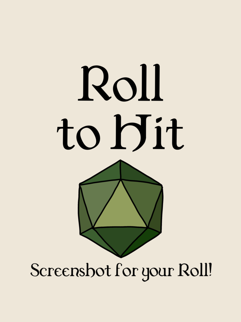
Next, I needed to narrow down my text. At first I thought maybe “Roll for Damage,” then “Roll for Stats,” but thought both were too vague. Eventually I decided on “Roll to Hit” seeing as a D20 is in fact a hit die. I scavenged for fonts and landed on a font appropriately named “Dungeons.” Adding that to the canvas, I captioned the bottom of the page “screenshot for your roll” and was done with my still poster image!

For the next few steps, I opened my phone and went to a random number generator. I set the range from 1 to 20 and hit randomize. I then wrote the number on the center triangle of the dice. I repeated this step until I had all 20 numbers written in a random order. To add a final bit of flare, I added the text “CRITICAL FAIL!” to the 1 roll and the text “CRITICAL SUCCESS!” to the 20 roll. I added some sparkles to the 20 frame and a skull to the 1 frame. I exported the canvas as an mp4 with a frame rate of 30 fps and I was done!