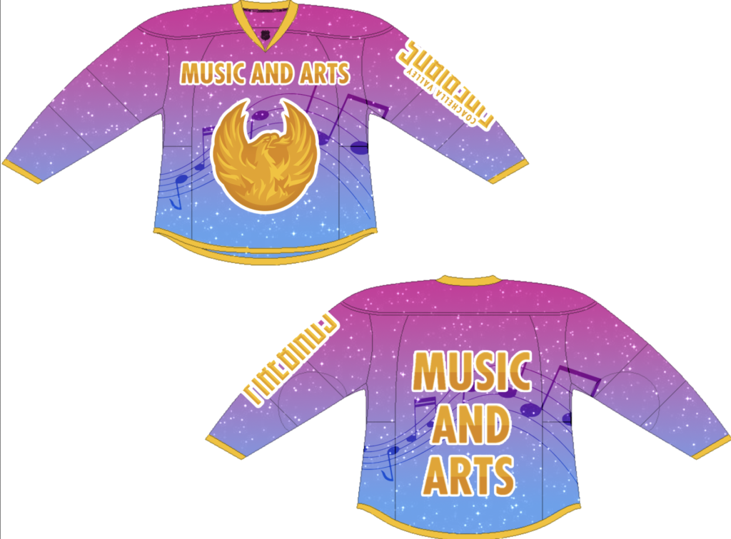
I think this will be an effective design for the Coachella Valley Music and Arts festival because it’s fairly simple yet bold. The colors are similar to that of the night sky, which is what you can see at the festival. In addition, the gold acts as a nice accent, and the overlaid music notes reinforce the motif of music. The logo on the front and name on the arm keeps the focus somewhat on the team while the words “Music and Arts” showcases the festival.