“In preparing for battle, I have always found that plans are useless, but planning is indispensable.”
-General Dwight D. Eisenhower
Last quarter in our Design History’s class, we had a final project where we had to incorporate a specific topic we have been researching and incorporate that into a poster design (for a ballet show). Through color, type, form language, layout, photo treatment, and/or composition, we had to use the visual elements, approaches and characteristics you discovered through our research process as a reference in our designs. My subject was ukiyo-e, a genre of Japanese art, spanning from the 17th to 19th centuries, with many different sub-genres within. The project within itself proved to be a challenge because we are not exactly emulating a piece from that time period but taking bits and pieces to incorporate it into a modern poster design that you may see today.
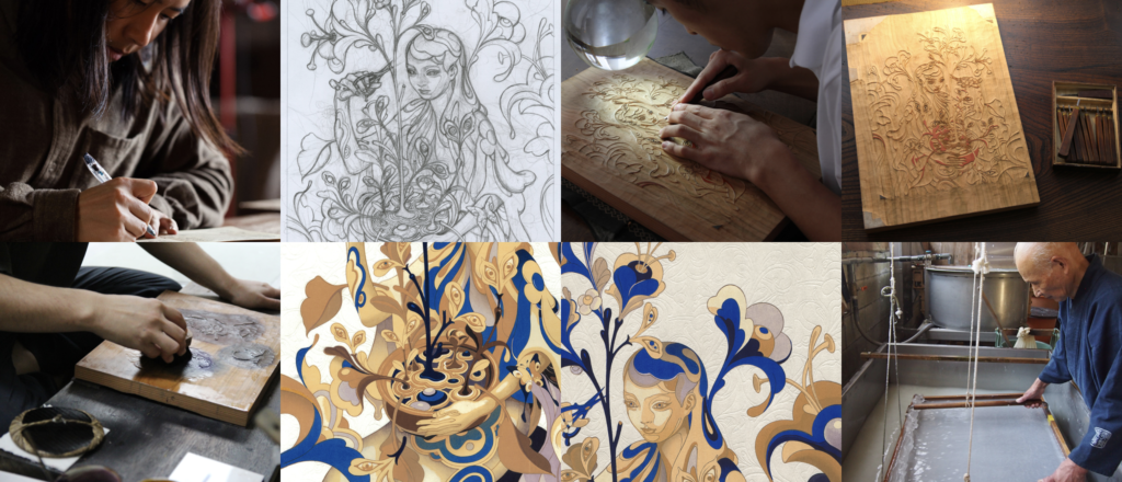
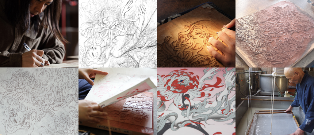
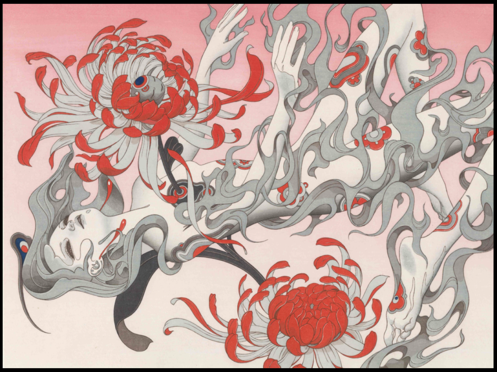
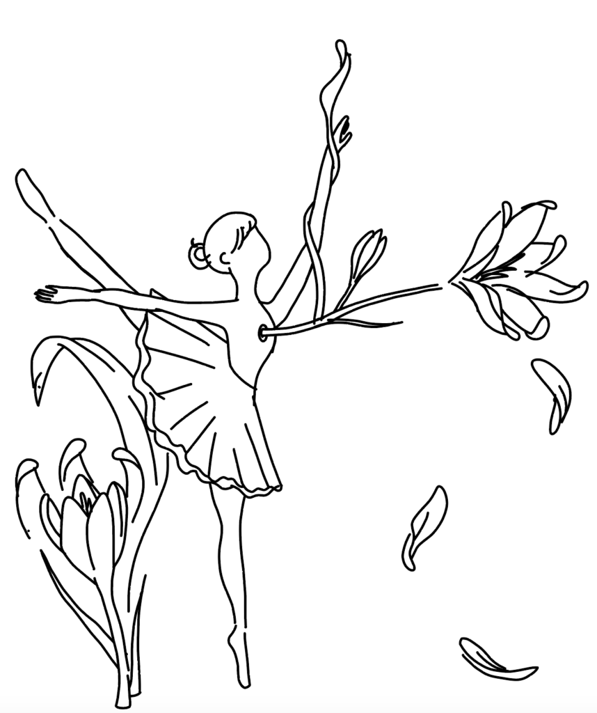
Before I start any project, I do additional research and find sources of inspiration or create a mood board. I already had an archive of ukiyo-e pieces, but I wanted to find work that is influenced by ukiyo-e but also pieces that still looked modern—a fine line I had to balance. I found many sources of inspiration. The one that caught my eye the most was a series of woodblock printings done by James Jean—he focuses on line quality, the human figure, and a limited color palette to showcase contemporary ukiyo-e art. His piece “Chrysanthemum” is what inspired my poster originally. Based on my initial sketches, I wanted to replicate a similar piece—focusing on the ballerina figure, while incorporating a flower (crocus—flower that blooms in the winter), and the color I wanted to focus on was purple.
As I went about this project, what I envisioned may have been a bit ambitious for my capabilities and limited knowledge on drawing digitally. I had only really used Adobe Illustrator (which wasn’t the best option for actual illustrations) and I didn’t want to use a mouse to draw every single vector. I remembered I had an old Wacom tablet that I had never touched and attempted using it. I was able to trace my sketch, but I only had so much time to work on this project and was not able to add as many details as I wanted to. There were also issues in bringing my drawing from Clip Studio Paint into Illustrator, all the strokes and line quality was taken away and I had to go back into Illustrator to manually adjust the widths and terminal strokes. Adding color was another issue as I didn’t have experience with that as well.
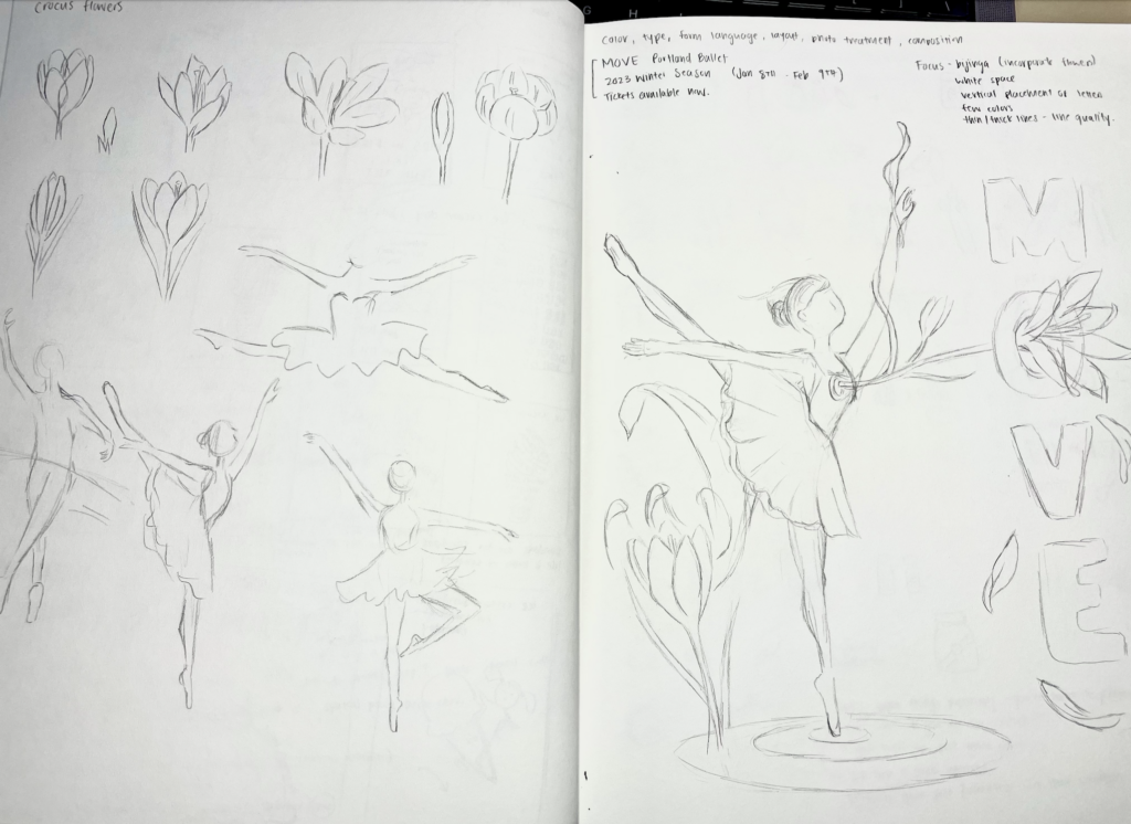
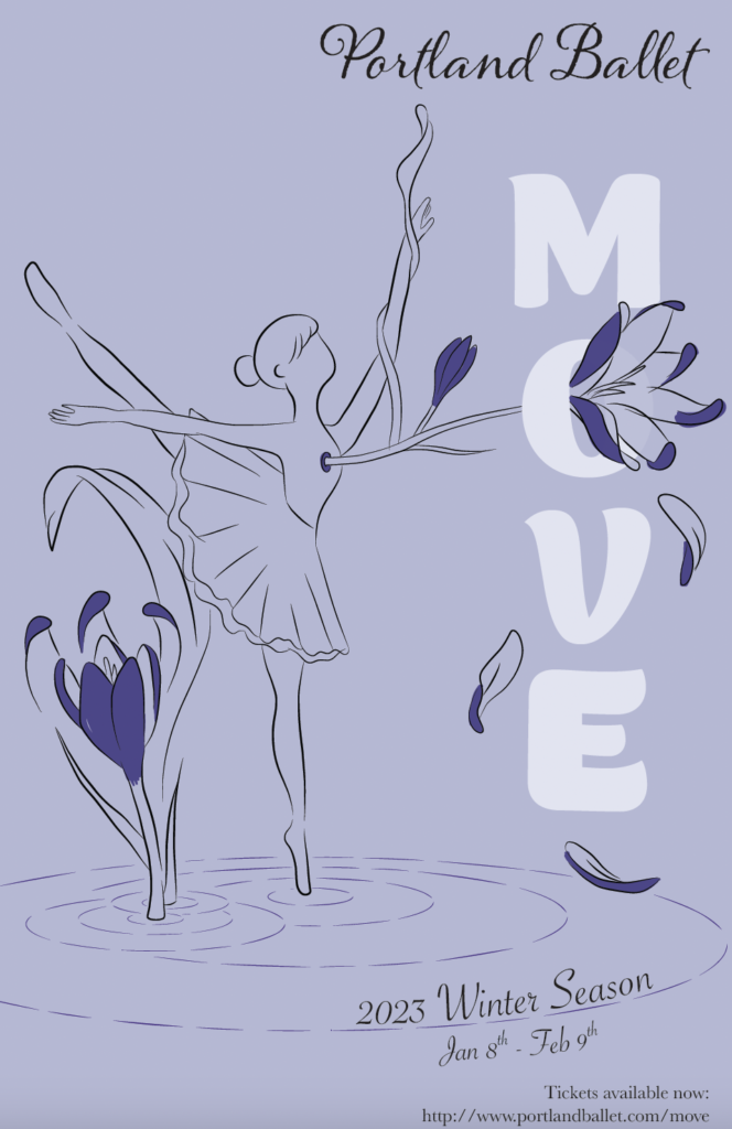
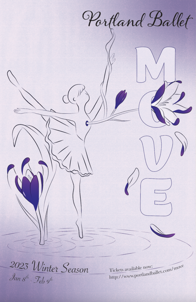
In the end I had to simplify a lot of what my original/planned outcome was. But I was able to adapt to what I knew I could do in a limited amount of time. My own take on this project and still hit the key points I wanted to convey in subtly incorporating ukiyo-e, which includes, the vertical placement of letterforms, utilizing one color, line quality, emphasis on the human figure, and lastly white space.