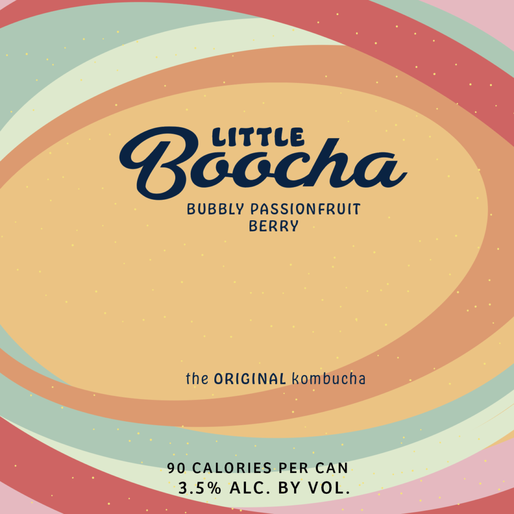
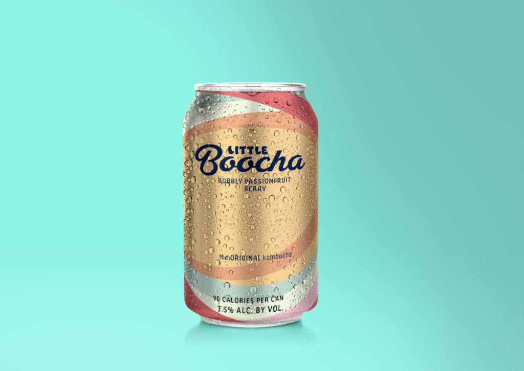
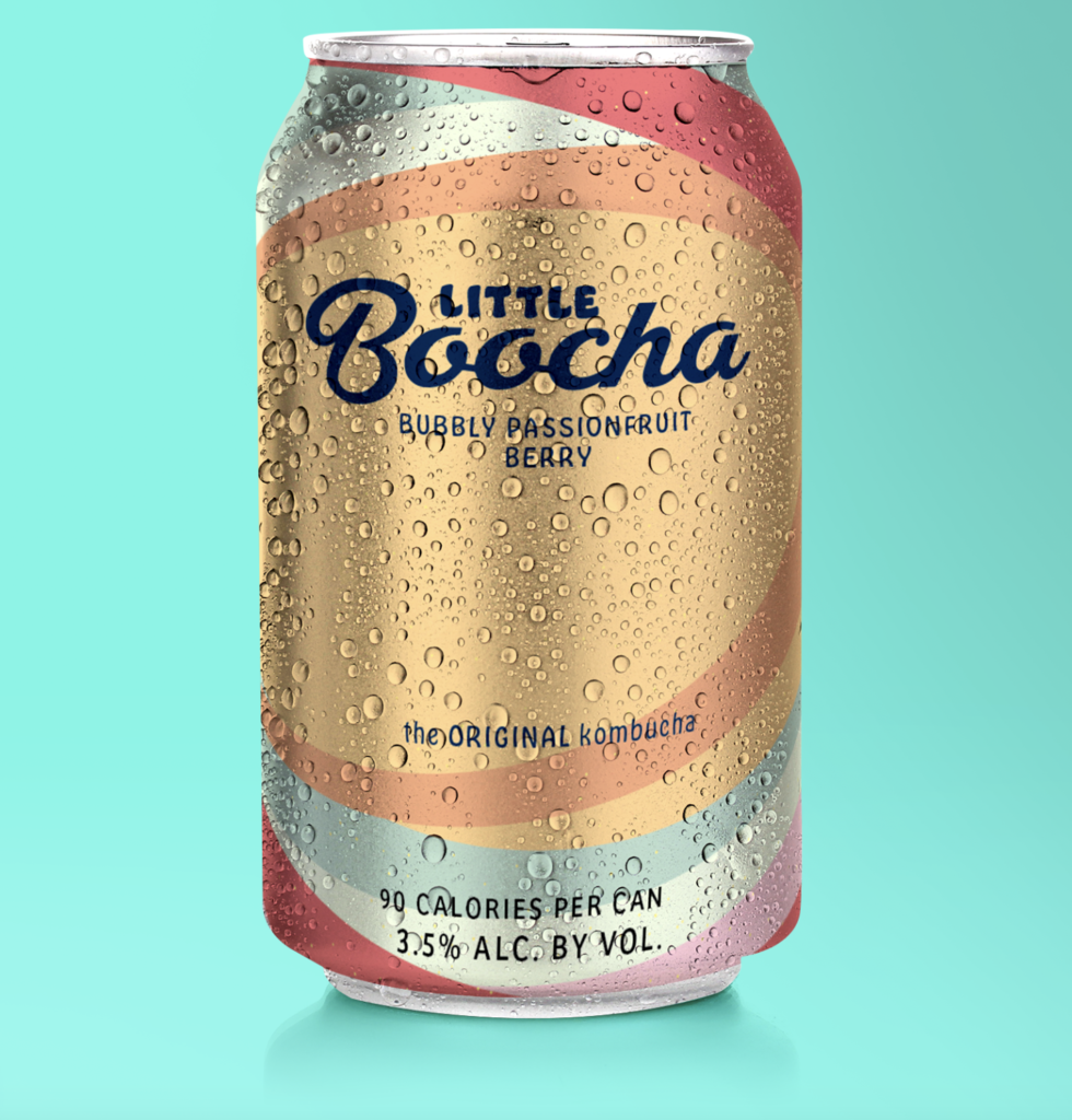
Having never done packaging, this was a fun challenge to learn how to use photoshop and mockups! I decided to design packaging for a can of kombucha (based on a conversation I had with some friends recently and passionfruit is one of my favorite fruits). I wanted to experiment with color palettes because of the color theory class we have this quarter—I explored Adobe Color Themes to create a fun and fruity palette for the drink. We are also in a typography class this quarter. Using what I learned, I also modified the typeface to make the “B” in “Boocha” more readable. Using Illustrator I created the design that has movement and refreshing colors, the open ovals drawing the viewers eyes towards the center. I then went into photoshop to place my design and edited/modified colors and shadows to the mockup accordingly. I hope you enjoy this refreshing bubbly boocha drink!