Brit Zerbo—Hard & Soft Skills

“Hard skills will get you the interview, and Soft skills will get you the job.”

Last week our guest speaker Brit talked about how hard skills is important, but what is even more important is soft skills and how that plays a role in your work environment (what makes you a good fit in the workplace).

There are my top three hard and soft skills:

Top three hard skills:

  1. Analytical reasoning/analyzing data
    As my current job, working as a Clinical Laboratory Scientist—I am often looking at data (specifically patient results/values) and evaluating if the results are consistent with the patient’s previous results and clinical picture. If the numbers don’t line up, troubleshooting must be done to evaluate if they are real and the reason behind why it might not be correct. Overall, having deductive reasoning skills and resulting in logical conclusions from assessing patterns and relationships.
  2. Laboratory science (troubleshooting instrumentation problems and releasing patient results)
    This is a more specific hard skill and encompasses many other skillsets. Working a as a scientist requires many hard skills such as troubleshooting instrumentation, running quality control, and most importantly performing clinical testing and releasing patient results.
  3. Inventory (accurately verifying stock, providing audit, and calculating how much more to order for low inventory)—requires organization
    From both my current and past job(s) I have had to perform audits. From my seven years in customer service working at a grocery/gift store, we biannually took inventory of everything in our inventory which took patience and attention to detail to make sure the numbers added up. For my laboratory job, I frequently do audits for our reagents, and it was crucial to make sure our reagents were up to par and calculate how much to order (we order on a month-by-month basis). Ordering required the ability to calculate how far out we needed certain items, but there also needed to be a balance because over-ordering could be costly as reagents expire quickly too.

Top 3 soft skills

  1. Empathy
    In general, I am an extremely empathetic person and deep feeler. I know many people say they’re empathetic, but I genuinely try to understand the people around me and to understand why people act a certain way. Obviously, everyone is going through their own journey and it’s best to be understanding. I try my best to acknowledge my colleagues hard work and weighing in their opinions before making big decisions. Integrating this skill at work has taken me time but an example would be me being vulnerable by opening up to my coworkers. For instance, there have been times when coworkers make mistakes and they are extremely unforgiving on themselves, especially knowing that we work in a hospital, but I reassure them that we all make mistakes and share an instance in which I may have made a mistake, but we just own up to it, learn from it, and move on. It’s ok to feel bad but it’s not productive (especially mentally) to beat yourself over that.
  2. Detail oriented
    I am detail oriented not only in numbers (as stated in my hard skills above), but also by following standard operating procedures and paying close attention to my peers and their needs. Noticing when there is a larger workflow and going to help where help is needed without having to be told is an important skillset. I also notice when there may be small inconsistencies from what we may be practicing and what is written in the procedure (e.g. last week I noticed that in the lab guide it states that HCG tests can be added on up to 48 hours refrigerated but in another section stated that specific gravity—which is a part of the HCG test can only be tested up to 10 hours refrigerated and there has definitely been instances where people have run the test and resulted it over 10 hours). Knowing when to clarify and bring up and inconsistencies is important.
  3. Organization
    Prioritizing important tasks which I do daily at my job. Patients always come first—the more rapid tests meaning that patients who might be bleeding out or have critical/abnormal results must be worked on and notified immediately as it impacts the patient’s clinical picture. More routine tests can always be done later. I also like to keep a list of tasks I must complete in a day so I can check it off and double check that everything is done before I get off my shift.

There are my two hard skills and the top two soft skills I would like to develop during the next year and a half while at SCCA.

Developing hard skills:

  1. Adobe Creative Suite
    Having a career switch to become a graphic designer, it is impertinent to be well rounded in the Adobe Creative Suite. Though I have a basic understanding and I am currently still learning, I want to be a master and know the ins and outs of Adobe as that is the industry standard. Not only will it increase my productivity, but it will also allow me to more accurately create things I have in mind.
  2. UI/UX
    An area that I want to explore and UI/UX design. Though this topic might not necessarily be the most interesting to me, UI/UX surrounds us every day and everywhere and it’s an extremely useful skill to have as it also helps us to be empathetic and understand user’s needs to solve problems. At the end of the day, accessibility is extremely important in all of design. If a design is accessible, a wider breath of audience is able to perceive, understand, navigate, and interact which benefits all.

Developing soft skills:

  1. Creative problem solving and design thinking
    Having hardwired to use my left brain (for essentially the bast decade), I want to exercise my creativity because that is how new and innovative ideas and solutions are created. I tend to be overanalytical and overthink which leads to decision paralysis and as a result not producing anything. I want to practice being more accepting of free flowing ideas and thinking outside the box—not just to please employers but to push myself to create unexpected designs/art.
  1. Communication (presentation and persuasion skills)
    At my current work I don’t have much of an issue with communicating hand-offs and vocalizing concerns/suggestions during huddles/meetings. But I want to work on my presentation and persuasion skills as it is important for designers to convince people of their design solutions and ideas. Even if I may have the best solution, if I am unable to communicate to clients and stakeholders my designs, then all my hard work might be for nothing which is why I want to improve and take every week as an opportunity to practice presenting my work in front of my classmates.

Jacob Christenson—Elevator Pitch

Our guest speaker Jacob talked about how networking and making contacts is important in our field. He emphasized that building relationships over just making “business contacts” makes a difference because not only can people tell if you’re going into an event just to meet as many people as possible/handing out business cards, but people also do care about what you have to say and care about building meaningful relationships.

This is my elevator pitch for now:

I’m currently a student attending the Seattle Central Creative Academy. I don’t come from the most typical background (from most creatives) as the past several years I have been working as a Clinical Laboratory Scientist (at Seattle Children’s Hospital) but decided to make a major career switch. Having worked in healthcare and as a scientist doing clinical work, I have many analytical and problem-solving skills that an average creative may not have as I work with data, research, and analytics. Though my left brain thinking brings many strengths, I want to learn and explore more creatively as I have always had an interest from a young age with drawing, painting, and design. I’m hoping to challenge what I know, as I have always been driven by data and facts, to expand and grow creatively and find how my designs can impact and influence viewers in ways I’ve never known before. There’s much more I have yet to discover. As I have more experiences from classes, jobs, and people around me, I hope to find out more about my artistic side in these next two years.

https://youtu.be/pJy34uyumwA

Andrew Nedimyer–Personal Projects

Personal projects are about your curiosity, not your output. They’re about exploring what’s inside of you rather than getting famous or finding a job. If you’re looking for direction in life, try creating something on the side instead of working more hours at your 9-to-5.”

A project that I have been wanting to start since the new year is a 100 day challenge. I plan on doing 100 days of paintings (specifically using gouache paints) on a fairly small canvas, around ~4 inches x 4 inches in size. I’ve always had a passion for painting in general but I’m not sure if it’s simply the perfectionist mindset I’ve been where if I do create something I want it to be perfect, so I spend hours, days, weeks and fixate on it. I specifically wanted to do this to push my limits on what I know and simply experiment and have fun with the process. Not every piece will be perfect but having a goal to paint a little bit every day with a time limit (possibly a one-hour time limit) will not only help me get past the “perfectionist” mindset but also increase speed and efficiency with my output in work (because I really am not producing work at a fast enough pace yet).

100 paintings in 100 days - #the100dayproject complete
I was inspired to start a 100 day painting challenge after seeing someone’s challenge.

It’s okay to be messy. It’s okay to experiment. It’s okay to accept imperfection.

The timeline is already set out for me, to complete a 100 day streak of paintings. For now, I am thinking of any abstract paintings, with color palettes I’m not used to, as I tend to stick to nature/realism most of the time, to try something different. To execute this project, I will need a consistent schedule to follow to have the painting done in a timely manner—setting a specific time slot will help me stay accountable and make it easier as I get into the groove of things, and it starts to eventually become a habit. I tend to have the most energy at night, so I can set a one-hour time slot in the evening everyday (in replacement of watching Netflix or any other unproductive task). The project itself shouldn’t cost much as I have the paints and paper already. I simply need to plan out a schedule that is realistic enough for me to follow through on and have no expectations (so after I catch up on homework and get my life together a bit more). I’ll just have fun with it and see what I produce.

Commit and create!

#the100dayproject

Steve Hansen–Food Packaging

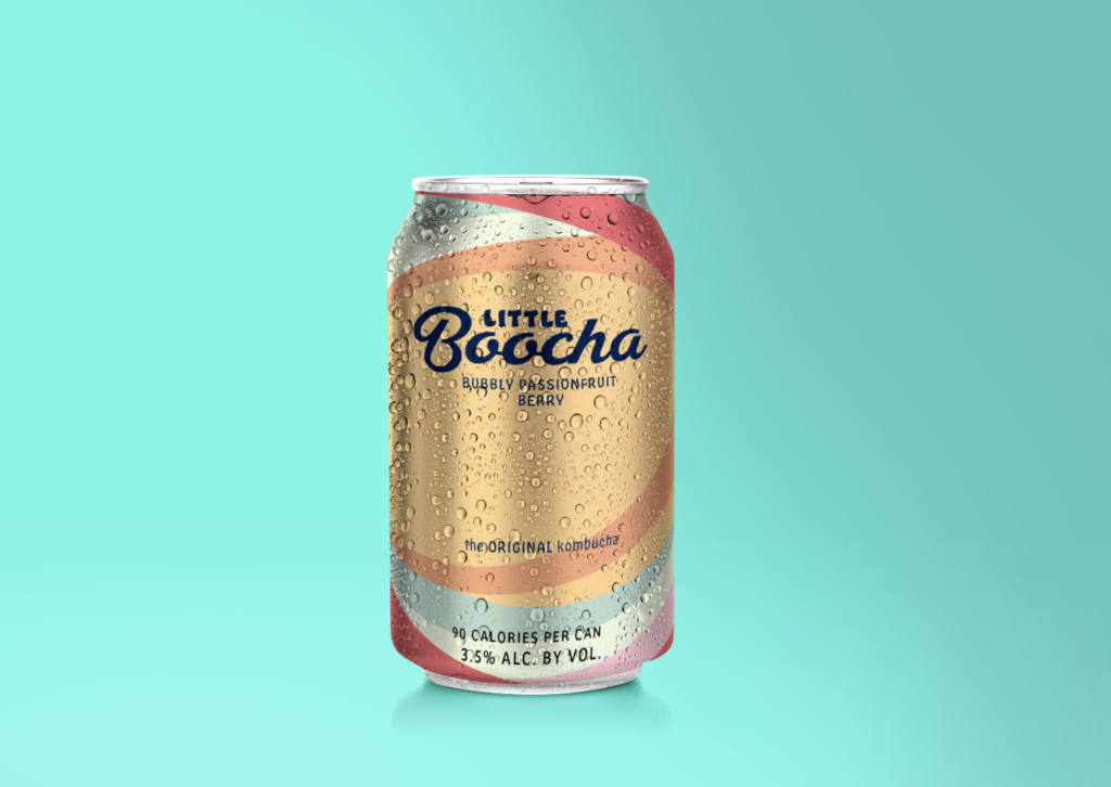
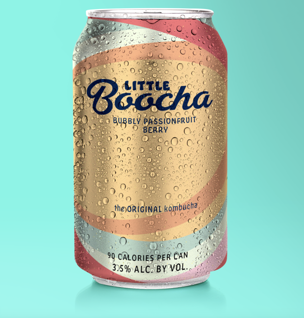
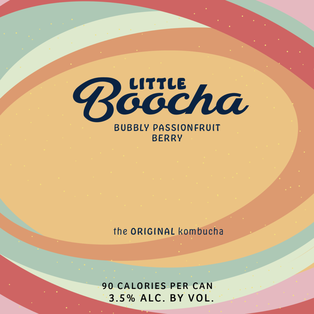
Having never done packaging, this was a fun challenge to learn how to use photoshop and mockups! I decided to design packaging for a can of kombucha (based on a conversation I had with some friends recently and passionfruit is one of my favorite fruits). I wanted to experiment with color palettes because of the color theory class we have this quarter—I explored Adobe Color Themes to create a fun and fruity palette for the drink. We are also in a typography class this quarter. Using what I learned, I also modified the typeface to make the “B” in “Boocha” more readable. Using Illustrator I created the design that has movement and refreshing colors, the open ovals drawing the viewers eyes towards the center. I then went into photoshop to place my design and edited/modified colors and shadows to the mockup accordingly.  I hope you enjoy this refreshing bubbly boocha drink!

Kombucha packaging design in Illustrator
Design brought into Photoshop mockup
a close-up!

Abdul Kassamali–Pivoting Plans

“In preparing for battle, I have always found that plans are useless, but planning is indispensable.”
-General Dwight D. Eisenhower

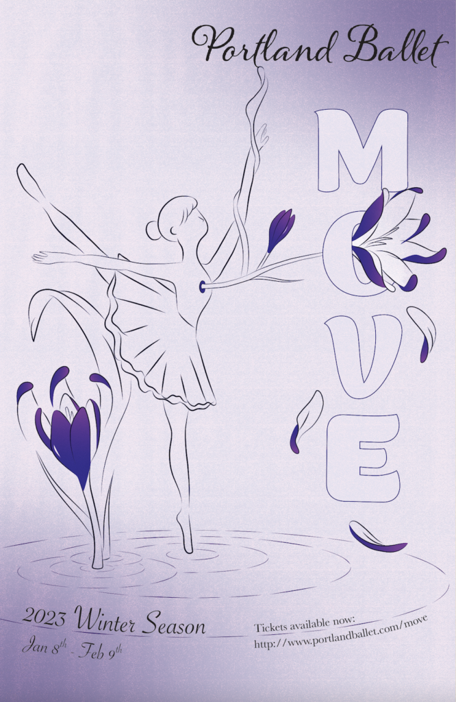
Last quarter in our Design History’s class, we had a final project where we had to incorporate a specific topic we have been researching and incorporate that into a poster design (for a ballet show). Through color, type, form language, layout, photo treatment, and/or composition, we had to use the visual elements, approaches and characteristics you discovered through our research process as a reference in our designs. My subject was ukiyo-e, a genre of Japanese art, spanning from the 17th to 19th centuries, with many different sub-genres within. The project within itself proved to be a challenge because we are not exactly emulating a piece from that time period but taking bits and pieces to incorporate it into a modern poster design that you may see today.

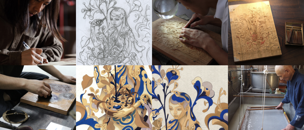
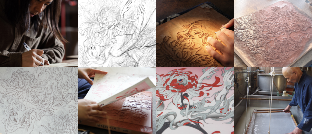
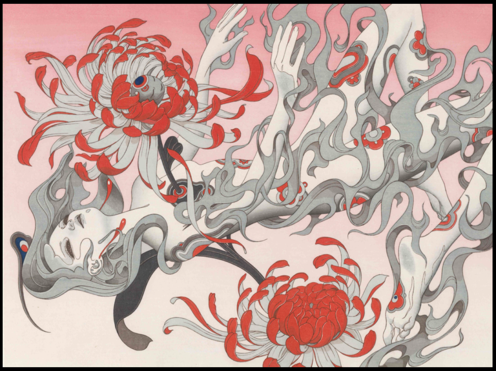
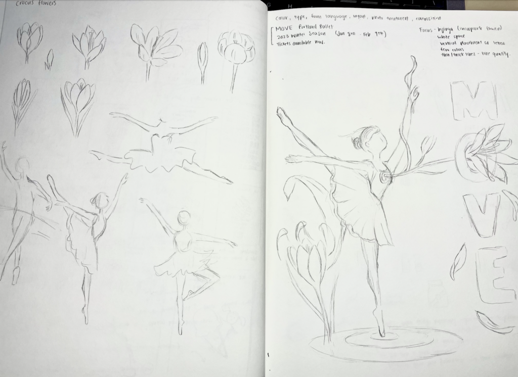
Before I start any project, I do additional research and find sources of inspiration or create a mood board. I already had an archive of ukiyo-e pieces, but I wanted to find work that is influenced by ukiyo-e but also pieces that still looked modern—a fine line I had to balance. I found many sources of inspiration. The one that caught my eye the most was a series of woodblock printings done by James Jean—he focuses on line quality, the human figure, and a limited color palette to showcase contemporary ukiyo-e art. His piece “Chrysanthemum” is what inspired my poster originally. Based on my initial sketches, I wanted to replicate a similar piece—focusing on the ballerina figure, while incorporating a flower (crocus—flower that blooms in the winter), and the color I wanted to focus on was purple.

James Jean “The Editor -Cutaway-“
James Jean “Chrysanthemum”
source of inspiration

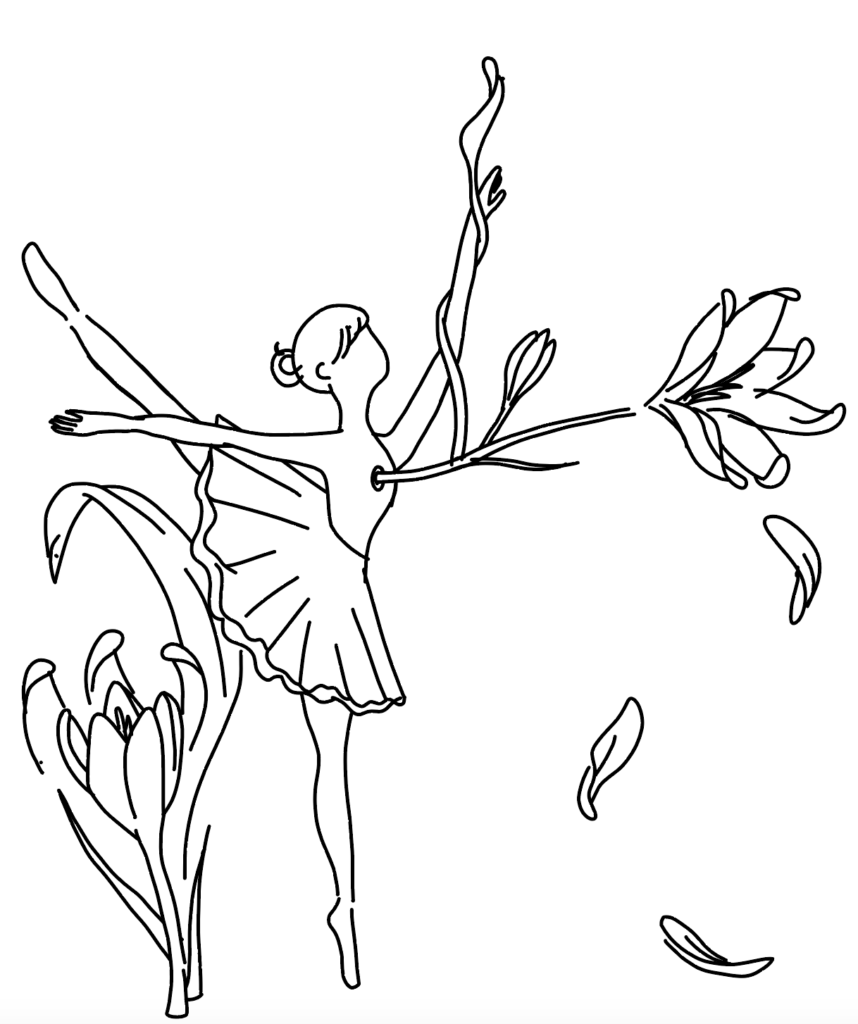
As I went about this project, what I envisioned may have been a bit ambitious for my capabilities and limited knowledge on drawing digitally. I had only really used Adobe Illustrator (which wasn’t the best option for actual illustrations) and I didn’t want to use a mouse to draw every single vector. I remembered I had an old Wacom tablet that I had never touched and attempted using it. I was able to trace my sketch, but I only had so much time to work on this project and was not able to add as many details as I wanted to. There were also issues in bringing my drawing from Clip Studio Paint into Illustrator, all the strokes and line quality was taken away and I had to go back into Illustrator to manually adjust the widths and terminal strokes. Adding color was another issue as I didn’t have experience with that as well.

initial sketches
Bringing my drawing into Illustrator rendered all my strokes and line weight useless
first draft after wrestling with Illustrator
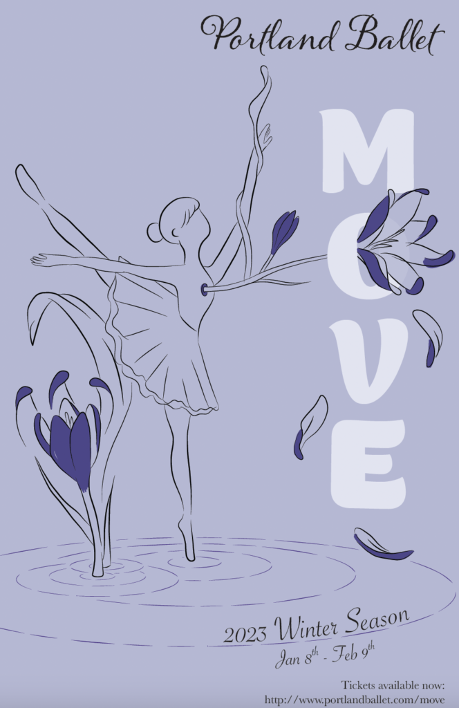
The final poster!

In the end I had to simplify a lot of what my original/planned outcome was. But I was able to adapt to what I knew I could do in a limited amount of time. My own take on this project and still hit the key points I wanted to convey in subtly incorporating ukiyo-e, which includes, the vertical placement of letterforms, utilizing one color, line quality, emphasis on the human figure, and lastly white space.

gREen-Designing

This week we heard from Mara Stokke, an experiential designer–I was really inspired by how much time and thought is put into each project, with researching the clients background, the actual user research of people who encounter these spaces (eg. patients in hospitals), material being utilized, etc.

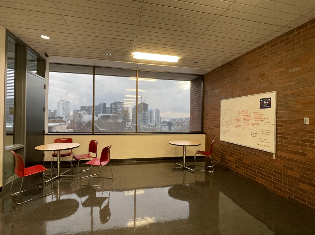
For this assignment, I redesigned a small nook in the Academy–the one near the elevators and stairwell because I think it is a really cute area that has potential.

Original layout of the nook
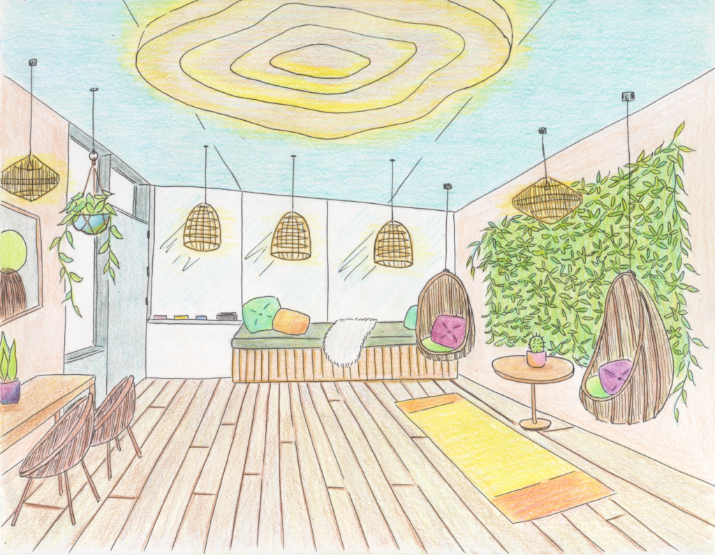
Moodboard that inspired my redesign

When redesigning this nook, the first thing I wanted to do was incorporate plants but in a way that fit into this small area. First having a green wall replace the white board to give the area more life–having more natural elements that can surround us in general puts us more at ease. I added a hanging plant and some potted plants on the tables as well. I also added hanging/swinging chairs so this spot can be for relaxing but also chairs with a desk to the side (to the left) for studying if needed–overall the material of the lamps, chairs and tables are all wooden to tie it all together. The floor has also been changed to wood to give it a more earthy-homey feeling.

I wanted to keep the windows but also utilize that space as the new “white board” by using erasable markers for the windows, which also allows students to look outside more to get that vitamin D! I really wanted to have the area well lit, so there is a huge center piece for the ceiling light. The ceiling is painted blue to be reminiscent of the sky if you ever need to daydream or stare off into space. Overall, I kept the area pretty open because there is an exit door to a classroom to the left and also elevators/stairwell as to not block any paths.

Nature inspired redesign of this cute nook!

I wanted this to be a place where students can come to relax and destress, but also be usable for studying purposes. Come here to meditate, stare off into the city skyline or fake sky! Do some collaborate work here with classmates or as a quiet area to study.

AR Panel–Meydenbauer Beach

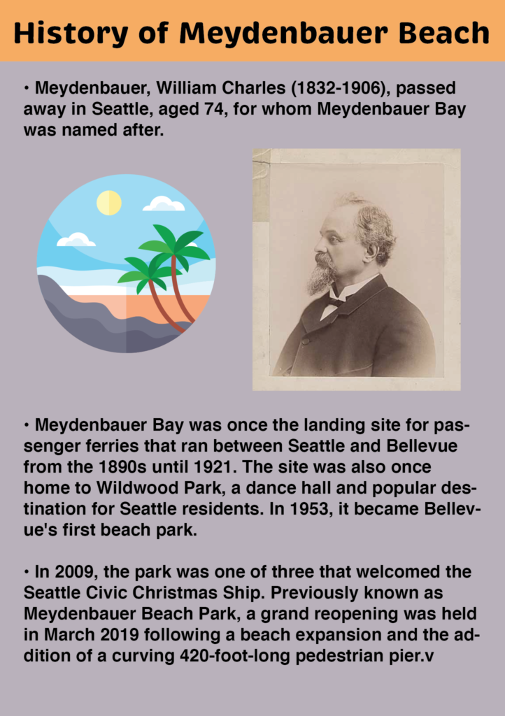
For our AR Panel Project, our group decided to go with the theme of beaches. There are many different beaches and bodies of water in the greater Seattle area, and we wanted to highlight the history, wildlife, and other fun facts about these locations.

I created the panels from Illustrator and the gif was animated from After Effects–which was all brought together in EyeJack Creator (I also added some water sounds to the gif for some spice).

Great ol’ history of the bay!
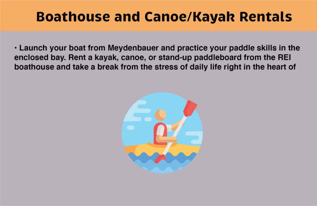
In the sunny months you can rent a canoe or kayak!
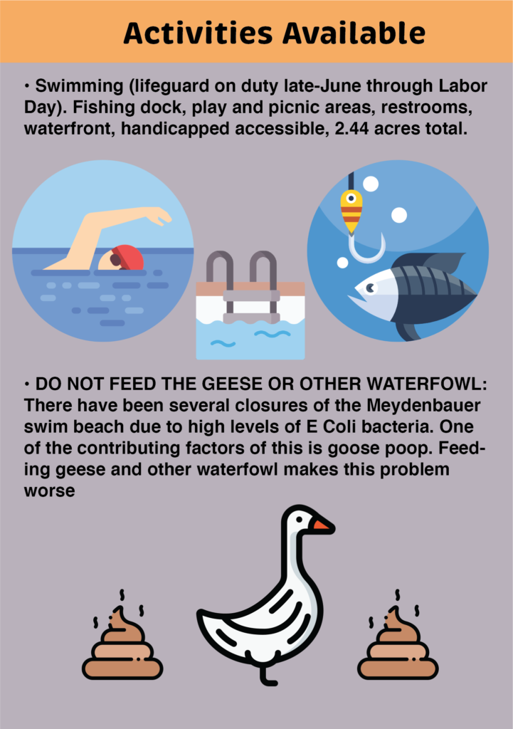
DO NOT FEED THE GEESE! REPEAT DO NOT FEED THE GEESE!!!
Little dude is back again! Guitar isn’t his only hobby (:
Try it out!

https://youtube.com/shorts/GBuPE4es7jg?feature=share

Holiday Card! Adobe Aero

In this project we used Adobe Aero to create interactive cards (in augmented reality). For my theme I wanted to create a holiday card and also incorporate my own assets as well as pre-made assets from Aero.

I created the text and the gift pngs!
snow gif asset from the web!

I wanted to incorporate this character I created for our previous project (AR poster) and added a Christmas hat–since he’s already playing a guitar I thought of having him serenading someone during the holidays and immediately thought of Mariah Carey’s “All I Want For Christmas Is You” song (acoustic version for the guitar)!

little guitar dude with a santa hat serenading–gotta go fast

The plants are all premade assets provided from Aero and I created it so if you tap the text the snowflakes will star falling and bells will play. Tapping on the guitar dude will start the animation and song. The trees spin upon proximity and the bouquet will rotate when tapped. All of this is contained within the present box and will pop out when touched!

Hope you enjoy and happy holidays!

Final product

SketchAR App Review

In this post I will be reviewing the SketchAR app.

What exactly is SketchAR?

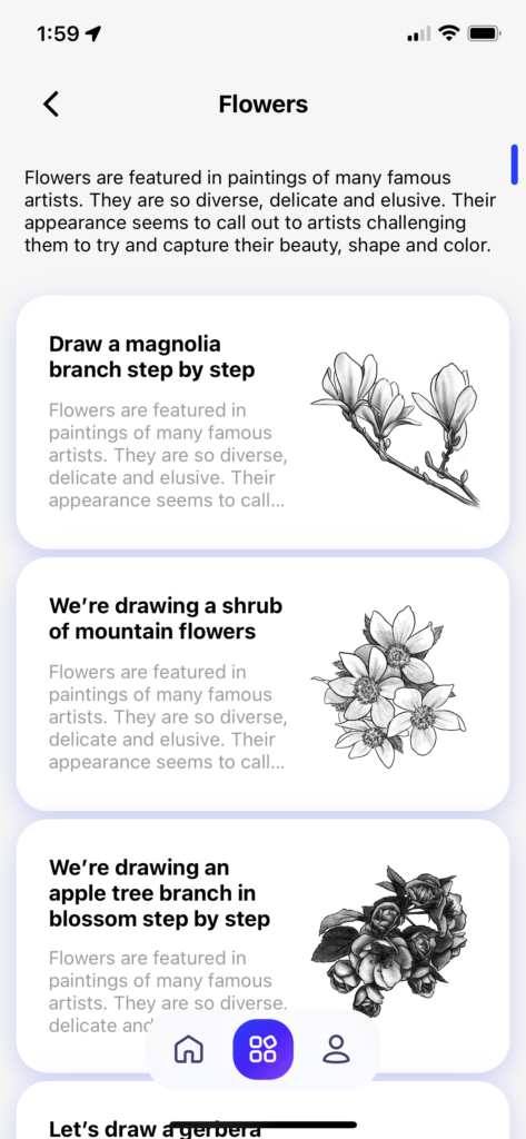
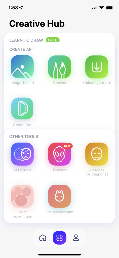
SketchAR is an augmented reality app that allows users to learn how to draw step-by-step using virtual images seen on the user’s phone placed on a surface (piece of paper, wall, etc). The user will then follow instructions to draw desired images–images can also be uploaded too!

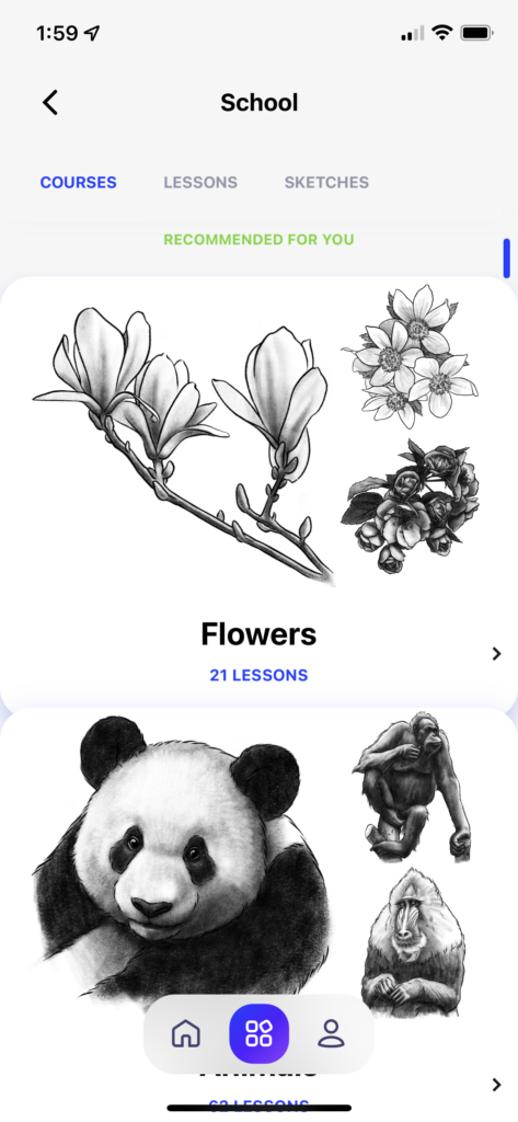
Right when you open the app, it will ask you for your drawing experience and what top three subjects you are interested in drawing–based off of that it will recommend certain lessons/courses to take.

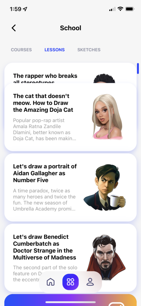
I wanted more practice with drawing people–so I decided to take a lesson on drawing Benedict Cumberbatch from Doctor Strange (slight Marvel fan !!). The first thing you will need is a piece of paper to draw on (I decided to tape my paper to the table because I already know how much it will move around with one hand holding my phone and the other attempting to sketch). Next it’ll prompt you to hold your phone at a distance so it can recognize where the paper is–you can then adjust the opacity of the image you are tracing and size/placement as well. It will then walk you through each step of the drawing process. I also really appreciate the little pidgeon/birdy giving instructions at the top of the paper (you can see it my video of the image trace).

Testing out the app by sketching Benedict Cumberbatch
The instructional steps walking you through how to draw the sketch

Overall I think this app is a good concept–I’m not sure if it’s necessarily a good app to develop strong drawing skills–because for me I felt like I was tracing and not necessarily learning proportions (also, felt like I was on a time crunch having the app automatically record a time-lapse). It was a bit disorienting drawing on a piece of paper but looking at my phone the entire time. My arm also got tired and I had to take some breaks in between (recommend having a phone holder of some sort)–maybe AR glasses would be better for this and also I prefer to look at my paper rather than my phone.

I do think there is potential for the app. I’ve already seen a lot of art shared by people who use it and it is really easy to create videos/time-lapses. I’ve seen some videos of the possibility of creating murals which would be very useful and creating anamorphic paintings.

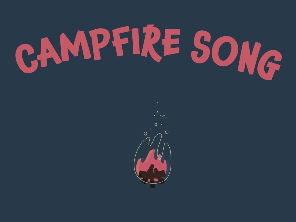
AR Poster–Campfire Song!

AR Poster

Having just had the After Effects module right before this one, I wanted to practice my animation skills and incorporate it into this project. I followed a lesson by Motion Design School to create my own background components and characters to put that all together to create an animation/gif that could be used in the EyeJack App. I added a fun Campfire Song to fit the lighthearted atmosphere of my campfire. Enjoy!

Character #1 roastin’ marshes
Blob #2 little guitar dude!
Let’s gather around the campfire
And sing our campfire song
Our C-A-M-P-F-I-R-E S-O-N-G song
QR code for EyeJack App–try me out!
Final video of the campfire animation!