


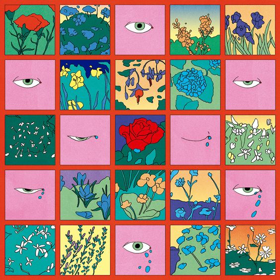
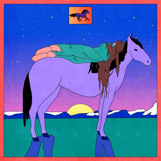
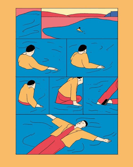
These images are by Maria Madem. I’m excited to have a body of work from which I can choose a set to represent any set of emotions at some point in the near future but for now, I think she says it better than me. I love her work. It feels transportive and liminal-spacey but also deeply familiar in a way I can’t put my finger on. To me she perfectly captures ‘Freedom to express, freedom to explore, freedom from expectation.’
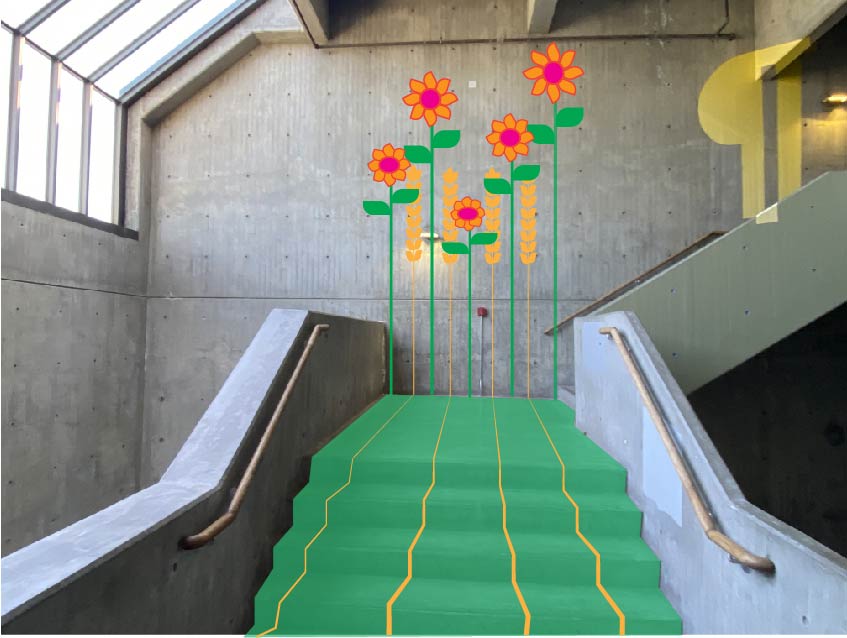
My mom has a green thumb, every corner you look in around my parents house has something green and living tucked into it. I wanted to make a mural that actually wouldn’t be completely visible until you got to a certain part of the stairs because of the way she fills corners with little plants.
This one was easy. I became familiar with Mary’s Place through an old barista job- we did a coat drive every year where each shop would compete for who could collect the most non and lightly used clothing articles to donate. Mary’s Place is a shelter that focuses, but isn’t exclusive to, women (and children) leaving abusive homes. I grew up in a household of mostly women- my parents weren’t divorced but my dad was a crab fisherman in Alaska and was gone from the house more often than he was home. I was raised predominantly by my mother, grandmother and sister, and I have a strong affinity towards female identifying people. It’s deeply important and ingrained in me to seek out sisterhood in all its forms; I think there’s a deep power in it.
I also experienced a childhood that included physical, verbal and emotional violence. I can say that I was safe, as in, my life wasn’t in danger, and overall I have a lot to be grateful for. I don’t want to compare my early home life to what a lot of people experience when they are marginalized in their own homes. But I can relate to feeling isolated, unsafe, codependent, and utterly beholden to the happiness and whims of someone who had control over my life, happiness, schedule, meals, etc. Though I experienced this through some of the women who raised me, it was also my relationships with my sister, cousins, and other female friends that gave me agency and a sense of community. These foundations were absolutely vital to my sense of self, and I don’t know where I would be without them.
I think about my values a lot, how to honor them and where to put my time and effort. It almost always comes down to sisterhood and to supporting anyone who has been made to feel that they don’t have control over their own lives. I would love to be able to contribute more than just clothing to what Mary’s Place does for the Seattle Community.
I felt extremely proud of our project, and especially the way the three of us worked together. I really can’t say it enough. I’ve had more experience working collaboratively in the past seven months than probably the previous five years combined, and have been surprised (or maybe I should say enlightened) by how difficult it can be to come together on an idea and its execution. We’re all creatives and we each bring completely unique perspectives to the table, and I think it’s harder for some people to share control than it is for others. It sometimes happens that one person will bulldoze and the rest of the group will follow suit in the interest of maintaining consistency throughout the project. There are one or two people I would not make the choice to work with again because ultimately I felt the project would’ve been improved by deeper collaboration within the group. This isn’t really a complaint so much as a reflection- I’ve learned a lot about how to work with different personality types, and when (and how) to assert myself versus when to prioritize getting along with everyone.
Then there have been the groups, only one or two, where it felt that not everybody was pulling their weight, and the rest of us were forced to pick up the slack, or wait around nervously for one person to deliver on their part, not feeling confident that they’d actually deliver. I don’t actually know which is less enjoyable of the two.
I preface with all of that just to juxtapose how easy and harmonious it was to work with Emily Schuman and Emily Taylor. I consistently felt that the three of us were open to hearing and building on each other’s ideas, and because of that we made this hilarious video that felt consistent and complex (as complex as a 2 minute video about plastic cockroach Survivor can be, anyway). It was also just really fun. We worked diligently on building the sets, and planning and executing the shots, and then occasionally I’d be dangling a plastic cockroach on a fishing wire over the trash can and be struck by the hilarity of what was happening. When the project was first announced I felt nervous about not being able to pull my weight. I can be a slow learner and am pretty comfortable with the fact that I just work really slowly. When it comes to working alone I’ve accepted these facts, even if they’re not my favorite things about myself- but it can be scary to feel responsible for the success of a group. But we each brought our different strengths to the making of the video and I think we all had a significant contribution.
10/10 would do this again.
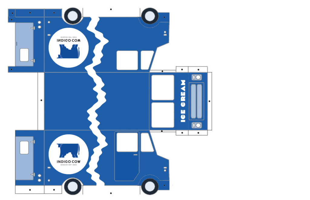
When presented with the project I immediately knew I wanted to design for a dessert spot because the limited menu makes for an easy approach to a design concept. They also usually have cute branding to begin with.I chose to design my food truck for Indigo Cow, a Hokkaido soft serve spot in Wallingford. I live in Sand Point and regularly make the drive over for an evening snack. Their desserts are simple and aesthetically pleasing. It’s a sparse menu, usually just vanilla soft serve plus one or two seasonal flavors, with a variety of toppings like brown sugar syrup and sweetened rice balls- not much else. Indigo Cow’s Wallingford location is tiny, basically just a walk-up window with limited outdoor seating. Their colors are navy and white and the design is minimal- blue outside walls with white and slate colored accents. The logo is a large blue cow on a white circle.
I decided to keep that simplicity in mind with the truck design. I wanted to stay true to the brand but also didn’t want it to look like an “ice cream truck,” though it was an ice cream truck. I made it almost solidly navy blue, and added the circular logo on both sides. That felt slightly too minimalistic so I drew a wavy white line up both sides and across the top. I wanted the line to be inconsistent rather than a simple wavy pattern, slightly reminiscent of the way soft serve looks as it pours out.
I printed at school and then took it home to cut that night without looking too closely, and when I finally did I saw that certain parts of it were a little pixelated. It took me an embarrassingly long time to realize the ppi was set to 72. It’s kind of insane to reflect on how much I’ve learned this year, and how much I’m still a baby designer.
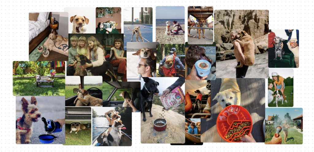
Here’s what I wanted to capture for this photoshoot: Film photography (or shot to look like film) and a feeling of nostalgia that could feel relatable to anyone- it could be childhood camping trips, road trips with friends during their 20’s, or happy times with their own children (and dogs of course!). For those that have or grew up with dogs, the memories are so special because their lives are short. They travel with us, love us unconditionally, and bring so much humor and sweetness to our experiences. We don’t get to have them in our lives for long enough and so every adventure that we have with them is extra special. I want people to see these ads and remember all the special dogs they’ve loved over the years, and want to go out and create new memories with their pups. And of course these pups deserve the most durable, high quality food dishes for their adventures!
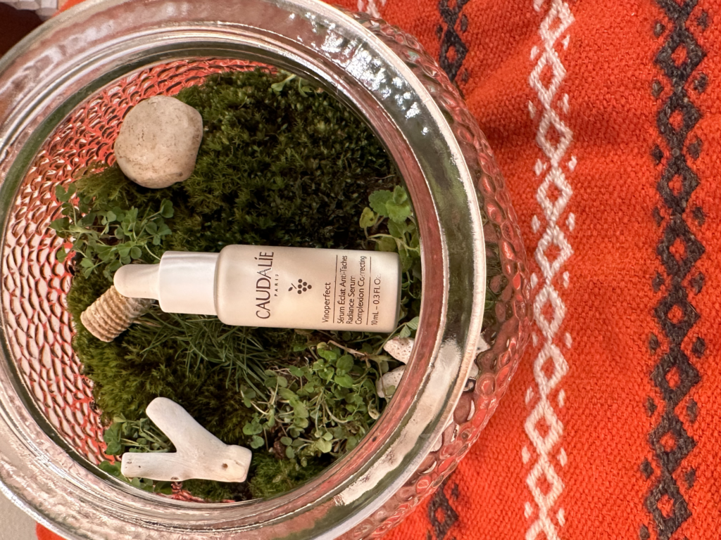
It’s a good thing I’m in design and not product photography because I think this photo might suck. But I enjoyed the setup! I’ve been wanting to make a terrarium recently, I love having little living things around my house that require little upkeep. I specifically chose the patterned glass for the terrarium because I wanted it to diffuse, or move, some of the warm light from the lamp for this photo. I use this antioxidant serum by Caudalíe. Caudalíe’s selling point is that they use natural antioxidants, usually derived from wine grapes. I didn’t want to use grapes because that felt kind of on-the-nose. Instead I chose a natural, living setting and added shells, coral and an Orthoceras fossil in as a nod to something I learned recently: the region of Chardonnay used covered by ocean, and the fossilized shells in the soil are what gives many regional Chardonnay grapes their clean minerality.