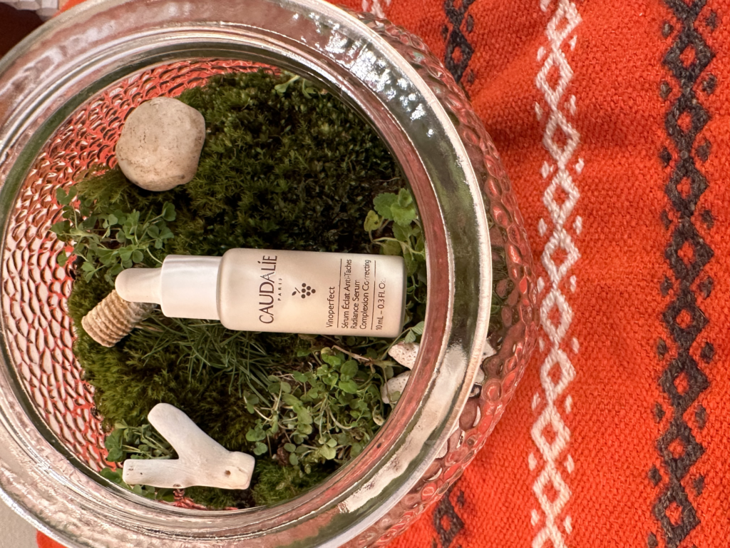
It’s a good thing I’m in design and not product photography because I think this photo might suck. But I enjoyed the setup! I’ve been wanting to make a terrarium recently, I love having little living things around my house that require little upkeep. I specifically chose the patterned glass for the terrarium because I wanted it to diffuse, or move, some of the warm light from the lamp for this photo. I use this antioxidant serum by Caudalíe. Caudalíe’s selling point is that they use natural antioxidants, usually derived from wine grapes. I didn’t want to use grapes because that felt kind of on-the-nose. Instead I chose a natural, living setting and added shells, coral and an Orthoceras fossil in as a nod to something I learned recently: the region of Chardonnay used covered by ocean, and the fossilized shells in the soil are what gives many regional Chardonnay grapes their clean minerality.
Budweiser- Old school delivery. A truck driver about to take a delivery of beer to the tavern in an isolated mountain town discovers that the weather is too extreme. At his horse’s encouragement, he hitches up the wagon and delivers the beer the old school way. Things done right: any superbowl commercial with animals in it is a yes for me. The music choice (The Weight by the Band) and general sense of camaraderie inspired watching people do nice things for each other, all solid. What could’ve been better: The story didn’t actually make any sense- firstly, why does this apparently single truck have so many horses when he’s probably never home- and also, why is the beer delivery at this house where he hitches up the wagons, instead of in a warehouse?
Mountain Dew, Having a Blast. Basically just Aubrey Plaza being weird and quirky, with Nick Offerman making a guest appearance on a dragon. What worked: They’re beloved, and Parks and rec fans love a reunion. What didn’t work: I don’t feel like the comedic possibilities were really tapped into other than each scene location being non sequitur. It feels like Mountain Dew, and the ads run in general the last couple of years- preferred to showcase celebrities and hold back on the comedy, to temper the risk of incurring controversy.
Robert F Kennedy presidential bid announcement. This wasn’t strictly a commercial but I can’t stop thinking about it. Took the famous 1960 Kennedy presidential ad exactly, and essentially just pasted Robert Kennedy’s over JFK’s face in a couple of shots. What worked (sort of): Nostalgia sells. Additionally, the JFK era has a sort of rose-colored mist around it and any Kennedy running for office would be remiss not to tap into that. What could have been done better: It was unoriginal, which made the candidate feel inauthentic- the effect was antithetical to what I assume was the intent. I feel like there were more, subtler ways to nod to the original Kennedy ads without stealing the whole thing. It also just felt disrespectful somehow.
Here to Stay, Apartments.com- two newly arrived space aliens are being questioned outside their spaceship by suspicious military personnel when Jeff Goldbloom steps in and explains that they’re just renters looking for an apartment. What worked: Everyone loves Jeff Goldbloom. Good callback to Independence Day (even though the aliens in those movies are distinctly not welcome on earth).
The Wait is Over, Popeyes- Ken Jeung plays a man who chose to be cryogenically frozen to wait for the perfect chicken wing. He’s awakened, tries a perfect wing from Popeyes, and then asks what else he’s missed. Queue funny montage of his encountering drone delivery, designer dogs, and massage chairs, all while eating wings. What worked: it was the only Suberbowl commercial I watched that I actually thought was funny- and uncontroversial! Brand integration was solid as well. What could’ve been improved: Clearer messaging about what they were selling? Maybe I just didn’t get it right away because I kind of thought Popeyes always sold wings.
I’ve decided to start my own Book of Delights. Ross Gay and his Book of Delights made the rounds on virtually every podcast I listened to a year or two ago. The author had challenged himself to write a short essay about something he found delightful, every day, for an entire year. Even my therapist recommended it. I expected Book of Delights to be sweet and funny and probably a piece of media I wouldn’t read to the end. When I finally picked up the book, it floored me. Every piece had me laughing while simultaneously reflecting on my own death, and the people I’ve lost or lost touch with. I found myself wondering, really, what they’d been doing out there in the world in the years since we’d spoken. And wondering what my parents and friends were like as toddlers, and noticing how absurdly funny my dog is, and reminding myself that someday I’ll miss them all terribly.
So I’m challenging myself to write a short piece about something that delighted me at the end of every day. I’m going to build the platform for this project using Webflow, which is a program I really want to get familiar with. Posts will include accompanying sketches and photos as often as possible. This may turn into something that looks and feels good enough to link to on my personal website or portfolio, but it might be just for me. Even if that’s the case, it’s a project that will help me hone some much-needed web and design skills, as well as reminding me to check in on my loved ones and talk to strangers and seek novelty on a daily basis, which are all things that feed my creativity and which I’m feeling the lack of lately.
I have not included a moodboard per se because all the blogs I looked at were garbage as far as design goes, but I’ve included an excerpt from the book itself.
Personal project brainstorm
What’s missing from my life/ what I want more of:
Community, connectedness, sisterhood
Time outside
Inspiration to some degree
Service
art – making things just for the sake of making
Writing (and reading)
Strenuous exercise
NOVELTY
Projects/ pursuits that might check some of these boxes:
Join a community garden
Volunteer
Start a running group
Start a walking group? lol
Build a personal website
Start a blog (a non-school-related blog, no offense)
Join a weekly painting class
Start a Book of Delights- ala Ross Gay
Make prints as personalized, no-occasion cards for my friends and loved ones on a regular basis
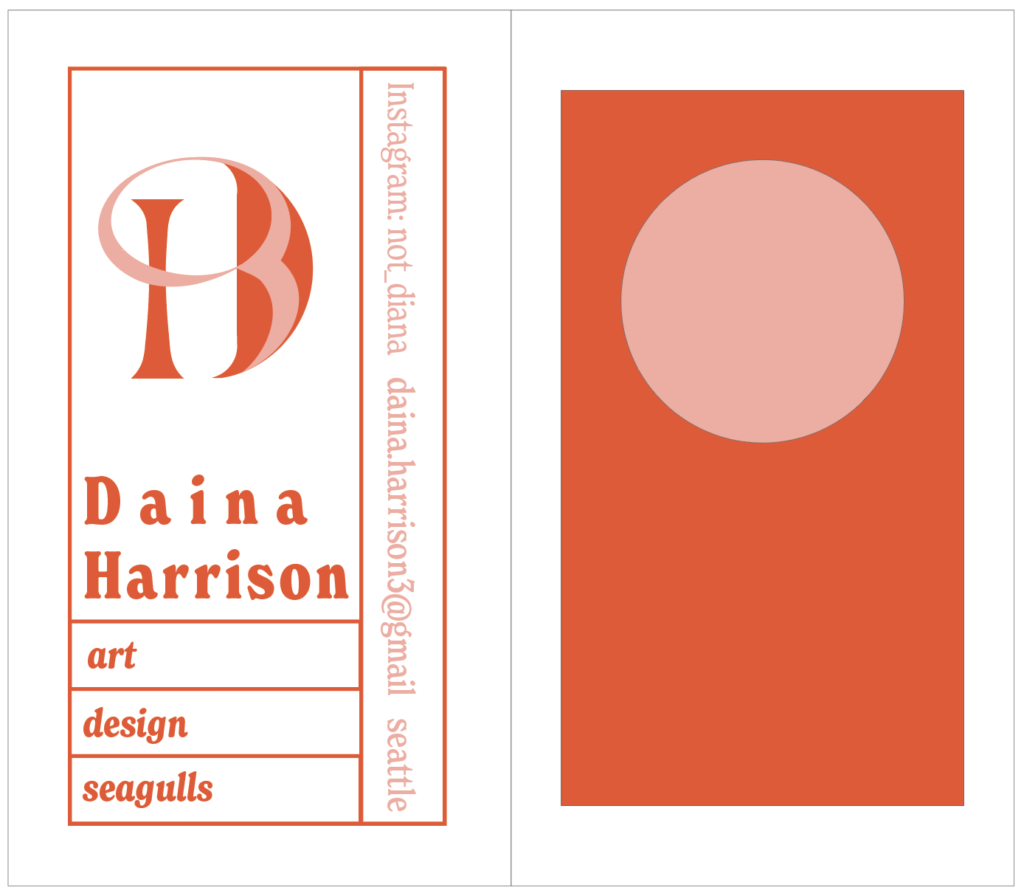
I’ve chosen my business card. This was the most recent project for Jill’s typography class, and is the first piece I’ve made in the program where I can start to see what I’ve absorbed in the curriculum so far coming together.
The Brief: to create a business card for myself, including these details: name, location, and a way to contact; and three interests. We were then to make an initial mark, using design to play on at least one of our listed interests. I listed art, design, and seagulls, which I recognize is a bit silly, but I didn’t want to take the assignment of presenting myself to the world too seriously. I think design and art should, or at least can, be fun and playful. I also just resonate with seagulls. They’re impulsive, raucous and occasionally not what anyone’s in the mood for. I feel that.
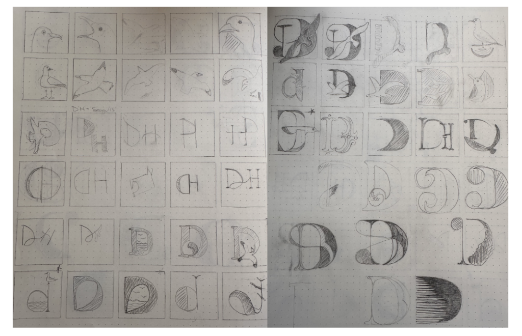
The Approach: I started by sketching iterations of seagulls before combining this element with typography. My intention was to take a look at all the different forms and ideas the image of a seagull can suggest. In flight, their bodies make a beautiful sort of arc with points and curves. I think to a degree this image conveys freedom, or a wistfulness for it- and also, having grown up here and spent a lot of time on the coast- there’s a 70’s beach cabin vibe that I love. On the ground, they can be pretty, or aggressive, or comical.
After that I started playing with my initials. I settled on using just the letter D after a few sketches, but was able to include the H in my final iteration. The first 15 sketches or so were very literal- I’m quickly learning the benefit of keeping a distance from my ideas until I’ve gotten enough of them out of my head. Eventually I came to some iterations that I felt suggested the idea rather than stating it.
The result: On the front, the letter D, with the top line of the bowl looping behind the stem, through the counter and back into the bowl, ending in the shape of a set of wide wings in flight- this crossover also creates the shape of an H, sharing the left stem with the D. On the back: using the two colors I’d chosen, red and pink- a rectangle with a pink circle enclosed near the top. I was thinking of the sun over water when I made this, and wanted to add a bit more detail- but everything I tried to add felt crowded, so I kept it simple.
I feel satisfied with the results. I can’t remember which teacher- maybe Jill- said that work is never done, it’s only due. I’ll probably continue to work on the back image until it feels in stronger synchronicity with the gridded lines and flowing shapes included in the information on the front. But overall, I consider this piece to be a success.