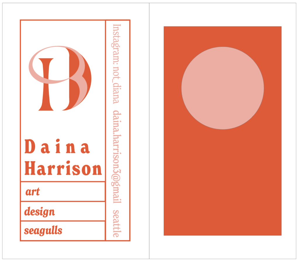
I’ve chosen my business card. This was the most recent project for Jill’s typography class, and is the first piece I’ve made in the program where I can start to see what I’ve absorbed in the curriculum so far coming together.
The Brief: to create a business card for myself, including these details: name, location, and a way to contact; and three interests. We were then to make an initial mark, using design to play on at least one of our listed interests. I listed art, design, and seagulls, which I recognize is a bit silly, but I didn’t want to take the assignment of presenting myself to the world too seriously. I think design and art should, or at least can, be fun and playful. I also just resonate with seagulls. They’re impulsive, raucous and occasionally not what anyone’s in the mood for. I feel that.
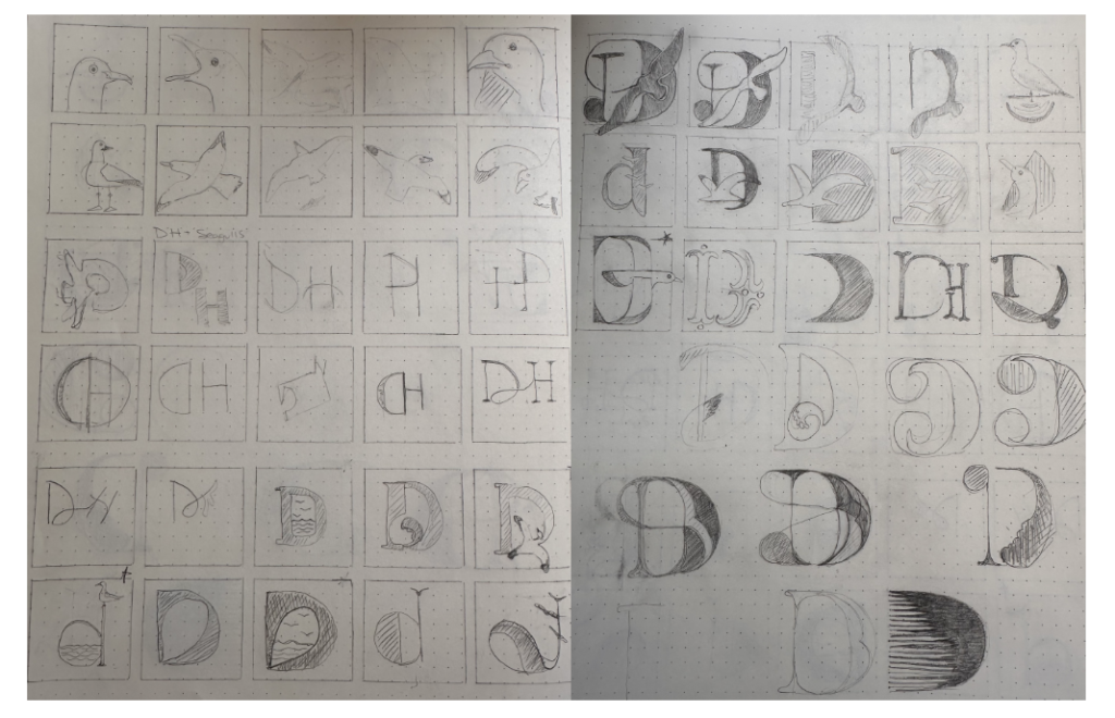
The Approach: I started by sketching iterations of seagulls before combining this element with typography. My intention was to take a look at all the different forms and ideas the image of a seagull can suggest. In flight, their bodies make a beautiful sort of arc with points and curves. I think to a degree this image conveys freedom, or a wistfulness for it- and also, having grown up here and spent a lot of time on the coast- there’s a 70’s beach cabin vibe that I love. On the ground, they can be pretty, or aggressive, or comical.
After that I started playing with my initials. I settled on using just the letter D after a few sketches, but was able to include the H in my final iteration. The first 15 sketches or so were very literal- I’m quickly learning the benefit of keeping a distance from my ideas until I’ve gotten enough of them out of my head. Eventually I came to some iterations that I felt suggested the idea rather than stating it.

The result: On the front, the letter D, with the top line of the bowl looping behind the stem, through the counter and back into the bowl, ending in the shape of a set of wide wings in flight- this crossover also creates the shape of an H, sharing the left stem with the D. On the back: using the two colors I’d chosen, red and pink- a rectangle with a pink circle enclosed near the top. I was thinking of the sun over water when I made this, and wanted to add a bit more detail- but everything I tried to add felt crowded, so I kept it simple.
I feel satisfied with the results. I can’t remember which teacher- maybe Jill- said that work is never done, it’s only due. I’ll probably continue to work on the back image until it feels in stronger synchronicity with the gridded lines and flowing shapes included in the information on the front. But overall, I consider this piece to be a success.
