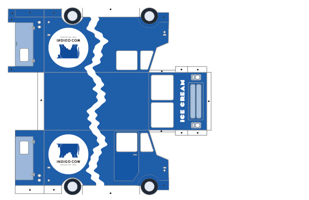
When presented with the project I immediately knew I wanted to design for a dessert spot because the limited menu makes for an easy approach to a design concept. They also usually have cute branding to begin with.I chose to design my food truck for Indigo Cow, a Hokkaido soft serve spot in Wallingford. I live in Sand Point and regularly make the drive over for an evening snack. Their desserts are simple and aesthetically pleasing. It’s a sparse menu, usually just vanilla soft serve plus one or two seasonal flavors, with a variety of toppings like brown sugar syrup and sweetened rice balls- not much else. Indigo Cow’s Wallingford location is tiny, basically just a walk-up window with limited outdoor seating. Their colors are navy and white and the design is minimal- blue outside walls with white and slate colored accents. The logo is a large blue cow on a white circle.
I decided to keep that simplicity in mind with the truck design. I wanted to stay true to the brand but also didn’t want it to look like an “ice cream truck,” though it was an ice cream truck. I made it almost solidly navy blue, and added the circular logo on both sides. That felt slightly too minimalistic so I drew a wavy white line up both sides and across the top. I wanted the line to be inconsistent rather than a simple wavy pattern, slightly reminiscent of the way soft serve looks as it pours out.
I printed at school and then took it home to cut that night without looking too closely, and when I finally did I saw that certain parts of it were a little pixelated. It took me an embarrassingly long time to realize the ppi was set to 72. It’s kind of insane to reflect on how much I’ve learned this year, and how much I’m still a baby designer.