Spring Quater
Blog Assignment #1:
google material design
- Design Language: Material Design is a design language developed by Google in 2014. It aims to create a consistent user experience across platforms and devices by providing guidelines for the design of apps and websites.
- Principles: Material Design is based on a set of principles such as material is the metaphor, bold, graphic, intentional, and motion provides meaning. These principles guide designers in creating interfaces that are intuitive, visually appealing, and responsive.
- Components and Tools: Google provides a range of components and tools to help designers and developers implement Material Design in their projects. This includes things like pre-made UI components, icon sets, color palettes, and design templates.
Apple Human Interface Guideline
- Consistency and Familiarity: Apple emphasizes the importance of consistency and familiarity in their interface design. They encourage designers to adhere to established interface elements, behaviors, and layout conventions across their platforms. This consistency helps users feel comfortable and confident when interacting with Apple products.
- Clarity and Simplicity: The HIG emphasizes the significance of clarity and simplicity in interface design. Apple advocates for clear, concise language, intuitive navigation, and uncluttered layouts to ensure that users can easily understand and interact with the interface. Visual elements should be simple and purposeful, enhancing usability without adding unnecessary complexity.
- Delightful and Engaging Experiences: Apple encourages designers to create delightful and engaging user experiences that go beyond mere functionality. They emphasize the importance of animation, sound, and tactile feedback to enhance interactions and create a sense of delight for users. Apple encourages designers to consider the emotional impact of their designs and strive to evoke positive emotions through thoughtful and engaging experiences.
Adobe Spectrum
- Creative Software Powerhouse: Adobe is renowned for its suite of creative software, including Photoshop, Illustrator, InDesign, and Premiere Pro. These tools are industry standards for graphic design, photo editing, video production, and more. They’ve become essential for professionals and hobbyists alike, shaping the way visual content is created and shared.
- Focus on User Experience: Adobe places a strong emphasis on user experience across its products. Whether it’s streamlining workflows, enhancing collaboration features, or improving performance, Adobe continually seeks to make its software more intuitive and efficient for users. This focus on UX helps ensure that creatives can bring their ideas to life with minimal friction.
- Commitment to Innovation: Innovation is at the core of Adobe’s ethos. The company consistently pushes boundaries with new features, technologies, and initiatives. From AI-powered tools like Adobe Sensei to cloud-based services like Adobe Creative Cloud, Adobe is always looking for ways to empower creatives and simplify their workflows. This commitment to innovation has helped Adobe maintain its position as a leader in the creative software industry.
Blog Assignment #2:

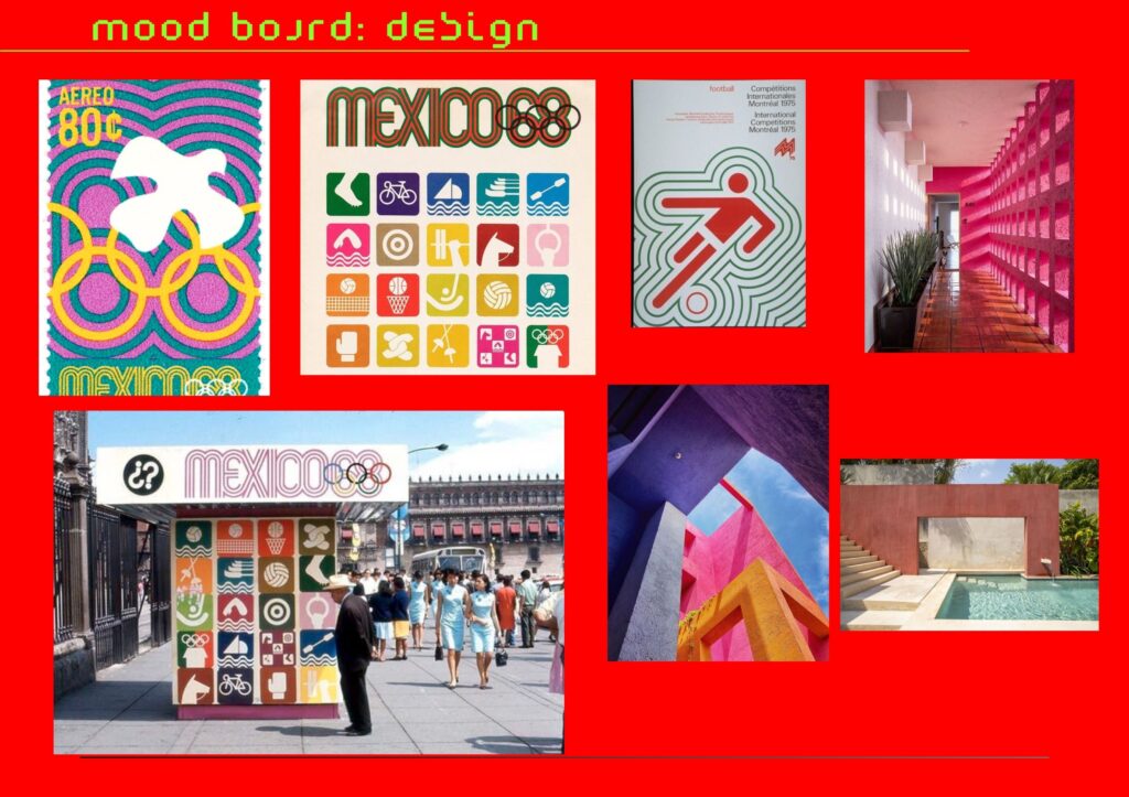
infusing the Stanley Cup with the vibrant style of Mexico’s ’68 Olympics, characterized by its colorful palette and rugged desert-inspired architecture, offers a compelling narrative that celebrates cultural richness and athletic prowess. Drawing from Mexico’s vibrant aesthetic, marked by bold hues and intricate patterns, alongside the raw, earthy textures of its architectural heritage, the Cup becomes a symbol of unity and resilience. This fusion not only pays homage to Mexico’s cultural legacy but also infuses the Stanley Cup with a renewed sense of vibrancy and diversity, embodying the spirit of competition and the enduring legacy of athletic excellence on a global scale.
Blog Assignment #3:
If I were to choose a Seattle-area nonprofit to donate $25,000 to, it would undoubtedly be Nepantla Cultural Arts. This organization holds a special place in my heart because it addresses a cause that resonates deeply with me: supporting the artistic expression and cultural heritage of the Latino community.
As a member of the Latino community myself, I’ve experienced firsthand the challenges of finding support and resources for artistic endeavors within our cultural context. Growing up, I often felt a lack of representation and opportunities to showcase my creativity in a way that honored my heritage.
Nepantla Cultural Arts fills this gap by providing a nurturing and inclusive space where Latino artists can come together to celebrate their cultural identity and express themselves through various art forms. From workshops and exhibitions to performances and community events, Nepantla Cultural Arts offers a wide range of opportunities for individuals to connect, learn, and grow as artists.
What sets Nepantla Cultural Arts apart is its unwavering commitment to uplifting and empowering the voices of Latino artists. By providing access to resources, mentorship, and platforms for expression, the organization helps bridge the gap between cultural tradition and contemporary art, fostering a sense of pride and belonging within the community.
Donating $25,000 to Nepantla Cultural Arts, I would be investing in the future of Latino arts and culture in Seattle. My contribution would support the expansion of their programming, outreach efforts, and resources, ensuring that more aspiring artists have the opportunity to pursue their passions and share their stories with the world.
But beyond the tangible impact of my donation, supporting Nepantla Cultural Arts is also about affirming the value of our cultural heritage and promoting social justice and equity within the arts. By amplifying the voices of Latino artists and creating space for their stories to be heard, we challenge systemic inequities and contribute to a more inclusive and vibrant cultural landscape.
Blog Assignment #4:
Collaborating with my classmates on this project was truly transformative. Despite their primary focus on graphic design, they seamlessly transitioned into various roles to support our endeavor. From crafting props essential to our video to stepping into acting roles when needed, their versatility proved indispensable.
Time constraints posed our greatest challenge, but instead of succumbing to pressure, we banded together and devised creative solutions. My classmates’ willingness to go beyond their designated roles ensured that our project not only met but surpassed expectations.
Our collaboration extended beyond formal meetings; we maintained constant communication, fostering a sense of trust and reliability. This allowed us to address challenges promptly and efficiently, ensuring we stayed on course.
What made our teamwork remarkable was our synergy. Despite the stress, we remained focused on our common goal. Each member brought a unique perspective, enriching our creative process and elevating the quality of our work.
Moreover, my classmates played a crucial role in storyboarding, helping to visualize our ideas and plot the sequence of our video effectively. Their input was invaluable in shaping the narrative and ensuring coherence throughout.
In addition to their professional contributions, my classmates’ friendly demeanor made the collaboration enjoyable. Their approachability and positive attitude created a supportive environment where ideas flourished, and collaboration thrived. We had fun working together, sharing laughs and creating memories along the way.
When it came time to present our project, my classmates once again proved invaluable. They assisted in refining our delivery, ensuring a seamless presentation. Their unwavering support and dedication were instrumental in our success.
Reflecting on this experience, I am deeply grateful for the opportunity to collaborate with such talented, committed, and friendly individuals. Together, we demonstrated the power of teamwork, transcending disciplines to achieve something truly remarkable. As we move forward, I am confident that the bonds forged during this project will endure, serving as a testament to the strength of collective effort and collaboration, all while having a great time.
Blog Assignment #5:
Blog Assignment #6:

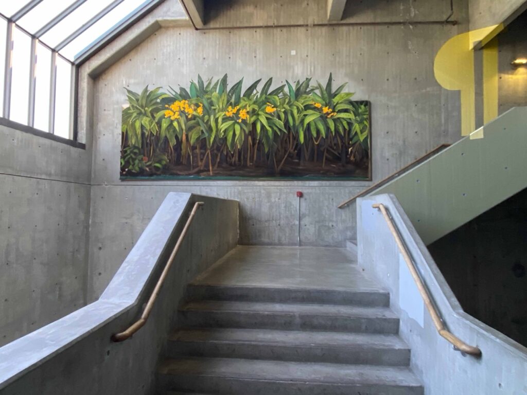
Reason why i chose this is because, my mother is a huge plant person
Blog Assignment #7:

Here are my mock-ups for the home and away jerseys and logo. I took Inspo from the bruce lee jersey that the Seattle sounders made and implemented it for the home one then for the away I did an all black kit. I am a huge fan of all black kits since in soccer it’s not a common color to see. the reason why i used Maderian for the name is because I saw Paris Saint German Footbal club do the same thing for their lunar jersey and thought it was the coolest looking thing.
One reply on “Davids footprint:”
Hi, this is a comment.
To get started with moderating, editing, and deleting comments, please visit the Comments screen in the dashboard.
Commenter avatars come from Gravatar.