Blue Earth Alliance – Nonprofit

Week 03: Blog Assignment #3 /Drew Hisey
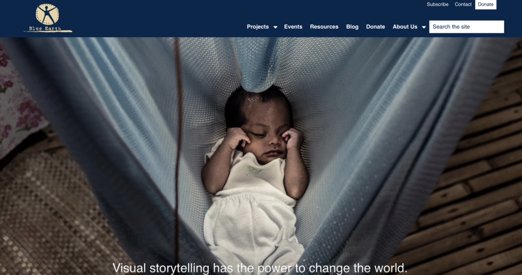
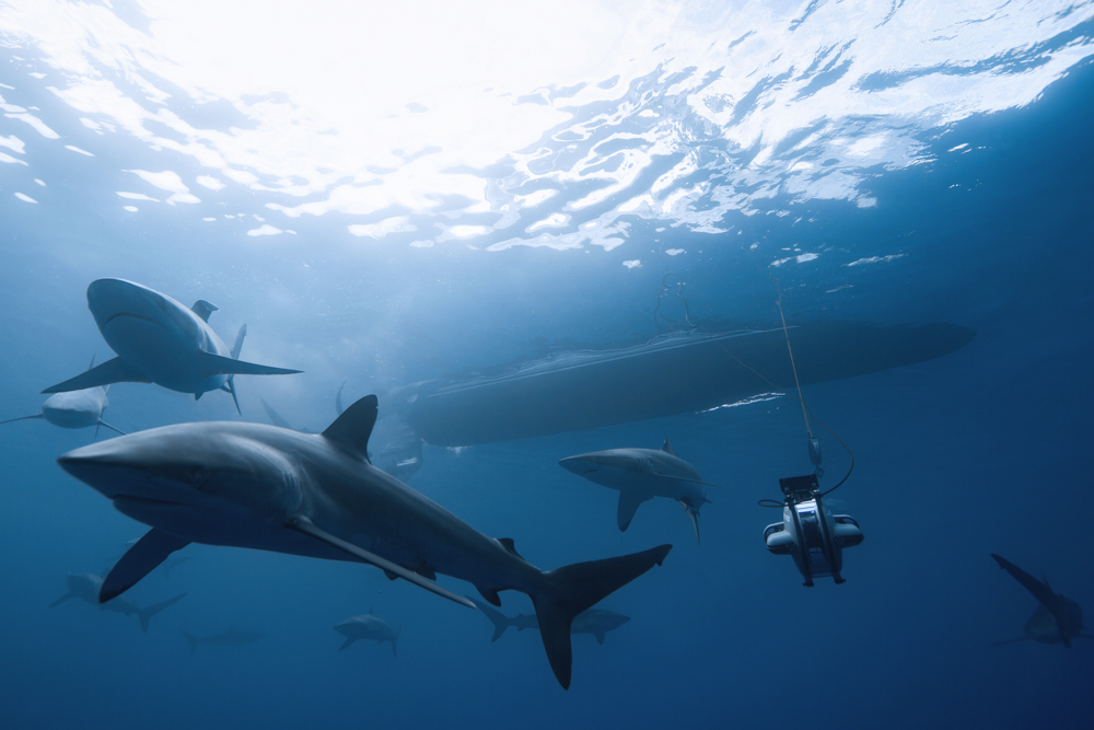
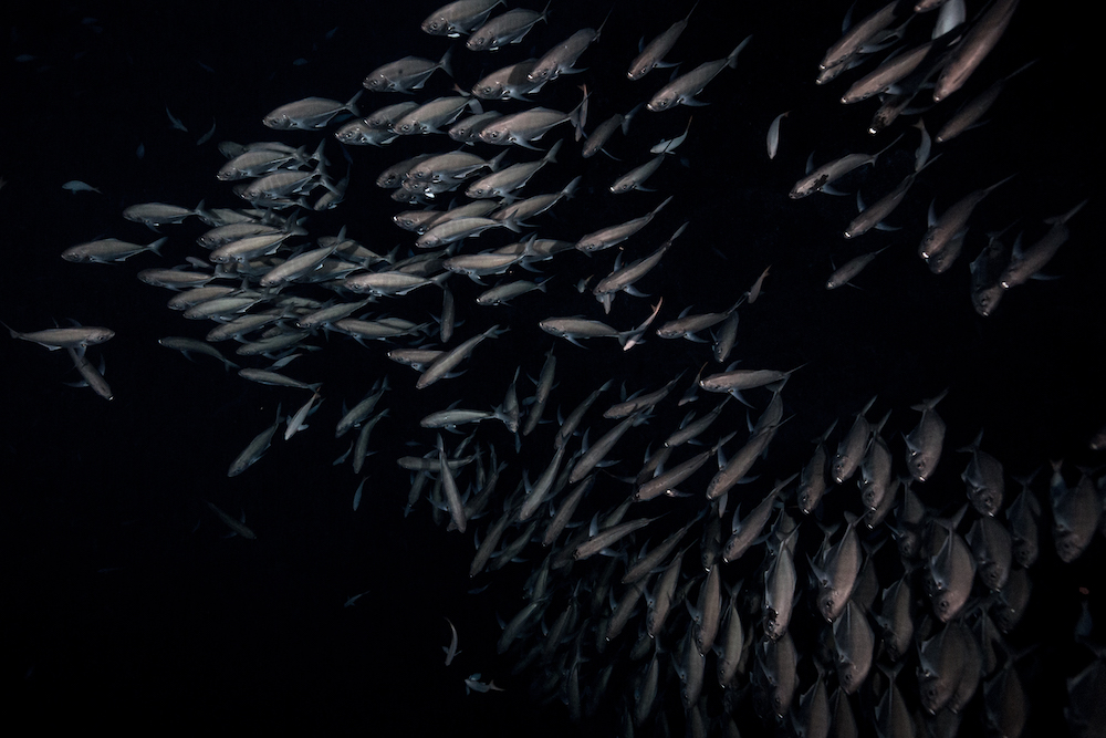
Blue Earth Alliance is a nonprofit organization that supports visual storytelling on environmental and social issues. They work with photographers, filmmakers, and journalists to create impactful visual narratives that raise awareness and promote positive change.

Nonprofits with a similar focus:

  1. International League of Conservation Photographers (iLCP): They work with photographers worldwide to create images and stories that inspire action for the conservation of nature and cultural heritage.
  2. The Everyday Projects: This nonprofit uses photography to challenge stereotypes and promote understanding by sharing images and stories from communities around the world.
  3. Environmental Film Festival Network: While primarily focused on film, they often collaborate with photographers and visual artists to showcase environmental issues through visual media.
  4. Conservation International: Although not exclusively focused on photography, Conservation International uses visual storytelling as part of its efforts to protect nature and promote sustainable development.

Why Donate to Blue Earth Alliance?

Supporting nonprofits that focus on meaningful causes is a powerful way to contribute to positive change in the world. Blue Earth Alliance works with photographers and filmmakers who are all about telling powerful stories. They tackle big issues like climate change, conservation, and social justice through amazing visuals that really make you stop and think. They’re big on diversity and making sure everyone’s voice is heard. They help to amplify the voices of communities that often don’t get enough attention. They team up with other nonprofits, schools, and media folks to really spread the message far and wide.

So, donating to Blue Earth Alliance isn’t just a donation; it’s a way to be part of something meaningful, impactful, and downright awesome!
Mood Board – Stanley Dog Bowl

Week 02: Blog Assignment #2 / Daniel

The new proposal for this bowl is aimed at those who want to take their pets on outdoor adventures, such as hikes, jogs, fairs, or other events. This bowl is retractable, making it more portable and taking up less space in any backpack or bag. Additionally, we’ve considered its durability and quality, which is why we use steel for the edges of the bowl in various colors. The interior material is matte-finished silicone, available in different colors to match any preference.

Website Design

Week 01: Blog Assignment #1 / Seneca Harper

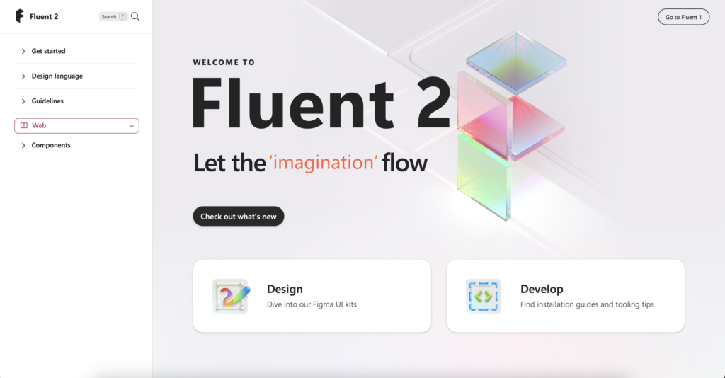
Fluent 2 / Microsoft Design

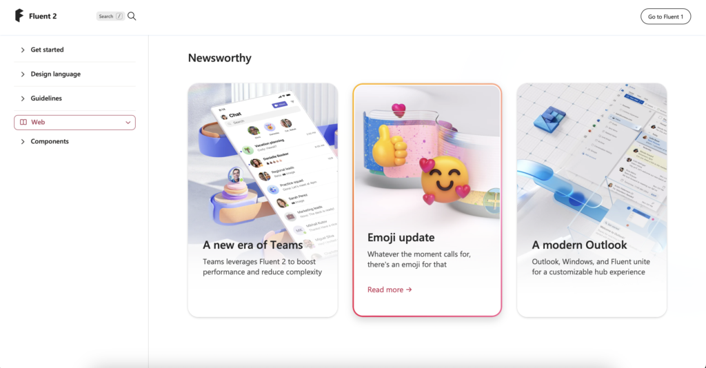
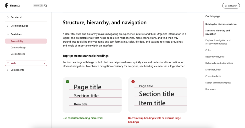
The website has a clean and minimalist interface which can provide a pleasant user experience focused on content, while font consistency contributes to better readability and visual coherence. Details such as colorful gradient borders can add a stylish touch without overwhelming the interface.

What I learned: It provides guidelines, components, and tools for creating consistent and user-friendly interfaces across different Microsoft products and platforms. It’s a resource used by designers and developers to maintain visual and functional consistency in their work.

Audi

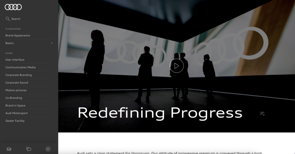
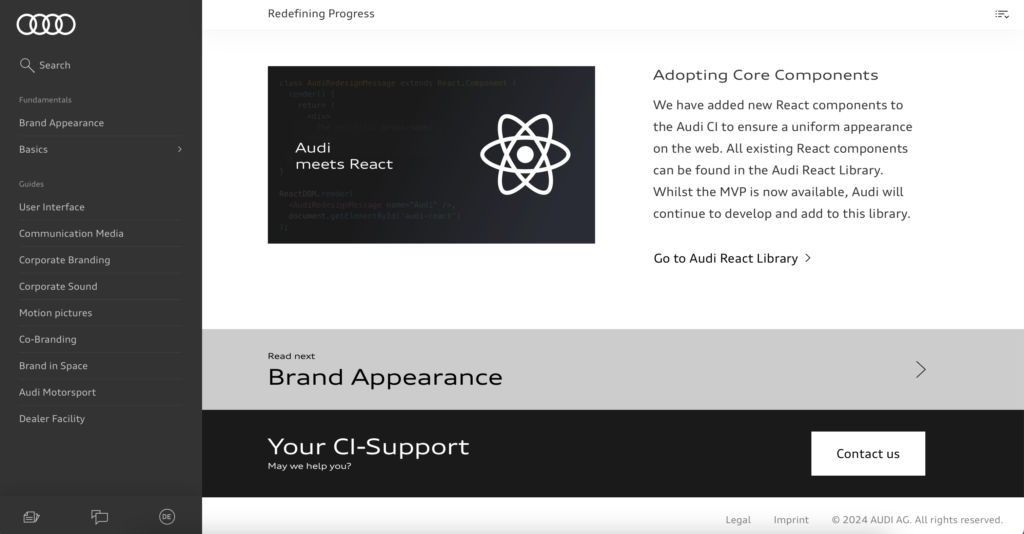
The website looks and feels elegant. The colors it uses are mostly neutral, black, white, and gray. It has a quite specific and accessible menu on the left side where you can easily navigate without having to leave the current page. They also use plenty of images and visual aids as references, which help users understand the information much better. The information is segmented by alternating between white and black colors in the background.

What I learned: Essentially, it serves as a platform for Audi to share important updates and developments regarding its brand with its audience. It focuses on communicating updates, changes, or innovations related to Audi’s brand identity, values, and offerings. It includes information about redesigned logos and updated visual elements.

The Guardian Digital Design Style Guide

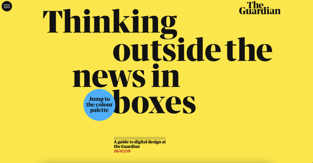
The website is a one-page design, where users scroll vertically from top to bottom. There are no other windows. The menu is quite basic and simple, using the title typography, which I consider to be too harsh for the design. Additionally, the typography is too large for a menu. The color scheme of the main screen is attractive to me, with vibrant yellow and black letters. Further down, we see templates as examples, accompanied by a small text on the left side.

What I learned: The Guardian, a prominent British news organization. The Guardian’s design team often shares insights, case studies, and articles about their design process and projects on this website. It’s a valuable resource for designers interested in learning about the design practices and principles employed by a major media outlet like The Guardian.