Week 01: Blog Assignment #1 / Seneca Harper
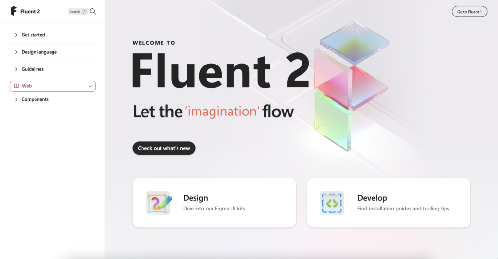
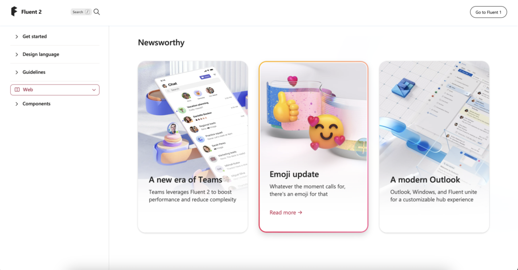
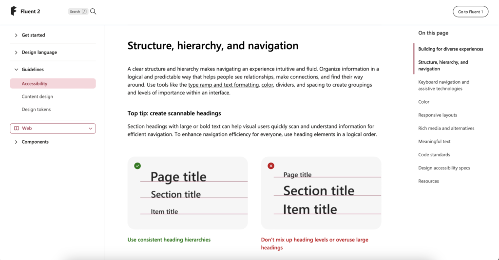
The website has a clean and minimalist interface which can provide a pleasant user experience focused on content, while font consistency contributes to better readability and visual coherence. Details such as colorful gradient borders can add a stylish touch without overwhelming the interface.
What I learned: It provides guidelines, components, and tools for creating consistent and user-friendly interfaces across different Microsoft products and platforms. It’s a resource used by designers and developers to maintain visual and functional consistency in their work.
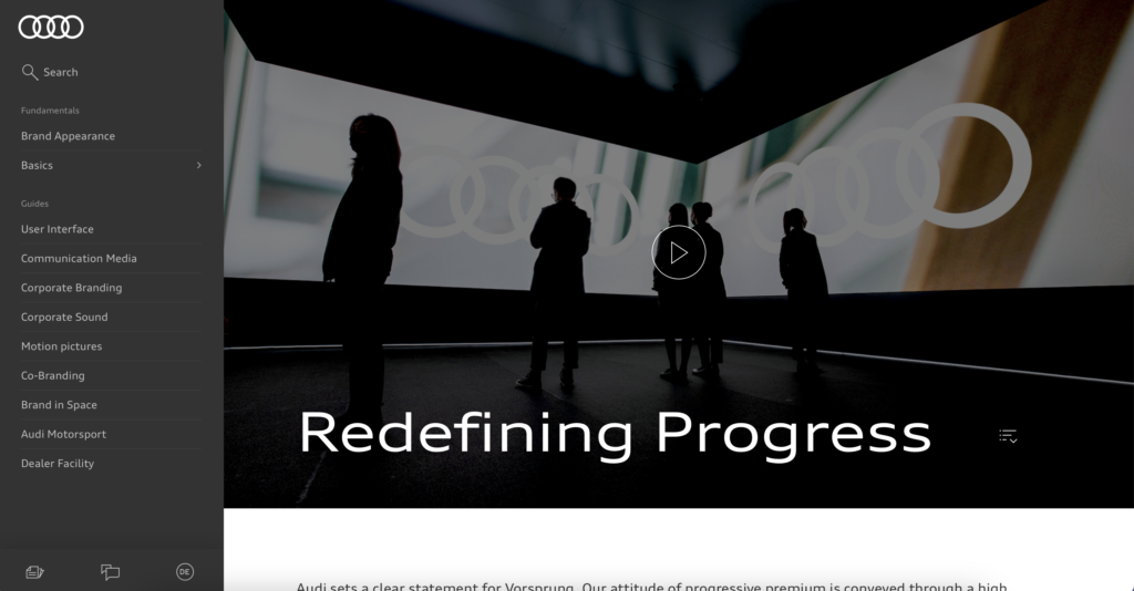
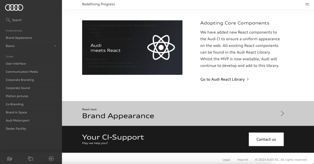
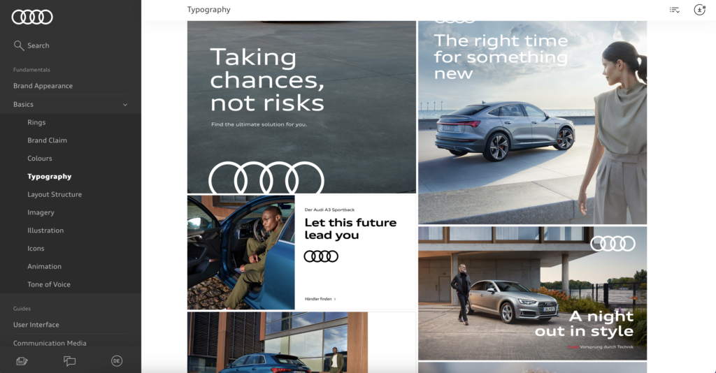
The website looks and feels elegant. The colors it uses are mostly neutral, black, white, and gray. It has a quite specific and accessible menu on the left side where you can easily navigate without having to leave the current page. They also use plenty of images and visual aids as references, which help users understand the information much better. The information is segmented by alternating between white and black colors in the background.
What I learned: Essentially, it serves as a platform for Audi to share important updates and developments regarding its brand with its audience. It focuses on communicating updates, changes, or innovations related to Audi’s brand identity, values, and offerings. It includes information about redesigned logos and updated visual elements.
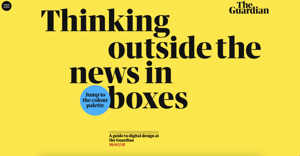
The Guardian Digital Design Style Guide
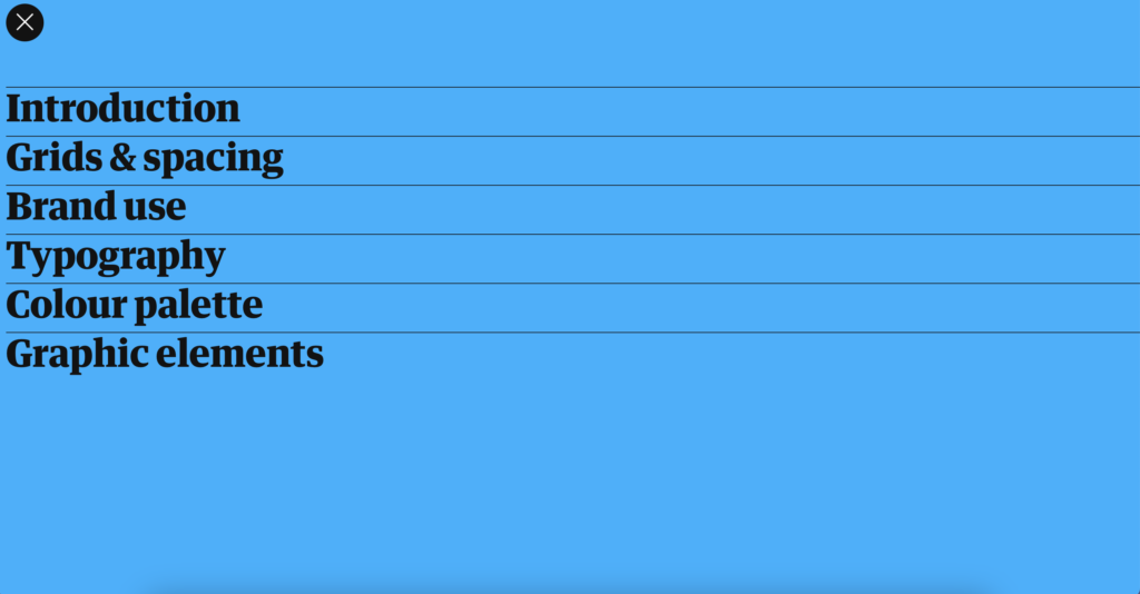
The website is a one-page design, where users scroll vertically from top to bottom. There are no other windows. The menu is quite basic and simple, using the title typography, which I consider to be too harsh for the design. Additionally, the typography is too large for a menu. The color scheme of the main screen is attractive to me, with vibrant yellow and black letters. Further down, we see templates as examples, accompanied by a small text on the left side.
What I learned: The Guardian, a prominent British news organization. The Guardian’s design team often shares insights, case studies, and articles about their design process and projects on this website. It’s a valuable resource for designers interested in learning about the design practices and principles employed by a major media outlet like The Guardian.

