Week 4 Assignment: AR App – UI/UX Review
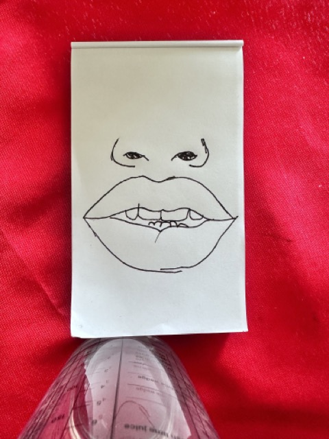
I have opted to provide an evaluation of AR Drawing: Sketch and Paint, primarily due to my pursuit of discovering novel and more user-friendly methods for instructing children in the art of drawing, while mitigating their potential frustration. Drawing has been an area of personal experience for me, and I believe that this experience equips me with the necessary foundation to critically assess whether this application possesses the capacity to yield tangible and effective outcomes.
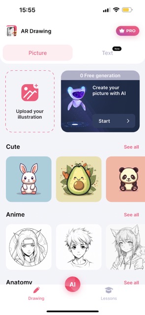
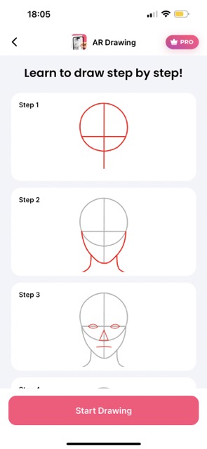
First Impressions: When you start using the app, it kicks things off by asking a few questions to figure out why you’re using it and how good you are at drawing. The interface is pretty easy to get the hang of. It shows you drawings based on what you like, and you can always add more to it. The interface is simple and clean, making it a breeze to find your way around.
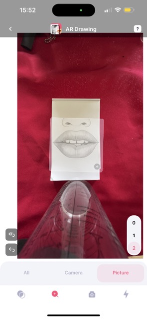
When you pick what you want to draw, the app brings up a tutorial video to help you set up your device. It also gives you a screen with all the tools you’ll need for your selected image, like opacity, size, and position controls. Plus, it includes handy extras like zoom and flash options.
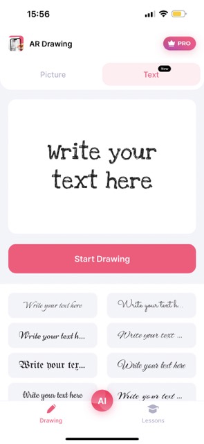
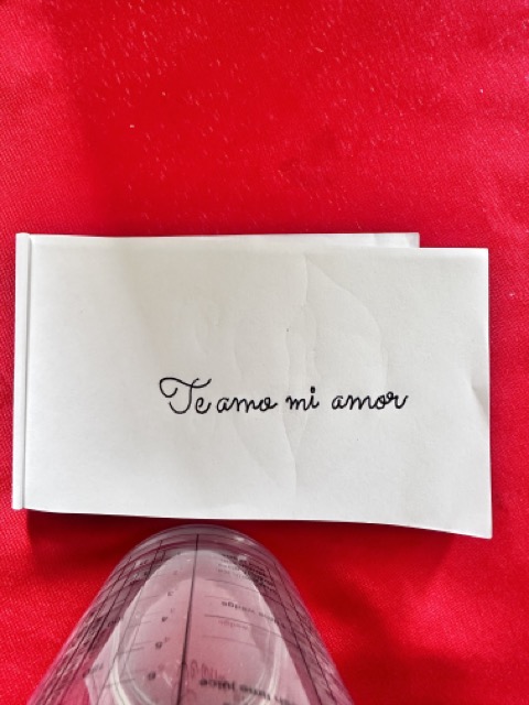
There’s also a separate screen for adding text to your creation. You can choose from different fonts and personalize your text in your preferred style.
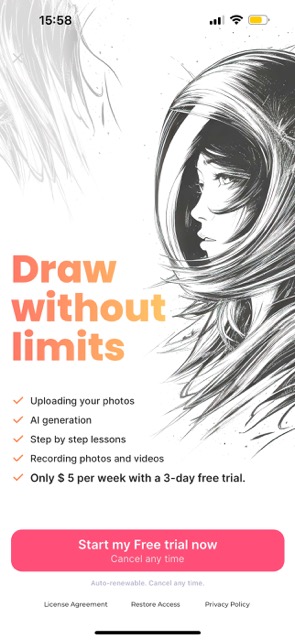
In the Pro version, you get some neat perks. You can tap into the AI character generator, which is super handy when you’re after particular features or objects. On top of that, you can upload your own images and draw them while capturing the process. It’s a pretty cool option, but if you’re not keen on shelling out for the app, the free version is quite worthwhile. It offers a bunch of images and plenty of opportunities for practice.

