Freedom …

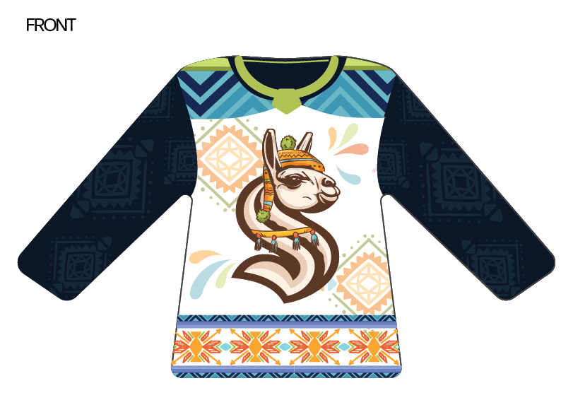
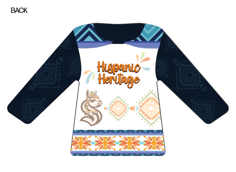
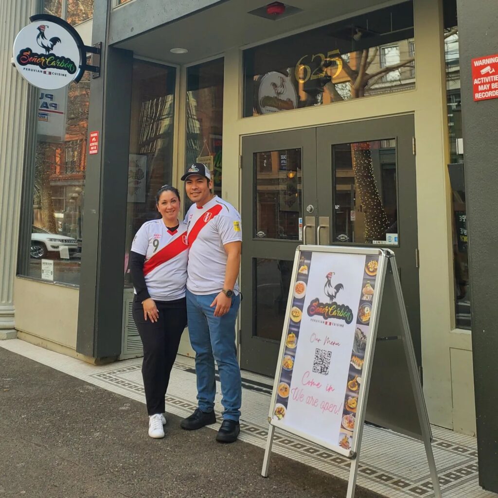
Kraken Jersey (Hispanic Heritage)

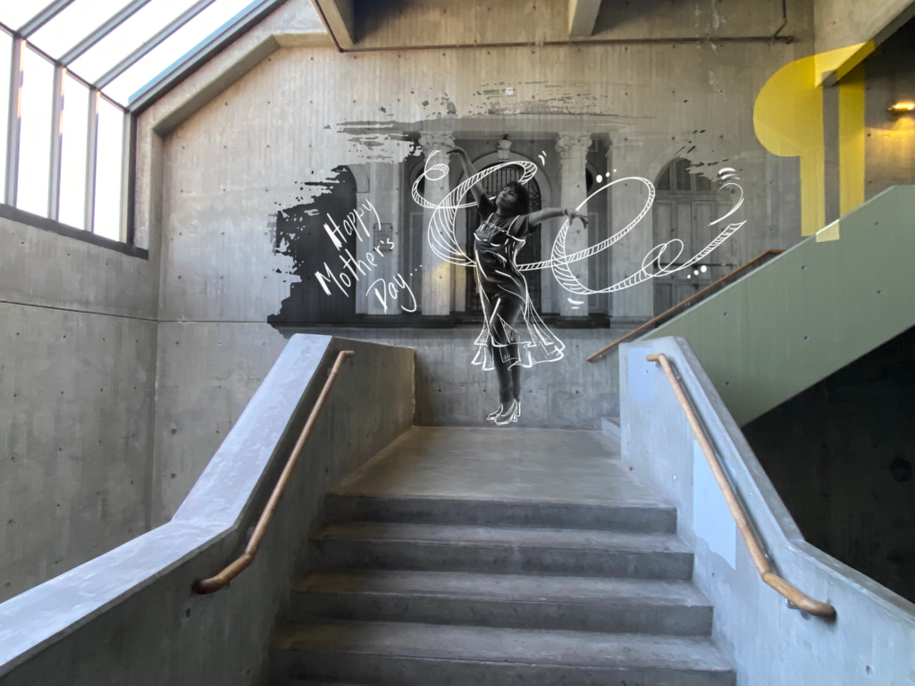
Mother’s Day

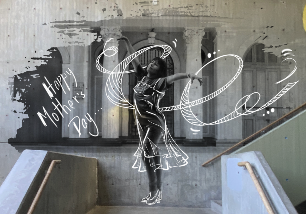
I want to dedicate this assignment to my mom, who has always inspired me to be free, authentic, and to follow my dreams. I took this picture of her when I was first learning analog photography, and she was always my best model. She didn’t need customized outfits or an elaborate setting to shine in her own unique way.

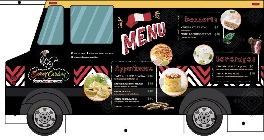
Señor Carbón – Food truck

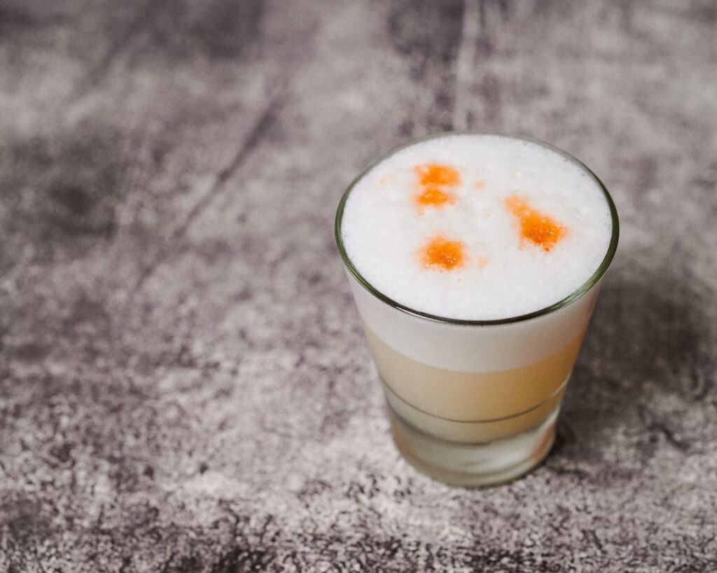
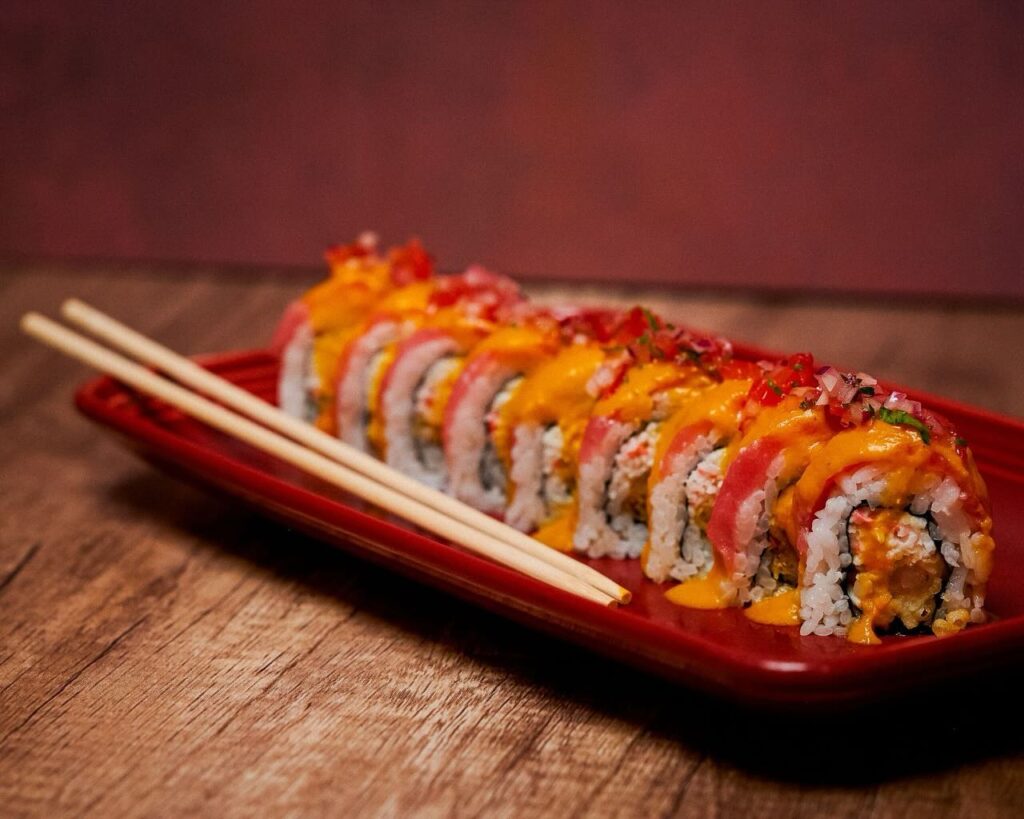
Nikkei Cuisine is a fusion of Peruvian and Japanese cooking styles, influenced by Peru’s abundant seafood and the cultural impact of its Japanese community, the second largest in South America. Fresh fish, a staple in Japanese cuisine, is combined with Peruvian ingredients like corn, chili, and potatoes, creating unique and delicious dishes that celebrate cultural diversity and culinary innovation.

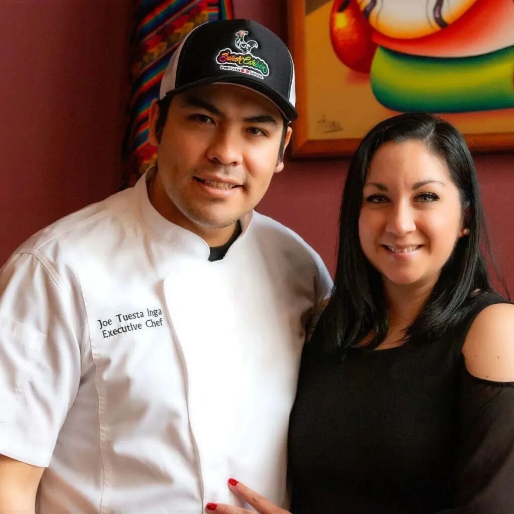
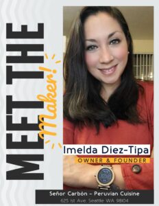
The amazing mind behind Señor Carbón Peruvian cuisine! She’s the founder and owner of this vibrant restaurant that brings the flavors of Peru to Seattle. Imelda’s journey started in Lima, Peru, and was shaped by her grandmother in Moyobamba, where she learned valuable life lessons and the importance of love and family.

Her grandma, whom she lovingly called Mamita Imelda, was her rock and taught her to be strong and wise in life. Despite facing challenges, Imelda found inspiration in her grandmother’s resilience and love. After her grandma passed away in 2018, Imelda carried on with her legacy, fueled by the love they shared.

In 2021, Señor Carbón Restaurant opened its doors in Pioneer Square, offering a fusion of traditional Peruvian dishes and Nikkei Cuisine, including sushi rolls. Imelda’s journey wasn’t easy; she had to navigate starting a restaurant in a foreign country with limited funds. Yet, her determination paid off, and now Señor Carbón is gearing up to celebrate its 2nd anniversary!

Imelda isn’t just a restaurateur; she’s a multitasking wonder. With a degree in hospitality administration, she handles everything from admin tasks to social media while being a full-time mom and managing household duties. Her story is a testament to chasing dreams and making them a reality.

Imelda’s motto? “Customers may forget what you said, but they’ll never forget how you made them feel.” She believes in creating those “wow” moments that leave a lasting impression, inspiring others to believe in their dreams too.

  1. Engage customers with an immersive culinary experience, showcasing creativity and cultural diversity.
  2. Promote the fusion of Peruvian culinary traditions through vibrant branding and innovative design.
  3. Adapt to various locations and events for maximum outreach and customer engagement.
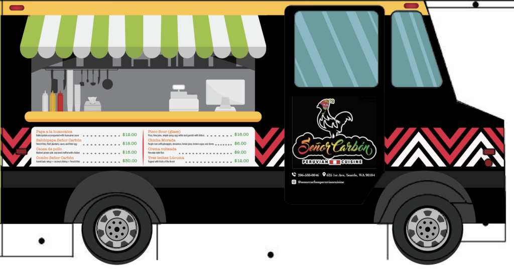
  • The food truck’s theme centers around Peru’s diverse culinary heritage.
  • Eye-catching graphics and vibrant colors reflect the brand’s identity and attract attention.
  • An open kitchen concept lets customers see the cooking process, enhancing their culinary experience.
  • A descriptive menu at the front aids customers in remembering their selections.
  • Technology integration includes contactless payment systems and social media displays for marketing.
  • The menu display at the back features clear descriptions and visuals of each dish, making choices easy.
Screenshot
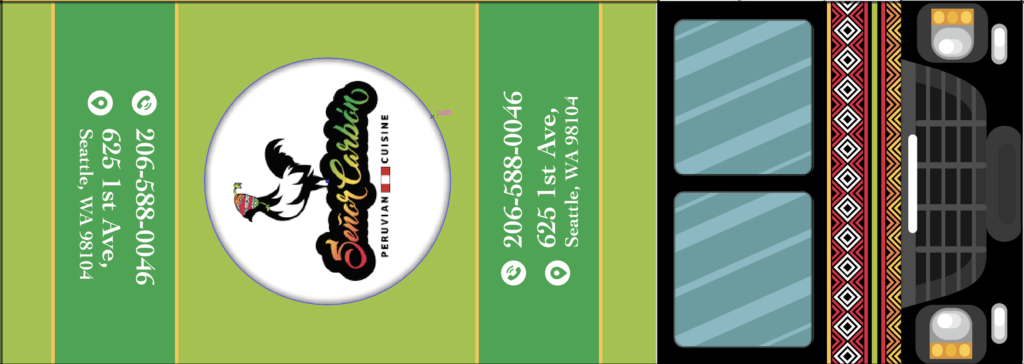
  • The roof serves as a marketing board with vibrant colors and restaurant information for visibility from the air (drones) or when on a different level highway.
  • Consistent branding, including packaging and promotional materials, reinforces brand recognition.

“Cirque du Pancake”

Week 04: Blog Assignment #4 / Brooke Montgomery & Zack Ellenbogen

THE IDEA

The Blender project was an adventure from start to finish. It kicked off with us receiving the prompts: a “Security guard,” “pancakes” as the object, and the phrase “I may be a clown, but I’m nobody’s fool.” These prompts sparked instant creativity in our team. Calla Lily jumped right into crafting a story, Ellery added depth with more details, and I suggested dynamic frame shots to enhance the narrative.

The initial stages were surprisingly smooth. We brainstormed the story, ensuring it made sense and seamlessly incorporated all the prompts. While I worked on organizing the shot list to capture our vision, Calla Lily skillfully mapped out the storyboard for visual guidance. At the same time, Ellery dove into writing and sourcing materials we would need to bring the story to life.

By the end of the first week, we had a solid foundation. Our story was complete, the shot list was outlined, and the storyboard was ready for action. Confidence was high, but then Bliss, our trusted critic, pointed out an issue with the pancakes in our story. It was back to the drawing board! We brainstormed tirelessly, considering even a complete overhaul of the narrative. The brainstorming sessions were a blast, letting our imagination run wild as we explored various plot twists and character arcs. Ultimately, we managed to tweak the original story to give the pancakes the spotlight they deserved.

THE SHOOTING

With a revised storyline, we dove into weeks of filming and editing. Calla Lily took on the role of our protagonist, bringing the character to life with props and charisma. I focused on setting up the recording set and capturing each shot according to our meticulous list. Ellery’s organizational skills were a lifesaver as she kept track of our shots and assisted with lighting setups.

On the highly anticipated “pancake day,” disaster struck when we realized we forgot to get the pancakes (cue collective panic!). However, Calla Lily saved the day by swiftly ordering them online, and Ellery embarked on a heroic mission to retrieve them. To our relief, the pancakes endured numerous falls and even a comical face plant during filming.

THE EDITING & PRESENTATION

The editing process was a whirlwind of creativity. We carefully selected the best shots from each scene, ensuring the video flowed seamlessly. A revised voiceover added a touch of polish to the storytelling. After final touches like color grading, titles, and credits, our project was ready for presentation.

As a team, we tackled challenges, embraced creative solutions, and celebrated successes together. Despite the occasional setback (like forgetting the pancakes!), the journey was incredibly rewarding. It was my first dive into a project of this scale, and the experience taught me valuable lessons in teamwork, creativity, and resilience. Seeing the diverse range of videos produced by other groups at the end of the project was the cherry on top—an inspiring showcase of collective creativity and dedication.

Blue Earth Alliance – Nonprofit

Week 03: Blog Assignment #3 /Drew Hisey

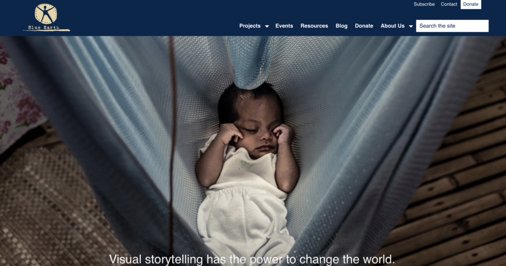
Blue Earth Alliance is a nonprofit organization that supports visual storytelling on environmental and social issues. They work with photographers, filmmakers, and journalists to create impactful visual narratives that raise awareness and promote positive change.

Nonprofits with a similar focus:

  1. International League of Conservation Photographers (iLCP): They work with photographers worldwide to create images and stories that inspire action for the conservation of nature and cultural heritage.
  2. The Everyday Projects: This nonprofit uses photography to challenge stereotypes and promote understanding by sharing images and stories from communities around the world.
  3. Environmental Film Festival Network: While primarily focused on film, they often collaborate with photographers and visual artists to showcase environmental issues through visual media.
  4. Conservation International: Although not exclusively focused on photography, Conservation International uses visual storytelling as part of its efforts to protect nature and promote sustainable development.

Why Donate to Blue Earth Alliance?

Supporting nonprofits that focus on meaningful causes is a powerful way to contribute to positive change in the world. Blue Earth Alliance works with photographers and filmmakers who are all about telling powerful stories. They tackle big issues like climate change, conservation, and social justice through amazing visuals that really make you stop and think. They’re big on diversity and making sure everyone’s voice is heard. They help to amplify the voices of communities that often don’t get enough attention. They team up with other nonprofits, schools, and media folks to really spread the message far and wide.

So, donating to Blue Earth Alliance isn’t just a donation; it’s a way to be part of something meaningful, impactful, and downright awesome!

Mood Board – Stanley Dog Bowl

Week 02: Blog Assignment #2 / Daniel

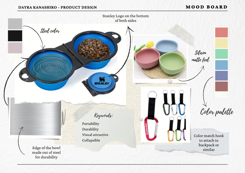
The new proposal for this bowl is aimed at those who want to take their pets on outdoor adventures, such as hikes, jogs, fairs, or other events. This bowl is retractable, making it more portable and taking up less space in any backpack or bag. Additionally, we’ve considered its durability and quality, which is why we use steel for the edges of the bowl in various colors. The interior material is matte-finished silicone, available in different colors to match any preference.

Website Design

Week 01: Blog Assignment #1 / Seneca Harper

Fluent 2 / Microsoft Design

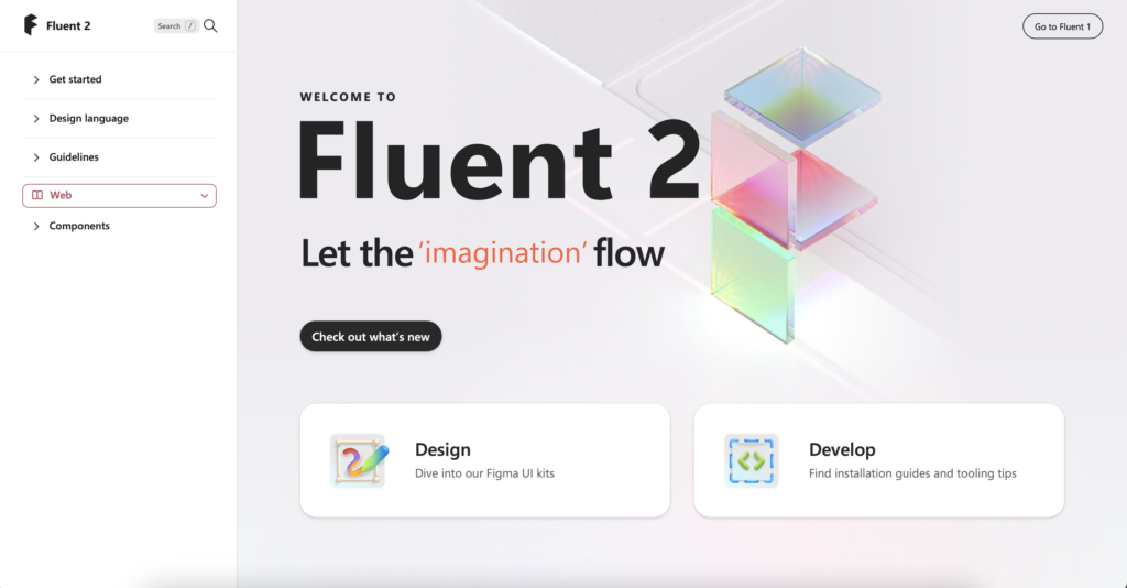
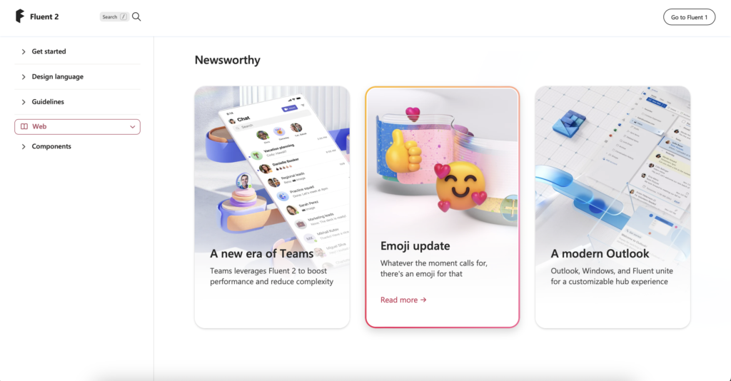
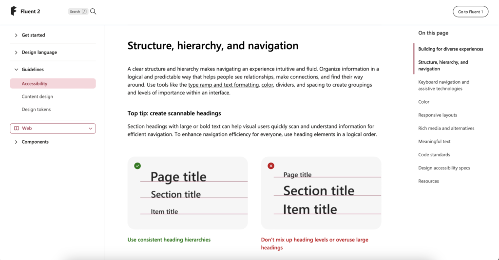
The website has a clean and minimalist interface which can provide a pleasant user experience focused on content, while font consistency contributes to better readability and visual coherence. Details such as colorful gradient borders can add a stylish touch without overwhelming the interface.

What I learned: It provides guidelines, components, and tools for creating consistent and user-friendly interfaces across different Microsoft products and platforms. It’s a resource used by designers and developers to maintain visual and functional consistency in their work.

Audi

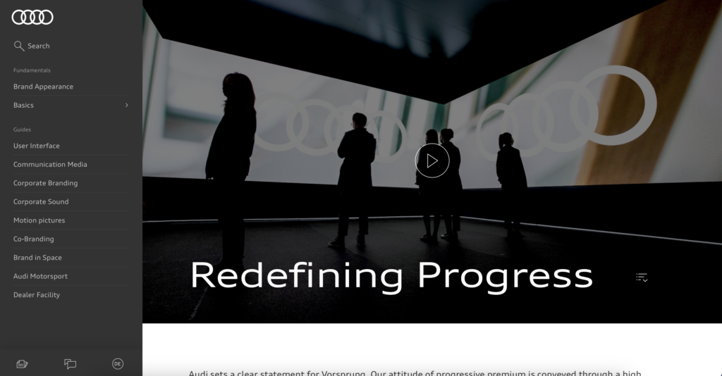
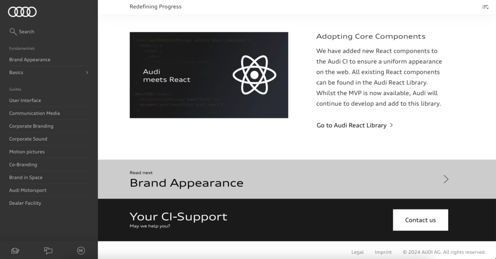
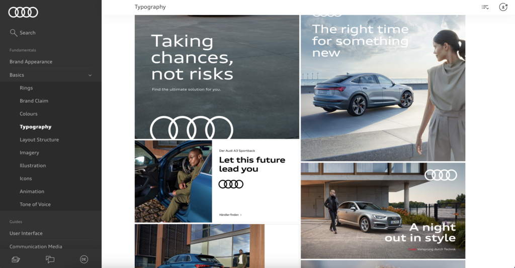
The website looks and feels elegant. The colors it uses are mostly neutral, black, white, and gray. It has a quite specific and accessible menu on the left side where you can easily navigate without having to leave the current page. They also use plenty of images and visual aids as references, which help users understand the information much better. The information is segmented by alternating between white and black colors in the background.

What I learned: Essentially, it serves as a platform for Audi to share important updates and developments regarding its brand with its audience. It focuses on communicating updates, changes, or innovations related to Audi’s brand identity, values, and offerings. It includes information about redesigned logos and updated visual elements.

The Guardian Digital Design Style Guide

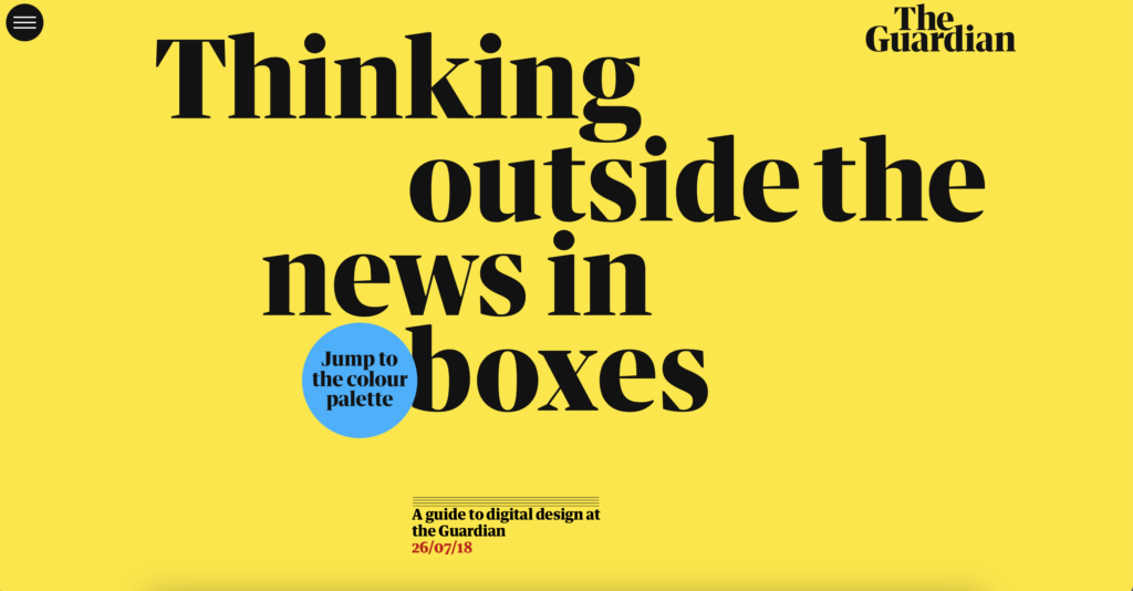
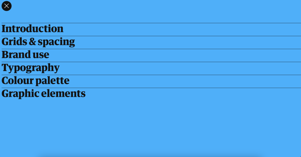
The website is a one-page design, where users scroll vertically from top to bottom. There are no other windows. The menu is quite basic and simple, using the title typography, which I consider to be too harsh for the design. Additionally, the typography is too large for a menu. The color scheme of the main screen is attractive to me, with vibrant yellow and black letters. Further down, we see templates as examples, accompanied by a small text on the left side.

What I learned: The Guardian, a prominent British news organization. The Guardian’s design team often shares insights, case studies, and articles about their design process and projects on this website. It’s a valuable resource for designers interested in learning about the design practices and principles employed by a major media outlet like The Guardian.

Boudoir Photo Shoot – Behind The Scene

Week 09: Blog Assignment #9 / Jacob Christenson

Final Project Lighting Techniques II

In my final lighting techniques project, I’ve decided to focus on capturing the essence of the “Human Form” through the lens of boudoir photography. This intimate and alluring style not only allows for the exploration of various lighting techniques but also creates a mood and vibe that adds a unique dimension to the portrayal of the human body.

For this project, I aimed to celebrate the beauty of the human form by utilizing creative lighting to accentuate curves, shadows, and highlights. Boudoir photography, with its emphasis on sensuality and emotion, provided the perfect backdrop for experimenting with different lighting setups.

I carefully curated an atmosphere that complements the chosen theme, creating an interplay of light and shadow that enhances the subject’s natural features. The result is a captivating image that goes beyond the physical form, capturing the emotions and vulnerability associated with the boudoir style.

Through this project, I not only explored advanced lighting techniques but also aimed to convey the powerful and evocative nature of boudoir photography, making the human body the star of the visual narrative.

Shoonicorn Shoes – Let your creativity flow!

Week 08: Blog Assignment #8 / Spencer Glenn – Tim Clark – Todd Durboraw

Product Details

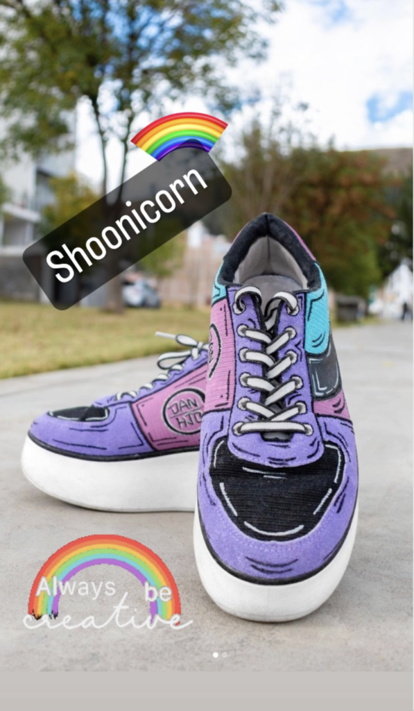
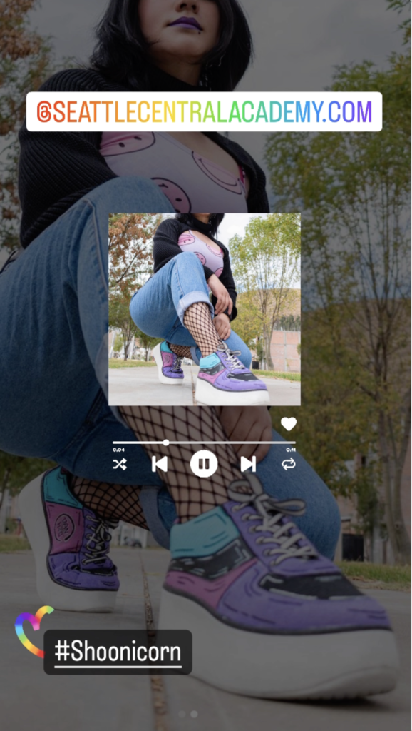
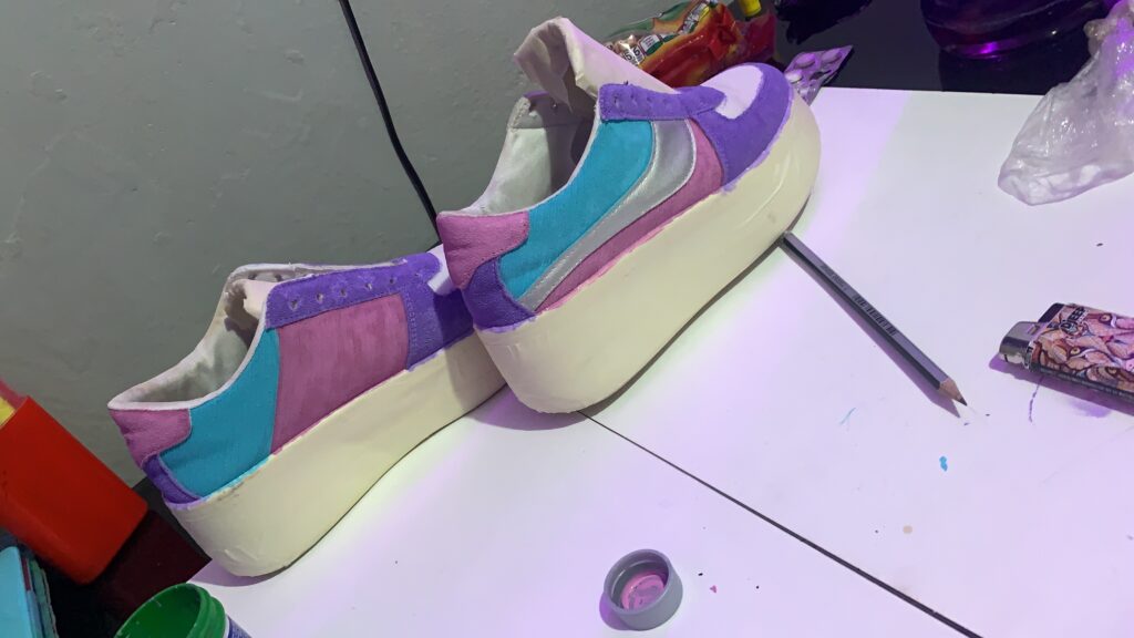
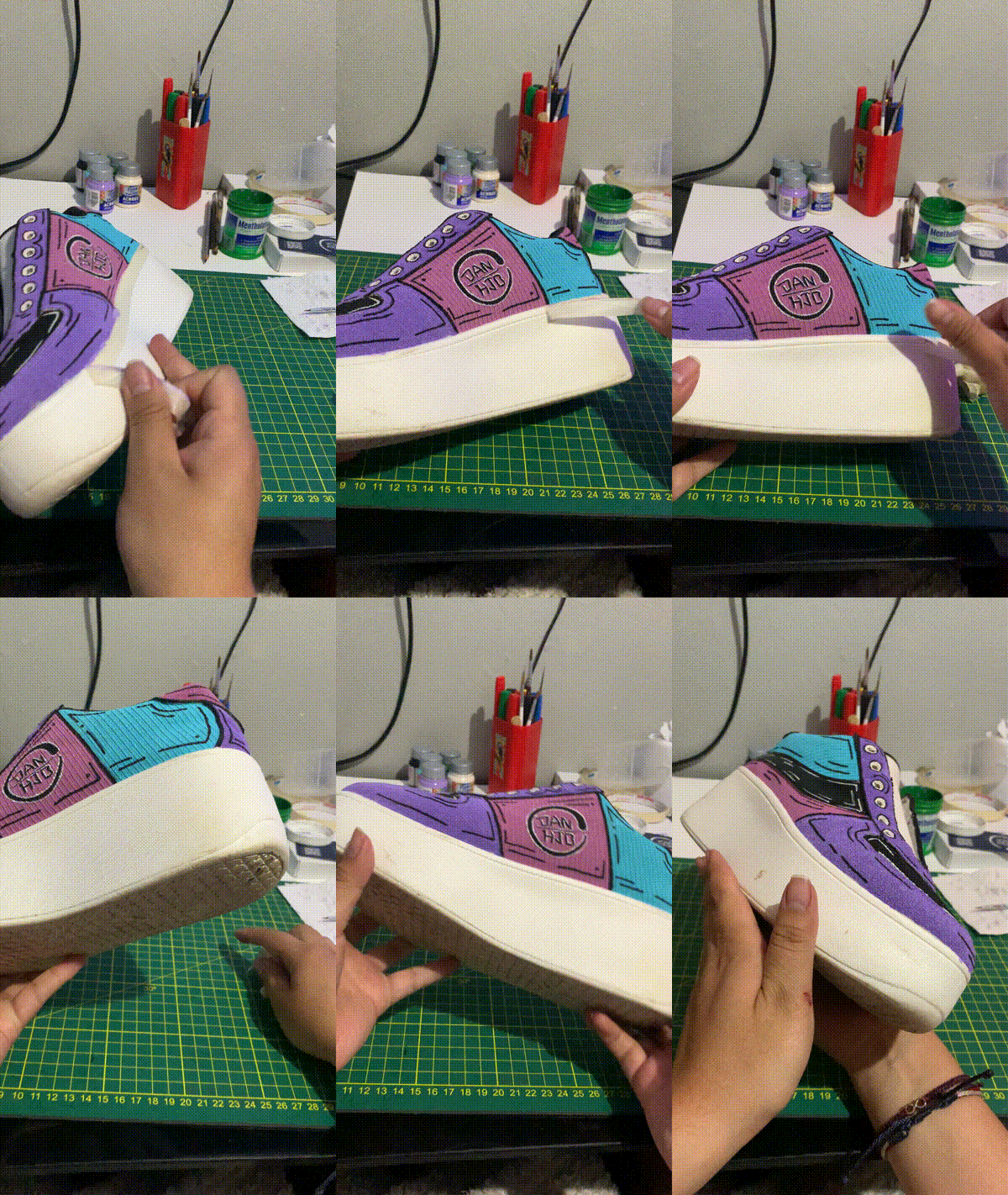
Introducing the Shoonicorn Shoes, where comic book flair meets fashion to kickstart your imagination. These kicks aren’t just shoes; they’re your personal gateway to a world of limitless creativity. Decked out with bold, comic-inspired graphics, these sneakers not only add a splash of boldness to your style but also unleash your creative superpowers.

When you rock these kicks, something magical happens. You dive into a constant flow of fresh and original ideas. Mental blocks vanish, and your mind becomes an unlimited canvas of creative possibilities. It’s like having a superpower, but instead of flying or moving things with your mind, you become a creativity master.

Not only are they comfy and stylish, but these sneakers are the perfect sidekick for all creators, from artists to writers, giving you the boost you need to conquer any creative challenge that comes your way. Unleash your creativity and bring your ideas to life with the new Shoonicorn Shoes!