I try to always fill my home with things that bring me comfort and joy. If you over-crowd objects and light them just the right way, it gives off a different feeling.
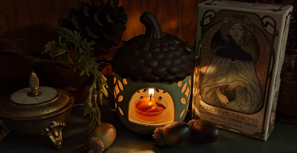
The main character of my little world is the acorn cabin being lit by a small pumpkin candle. All the other characters are supporting and surrounding the cabin, creating a sense of closeness and mystery. The looming lady in the background overlooking the acorn is dominant and stern. It’s almost overbearing and unnerving. All the small little acorns are haphazardly placed. Sometimes life is unplanned and small things get in the way. I wanted to create a mysterious yet natural environment with the wood tones in the background. It’s not just a shelf, it’s a safe place to keep your memories, thoughts, and ambitions.
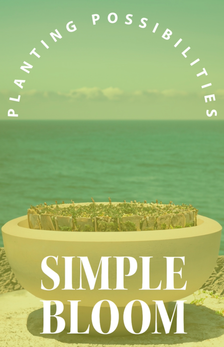
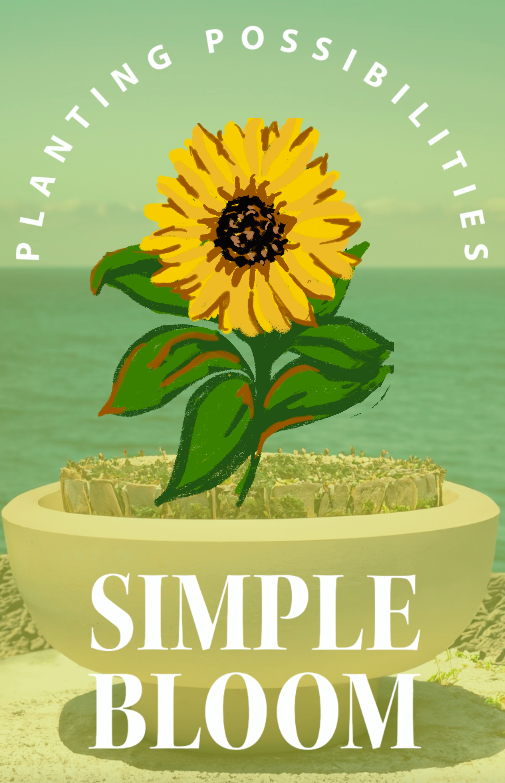
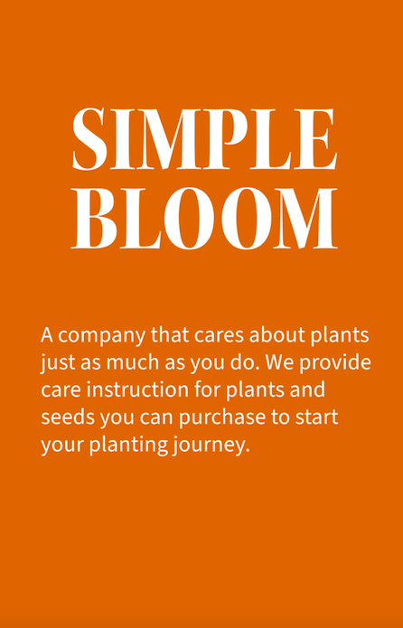
I was thinking about my plants back home and realized that I haven’t had the time to take care of them as well as I should. I then started thinking about different companies that are associated with plants. I created a company called Simple Bloom that allows individuals to grow their own plants. They provide seeds, educational videos, and clear instructions on how to take care of them. I wanted a simple background, prominent text and a simple illustration of a plant growing.
Before entering this program, I used to use ProCreate for my own drawings. It’s capable of making gifs and sharing mp4s. I prefer drawing with a pencil or a pen and an iPad gives me that opportunity.
I had some difficulty with ProCreate as a program for animation. It was easier to animate using a pencil tool and drawing straight on an iPad, but I had to preset my layers prior to starting the animation. The problem with presetting layers is that you can’t add more layers if you require more than the maximum listed. I also created the poster background prior to creating the animation and I didn’t find out until later that I needed to merge both the poster and the animated layer together with each layer.
In order to solve the first issue of not having enough layers, I just created as many layers as I could and slowed down the transition of the mp4. I solved the second issue by duplicating the background image for each animated layer and merged the drawn layer and the background image together. So each generated transition had a background and a foreground of the animation.
My iPad unfortunately loses battery fairly quickly, so I’m glad that it didn’t take too long to create the animation. Usually, if I’m working on my iPad for too long it dies and it’s a hassle but I’m glad that no problems arose. I finished the animation, published it, and had fun creating it.
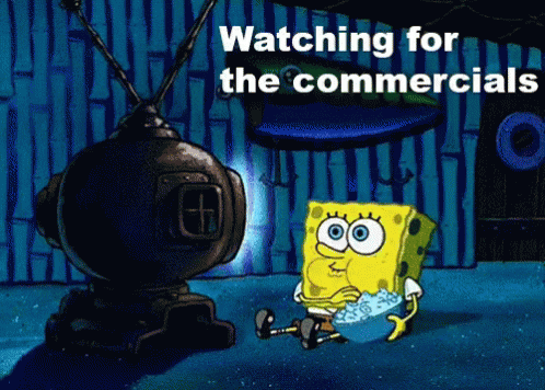
State Farm Neighbor Ad – I’m only here for Danny DeVito
Dunkin Donuts – Ben Affleck is trying to impress Jennifer Lopez with his bad music while she’s in the studio. He brings Tom Brady, Matt Damon, and several others. Inspired by Dunkin Donuts, he breaks into her studio.
The audience for this commercial was hard to gauge because millennials grew up with Jennifer Lopez and Ben Affleck. That relationship was in the tabloids a little aggressively back in the day. Seeing it play out again in a Dunkin Donuts was awful.
Pros: Outfits worked really well. Company’s colors are identifiable.
Including a professional “retired” football player is important because it falls in line with the Super Bowl theme.
Cons: The “comedy” lacked luster. I felt disgust in the pit of my tummy.
The fact they didn’t use/or take inspiration from the superior Casey Affleck skit from SNL is a huge miss.
Duolingo – The animated bird is centered on the screen with it’s little green buttcheeks sticking out. The bird turns around, coyly, and suddenly it’s little buttcheeks have started to inflate. Their buttcheeks pop and turn into another head. The ad then has the gall to ask if you’ve “Do your Duolingo”. Duolingo’s target audience is on the younger side, so the humor in this ad especially targeted for younger folks. Gen Z and Gen A.
Pros: It’s funny and quick. This ad is only 10 seconds or so. It grabs your attention and surprises you with the inflating butt.
They use familiar sounds that remind you of how annoying their app is and they poke fun at themselves. Nice touch (or is it?)
Cons: Not for everyone. Comedy is subjective and this might rub some older folks the wrong way.
The app itself is rather annoying, illustrating that in a commercial might remind people why they stopped using the app in the first place. It’s annoying.
Creating packaging for a range of vintage candies. The design should capture the essence of the era I would like to depict.
Designing packaging for a line of SciFi beverages.
Creating packaging for a line of perfumes that would fit into a Victorian-era setting.
Designing vintage-style medicine bottles for an apothecary shop setting. The project would involve researching historical medicine bottle shapes, labels, and typography.
Designing a series of wine or ale bottles that are inspired by “The Lord of the Rings”. Each bottle will have a different design based on the different regions within Middle-earth.
Developing packaging for a line of chocolates inspired by “The Lord of the Rings,” For example, a chili flavored dark chocolate could represent Mount Doom.
Developing a branding package for a gothic café that draws inspiration from Tim Burton films. This will include logo design, menu layout, packaging for products like coffee bags or pastry boxes.
Designing branding and promotional materials for Epcot’s Food Festival. Include logo design, and menu design.
Designing a series of vintage-style posters for Disney iconic rides like Space Mountain, Pirates of the Caribbean, and the Haunted Mansion.
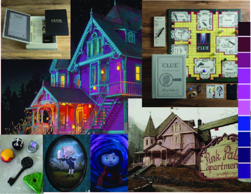
Redesign a classic board game.
Special Project: Special Edition Coraline’s Clue
Transforming the traditional “Clue” board game into a Coraline murder mystery. This special edition offers a fresh new take on the classic detective game to a whole new generation of players and collectors.
Game Design Details include the following:
Traditional Clue characters are replaced with figures from “Coraline,” including Coraline herself, the Cat, Wybie, and other characters in the film.
The setting of the game will be the Pink Palace. Classic Clue rooms are reimagined as key locations from the “Coraline” story, such as the Drawing Room, the Theater, Mr. Bobinsky’s Circus Room, the Garden, and the Secret Door Room.
Traditional weapons are replaced with items found in the film, like the Button Needle, a snowball, a pair of button eyes, and poison candy.
Why should you include this idea in a portfolio?
Reimagining a traditional board game takes many multidisciplinary design skills. Designing the game components, such as the board, cards, and character pieces, showcases my ability to create original illustrations that capture the essence of the “Coraline” universe. Crafting the text elements of the game, including card descriptions, instructions, and the box design, allows me to demonstrate my proficiency in typography, layout design, and information hierarchy. This board game not only showcases a broad spectrum of design skills but it also highlights creative problem solving, and storytelling ability.
What skills do you hope to gain?
With this project I hope to improve my ability to create a cohesive visual narrative. I need more practice with storytelling in design and translating a story from one medium to another shows my skill in adaptation and interpretation.
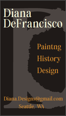
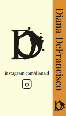
Last week we handed in our business cards. I have to admit that it is one of the most demanding projects I have worked on so far. It was difficult on so many levels, but I left feeling proud of my work. The most immediate challenge in designing a business card is its size. This constraint requires careful consideration of the content and placement on the card. Balancing legibility with my own personal aesthetics required a large pile of revisions. I wanted to make sure that my business card had personal branding which in itself is an ever changing development as I navigate that graphic design program.
Actions:
I understood that my business card was not just a tool for sharing contact information; it was a critical component of personal branding. In order to create my identity, I picture the kind of work that I would enjoy the same way I would enjoy a classic novel. I wanted clients to know that I am reliable and established. This gave me an opportunity to include the use of vintage typography, texture, and aged elements that enhanced the storytelling element of my branding. My logo was carefully crafted by hand adding a personal touch. The typographic style and formatting was inspired by classic novels. Achieving this nuanced representation within such a confined format was a daunting task, but my strategy and thoughtful approach created a business card that I feel proud of. The final draft had a distinctive identity compared to contemporary styles.
Results:
On our critique day I presented my work and I received feedback on my work. I needed to make a few changes to my design to make it fully successful. It was a profound learning experience that extended beyond aesthetic adjustments. I took this opportunity to deepen my understanding of design as a dynamic and responsive discipline.