

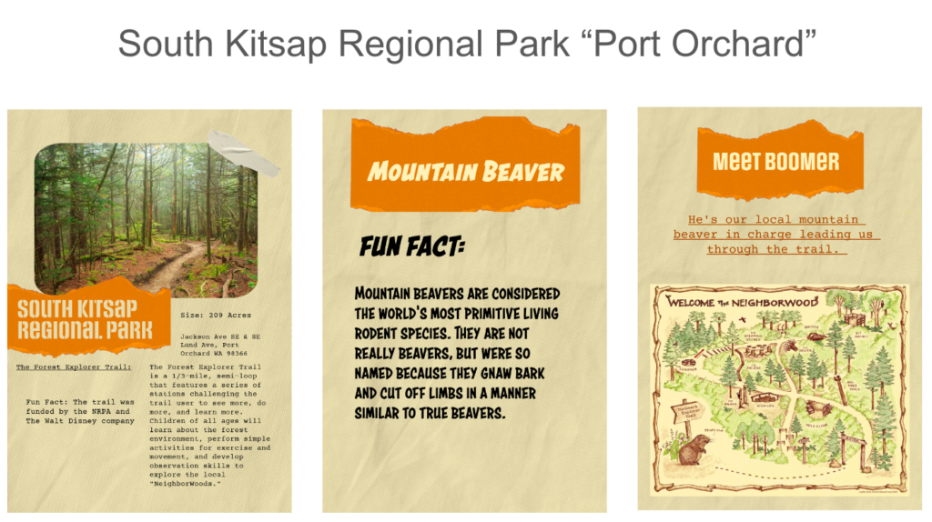
What Point of interest (POI) did your team decide on?
Our team decided to look for local parks in our area. We wanted to focus on the local animals and fun facts about our regional park. I live in Port Orchard and I was grateful to find such a cute family friendly park close by. I’m thinking about going back after finals.
How did you create it (photoshop, Figma)?
I created my panels in adobe express. Adobe express is a new feature in adobe that I was really excited to explore for the first time. It has assets that you can add to create texture right in the program. I’m so grateful that I didn’t have to search for free assets in another website. The animate feature is so intuitive and fun to use. I think this is a groundbreaking program that will help designers create fun and interactive projects. It’s not a replacement product for the other adobe programs because of its limited options, but it was easy to learn and if you need a quick presentation for a client this program works wonders.
What assets did you use? (jpg/gif/audio/etc)
I used jpg’s and a cute little mountain Beaver gif.
Documenting creative process
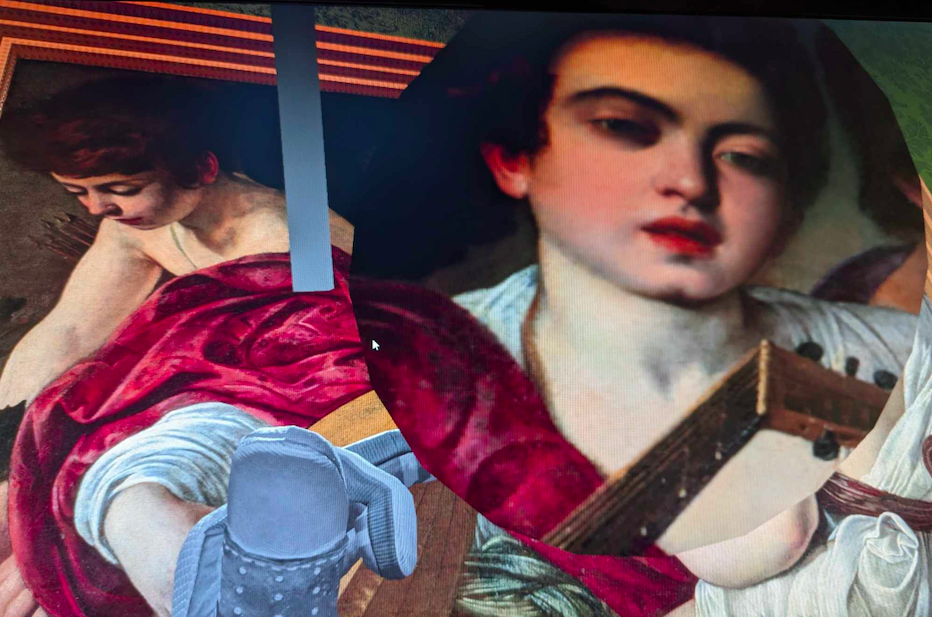
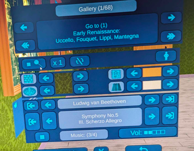
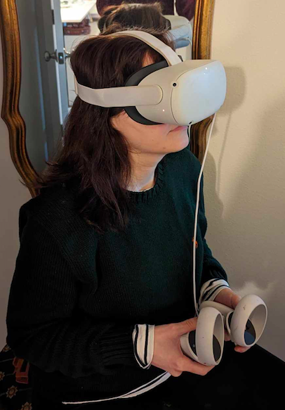
Starting off in this game I felt really immersed. The music helped me feel more comfortable in the environment and the availability of changing music and the colors of the wallpaper made it feel more customizable. I did, however, have some negative experiences while navigating from one end of the room to the other. It was hard to figure out how to move. At first there wasn’t anything showing you how to move so I figured out that the pointers directed you. You had to point on the floor and a green square would show up. Then you would travel to that location. Sometimes when you travel to that location, it would have you travel super fast and it wouldn’t even land where you wanted to land. You end up crashing into some paintings and it was very jarring. When you finished looking at all the paintings in the room you had a menu that allowed you to travel.
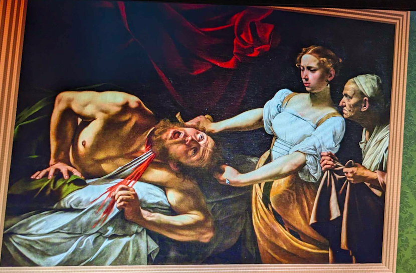
The overall design was very basic. You had paintings on the wall that you can view and a little chair in the corner for some reason. It gave you a description of each painting. The magnifying glass was a cool addition but it wasn’t anything special. It would just amplify what you already see. Overall, I thought it was really well done for a free game and if it didn’t give me motion sickness, I would have played it for a little bit longer.

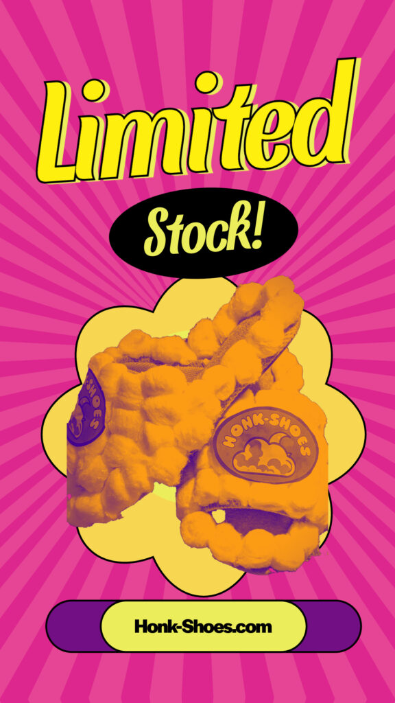
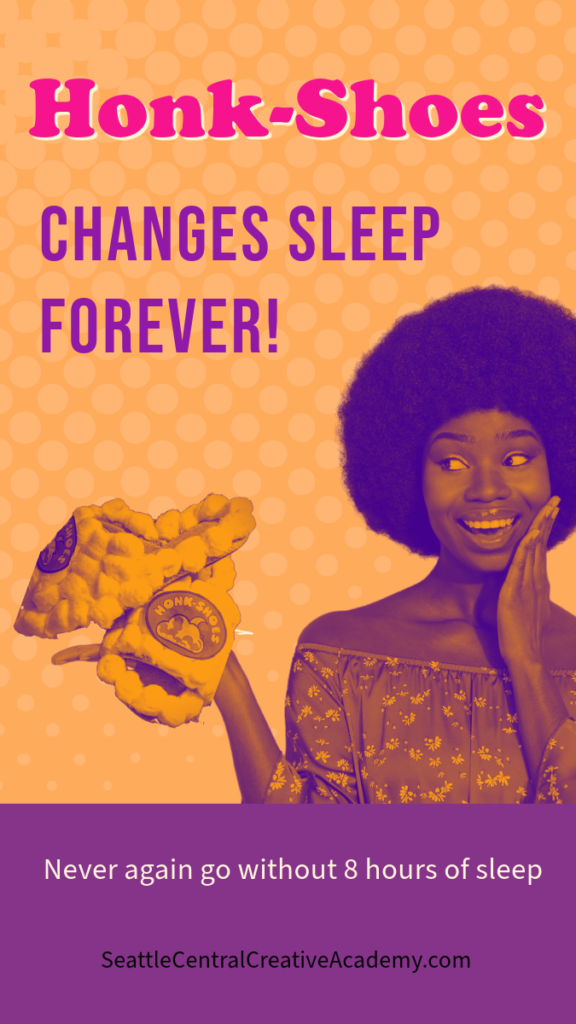
The revolutionary shoes that are more than just comfortable, they offer the key to unlocking the perfect night’s sleep! This is “style meets sleep” science. No matter how long you spend on that project of yours, Honk-Shoes has your sleep covered!
Limited supply only! Don’t let these stylish puppies slip through your fingers!
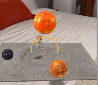
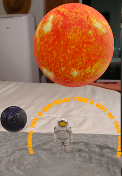
I came up with my idea by looking at all the available assets in the application. I felt a space related birthday card would be more fun and atmospheric. I could make the planets revolve around the sun.
I encountered challenges with the scale of the planets; they were too large, hindering the execution of other functionalities. This unexpected scale issue inadvertently created a visually impressive scene, but not what I intended. To address this, I revisited the sizing settings, realizing the importance of pressing the apply changes to see the changes. After a few adjustments, which included scaling down too much at one point, I found the perfect balance. This was a learning curve, but it ultimately led to the successful product.