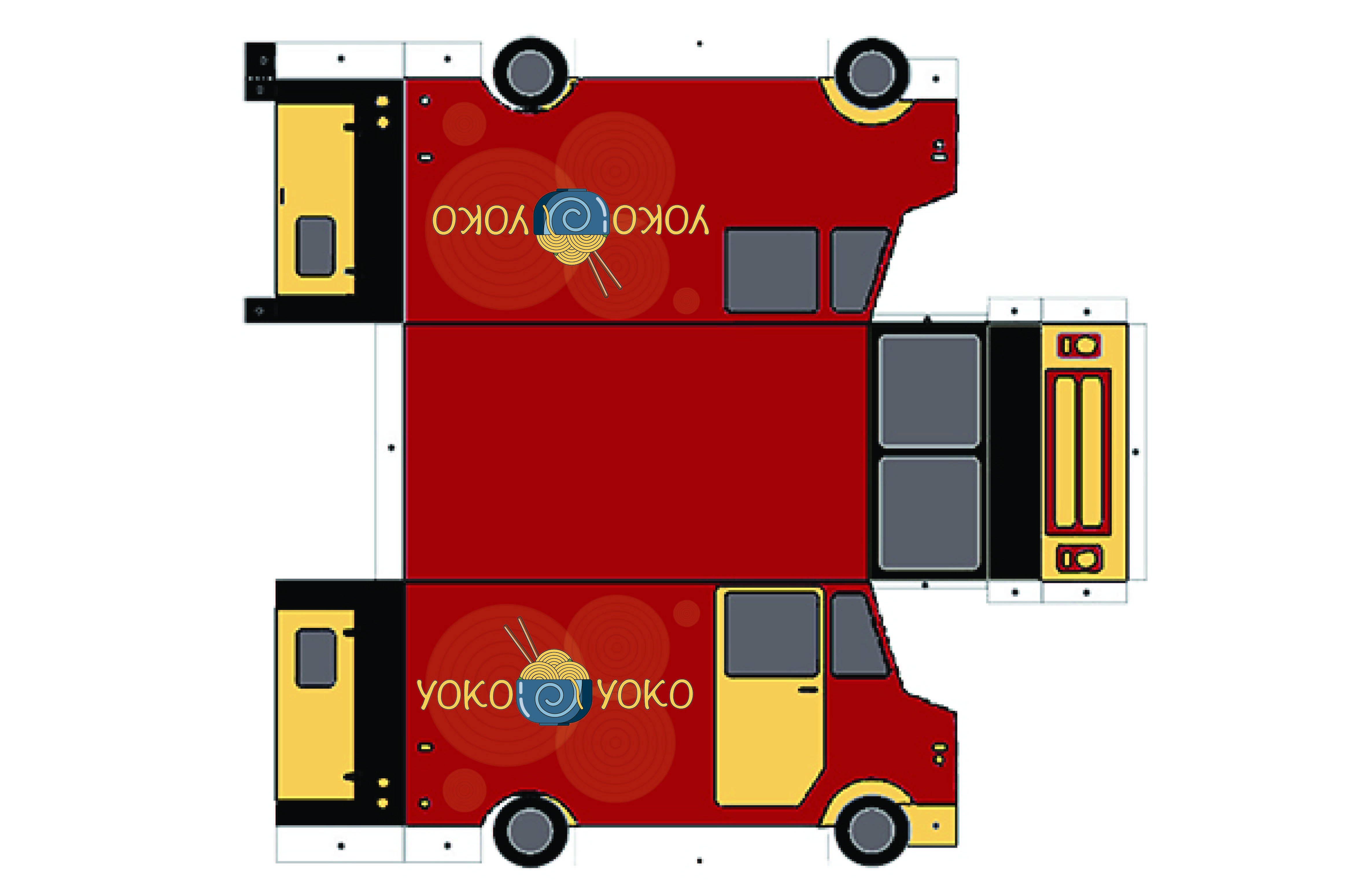
I was excited to see that I had an opportunity to design a unique wrap for a food truck representing a culinary haven of mine. I loved to visit a local ramen restaurant. I use to frequent this restaurant while I was in the navy. The beloved Yoko Yoko Ramen restaurant, promises not only delectable dishes but also a feast for the eyes.
The heart of this design lies simplicity. All design in illustrator for its versatility. I created A linear vector of a delicious bowl of ramen takes center stage. Its circular noodles forming an intricate pattern reminiscent of yarn. This simplified vector emulates a message of warmth an comfort just like the original restaurant. I simplified the pallet to just a few colors. Red and yellow is the dynamic duo of food industry colors. The red dominates the truck’s exterior. Red, known for its appetite stimulating effects. Yellow, on the other hand, radiates warmth and positivity, inviting patrons to step closer and savor the experience. Both colors can been seen at a distance which can help people attract those who frequent. Our logo, is a simple circular emblem that adapts effortlessly to any background or color palette. The typography is also simple and legible. Whether parked against a city skyline or nestled in a serene park, the design remains striking.
As a resident of Port Orchard I live a little further away and don’t frequent as much. Now, that my favorite noodle spot has wheels, they can pick several places in kitsap. Hopefully closer to where I live.
In the world of food trucks, ours stands out both in color and design. Its new visual identity will resonate with people who already know the brand and incoming new customers that are curious to experience delicious ramen from a food truck experience.