Since I was 12, I’ve enjoyed creating and photographing compositions of various objects, making what people call “little worlds.” These days, I’m more into photographing people than still life, but I still like to dabble in product photography now and then.
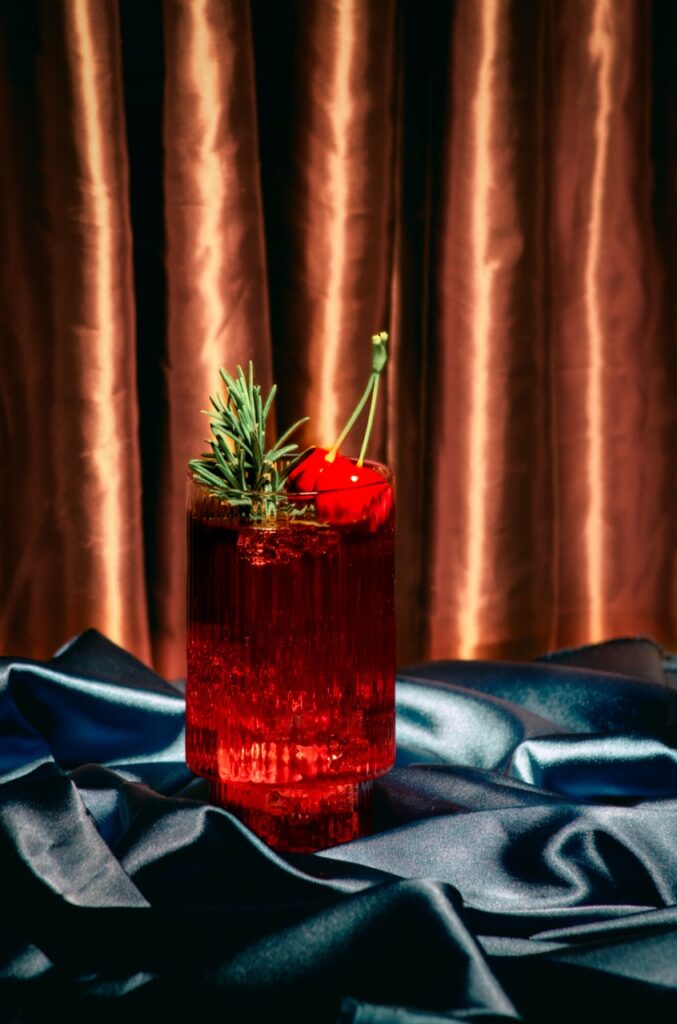
Here’s my latest product work. It was inspired by the Vogue Cocktail Party in New York in the 80s and 90s. I really love the fashion and glamorous style of Vogue magazine, especially from the 90s.
I took this photo almost 4 years ago when I still lived in Ukraine. It was around Halloween, and even though Ukraine doesn’t celebrate this holiday, I really loved the atmosphere of Fall. I still remember gathering leaves in my backyard for this shoot.
I enjoy creating these little worlds and doing product photography, but I still prefer portrait photography. I think sometimes it’s harder to capture the beauty of an object than a live person.
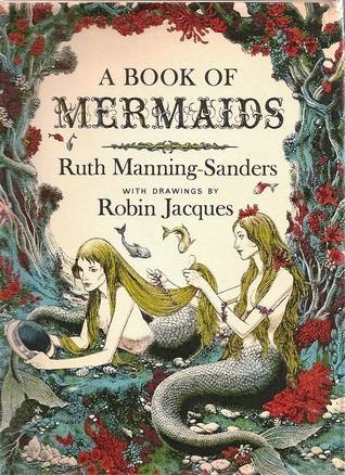
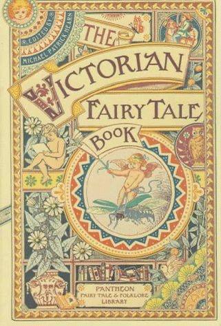
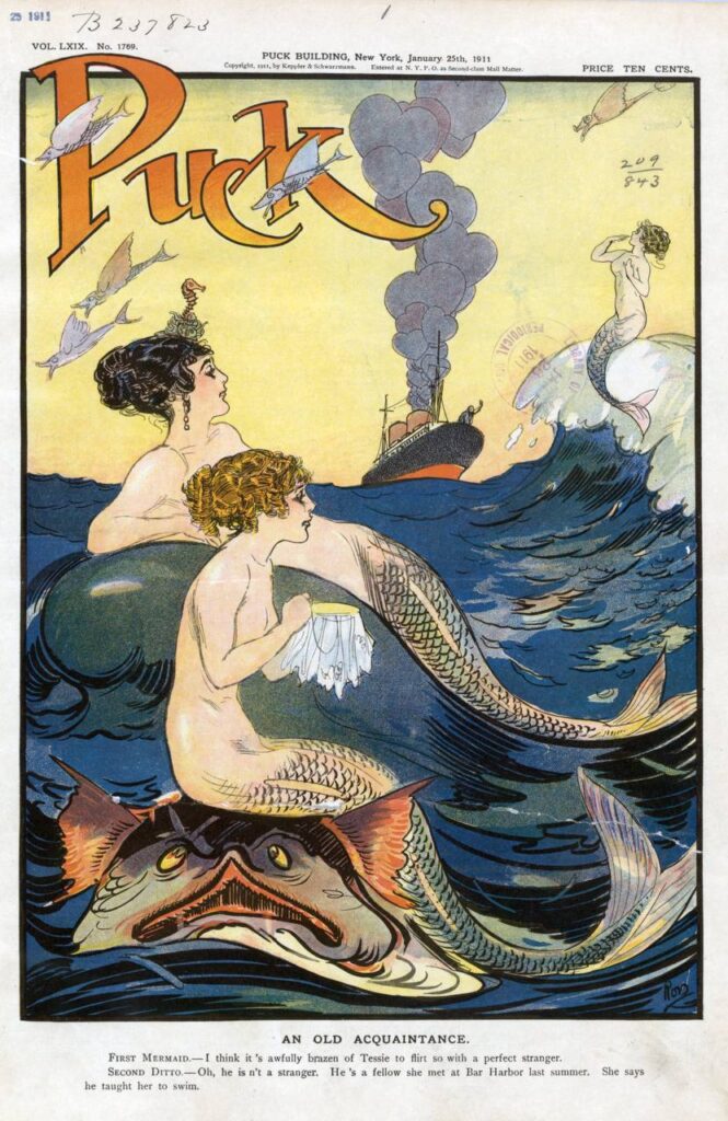
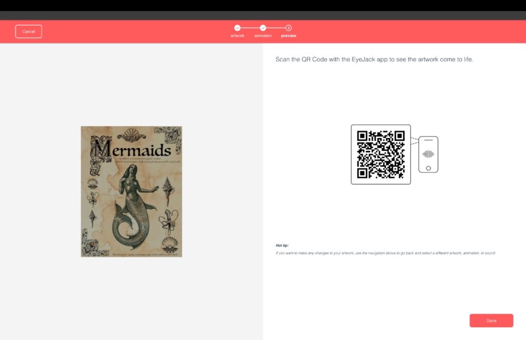
For my first AR module assignment, I decided to create a poster inspired by a marine theme, specifically mermaids.
I quickly settled on the theme for my poster. My favorite mythical creatures have always been mermaids, especially sirens, so I was eager to create something related to these mystical ocean beings.
For the poster and animation, I used Photoshop. It was my first time using Photoshop for animation, and I’m quite pleased with the result. I didn’t face any difficulties creating the animation, but I did spend a considerable amount of time searching for all the necessary images with a consistent marine theme.
My objective was to create a poster reminiscent of the cover of an old fairy tale book or stories about mermaids, and I believe I accomplished that goal!
References and inspiration: “Old fairytales book covers”
When uploading the animation to EyeJack, I also decided to add a siren song to enhance the atmosphere of my poster.
I really enjoyed working on this project, and I found it very fulfilling. I’m sure that I will continue to experiment with animation and AR, improving my skills in this area of visual media!
This commercial shows a scene where aliens visit Earth. The general asks the aliens their purpose for visiting our planet, and the real estate agent tells them that the aliens’ goal is to find a place to rent. The agent then starts offering the aliens options for renting a one-bedroom apartment, which can be found on the apartments.com website.
In the end, one of the aliens asks for a two-bedroom apartment to have a guest room for its mom, while the other alien doesn’t want this, so it asks for a one-bedroom apartment. The joke about the mom implies that the aliens are a married couple.
I liked the idea and atmosphere of this commercial. I’m a big fan of “The X-Files,” and the visual component of the commercial captured that mysterious atmosphere well. I think it would appeal to audiences who enjoy science fiction themes.
Two Pro’s – something it did well:
Atmosphere, script, the concept;
Special effects.
Two Con’s – Something they could have done better:
In my opinion, at the end of the commercial, the scene where Jeff Goldblum says, “Apartments.com – the place to find a place,” looks rather cheap compared to the main advertisement. It cheapens the overall impression.
Some scenes differ in color and contrast, which also detracts from the viewing experience.
Volkswagen “An American Love Story”
This commercial showcases the evolution of Volkswagen cars, starting from 1949 when the first car of this brand was imported into the United States, and ending with the present day. The commercial features a wide variety of scenes and shots with different atmospheres, color schemes, and fashion styles in which the actors are dressed. The commercial effectively conveyed the atmosphere of the times – the 50s, 60s, 70s, 80s, and 90s.
I liked this commercial for its wide variety of scenes and colors. The music also perfectly complements the idea of the commercial. I also really liked that the first half of the scenes was shot with a film effect. I think this commercial will appeal to people who love film, vintage fashion, and of course, Volkswagen cars!
Two Pro’s – something it did well:
Visually appealing vintage atmosphere;
Musical choice;
Two Con’s – Something they could have done better:
I didn’t like the insertion of a scene from “The Simpsons” at the end of the commercial. In my opinion, this scene didn’t fit into the video sequence and was quite distracting.
The beginning of the commercial looked visually stronger than the end.
10 ideas: Pole/Strip Dance Video; Short Fashion Film; Photoshoot with red light; Photoshoot with a full body latex suit; Mix the American and Ukrainian culture in art; Photography book; Design for Iphone cases; Logo design; Design costumes for stage performances; Jewelry design.
I’ve had the idea for a while to create a dance video for a dance studio focusing on pole and strip dance. I think dance is one of the most challenging forms of art, so I’m really interested in showing strength and provocation through this unconventional dance style. I also really like the look of leather and latex clothing and how it appears on camera, so I’d like to use this idea for my future photo shoots and video projects. I enjoy incorporating provocation into my art because it always evokes different reactions among people and doesn’t leave anyone indifferent.
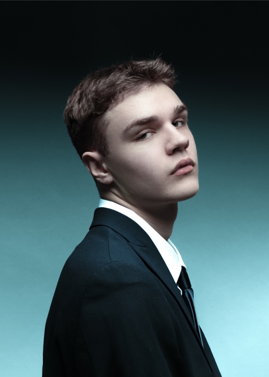
I want to share a recent project of mine – a self portrait and one of my toughest photography works. It took me about ten hours to create this photo, mostly adjusting it afterward. I believe that I used mostly all the skills I learned at Seattle Central Creative Academy to get this image. I spent a lot of time in Photoshop and Lightroom to make this photo perfect, and I’m really proud and happy with how it turned out.
Background & Challenges
One big challenge was not having much time. I only took 20 photos because time was short. Most of my effort went into making the background look just right, which was the main thing in this photo. It was my second time using a gradient, so I knew what to do to get the result I wanted. Another challenge was editing the best photo to look like the reference picture that inspired the whole session. Retouching the skin, getting the colors just right, dealing with shadows, and making other adjustments took a while.
Lessons learned & Results
I learned a lot while making this photo, especially getting better at working with light and adjusting things afterward. Additionally, this project allowed me to explore the intricate details of portrait photography. I’m definitely putting this photo in my portfolio! It was great to hear positive feedback from people close to me who liked the photo. For me, the most important part of any project is hearing what people think. I think the main job for all artists, whether photographers or graphic designers, is making people feel something with their art. There’s still a lot more I’ll learn in my visual media studies, but I’m excited to see my photography skills improve and my own style develop.
As I continue my creative journey, I look forward to embracing new challenges and incorporating the insights gained from this project into my future work. I really enjoy working on tough projects that help me learn more about photography!