Categories
Uncategorized

Hallock Blog: Week #3

When I got home Friday, I just kind of looked around my apartment at all the things I own that were designed and where they’d rank on that spectrum, and it was pretty interesting. I’m drawn to movie posters, and in general they’re low information density, with a fairly broad audience. They’re mostly the title, some actors names, the director and a nice background with little else to convey than “this movie is cool”.

Designing a poster means distilling an idea down to something relatively simple, at least with the theatrical run. You need to have a good artistic background as well as an understanding of design principles in order to make something interesting to look at. The poster needs to be able to convey the tone the targeted audience is looking for, you don’t want to confuse someone as to what kind of experience they’re about to have. You’re trying to convey a message to as wide of an audience as possible generally, but if for example, it’s a science-fiction movie, some people just aren’t going to want to see that because they aren’t interested in those movies (like my mom) So you need to make choices on how heavily you lean into the look of a science-fiction poster. Do you try and make it more enticing for fans who you know are already going to go see that movie? If it’s a custom poster for fans who’ve already seen the movie, what can your poster show that would make them want to buy your poster? What makes yours special?

Theatrical ‘Pulp Fiction
Saul Bass’ ‘Magnificent Seven

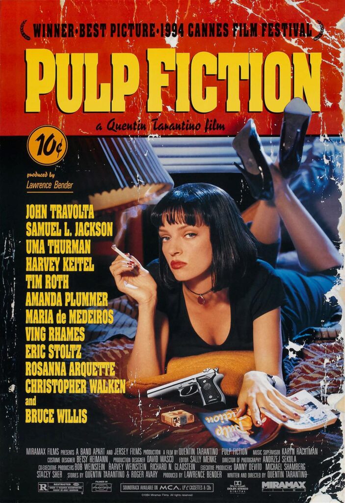
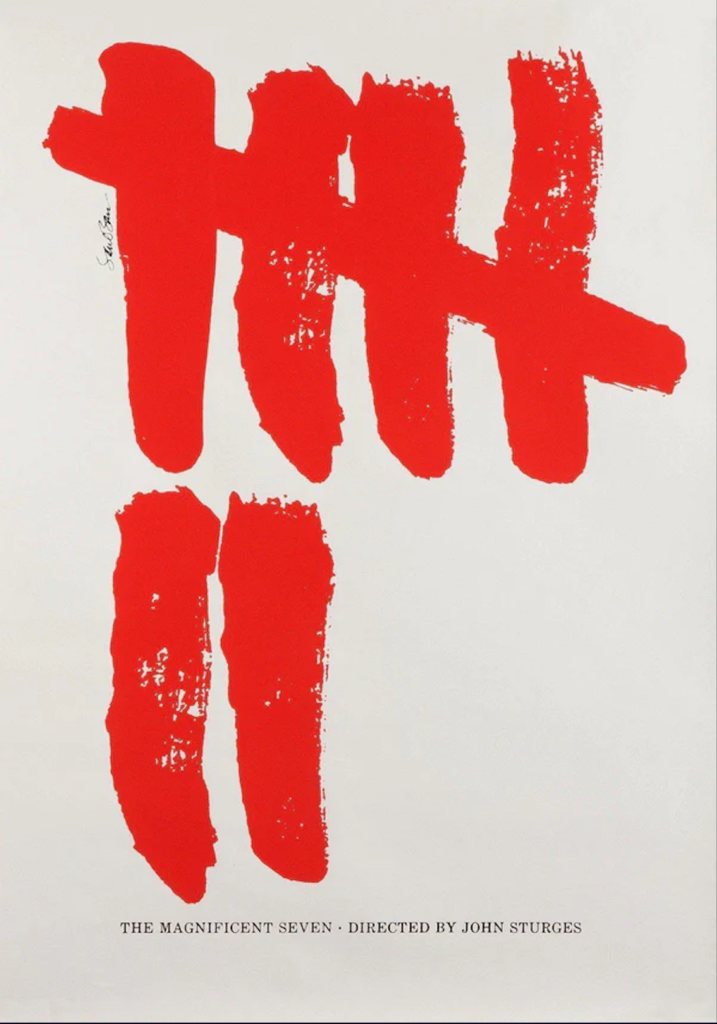
 Contrast a barebones poster like Saul Bass ‘Magnificent Seven’ with ‘Pulp Fiction’ whose movie poster is meant to resemble the kind of cheap book the movie’s title is derived from. Saul Bass was able to be a little more playful and abstract because his poster wasn’t for the theatrical run, anyone who wanted his poster probably had a good familiarity with the movie. Pulp Fiction’s poster was meant to convey the tone of the film, let people understand the idea and distill that into an aesthetic. Depending on what you’re designing for with your movie poster, the marker on the spectrum can shift from broad audience to specific, it generally just depends on if it’s the original theatrical run or if this is for a movie released already.

Categories
Uncategorized

VR/AR#3: IKEA Place

For my AR app review I chose IKEA place. Originally I was doing Warby Parker’s app but apparently the AR features are only available on an iPhone X or newer so I had to scrap that. The IKEA place app had a good presentation, requested you read the privacy policy which wasn’t very long and made you understand that any data they ‘took’ (images) would only be held on their server for about 4 hours. I really appreciated how forthcoming they were with that information and kind of set the tone for a good app experience overall.

Once past the privacy policy, I started to notice some of the apps’ real faults. When sampling furniture it doesn’t ask for you to map out your space which is kind of an indicator of some of the issues to come. You select the item you want to test and tap where you want it to go. This places it in your room but it isn’t aware of your other appliances/furniture at all. Chairs, lamps, beds, all of them clipped through my living room furniture and walls. In an ideal scenario where you have a completely empty room and are trying to find an aesthetic for your home or apartment, I can see where this would come in handy. The 3D models aren’t very detailed or textured so you don’t get a really good feel for them in your space. The app’s pretty intuitive but none of the features are explained at all so if you do get confused you’re just gonna have to figure it out. The last real flaw I noticed was that it seemed odd you cannot buy the furniture in the app, seems like a wasted opportunity.

There were some things I liked however. The privacy policy being upfront was one. Their catalog of items to sample is massive, and even though the models aren’t textured or really good, the lighting on them seemed to match up well with my room at the time I did my review. That could have just been a coincidence though.

Overall the app was a pleasant experience, it was fun to mess around in anyways even though I think the useful applications of the app are few and far between. I think if they cleaned up their models and allowed for interactivity (ie. no clipping into other furniture, actually scanning the space the furniture is going into) they could have a really powerful and usable app on their hands.

Categories
Uncategorized

Tossolini Blog: Week 2

For this blog assignment, I wanted to reflect my feeling of excitement for my first few weeks of being in the program. My experience has overall been really enjoyable which makes sense. I always had fun in class if it was a subject I’m interested in, and I came here to learn and get better so aside from some first week jitters and being in a new environment, I’ve really enjoyed my time here so far.

To reflect my excitement, I wanted to do something a little outside my normal comfort zone. In my virtual media module, we worked with EyeJack last week and I wanted to do something like that again, but instead of doing an 8-bit Photoshop animation I decided to use After Effects for the first time. It took some trial and error but I ended up animating about a 26 second clip of the word excitement and a ball bouncing around the screen, changing colors and orientation to the song Car 24 by the Seatbelts. That song always seemed endlessly positive to me, and the bright colors shown in the animation were just meant to represent how happy I am to be here and taking this chance on my future. I did a bit of typography and a procreate drawing for the EyeJack thumbnail image to round out the project. All in all, I probably made it harder on myself then I needed to by using some new programs but it was a fun project and I enjoyed the result and trying something new.

The project itself was made using After Effects, Illustrator, Photoshop, Procreate and EyeJack, involving a photo, digital drawing, animation, and an mp4 file. If you don’t have EyeJack or can’t get the file to play for whatever reason, I can slack you a zip file at your request!

Attached below is the EyeJack link

https://launch.eyejackapp.com/Artwork-30cea190-fbef-4fe3-ab8f-bc53b696ac02

Categories
Uncategorized

VR/AR #2: AERO

This project actually made a lot of sense to me having done the tutorial in class. As in, I didn’t really have to fumble around with knowing how to work the program, it seemed to make sense for the most part. Originally, trying to conceive an idea, I thought it would end up boring to just do a congratulations card, so I wanted to do something different. I was going to try and make some mountain assets to put in but they just weren’t looking good for the LOTR (Lord of the Rings) style greeting card I had in mind so I decided to change gears. Ultimately, I decided I wanted to try making a survey, with different taps leading you to different actions and pages, like a choose your adventure book or game.

I didn’t think I should let it get too complex, both for my sake and I think it’d have to really be something special for someone to want to putz with my Aero project for more than a minute. I decided to do a survey about my favorite beverage ‘Diet Coke’. First I began by writing out the script of how I wanted each interaction to go, directing the flow of the card. Next, I put the script into Adobe Illustrator and exported all the individual pieces of dialogue out as PNG’s. I needed some pictures and sound clips as well so I took those off of google images and youtube as I needed. Some minor editing to the audio clips was necessary, so I just did the trimming in quicktime and reconverted those MP4s back into MP3s so I could use them, which was probably the most annoying part of the process.

This was the original script I had written, some minor changes made in the end

I’d say actually putting all of this into Aero wasn’t too hard, it basically went as I had planned when writing all the dialogue out. One problem I thought would happen was that I had written a planned “Yes or No” question, with a “No” response leading you to choose if you wanted to retake the survey. I wasn’t sure if the program would loop back to the first question or if I would have to copy or re(animate?) the entire rest of the survey to happen again. But Aero knew to just loop it back and the survey could continue as normal. That was a big bonus and time save for me. Aside from that, the only other thing was adjusting the right size of the card and distance from the screen to make sure everything could be viewed correctly, but after some test previews I finally got it to where I wanted it and, I’m pretty happy with it! It’s pretty fun, I think adding some creative features would be nice but it was a very fun beta to play around with.

Categories
Uncategorized

Blog 1: AR Poster

For my poster, I decided on a theme of comedy. I knew I wanted something funny, but I had to boil that down to something more concrete. Relaxing after my first week of school, I scrolled the TV channels until I stumbled upon TBS playing Talladega Nights: The Ballad of Ricky Bob halfway over. I had my idea.

I wanted to try animation because I’d never done that before. Originally I was going to use Procreate but realized trying to lip-sync the dialogue of the scene I chose would be really hard and time consuming, something to try later, after learning some basics of animation. I knew I couldn’t do something too intricate so I ultimately decided on a simple 8-bit animation style sprite. After watching a few Youtube tutorials, I felt good enough to begin the design process.

Drawing the idea for the character sprite was the first thing. My favorite part of Talladega Nights was Cal Naughton Jr. played by John C. Reilly. I chose a scene where Ricky returns to find that Cal has completely replaced him in his families hierarchy, including tapping his face over Ricky’s in a family portrait. After the base drawing was done, I imported that into photoshop and put all the different features on separate layers. After all the pixel art had been made, I made 11 frames, and narrowed down my scene of dialogue to about 2 seconds. Made 11 frames of .2 seconds that would loop forever. Then went into every other frame to animate the individual frame details: hair bouncing, eyebrows moving, shoulders going up and down. I wanted that sort of idle animation you’d see in a fighting game when you’re selecting a character (obviously just not very detailed)

I did a test of the animation for something else, a pigeon cooing, just to see how photoshop animation worked with EyeJack and I had quite a bit of trouble with exporting as a gif and getting it to work properly. Luckily, when I did the Talladega animation everything seemed to work and export out really easily. This was a really fun project and I think it’s something I’d really like to work with and experiment on more in the future.

Categories
Uncategorized

Hello world!

Welcome to New Media . This is your first post. Edit or delete it, then start blogging!