I found inspiration for this project through one of the example Aero projects on Behance: Take Me There by Susi Vetter and Carrie Gotch. I enjoy illustration and was intrigued by the idea of adding dimensionality and simple animation to something like this. Creating an illustration as detailed as the example that inspired me felt like too much to take on for this project, but I happen to have some layered scenery illustrations already made for packaging for a probiotic soda brand for Erik’s class, so I opted to modify one of those images for this project. This had the added benefit of a narrative for the project, as I can imagine a branded AR experience being an interesting addition to our website or social media.
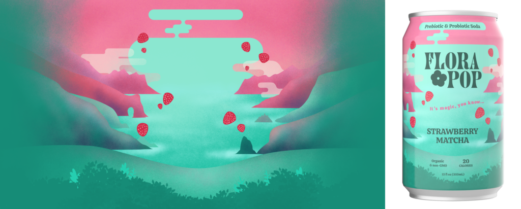
Fortunately, the creators of Take Me There included some information about their process in their Behance post. Before exporting separate layers from my Photoshop illustration, I took their advice and tried to eliminate sharp edges on the layers so that the scene would appear to dissolve into the environment. I added transparency to many of the clouds. I also changed the ratio of the image dramatically and shifted a lot of elements around to fill the additional space. My final experience includes clouds that shift back and forth, as well as a a strawberry that appears on proximity which, when tapped, flies upward and bursts into many other strawberries.
I ran into quite a few issues. Here are just a few:
- Before even getting into Aero, figuring out how to structure and export my numerous Photoshop layers was a lot of work. My attempts to make the backmost layer “fade out” look pretty shoddy. Time ended up being a limiting factor and I wasn’t able to go back and make adjustments to the edges.
- Placing the layers into the Aero scene was also a challenge. I thought the elements might include their relative place in my Photoshop canvas so that, by importing them in order and changing their Z coordinates, they would naturally line up, but this turned out to not be the case. I solved this by placing and adjusting the location of each element manually. This took a lot of time, and was essentially recreating the layout of an illustration I’d already created once in Photoshop. Adding to this was the fact that I didn’t really account for the viewing angle in 3D space, so some of the elements that overlapped each other didn’t actually extend far enough down. Now that I know this I would approach my workflow differently next time. I would definitely not spend so much time on the intricacies of my layout before placing everything in 3D space, and I would ensure that when 2D elements overlap, the element in the back extends much further behind the one in front than I would have it do in a purely 2D piece.
- I initially set the cloud movements to be triggered by proximity, then later decided I’d rather have them animated from the start. I tried changing the trigger, but it seemed to mess up the movement of the clouds–instead of drifting slowly back and forth, they made several sudden, jerky, drastic jumps and then stopped moving altogether. With more time, my next step to solve this issue would be to delete the trigger and start over with the clouds, but as there are quite a few of them and I was already quite a few hours in, I opted to keep the trigger as proximity. Unfortunately, even though I set the proximity range pretty high, they don’t always seem to work in the actual experience (although in the preview they work just fine). The movements are also fairly small and subtle, so it’s sometimes difficult to tell if they’re actually moving or not when I’m viewing the experience on my phone.
- I think the strawberry animation came out okay, but one thing I couldn’t figure out how to do was to stop the triggered strawberry from throbbing after it has been tapped and done its thing. Currently you can continue to tap the strawberry multiple times, and each time the animation causes it to climb higher and higher–which is funny, but not really what I was going for.
- Finally, I had a lot of trouble finding surfaces that Aero would project onto, especially in my small apartment! I used a vertical anchor for this project, so I needed a wall, and the only place I could find in my house that Aero would acknowledge as a vertical surface was high up on a bookshelf in the bedroom, which made it pretty much impossible to view. Fortunately I remembered that this had been an issue in the past with Polycam and didn’t waste too much time trying to make it work at home. Even at school, though, where there’s plenty of open wall space, it took quite a long time to find a spot where the experience would actually launch.
Overall I found this challenging, but pretty fun. Even though my execution on this project was a little rougher than my original vision, I loved seeing my illustrations come to life, seeing how shifting perspective changes the experience, and getting to explore a scene I created. Aero is something I could see myself wanting to spend more time with in the future.