This week I’m reviewing Stack AR, a free game with an optional AR experience available in the App Store.
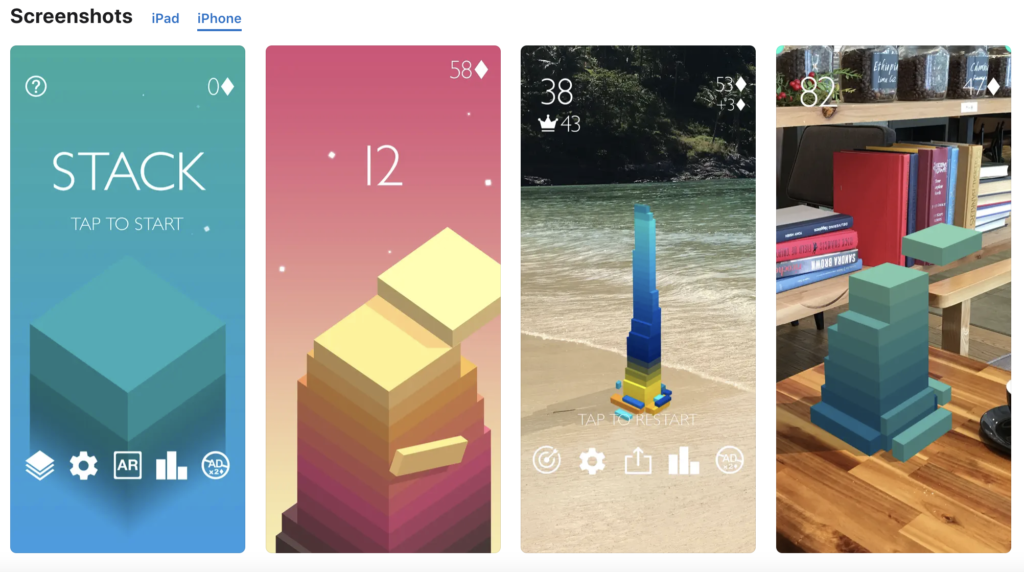
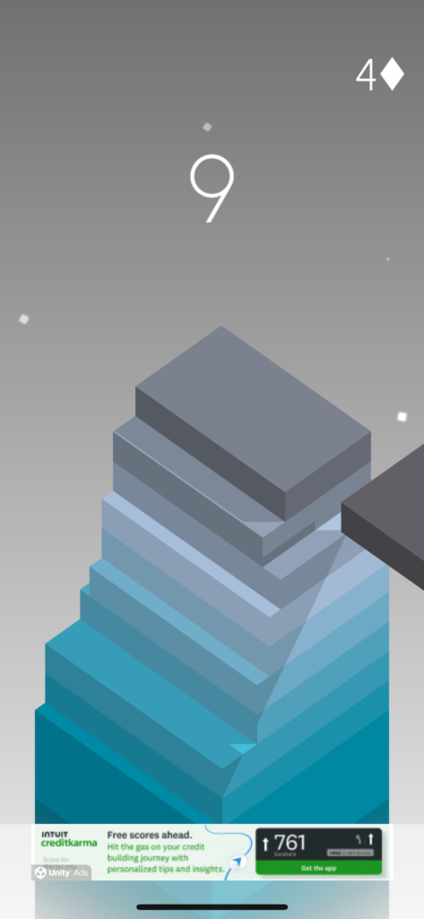
The game is simple and intuitive. A block slides back and forth rhythmically, and you try to tap it as it passes over the block underneath so that it lands perfectly on top. If you miss by a little, the part of the block that didn’t overlap the one below it will be cut off, leaving you with a smaller surface to place your next block on. The blocks shift in color as you go along, creating a pretty gradient. The aesthetic and UI are overall pretty minimalistic and clean (sometimes to the detriment of the user experience, in my opinion–but we’ll get to that in a moment). The App Store description says you can “play in Augmented Reality anywhere” and shows a screenshot of gameplay in AR mode on a lovely beach and a home library. Sounds low-key and fun.

Here’s what I thought worked well. The game is relatively intuitive, and this goes for the AR version too. There’s no real onboarding, but it’s not hard to pick up what you’re supposed to do. The color gradient on the blocks is pleasing. The animation is kind of fun to watch in your environment.
And that’s about it for positives. There might have been more if I weren’t here to review the AR functions, but I am.
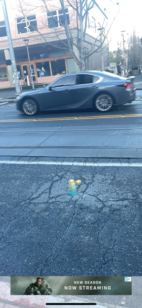
The AR mode in this game seems like a cool idea, but I found the experience a little frustrating for several reasons, including: As with a lot of AR experiences in my cluttered urban home, it was really tough to find a surface it would launch on to begin with, and when I did the stack often ended up very small–so small that it made it pretty hard to play the game at all. It worked better outside, but that left me with even more distance between myself and the stack. This is especially apparent when you compare AR and non-AR modes; the latter is much more zoomed in and the play takes up a lot more of your screen.
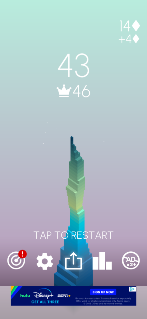
The ads were OUT OF CONTROL. I know that’s how free mobile games are, but it was definitely worse that several others I play regularly. This combined with the poor display size in AR mode meant I spent a lot more time watching ads than actually playing. I would have absolutely given up over this after just a couple of rounds if I weren’t doing this for homework.
Non-AR mode is a visually appealing game, with nice composition and a subtle color gradient in the background. By comparison, when I play in AR mode I get to stack blocks in my messy apartment, or on the sidewalk, or on the bus! (Actually not on the bus–it does NOT work on the bus). The environment is distracting and, more importantly, not the escape I’m looking for when I play a mobile game like this. The beach/library screenshots from the app store shots look lovely, but my environment isn’t like that most of the time–and if it was I think I’d rather enjoy my time in other ways than playing this. This makes me question the point of having AR play for this game at all. For me, it doesn’t make a lot of sense.
Finally, it felt like there were more on screen prompts, goals, and other messages when I played in non-AR mode than in AR mode. Later on when I looked at my own screenshots, it looks like some of them (ex: the counter for how many blocks you’ve stacked) might be there in AR mode but displayed differently. They were definitely easy to miss, and as one of the few elements of clear UI in the game it would have been nice to have them more prominent.
This was an interesting opportunity to reflect on what makes an AR experience fun and intriguing. For example, I haven’t played Pokemon Go, but I get why it’s exciting to have Pokemon you can capture and interact with appear in your environment with AR. Adding animated blocks to the world, however, doesn’t feel like a big add; in fact, the AR functionality takes away from the charm of the non-AR version of the game.


