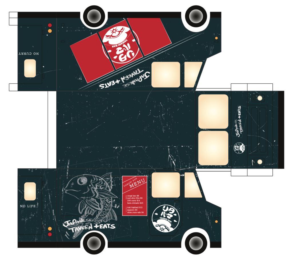
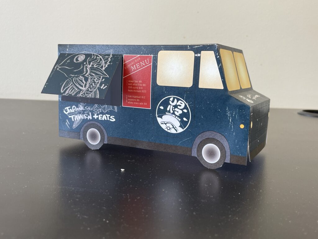
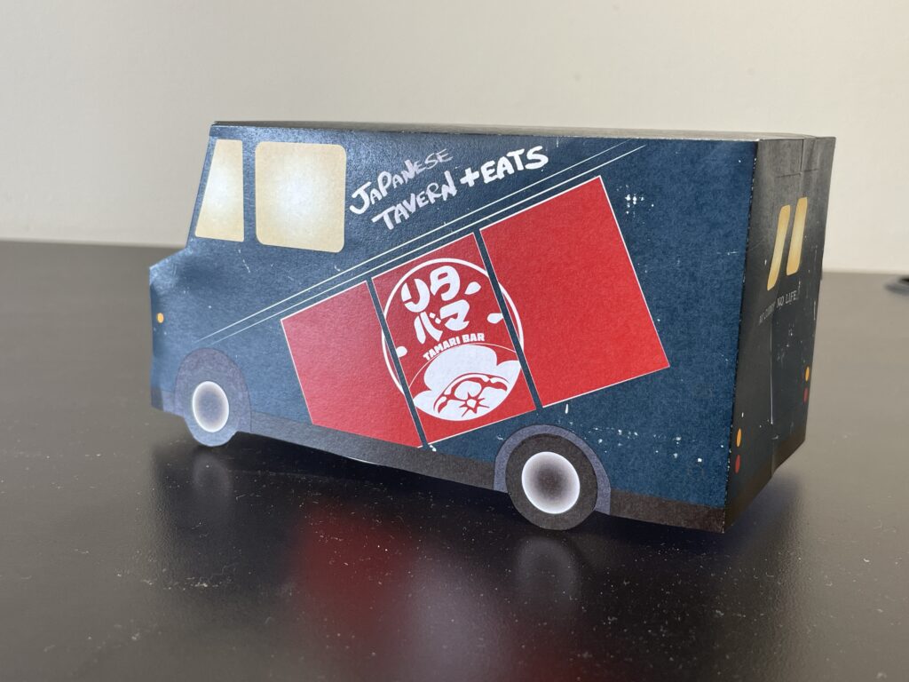
Our assignment this week was to design the exterior of a food truck. For this assignment, I chose to design for Tamari Bar. Tamari Bar is a local izakaya located just a few blocks down Pine Street from SCCA. They serve Japanese curry, sashimi, and a variety of bao with Japanese fillings. I work at Tamari Bar a few nights a week, so I’m familiar with the menu and look–but that’s not the only reason I picked this spot. In fact, I was primarily inspired by the design of the interior and the signage around the restaurant, two things that I admired about Tamari Bar before I joined their team. This also posed an issue, though. Since a food truck is by its nature separated from the brick and mortar location, how could I capture some of the restaurant’s essence in this different format?

My solution utilizes some of the recognizable symbols of Tamari Bar, including their logo, a design depicting the noren curtains that hang outside the door, and some of the owner’s distinctive hand-drawn illustrations and text. For color inspiration, I looked to the interior of the restaurant, which has recently been repainted a very deep teal. Alongside dark wood and warm yellow lights, that color gives Tamari Bar a distinctive atmosphere. I pulled pops of red from the lanterns and curtain outside. The texturing is a little more pronounced than I had originally envisioned, but is meant to give the truck a feeling of being well-loved and a little industrial, but still welcoming and fun. In my mockup, I cut out the serving window to get a sense for what it it would look like open, and I added a simple gradient glow to the windows. I picture this food truck being a welcoming beacon on a warm spring evening like tonight.

