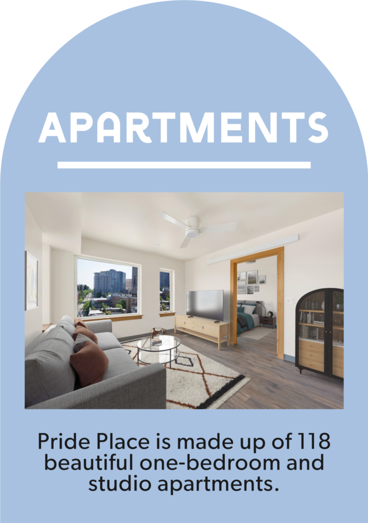
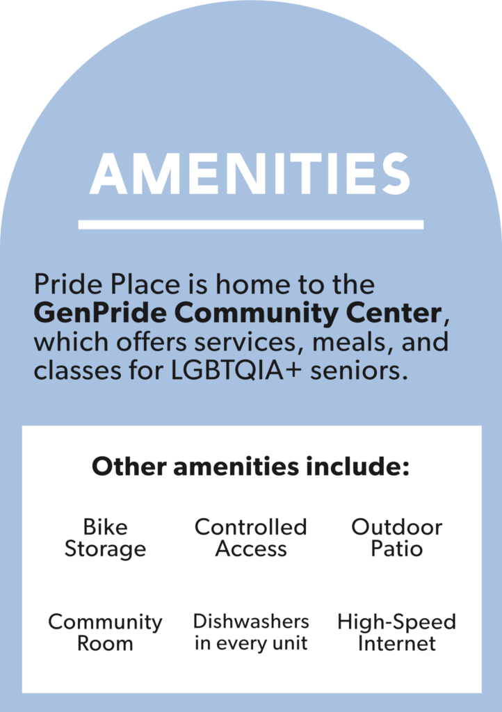
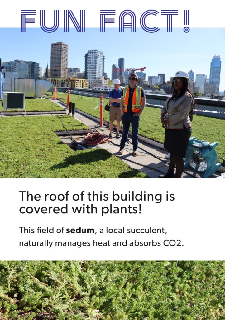
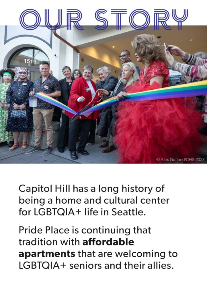
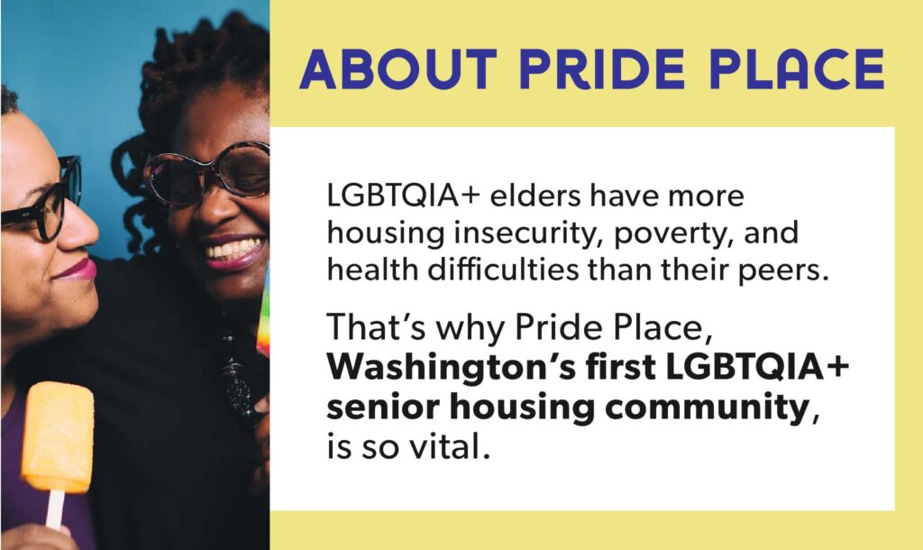
For my final AR project, I decided to focus on affordable housing in Seattle. I chose this Point of Interest because I think it’s important for people to know how public dollars like the Seattle Housing Levy go toward creating invaluable housing for people and communities who increasingly cannot afford to live in our city. Pride Place is located just a block away from Seattle Central, and it’s a really cool example of a collaboration between the city, a seasoned local affordable housing provider, and a nonprofit without prior experience administering housing but with deep knowledge of a specific community (in this case, LGBTQ+ elders) who are disproportionally affected by housing insecurity. I got to take a tour of Pride Place last year when it was still under construction, so I thought this would be a fun opportunity to share what I learned with my classmates.
I created the panels in Illustrator with a combination of my own photographs, images from the Pride Place website, and images from Capitol Hill Seattle Blog’s coverage of the opening (photos by Alex Garland). The project is 6 panels introducing the building, its apartments and amenities, and some “fun facts” about the development and why it’s important. I opted for extra panels instead of trying to include sound with this.
This was a fun project! The file size limit was definitely a challenge, but otherwise Eyejack was easy to use. The only other unexpected challenge I encountered was recording the experience. Pride Place is on Broadway, a busy pedestrian thoroughfare, and I was especially mindful of not wanting to make any residents who were coming or going uncomfortable. In the end I was able to get a relatively clean recording, but I would definitely think more carefully about my filming location if I were doing this again!
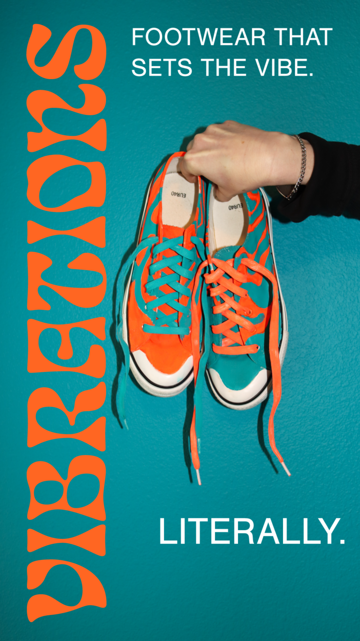
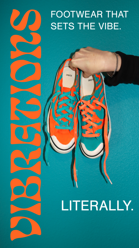
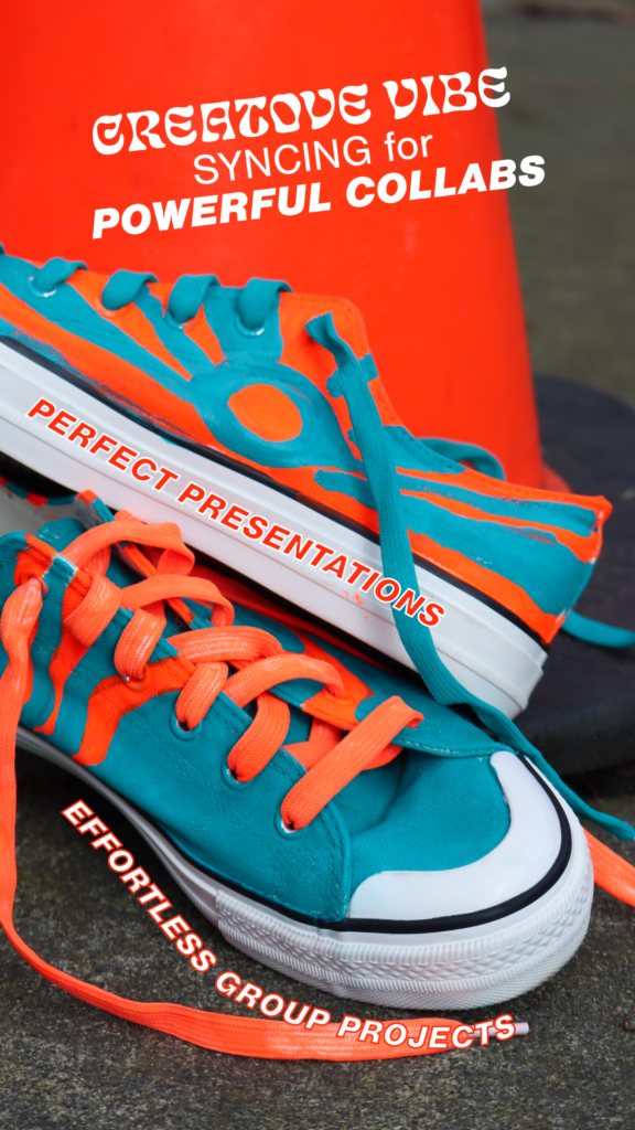
Step into a world of boundless creative collaboration with Vibrations: shoes that truly resonate. Vibrations are the world’s only shoe equipped with advanced sensors that amplify brainwaves, allowing you to effortlessly understand your assignment, communicate your concepts and designs, and sync vision with collaborators. Getting ready for a final presentation? Vibrations ensure that your creative voice is heard loud and clear. Doing an intake call with a new freelance client? Vibrations pick up what they really want but might not put into words. Working on a group project? These shoes get everyone on the same page.
Crafted with premium materials and engineered for comfort, Vibrations are the ultimate tool for any graphic design student looking to take their skills to the next level.
Features:
Adjustable vibe levels: choose 100% projection to ace that presentation, 100% reception to get to the heart of what your client wants, or 50-50 for effortless collaborating with peers.
Vibrating colors provide a resonance range of up to 300 feet.
Bold design lets everyone know how creative you are.
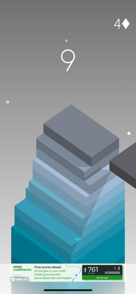
This week I’m reviewing Stack AR, a free game with an optional AR experience available in the App Store.
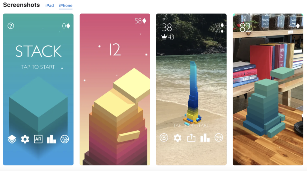
The game is simple and intuitive. A block slides back and forth rhythmically, and you try to tap it as it passes over the block underneath so that it lands perfectly on top. If you miss by a little, the part of the block that didn’t overlap the one below it will be cut off, leaving you with a smaller surface to place your next block on. The blocks shift in color as you go along, creating a pretty gradient. The aesthetic and UI are overall pretty minimalistic and clean (sometimes to the detriment of the user experience, in my opinion–but we’ll get to that in a moment). The App Store description says you can “play in Augmented Reality anywhere” and shows a screenshot of gameplay in AR mode on a lovely beach and a home library. Sounds low-key and fun.
Here’s what I thought worked well. The game is relatively intuitive, and this goes for the AR version too. There’s no real onboarding, but it’s not hard to pick up what you’re supposed to do. The color gradient on the blocks is pleasing. The animation is kind of fun to watch in your environment.
And that’s about it for positives. There might have been more if I weren’t here to review the AR functions, but I am.
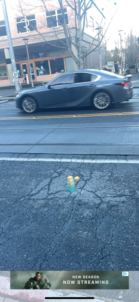
The AR mode in this game seems like a cool idea, but I found the experience a little frustrating for several reasons, including: As with a lot of AR experiences in my cluttered urban home, it was really tough to find a surface it would launch on to begin with, and when I did the stack often ended up very small–so small that it made it pretty hard to play the game at all. It worked better outside, but that left me with even more distance between myself and the stack. This is especially apparent when you compare AR and non-AR modes; the latter is much more zoomed in and the play takes up a lot more of your screen.
AR vs. Non-AR mode. Even on the closest surface I could get the experience to work on, the play area is just a lot smaller. In this game, that makes a difference.
The ads were OUT OF CONTROL. I know that’s how free mobile games are, but it was definitely worse that several others I play regularly. This combined with the poor display size in AR mode meant I spent a lot more time watching ads than actually playing. I would have absolutely given up over this after just a couple of rounds if I weren’t doing this for homework.
Non-AR mode is a visually appealing game, with nice composition and a subtle color gradient in the background. By comparison, when I play in AR mode I get to stack blocks in my messy apartment, or on the sidewalk, or on the bus! (Actually not on the bus–it does NOT work on the bus). The environment is distracting and, more importantly, not the escape I’m looking for when I play a mobile game like this. The beach/library screenshots from the app store shots look lovely, but my environment isn’t like that most of the time–and if it was I think I’d rather enjoy my time in other ways than playing this. This makes me question the point of having AR play for this game at all. For me, it doesn’t make a lot of sense.
AR vs. Non-AR mode gameplay. Which one would you rather play?
Finally, it felt like there were more on screen prompts, goals, and other messages when I played in non-AR mode than in AR mode. Later on when I looked at my own screenshots, it looks like some of them (ex: the counter for how many blocks you’ve stacked) might be there in AR mode but displayed differently. They were definitely easy to miss, and as one of the few elements of clear UI in the game it would have been nice to have them more prominent.
This was an interesting opportunity to reflect on what makes an AR experience fun and intriguing. For example, I haven’t played Pokemon Go, but I get why it’s exciting to have Pokemon you can capture and interact with appear in your environment with AR. Adding animated blocks to the world, however, doesn’t feel like a big add; in fact, the AR functionality takes away from the charm of the non-AR version of the game.
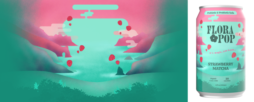
I found inspiration for this project through one of the example Aero projects on Behance: Take Me There by Susi Vetter and Carrie Gotch. I enjoy illustration and was intrigued by the idea of adding dimensionality and simple animation to something like this. Creating an illustration as detailed as the example that inspired me felt like too much to take on for this project, but I happen to have some layered scenery illustrations already made for packaging for a probiotic soda brand for Erik’s class, so I opted to modify one of those images for this project. This had the added benefit of a narrative for the project, as I can imagine a branded AR experience being an interesting addition to our website or social media.
This is the illustration from our probiotic soda can design that I attempted to turn into a 3D mural in Adobe Aero.
Fortunately, the creators of Take Me There included some information about their process in their Behance post. Before exporting separate layers from my Photoshop illustration, I took their advice and tried to eliminate sharp edges on the layers so that the scene would appear to dissolve into the environment. I added transparency to many of the clouds. I also changed the ratio of the image dramatically and shifted a lot of elements around to fill the additional space. My final experience includes clouds that shift back and forth, as well as a a strawberry that appears on proximity which, when tapped, flies upward and bursts into many other strawberries.
I ran into quite a few issues. Here are just a few:
Before even getting into Aero, figuring out how to structure and export my numerous Photoshop layers was a lot of work. My attempts to make the backmost layer “fade out” look pretty shoddy. Time ended up being a limiting factor and I wasn’t able to go back and make adjustments to the edges.
Placing the layers into the Aero scene was also a challenge. I thought the elements might include their relative place in my Photoshop canvas so that, by importing them in order and changing their Z coordinates, they would naturally line up, but this turned out to not be the case. I solved this by placing and adjusting the location of each element manually. This took a lot of time, and was essentially recreating the layout of an illustration I’d already created once in Photoshop. Adding to this was the fact that I didn’t really account for the viewing angle in 3D space, so some of the elements that overlapped each other didn’t actually extend far enough down. Now that I know this I would approach my workflow differently next time. I would definitely not spend so much time on the intricacies of my layout before placing everything in 3D space, and I would ensure that when 2D elements overlap, the element in the back extends much further behind the one in front than I would have it do in a purely 2D piece.
I initially set the cloud movements to be triggered by proximity, then later decided I’d rather have them animated from the start. I tried changing the trigger, but it seemed to mess up the movement of the clouds–instead of drifting slowly back and forth, they made several sudden, jerky, drastic jumps and then stopped moving altogether. With more time, my next step to solve this issue would be to delete the trigger and start over with the clouds, but as there are quite a few of them and I was already quite a few hours in, I opted to keep the trigger as proximity. Unfortunately, even though I set the proximity range pretty high, they don’t always seem to work in the actual experience (although in the preview they work just fine). The movements are also fairly small and subtle, so it’s sometimes difficult to tell if they’re actually moving or not when I’m viewing the experience on my phone.
I think the strawberry animation came out okay, but one thing I couldn’t figure out how to do was to stop the triggered strawberry from throbbing after it has been tapped and done its thing. Currently you can continue to tap the strawberry multiple times, and each time the animation causes it to climb higher and higher–which is funny, but not really what I was going for.
Finally, I had a lot of trouble finding surfaces that Aero would project onto, especially in my small apartment! I used a vertical anchor for this project, so I needed a wall, and the only place I could find in my house that Aero would acknowledge as a vertical surface was high up on a bookshelf in the bedroom, which made it pretty much impossible to view. Fortunately I remembered that this had been an issue in the past with Polycam and didn’t waste too much time trying to make it work at home. Even at school, though, where there’s plenty of open wall space, it took quite a long time to find a spot where the experience would actually launch.
Overall I found this challenging, but pretty fun. Even though my execution on this project was a little rougher than my original vision, I loved seeing my illustrations come to life, seeing how shifting perspective changes the experience, and getting to explore a scene I created. Aero is something I could see myself wanting to spend more time with in the future.
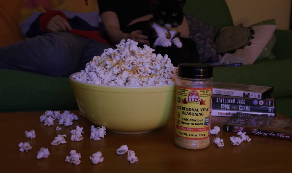
I chose to photograph a product I always have in my house: Bragg’s nutritional yeast. This is something I grew up eating on buttered popcorn, probably because I grew up in Mendocino, California, where everyone ate health food before it was cool. It wasn’t until much later that I realized that a lot of the things I grew up with, from Tofu Pups to Birkenstocks to Subaru Outbacks, were also characteristic of 1990s queer culture, and it was even later than that when I realized I was also queer. I introduced my partner to “nooch” on popcorn when we first started dating, and it’s a movie night staple for us–as it is for many other folks we know.
My photo is dimly blue-lit to create a cozy nighttime movie night mood. In addition to a bowl of popcorn, I pulled some of our gayest DVDs from the shelf to build out the scene. In the back is a couple (my partner and I) watching a movie, accompanied by a cat (cats are also gay).
As I was thought about this concept, I was also thinking of the long history of coded messaging to LGBTQ+ audiences in advertising. Here’s a little more reading on that topic.
I love to go down to the water at low tide and look for intertidal animals, and I think it’s a great way for anyone to learn more about ecology, gain knowledge of local ecosystems, and build empathy and care for the natural world. For this project, I wanted to use some of the video clips I already have from those excursions to promote awareness of some of the cool things you can see at low tide.
Rather than using photos on the poster, I thought a bold graphic with a mysterious message would create a sense of intrigue and excitement. I designed the poster in Illustrator with a simple animation concept in mind that would segue into the nature clips in my video. The video/animation was created in AfterEffects.
I actually found this project pretty smooth and straightforward. The biggest challenge I encountered were remembering the basics of AfterEffects. It also took me a couple of tries to realize that I had to tap the “done” button at the end of the Eyejack upload process for my project to actually be published, but that wasn’t difficult to figure out.
The video clips are mine. The song is Swans in Flight by Asher Fulero via YouTube’s audio library, which is also where the wind sound effect at the beginning (which is pretty quiet) is from.
I watched a compilation of Super Bowl ads this week, which included:
Booking.com
Doritos
Hellmann’s Mayo
Starry
UberEats
Drumstick
Pringles
Oikos
Reeses
T-Mobile
Hellmann’s Mayo
Kate McKinnon’s character can’t figure out what to make from the leftovers in her fridge, so she asks her cat, and the cat’s responding meow sounds like the word “mayo.” Cut to a montage of TV appearances and book signings for the now-viral Mayo Cat and owner promoting an anti-food waste message. The commercial ends with a tabloid cover covering Mayo Cat’s recent breakup with Pete Davidson. This feels like millennial humor, but I think the cute cat and the story would make it appeal to a wide audience.
What works: The cat, obviously. The cat is very cute, and “cat video gone viral” is now a known story archetype that works well in a short commercial spot. Like almost all of the Super Bowl commercials I watched, this one had some stars, but unlike many of the others I felt that this one still made sense if you weren’t very familiar with the individual actors. Finally, I think the added message of reducing food waste made this commercial feel not just funny, but wholesome and positive.
What didn’t work for me: There was so much going on on-screen during this short commercial, and the cuts were very fast, so even though the storyline was pretty simple and familiar I had trouble taking everything in.
Starry
Ice Spice is sipping on a soda flanked by two cartoon citruses who are kissing her cheeks. Her ex with a blurred out (7-up?) logo on his sweatshirt shows up, the citruses exclaim how vulnerable and awkward the moment feels as Ice Spice rejects him. Overcome with emotion (??) her ex’s head explodes in a fountain of soda. The slogan “It’s time to see other sodas” appears on the screen. This is definitely targeting a younger demographic.
What worked: What hit for me was that I’d never heard of Starry before, so I was immediately intrigued by this high-budget ad and wanted to know more about the product. I’m not a person who keeps a finger on the pulse of pop culture and also didn’t know who Ice Spice was (sorry!) but that didn’t detract from the experience because the story felt familiar and her character was easy to understand. I also thought the bright pops of yellow and green on the dark club interior and in contrast to the ex’s gray sweatshirt looked exciting, bright, and refreshing. There was a little bit of a retro vibe with the character design of the mascots that ties in to some of Starry’s other branding. And speaking of tie-ins, Starry did a bunch of dating/Tinder related social media campaigning around this ad that fits the fun slogan felt seasonally appropriate with the proximity to Valentine’s Day.
What didn’t work for me: Maybe I am old, but I didn’t really understand the soda explosion at the end, and to me it felt kind of gross. It felt like there was a lot of absurdist humor in the ads I watched, which I can sometimes get behind, but when it feels like it’s happening just because “it’s what the kids like now” it falls flat for me. But again, who am I to say what the kids like now?
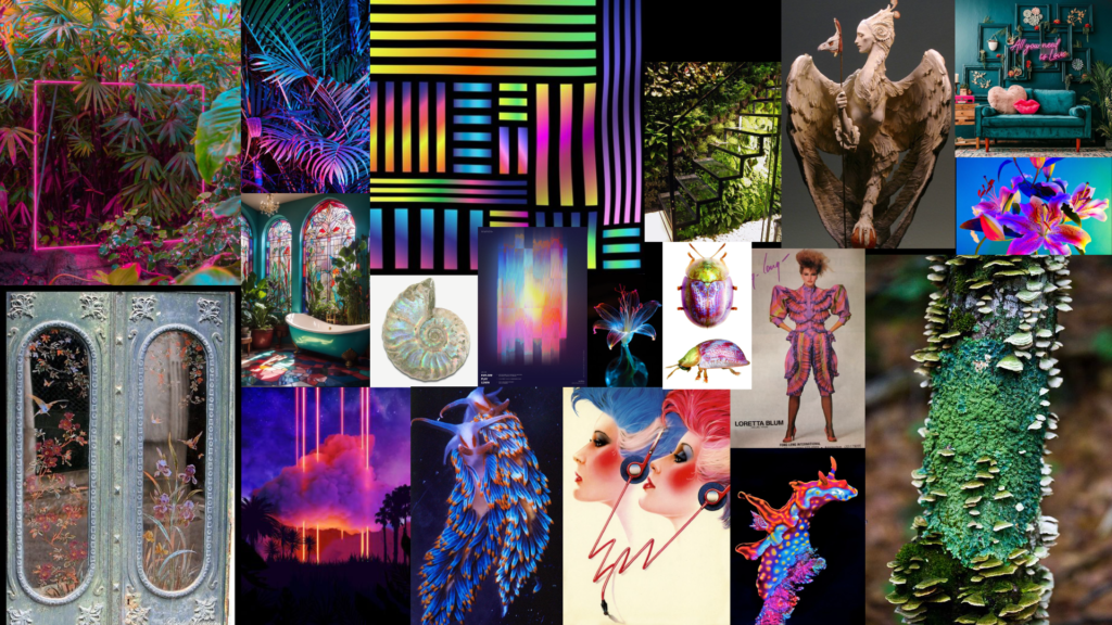
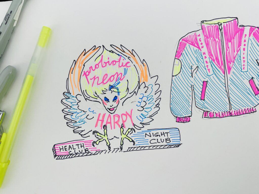
Create a brand for a fictional business that I came up with for an exercise in Ben’s New Media module. Probiotic Neon Harpy is half gay nightclub, half health club, and all vibes. The concept for this personal project is to create branding, collateral, a website, and maybe some ideas for merch and environmental/wayfinding for this off-the-wall concept.
Why This Project
I have no idea if this would be a good addition to my portfolio, but I picked this project off the list because it’s purely personal. I think this would be a fun way to explore some of the concepts I’m learning in school. I’d be especially interested in branding and logo design, and creating a website. Currently web design is the class I’m having the hardest time in, partially because I struggle to wrap my mind around some of the concepts and partially because I put a lot of pressure on myself to do well. I have a hunch that assigning myself something zany and fun, something I really feel excited about making, might help me remember the more serious stuff.
Moodboard/Sketches
Full Idea List
Bean Zine: an illustrated zine about my cat, Bean, where each facing page spread has rhyming word pairs after her name—for example, “Bean Leap/Bean Peep”
Bathroom sign photobook: definitely taking big inspiration from Andrew’s Internet book. Printing in riso would be cool.
Improved flower wall: I have a photo backdrop I constructed out of a sheet, PVC pipe, tissue flower papers that I made, and artificial flowers I bought at Goodwill. It’s not easy to store, though, and wasn’t well put together. Revamp the wall with better eye for design, construction, and usability.
Risograph print of intertidal species
Miniature diorama of a strange alley scene that could be stored in a bookshelf.
Design a brand identity for a fake business I came up with in Ben’s new media class: Probiotic Neon Harpy, a gay nightclub/health club with an 80s/neon/botanical/maximalist aesthetic.
Graphic novel about the life of Apsley Cherry-Garrard.
An advent-style calendar that you can use for any month to give yourself treats.
A Halloween party with retro decorations based on Victorian era Halloween aesthetics. Design and build an environment and send out elaborate printed invitations.
Adapt a zine idea into a website—an online zine that is interactive and uses modern web design. Expanded illustrated guide to some interesting tide pool animals?
Assignment: Practice the BAR Method for talking about your work. Highlight a piece of work you are proud of and feel is successful. Write an explanation of the Background, the Actions you took, and the Results.
Background
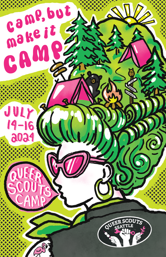
Our assignment was to create a poster for an upcoming nonprofit event. I selected Queer Scouts Seattle, a local LGBTQ+ organization that I have been involved with for the last five years. Queer Scouts hosts events, skillshares, and an annual camping trip for LGBTQ+ adults. They fill a need for sober spaces for community building for queer and trans people in our region. Because they are a small organization and entirely volunteer-run, they do not often have many resources to invest in design. My goal was to design something interesting and unique for their upcoming camping trip.
Actions
I worked with my classmates to brainstorm numerous ideas for the poster. I wanted the poster to feel handmade, punk, and to speak to the younger adult demographic the organization most appeals to. I also wanted to say “queer” without leaning on the common symbols of rainbows and unicorns. My solution was to play with the concepts of of a camping trip and camp aesthetic by centering an illustration of a figure in a giant green beehive wig ornamented with a camping trip scene, so that the wig also appears like a hillside. Picking bright, unnatural colors was important for my concept, so I borrowed a swatch kit from the equipment room to help guide my initial color choice, then printed test swatches before selecting my final shades of apple green and pink. I really enjoy illustration but sometimes struggle with integrating typography, so I looked to classmates for advice and added more hand-lettering and moved some letters around for a more playful vibe.
Results
I’m very proud of this poster, and it was well-received by my classmates. More importantly, the Queer Scouts also loved it—in fact, they are using it as a promotional image for their 2024 Queer Scouts Camp event this summer! I believe that what makes it successful are all the things I was most nervous about: an illustration-centric, rough style with slightly disorganized text and very bright colors. I’m glad that I asked for critique and advice, and that I ultimately followed my boldest vision for this project.
This week I played Genefunk 2090, a tabletop roleplaying game that uses Dungeons & Dragons 5e as a base, but adds new mechanics, character types, and a dystopian cyberpunk setting where most people have AI brain implants and corporations literally rule the world (and have even begun tweaking the human genome to create people with physical attributes that meet their business needs). I have been playing this game with the same group of people once a week for about four years now.
How the game is played
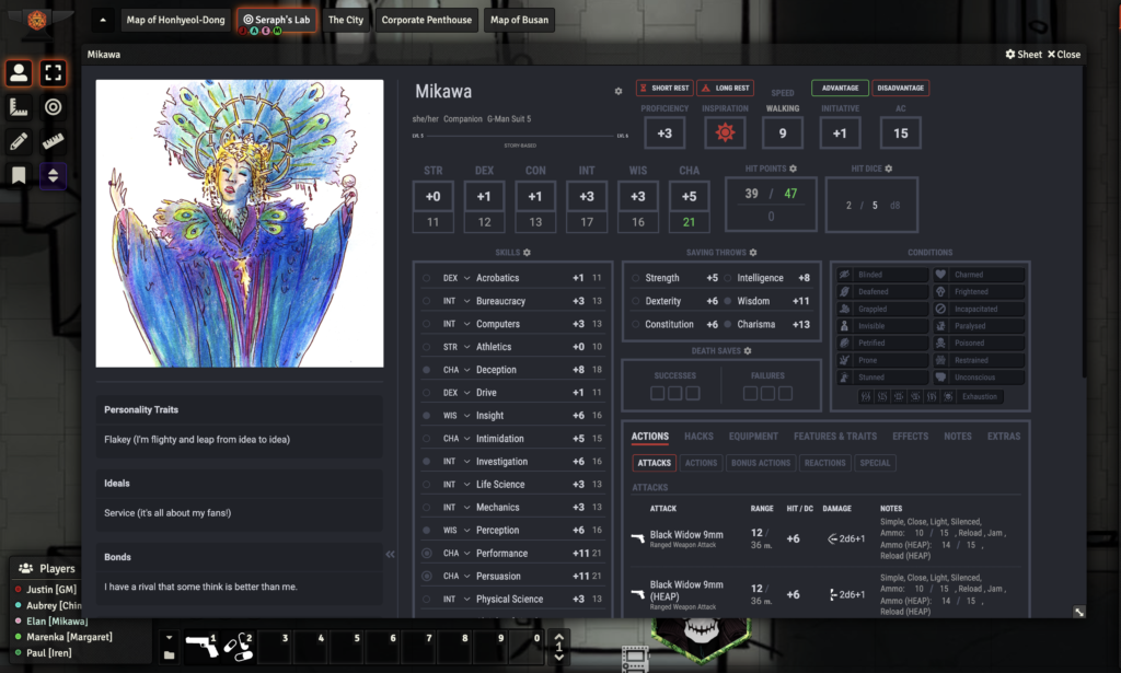
As with other forms of D&D, the game begins with players creating characters based on parameters from the core rulebook. My character, Mikawa, is an aging former pop star who was genetically engineered and raised by her record label to be a charismatic performer. My three fellow players also have characters who are members of the same mercenary cadre. The final member of our group is the Dungeon Master (DM). When we play, his role is to narrate the scenes and scenarios our characters encounter, act as all of the non-player characters and arbitrate the rules as we interact with the world he builds for us.
Dungeons & Dragons has been around for decades now, and its rules have been through many iterations, but the fundamental method of play is still pretty similar. The DM narrates scenes, and the players, acting as their characters, narrate their actions within the scene. When an action involves skill or an element of chance, the DM and players roll dice to determine the outcome. Combat is a key element, but diplomacy, puzzle-solving, and creativity can also help players progress the game. Because the stories and worlds players navigate are elaborate, it’s not uncommon for one “campaign” or story arc to last many sessions.
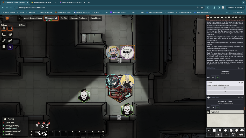
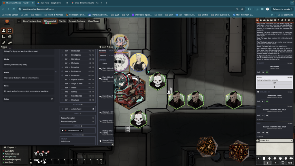
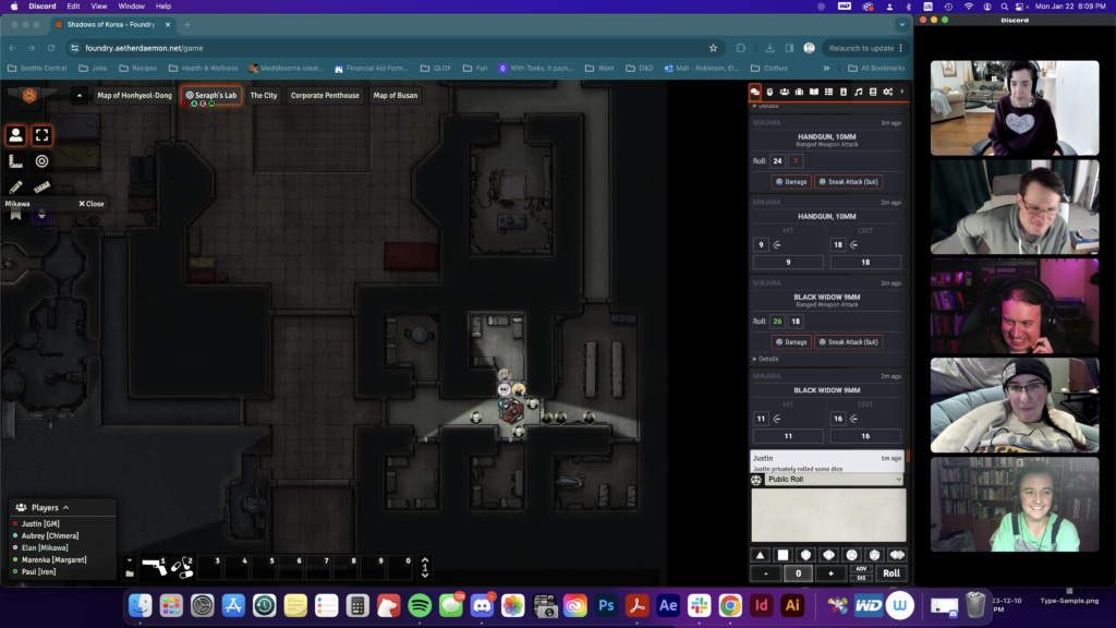
Traditionally D&D is played in-person with physical rulebooks and dice, but online platforms have made it possible to play online as well. Our group plays online using a combination of Discord (for video call and chat) and Foundry, an online tabletop game platform with a lot of customization options. In Foundry, our DM uploads maps and music, and we as players can create our own character tokens that we use to move around the map. All of the important information we need to play (like statistics for our characters, items we can acquire, and information we have learned about our allies and enemies) is stored in the game and easy to access from the icon menu. We can even select and customize our digital dice—admittedly not quite as fun as collecting unique physical dice, but still a nice touch.
Screenshots of Genefunk 2090 gameplay in Foundry.
What makes our Genefunk 2090 game unique is largely the setting (Busan, South Korea in the year 2090 instead of the vaguely-historical fantasy setting of the D&D universe), but there are some mechanics that differ from traditional D&D as well. For example, damage in combat is higher across the board to account for the prevalence of guns as a weapon (guns usually don’t exist in D&D), which raises the stakes and forces players to think differently about how they behave in fights. Overall, though, if you’ve played D&D 5e before, Genefunk is not a huge adjustment.
Who is the ideal target audience?
This game is definitely designed for players with at least some recent Dungeons & Dragons experience, since it is essentially an extension of those rules (which are already numerous). It also narrows that pool further with its subject matter, because while traditional D&D can appeal to kids (my 10-year-old neighbor plays multiple times a week with different groups!), the Genefunk 2090 setting is decidedly dark, gritty, and adult. I would say that this game is designed for people who enjoy tabletop games like D&D and who have played enough D&D that they’re a little bored and ready for something new.
What you enjoyed about your experience (or didn’t enjoy)
My favorite aspects of Genefunk 2090 are group storytelling and the social connection. I really love how D&D and other tabletop roleplaying games encourage creativity, from character creation to problem-solving. I am personally not very good at improvisation (especially not on a Monday night at 9pm), but I always love watching and listening to my fellow players embodying their characters. Our DM is also incredibly creative, and although some of the scenarios and the overall setting came from a book, he elaborates a lot with his own ideas—and by weaving our characters’ backstories into the ongoing storylines. Because he is a programmer and is very tech-savvy, he also makes a lot of modifications to the way the online play works. For example, our characters were recently in a nightclub setting, and the custom map we used included features like moving colored lights and music that changes volume depending on how close your character token is to the stage. I appreciate Foundry allows so much customization and freedom; it really makes for a rich play experience that could be adapted to many different groups, settings, and games.
Something I don’t always enjoy about this game (which I felt this week) is the huge volume of rules and how challenging they can be to reference. I personally have a very hard time memorizing so many rules, and it can feel embarrassing and frustrating when, for example, we’re in an exciting combat scene and I have to pause to ask for help remembering how to do something. D&D 5e rules are fortunately usually pretty easy to find online with a simple Google search, but when it comes to the specifics of the Genefunk 2090 setting I have to refer to a PDF version of the setting rulebook, which is a big file that often lags during a Control + F search and doesn’t read that easily on a desktop/laptop screen. A physical rulebook was produced when the game was released, but it was a Kickstarter project that only had one print run so those physical books are hard to come by. Fortunately my fellow players are very knowledgeable when it comes to the rules of the game and never seem to hold it against me when I have to ask the same question for the 9th week in a row, but I could see the sheer volume of rules and preparation needed to play any version of D&D being a barrier to a new player.
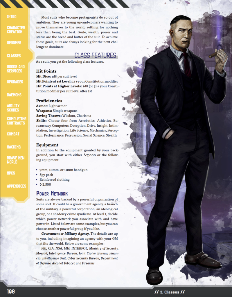
A sample page from the Genefunk 2090 rulebook describing just a few of many features of the Suit character class. As a design aside, I enjoy the overall look of this book because it follows the expected format of a D&D rulebook but with a look and feel that fits the setting. If only it were a little easier to navigate digitally!
Despite these challenges, I really love playing this game, and I look forward to it every week. When I started with this group of people I only knew one of them, but now we’re all friends who attend each other’s birthday parties and keep up on one another’s lives. In our busy adult existences, I feel really lucky that our group has managed to stay together for this long, and that we continue to make time for this activity every single week.
Our Foundry session on the left and Discord video call on the right. We’re all laughing and having a good time as we breeze through this battle.